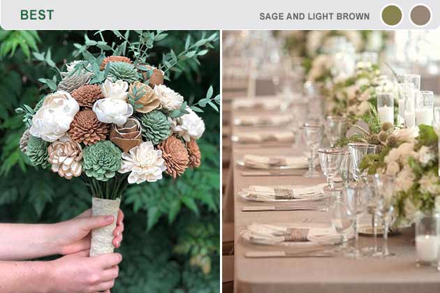
We love sage and browns because they bring an earthy feeling. One of the best weddings we’ve seen is one that used succulents instead of flowers. Not only did they last longer than flowers, but they also created a rustic feeling without being cliche. These two shades are also versatile because you can go light or dark brown.
These colors are perfect for outdoor weddings because they'll generally match the scenery. Otherwise, they'll evoke a kind of natural aesthetic that's cute and comfortable.
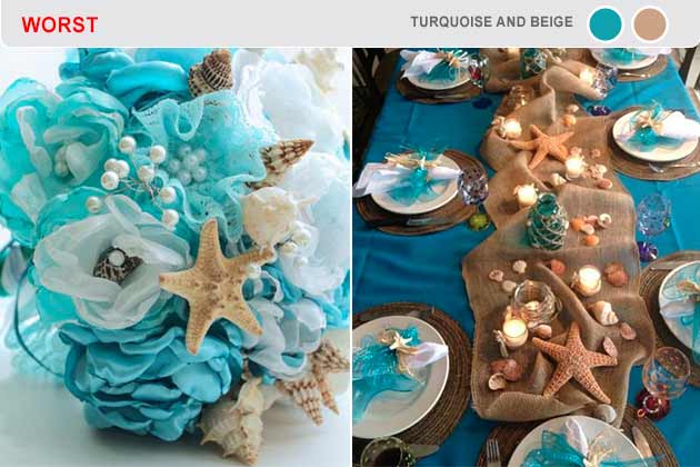
Unless you’re having a beach wedding with tons of “beach-y” elements, it may be best to stay away from turquoise and beige. Most bridesmaids aren’t too keen on wearing beige because it washes out a lot of skin tones. In all honesty, turquoise isn’t much better. If you love this shade, it may be best to go with a pastel option.
A color scheme to match a theme like this is more what you'd expect from a prom, not a wedding. Plan for some more mature tones.

Lavender is an elegant color that looks best during the spring, but you may also pull off this color during winter and summer. While you could go lavender and cream, we suggest pairing lavender with mint. If it’s too much on the eyes, you could also use the cream shade to break up each tone a little. Plus, white, lavender, and mint flowers in a bouquet is precious.
Make sure to keep the shades subtle, but these make a beautiful bouquet that you'll be happy to hold.
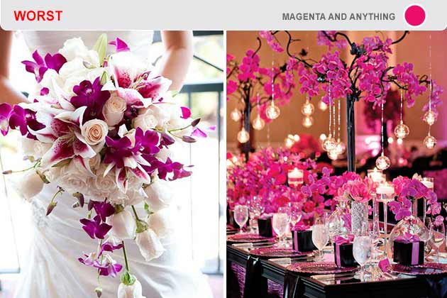
Magenta is another one of those colors that can be too bright on the eyes. Wedding photographers loathe colors like these because they make the bride and those wearing the color sickly. The color grabs the attention of anyone who looks over, and that isn’t what you want at your wedding. YOU want to be the center of the event – not the color.
Of course your wedding is your special day, so if magenta is your favorite color, you should include it. Just try to use it sparingly so you're not assaulting your guests with its brilliance.
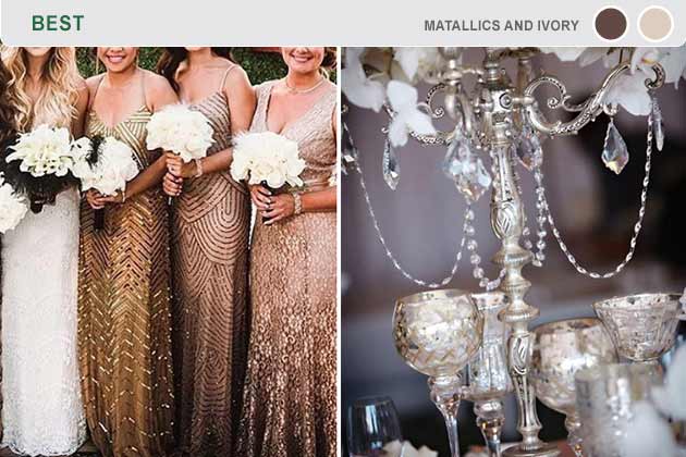
Some people say you shouldn’t mix metallics, but that advice is incredibly outdated. Metallics can be beautifully combined as long as you pair it with another color that goes with each shade. That’s right—we’re talking about ivory. White can be a little much, but an off-white like ivory or cream is perfect.
Along with these metallic tones come some super cute textures that will keep your guests in awe. Just be careful not to get carried away in the fun of it all and end up with some clash.
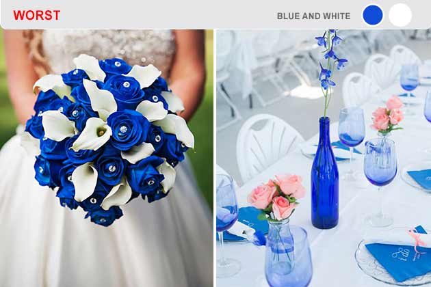
Blue is too much on the eyes, which is why many brides and wedding planners suggest a pastel blue or darker blue like navy. The issue with blue and white is that white brings out the already-vibrant blue. It can give your guests headaches, primarily if the blue is used liberally throughout the event.
(Image via Pinterest and Pinterest)
Color combinations this bright should be reserved for team spirit and mascots. Unless you want your wedding to feel like a high school football game, steer clear of these.
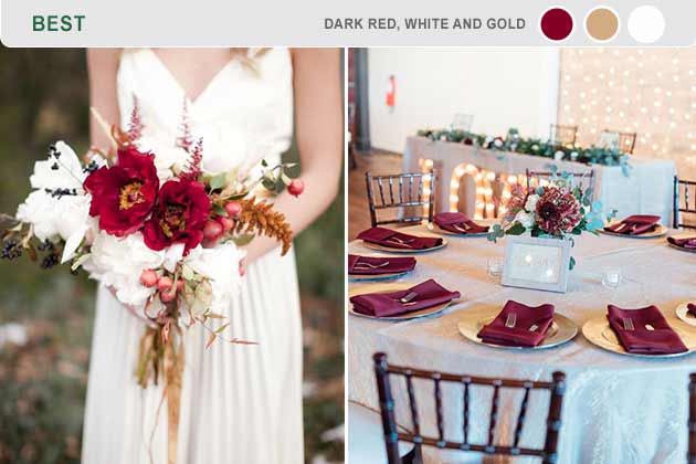
Dark reds are gorgeous and go well during the fall and winter months. Pair a lovely merlot shade with gold, and you have a winning combination. Of course, you’ll need a little something to bring the two colors together in a beautiful way – we suggest white. You can also go silver if you think that would work better with your vibe.
(Image via Pinterest and Pinterest)
Combinations like this are much more subtle in a way which exudes class. For the less refined however, dark red napkins have the added bonus of soaking up spilled wine without worrying about a stain.
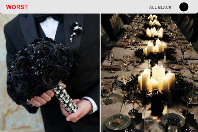
You don’t want your wedding to look like a funeral, and that’s precisely what will happen if you go all black. Black and white is classy since they’re used for most elegant parties, but all black? No, thanks.
(Image via Pinterest and Pinterest)
Also, nothing is worse than eating a black cake. Fondant is gross, and if you go the non-fondant route, you’ll have to dye the frosting which will stain.
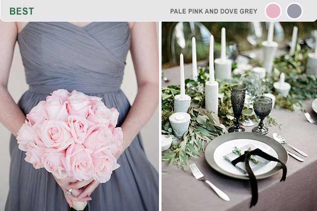
Whether you’re having a small romantic wedding or something a bit larger, pale pink and dove grey are an incredibly elegant combination. If you need a little more oomph, adding rose gold or silver into the mixture will make the pink pop.
(Image via Pinterest and Pinterest)
Here's a calm color scheme that looks good on almost anyone. You'd have to run into some serious trouble to mess up this classy combo.

Almost everyone loves colors, but that doesn’t mean you can use ALL the colors in your wedding. It may look good as accents but going full-on rainbow will make your wedding look incredibly busy. It’s just too much going on in one place.
(Image via Pinterest and Pinterest)
It’ll also make your pictures look less than great. Any wedding photographer will tell you that using every color in the rainbow will make for horrible pictures.
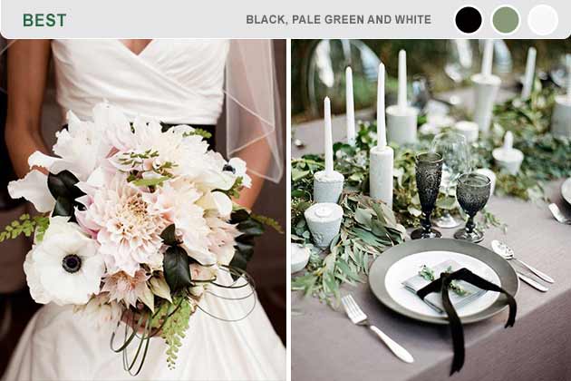
Pale green is a beautiful color on its own, but it really shines when it’s with black and white. The shade of pale green is up to you, but we’re pretty fond of sage. It’s a stunning shade that brings a sense of freshness and spring to your event.
(Image via Pinterest and Pinterest)
Muted colors like these make for a generally comfortable environment that everyone can enjoy. Especially green, since it will make for a more natural seeming space.
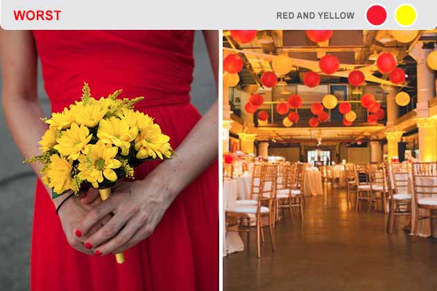
Overall, red and yellow aren’t great shades to pair up. Your wedding will look like McDonalds sponsored it. To make matters worse, yellow is another one of those colors that don’t photograph well. Most wedding photographers hate it when you choose yellow in your palette, and it only gets worse when red is also used.
(Image via Pinterest and Pinterest)
Red and yellow are hardly acceptable colors for a child's birthday party, so for something as formal as a wedding, they are completely inappropriate. Don't model your big day after bottles of ketchup and mustard.
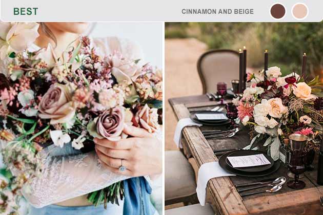
If you’re having a fall wedding, few things are more beautiful than cinnamon and beige. The cinnamon brings a regal Spanish vibe that’s accented by the beige. It helps the cinnamon pop and shine. It also goes well with traditional wedding elements like a tall, tiered cake and place cards.
(Image via Pinterest and Pinterest)
Earth tones make for a richly pleasing space, particularly paired with an outdoor venue. Your guest will be happy to get close to nature with you.

Orange and pink can go well together, but not for weddings. They’re two dominant colors that attempt to outshine each other. Including them in one place as a color palette will make your wedding seem too much – too loud, if you will. You don’t want to give your guests headaches.
(Image via Facebook and Facebook)
Most girls outgrow this color scheme around the age of eight, so don't try to bring it back. You'll be stressed enough; give your eyes a break.
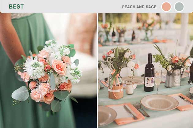
Peach and sage can be great for spring weddings, but you can use it whenever! These two colors go really well together and help accentuate any real plant life you’re incorporating into your wedding. Not to mention, your budget will thank you for adding more greenery and fewer flowers in your table displays and bouquet.
(Image via Pinterest and Pinterest)
These two are perfect examples of ways to make your favorite colors work with the formality of the event instead of against it. If you absolutely have to have green, use a subtle sage, please.

Orange and blue have the same issue as some of the other colors on this list – they’re two strong colors that fight for attention. It’s always best to have neutral colors or one vibrant color paired with other neutral colors to keep things elegant. If you’re the quirky type, orange and blue may work out.
(Image via Pinterest and Pinterest)
If you do choose to stick with these colors or another pair of loud tones, your wedding will certainly be memorable for your guests. They'll remember being blind for the days after your wedding as well.
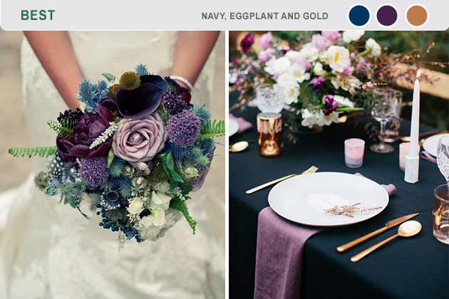
Eggplant is an off-color that not many people choose, but it’s underused. When combined with navy and gold, it gives your wedding an art-deco feel that’ll make Gatsby jealous. If you wanted to, you could also mix other metallics with these colors as long as you don’t go overboard. It’ll give your wedding a unique feel that's easy to remember.
(Image via Pinterest and Pinterest)
These cool, darker tones will will give your special day a comfortable feel that all your soon-to-be wed friends are sure to try and copy.
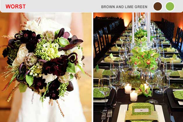
Lime green doesn’t photograph well no matter how hard you try. Throwing in brown will make people think “Coconut” by Harry Nilsson will play as the couple’s first song. It might have a fun vibe, but you’ll regret it when everything starts coming together.
(Image via Pinterest and Pinterest)
If you can't tell by now, staying away from overly bright tones should be a general rule. Lime green may be the worst of these, so if you're thinking about it then you should probably reconsider.
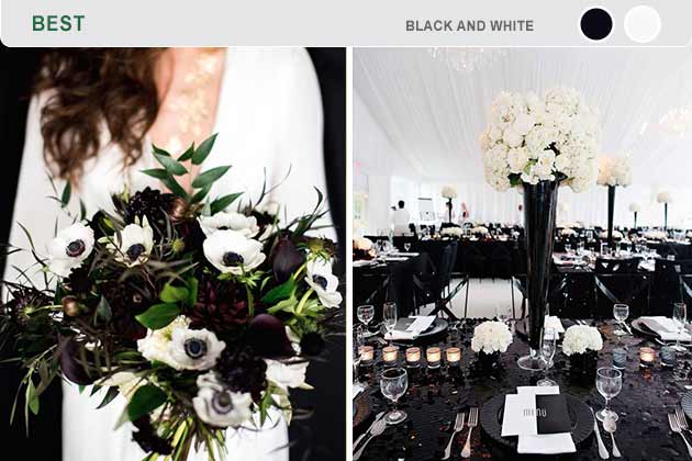
We love minimalism, and few things are more minimalistic than black and white. Some might think these two colors are bland, but we say they’re incredibly elegant. It’s a timeless combination, but it can be a little intimidating for some. Just use different fabrics and textures to create an unforgettable event.
(Image via Pinterest and Pinterest)
As we've said before, don't use too much black if you don't want to make everyone think you're reliving your emo days. But if you've got a good blend, then you're bound to impress.
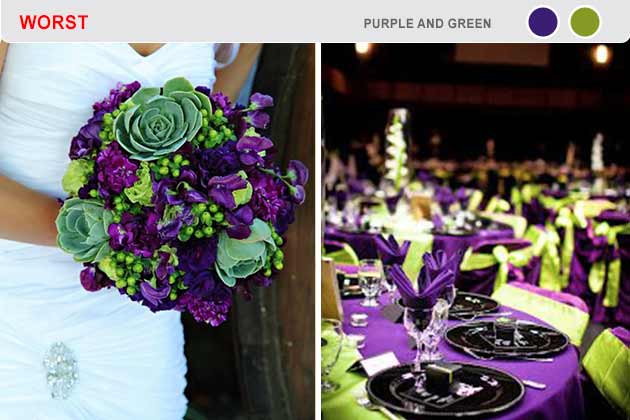
No one wants to use a color scheme that reminds everyone of Batman’s Joker. If you go with green, it’s best to add another color like beige to help break up the colors. Also, go with a pastel green like sage to decrease the loudness of the purple.
(Image via Pinterest and Pinterest)
Purple and green, especially when brighter or richer, give off the impression of a half-baked Mardi Gras, which is a great celebration, just probably not one you want to have with all your new in-laws.
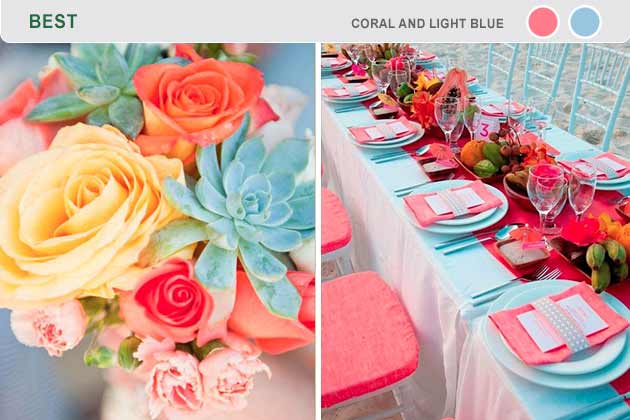
Coral is a shade of pink that’s boosted by baby or light blue. These two colors go amazingly if you’re having a wedding on the beach or anywhere near water. Imagine these two colors with conch shells – beautiful, right? It keeps your wedding upbeat, which is what everyone wants.
(Image via Pinterest and Pinterest)
Make sure you don't go overboard with the nautical theme, which can be easy to do on a beach. These colors alone evoke that light, ocean spray feeling. Let them work their magic.
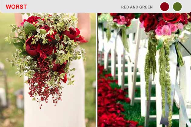
Green and red shouldn’t meet unless it’s December. While we love the two colors separately, together, it’ll just remind everyone about Christmas. However, if you wanted to have a December wedding, this color scheme works amazingly as long as you embrace the “Yule” feel.
(Image via Pinterest and Pinterest)
If you're adamant about red and green, then have a holly jolly wedding day. Just don't say we didn't warn you.
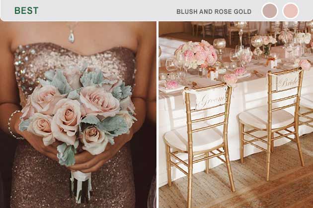
Rose gold was incredibly popular a couple of years ago, and nothing accents this color better than blush. They’re both delicately colored and gives your bridesmaid’s plenty of options. They can go bright and glitzy with rose gold sequins or choose a delicate blush shade.
(Image via Pinterest and Pinterest)
These colors are almost exclusively reserved for elegant affairs, and what should be more elegant than your wedding day?

Blue and yellow are two primary colors that are just too much for one place. Blue can look great if it’s desaturated a little, but most wedding photographers will tell you that yellow almost never photographs well. If you’re dead-set on yellow, it may be best to choose a pale yellow color that is with a darker color like mocha.
(Image via Pinterest and Pinterest)
Here's another general rule of thumb: try to avoid colors that come directly from the most simple color wheels. Instead, go for softer, blended tones. If it's in a child's paint set, it'll probably come off just as unrefined.
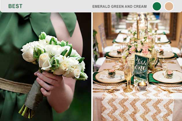
Emerald is a gorgeous color. We’re talking about the deep, earthy green color that looks refreshing on almost anyone. To pair with that, many people choose white. Instead, we think cream would be the best option. It brings the whole thing together and makes your wedding look incredibly classy.
(Image via Pinterest and Pinterest)
Be warned, because greens can go wild if you let them. However, when done right, they can be the best colors for you to choose. Just keep them subtle.

Anything neon is some of the worst things you can do. This includes hot pinks and bright blues. Not only do they wash out most skin tones, but they also don’t photograph well. Instead of neon, try a pastel version of the color and go with other neutral colors to highlight the shade.
(Image via Facebook and Pinterest)
Neon colors should only be used if you're planning to have an all-out 80's wedding, but if that is your plan, then you're too far gone for us to help.
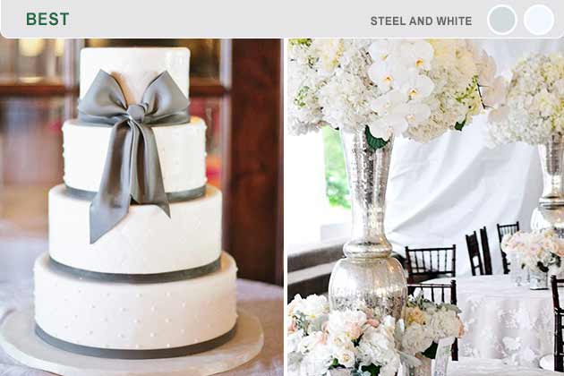
Steel and white are incredibly elegant, which means they’d also be perfect for a wedding. You can do so much with these shades. Steel is basically a slightly duller silver.
(Image via Pinterest and Pinterest)
Basically, this type of color combination allows you to use silver or any shade of grey. You could have your bridesmaids wear shades of gray that fade in or out for a gradient effect. Think about the pictures!
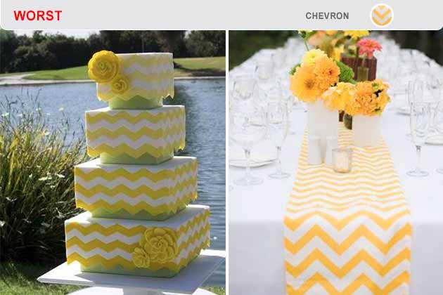
Sorry, we’re just not a fan of chevron. First of all, it’s done way too much. We’ve personally heard from wedding photographers that they’re sick of chevron. Second, it almost never looks good, because it always comes off as tacky. Avoid this pattern in any way, shape, or form.
(Image via Pinterest and Pinterest)
We're cheating a little since this is a pattern and not a color combination, but we thought it was worth mentioning for all of our wedding photographer fans.
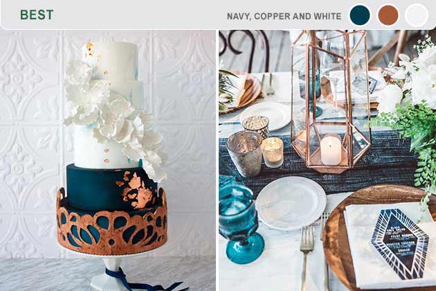
Copper is one of the most underused colors during any event. This metal shade is only made better by using navy and white strategically to bring it out even more. We suggest using these colors during the colder months since it works better as a theme. Although, if you want to use it during the summer, nothing is stopping you!
(Image via Pinterest and Pinterest)
No matter what time of year, this color scheme will give your special day a classy, rustic feel to match your love which will last through the ages.

Like many of the colors on this list, aqua and purple are just too much on the eyes. It’s absolutely necessary to have a third color if you have to have these colors. White is not an option because it’ll just make aqua and purple more vibrant.
(Image via Pinterest and Pinterest)
While we suggest staying away altogether, you could always use ivory or cream as the primary color and use splashes of aqua and purple.
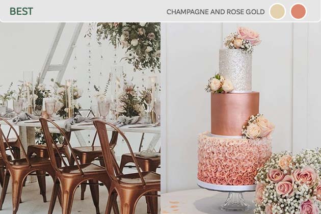
Rose gold is very trendy right now, and for a good reason. The toned-down pink tones have a feeling of classiness that hot pinks just don't. When combined with champagne colors, this combination is sweet and girly while still being sophisticated. These colors will accentuate your wedding without overshadowing it.
(Images via Instagram and Instagram)
So sweet, so classy. All the things you want your wedding to be. In the early stages of a trend, it can be hard to go wrong, so enjoy it while these colors are fresh.
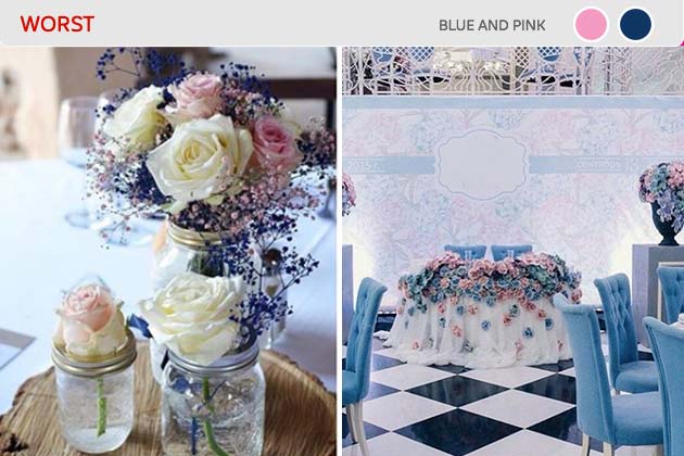
Having pops of blue and pink to decorate for the best day of your life can be tackier than you might imagine. The two colors, especially together, give off baby shower vibes. Or worse, your wedding will feel like an '80s throwback party. Consider using toned-down colors like pastel blue or a blush pink instead of the bright shades.
(Images via Instagram and Instagram)
This is more of a warning than an all out rule. Just be mindful of how you're using your blues and pinks so you can curate the right feeling for your day. These colors make it a lit easier to go astray.
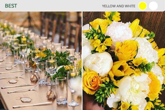
White is the classic color for weddings so it's usually a safe bet. Yellow is bright and happy, which matches how you're feeling on the day you marry the love of your life. Together, the colors look refined without looking boring. The combination also will compliment you without outshining you on your special day.
(Image via Instagram)
The white will be the perfect compliment to offset the yellow to avoid an abrasive decor, but don't go crazy. Overly bright mustard shades still won't suit anyone well.
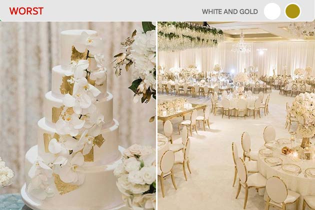
White and gold look alright together, but the combination has been painfully overdone in weddings and now feels cliche. Your wedding can also look very washed out when everything is covered in white with gold accents. Avoid this boring, uncreative color scheme and shake it up with some pops of color.
(Images via Instagram and Instagram)
If you love how white and gold look together, consider adding in some rose gold to modernize the look. That way, you can stick with colors you like without losing the appeal for your guests.
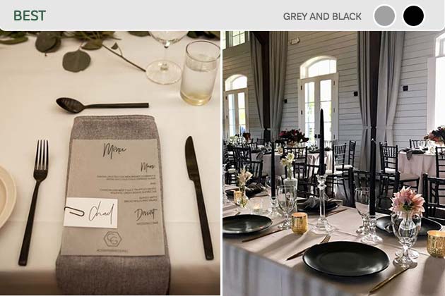
Who said weddings have to use white in the color scheme? If you're looking for a less traditional look then black is a bold and posh way to go. Using grey as the main color with black accents will give your wedding a high-class look that makes your white dress pop against the background.
(Images via Instagram and Instagram)
This is great for pictures, especially if the lighting in your venue isn't the best. Take advantage of the every opportunity to look your best. These pictures will be with you forever.
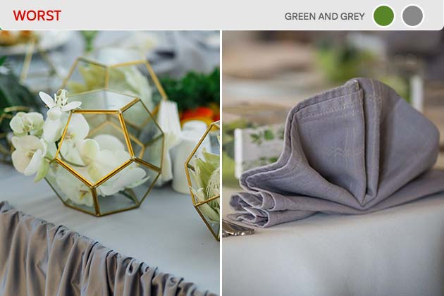
Grey is a great color to use because it compliments many other hues well. However, combining grey with green can make your wedding look drab. If done right these colors can work well together, but all too often it ends up looking washed out. Consider pairing grey with purple for a more modern, classy look.
(Image via Instagram)
If this is the kind of aesthetic you want for your wedding, try turning to some earth tones. They won't seem so bleak.
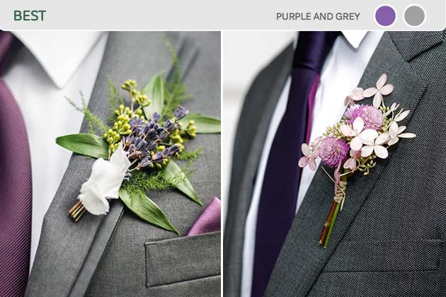
Purple is the color of royalty and grey is the perfect accent shade. When you use these two hues together, you get a subtle yet glamorous look that your wedding guests will remember. The two colors look so good together that you can use just about any purple tone with grey and it will still look beautiful.
(Image via Instagram)
Purple also looks great on just about anyone, so both the bridesmaids and the groomsmen will thank you for their wedding attire.
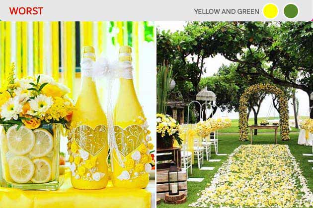
Springtime colors can give your wedding a whimsical and cheerful vibe, but it can easily turn into a childish and tacky mess. Yellow and green are both bright, beautiful colors that usually don't look good together. Since they're so close on the color wheel, you have to pick out the exact right shades for them to work with each other.
(Images via Instagram and Instagram)
We've already warned you to stay away from yellow; your picture won't be able to adequately show off your beauty from the event if you're having to compete with all the decorations.

Brown isn't usually a color you think of when you're decorating for a wedding. However, it can be a gorgeous accent color and give your wedding a rich, earthy vibe. Pairing brown and orange also adds some warm and bright tones, especially if you're having a fall wedding. Use a pastel orange to avoid looking like you're hosting a Halloween party.
Everyone can enjoy fall tones like these when pulled off well and in their season. Take the time to figure out what mood you want for your wedding, but this is a great choice if you're going for cozy and classy.
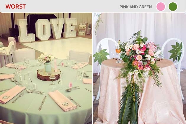
Pink and green are difficult colors to use when decorating. If you choose shades that are too bright then you look like you stepped straight out of the '80s. On the other hand, the pastel versions will remind your guests of Easter. Avoid using pink and green if you can help it, or at least, don't pair them together.
(Images via Instagram and Instagram)
With a color combination like this, you're too close to coming off as a poorly put-together prom, and it's simply not worth the risk.