Scary...but not as scary as the real thing.

Portraits are one of the hardest styles to do for tattoos, which is why you should find a good artist with a strong background in portraiture. You don't want a tattoo of your favorite celeb to turn out like this tattoo of Michael Jackson.
Also, that quote? "He touched so many." That didn't age well. Or maybe it did--depending on how sick your sense of humor is.
This is why adults shouldn't read children's books.

Harry Potter was one of the most iconic characters in recent years, with the influence of the wizard boy going far beyond the books and movies. Dedicated fans were known to get details from the story tattooed on themselves.
As you can see from this Deathly Hallows tribute, not all of the ink turned out that great. That tattoo is so ugly even Mrs. Weasley couldn't love it.
A face only a mother could love

Not all tattoos are bad because the linework is shaky. Sometimes, they're just a poor choice from the customer. The tattoos on this guy's face aren't amazing, but what makes them fail is their location.
Who needs a giant spiderweb and Adidas logo on their face in black ink? No one, obviously. But if I'm a tattoo artist and you're a paying customer, I say let's get to screwing up your face!
If you have to explain your tattoo with more tattoo, you've failed.

Yeah, the quality of this tattoo—and even the tiger tatt above it—is terrible, but what really makes this a fail is the actual tattoo.
Why would you ever want to tattoo extra nipples on your chest and proudly label it "dog t*ts?" We can't really blame the artist for this bad tattoo.
You're not as tough as you think you are.

It's not that unusual to see people with tattoos of knives or other weapons. It's normal to want to get ink done of your favorite object. What is strange is the very shaky lines that make up this tattoo, along with the weirdly thick shading on the handle of the knife.
Hopefully the person who got this tattoo already looks tough--because this isn't intimidating anyone.
This one...strangely works.

This tattoo made it on the list because of how hilarious it is. The actual tattoo is nicely done—the details and shading are all how it should be. What makes this a fail is that, while it's funny, this tattoo has to look really silly in person. Do you think he regrets it?
I, for one, would be showing it off at every opportunity. I don't care if it's the dead of winter, every day is a good day to go shirtless when you have a terrifying manbaby tattooed to your chest.
What's the point of a tattoo you can't even see?
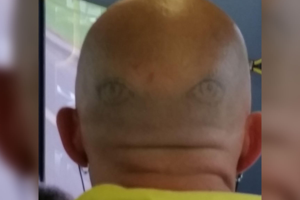
Our parents always said they have eyes in the back of their heads, but they probably didn't mean like this! Can you imagine standing behind this guy in line at the DMV for hours?
That alone makes this tattoo a fail without even considering the fact that the image is poorly done and fading. But let's definitely take a moment to consider those, too.
Any boy can get a tattoo, but it takes a real idiot...

It took way to long to figure out what the hidden message was in this crossword puzzle tattoo. It says "any boy can be a father. it takes a real man to be a dad." The lettering is nice and neat, so the tattoo artist did a good job, but the customer who requested this obviously didn't think anything through.
And clearly whoever willingly had a child with this guy didn't think things through, either...
I understand the how, but I don't understand the why.

Have you ever gotten tired of the "no shirt, no shoes, no service" rule? This guy clearly did, but he still isn't fooling anyone! Why you would ever want flip-flop straps tattooed on your feet is beyond us, but maybe this guy knows something we don't.
Also, here's a protip for anyone who wants to show off their foot tattoo, stupid or otherwise--clean your nasty-ass toes before you snap a photo. I'm not saying they have to be new pedicure levels of clean, but a mere wet wipe could have saved us all a lot of heartache in this scenario.
So bad it almost seems intentional
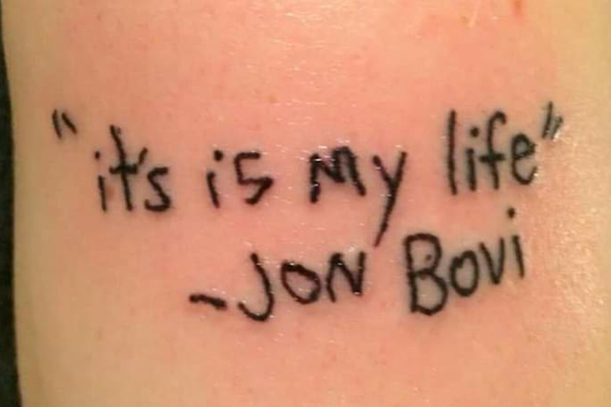
Oh boy, there's a lot wrong with this tattoo. The lyrics and song title is "It's my life," which has been mistranslated with "it's is." To make things worse, Bon Jovi's name is hilariously misspelled. We don't know if the tattoo artist or the customer is to blame for this failure, but someone really messed up!
To make things worse, Bon Jovi's name is hilariously misspelled. We don't know if the tattoo artist or the customer is to blame for this failure, but someone really messed up!
Apparently Grandpa was a Pontiac fan.
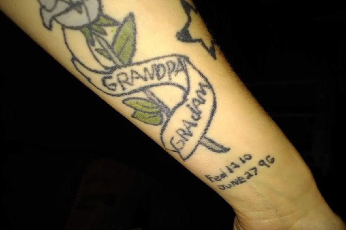
First of all, this tattoo looks like a third-grader did it behind a dumpster with a sharp crayon. Second, how do you misspell "grandma?" This whole image is just bad, right down to the terrible lettering and jumbled linework.
As cold as it sounds, I'm just glad that grandpa and "gradam" weren't around to see this travesty.
At least Mufasa didn't live to see this terrible tattoo.

This tattoo is really unfortunate. The Lion King is a beloved Disney movie that many people cherish. This back piece was surely meant to be a beautiful portrait of Simba and Mufasa, but instead, it turned into this nightmare.
This is just another great argument for why adults shouldn't get Disney tattoos. Although I suppose kids should probably avoid them too.
This tattoo is horrific, but not in the way they were hoping.

We don't know why you'd want a tattoo of Chucky the murderous toy popping out of your skin, but if that's what you want we're not here to judge.
What we are here to judge is that terrible linework and awful details. This rendition of Chucky is even uglier than the actual doll.
We've got low prices (and bad tattoos).

This is another great example of the actual subject matter of the tattoo being the fail. This is a pretty nice tattoo—the lines, lettering, and coloring are all solid—but why would you ever get a tattoo dedicated to working 10,000 hours at Walmart? That's just tacky.
Do you think one of the Waltons is gonna get your dumb face tattooed on them? I'm skeptical, but I was also skeptical that someone would actually get a Walmart tattoo--and yet here we are.
I'm sure this will age well.
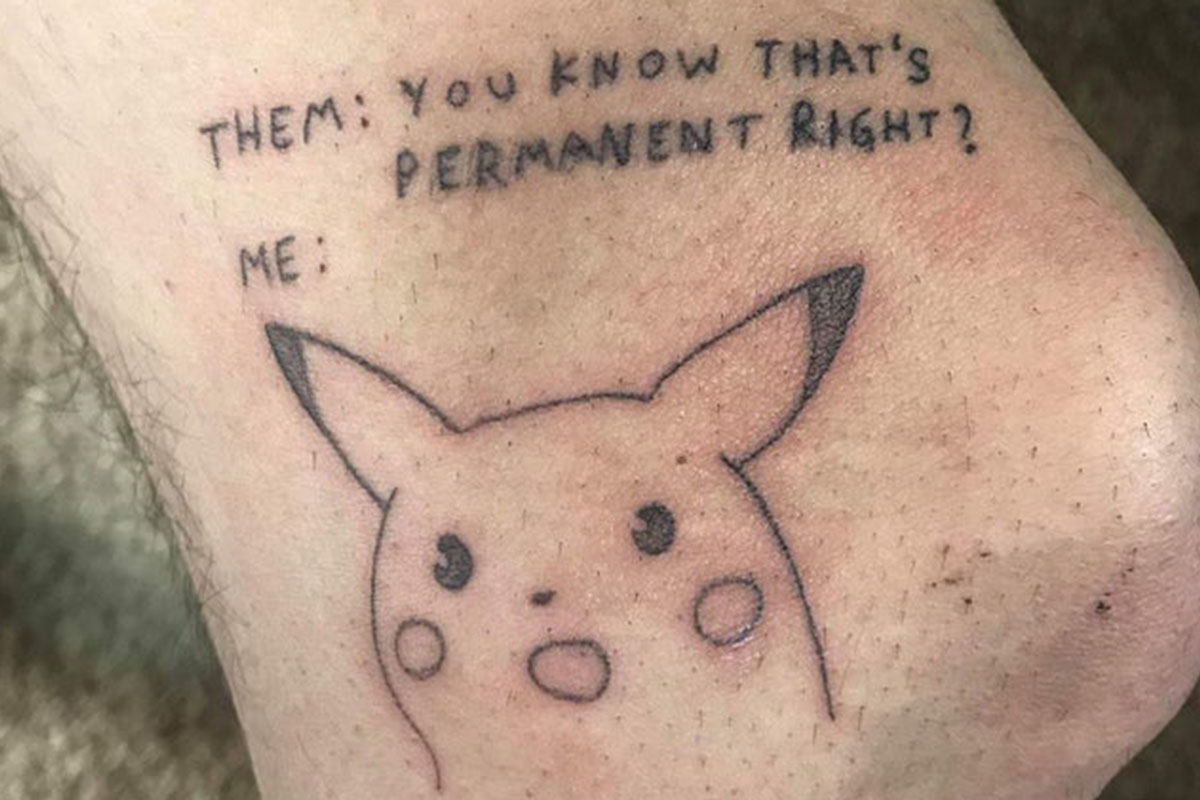
There will always be people who get tattoos because they think it's funny. This tattoo is a meme that someone decided to get on their body for the irony.
How funny will this tattoo be in 30 years when no one remembers the meme? Heck, it's only be a year or two and I barely remember what this meme was about.
Maybe ask to see a portfolio before you choose a tattoo artist.
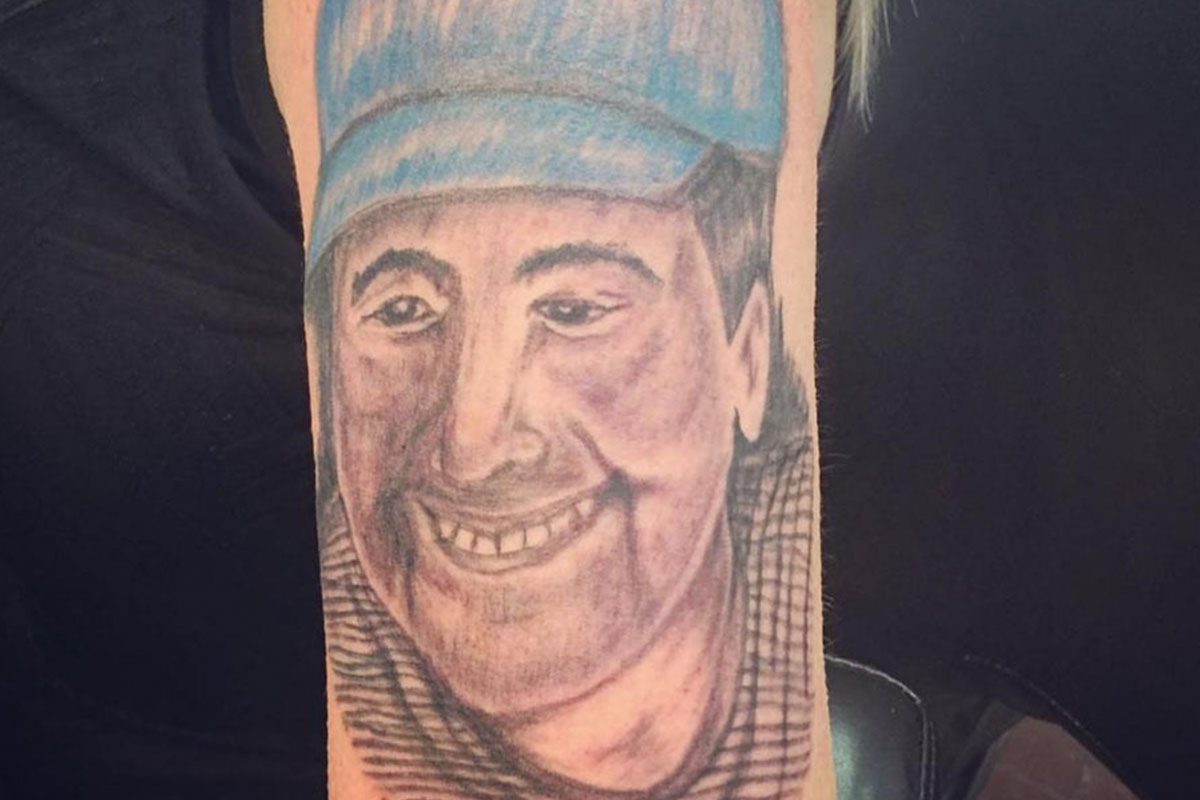
Here is another example of a bad portrait. At least with this tattoo, the artist attempted to shade the face. Unfortunately, there's nothing else positive that can be said about it. Everything is muddy, shaky, and incorrect—right down to the wonky eyes and creepy smile.
Everything is muddy, shaky, and incorrect—right down to the wonky eyes and creepy smile. Which, honestly, give the whole thing a very absurd, ventriloquist dummy vibe.
He's clever enough to think of this tattoo but not clever enough to avoid it.
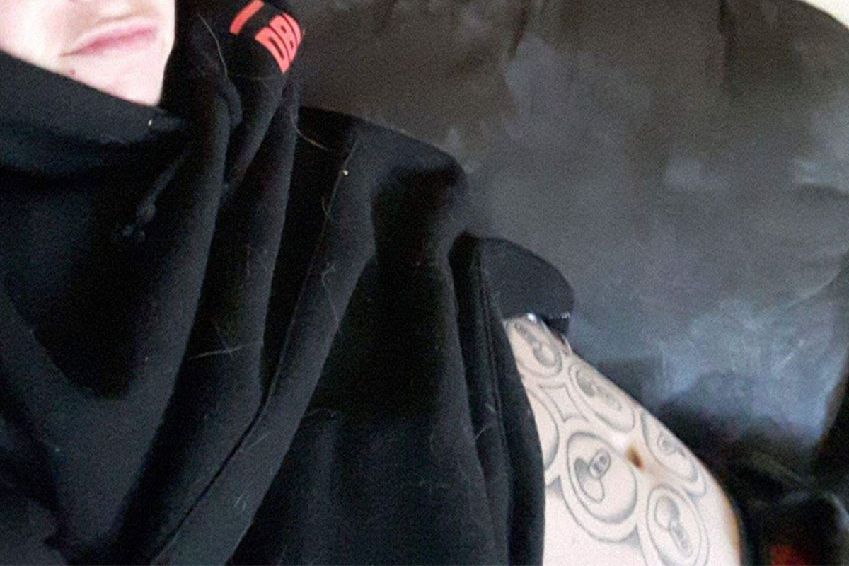
This tattoo is actually pretty funny, but not in a "we're laughing with you" kind of way. This fail of a tattoo is poorly done on top of being a bad idea.
It's almost so bad that it loops back around to being good again. Almost.
An underwhelming tattoo for an overrated show—it's perfect.

Unless you've been living under a rock, you know that Game of Thrones has finally ended after many years on HBO. The series had many dedicated fans, many of which got tattoos to commemorate their favorite show. Unfortunately for this fan, it looks like the artist was a newbie because they really messed up this tattoo.
Here's hoping they keep it hidden under plenty of layers of clothing--and not just because it's a terrible tattoo.
A tattoo so smart that it's incredibly dumb
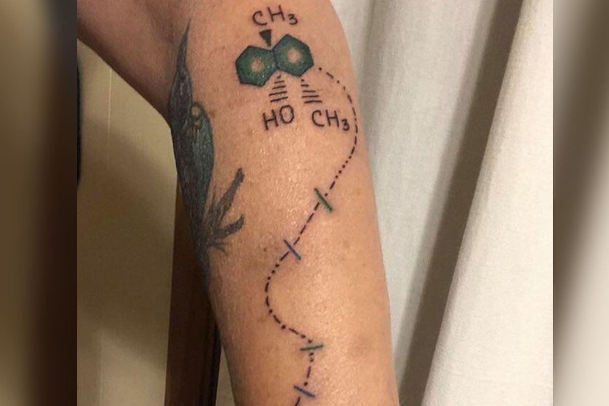
The idea for this? Kinda cool. It's the chemical smell for rain and Morse code for "remember to dance in the rain" but have fun explaining that to everyone.
Unfortunately, no one will be having any fun but you when you explain this overwrought and pretentious tattoo.
This tattoo makes me hope the zombies win.
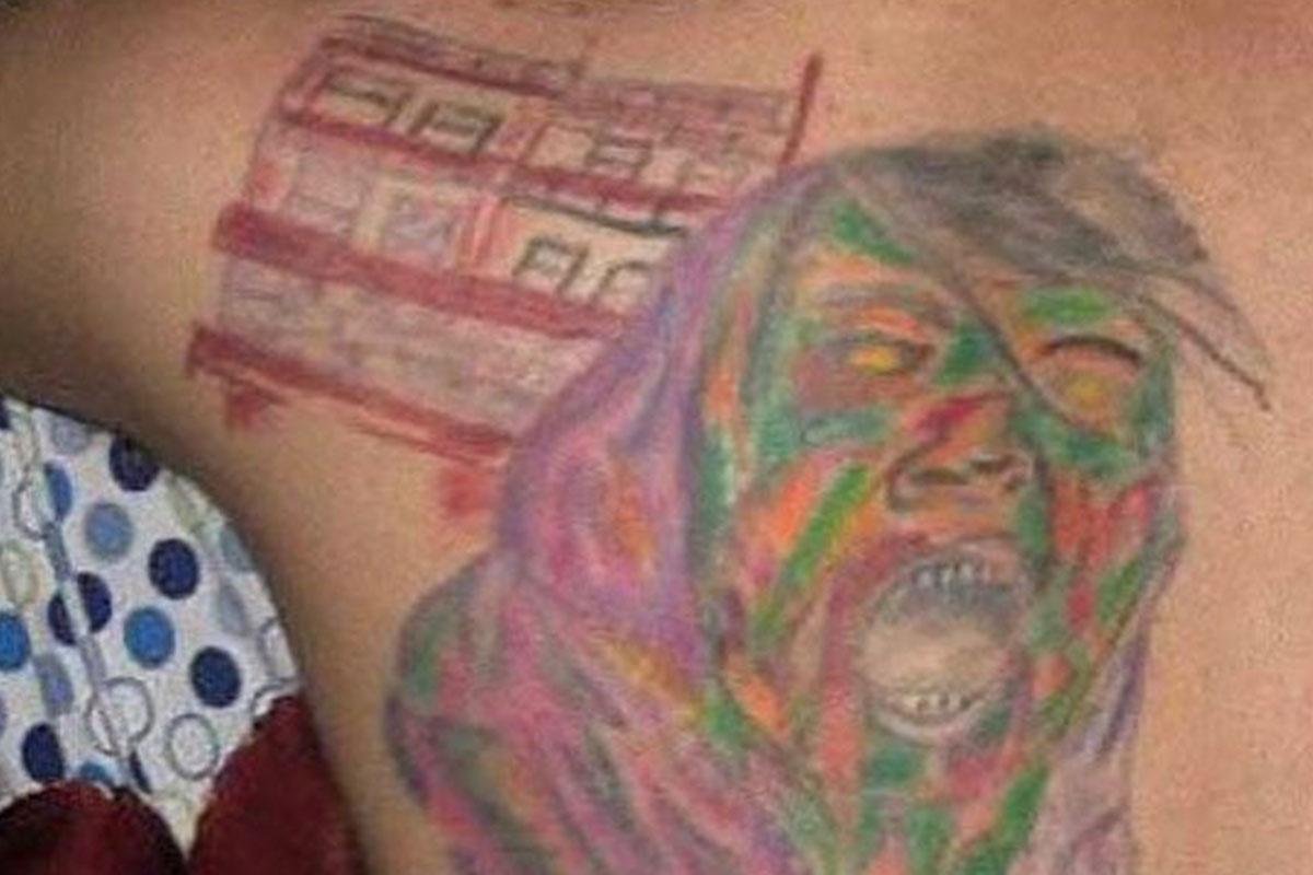
We don't really know what this image was supposed to be, so your guess is as good as ours. It kind of looks like a zombie, but then what's in the background?
And why is the zombie a rainbow of colors? This is just an all-around failure of a tattoo.
Have those deer been hanging around Chernobyl?
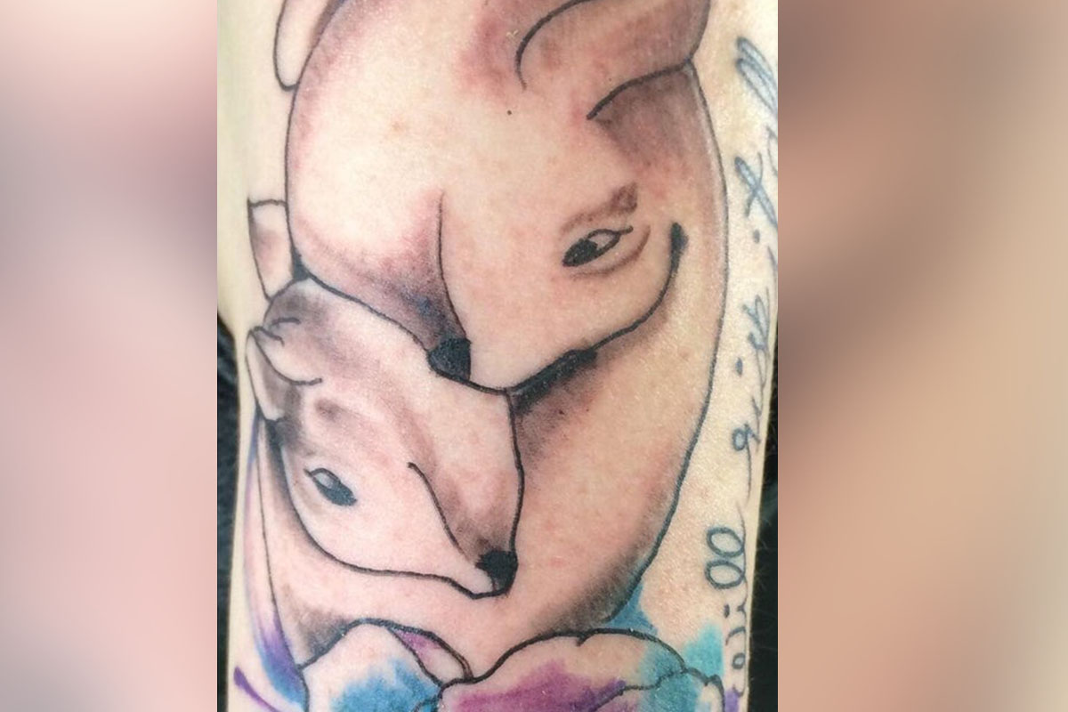
This was probably supposed to be a cute tattoo of a momma deer cuddling with her baby, but it turned out looking more like Chernobyl deer after years of radiation. Just look at the forehead on that deer!
Other than just being a bad drawing, the coloring, shading, and linework all need some serious help. This is one tattoo that needs to be put out of its misery.
It's so ugly that it's almost cute!

It doesn't get much funnier than this. Is this supposed to be a demon or some sort of hellcat? We're not sure, but the finished result is hilarious. There is absolutely nothing good about this tattoo, but it sure is fun to laugh at!
Whatever it is, it's not nearly as intimidating as it wants to be. Hopefully someone gets it to the groomer ASAP.
Even if this wasn't misspelled, it would still be a terrible tattoo.
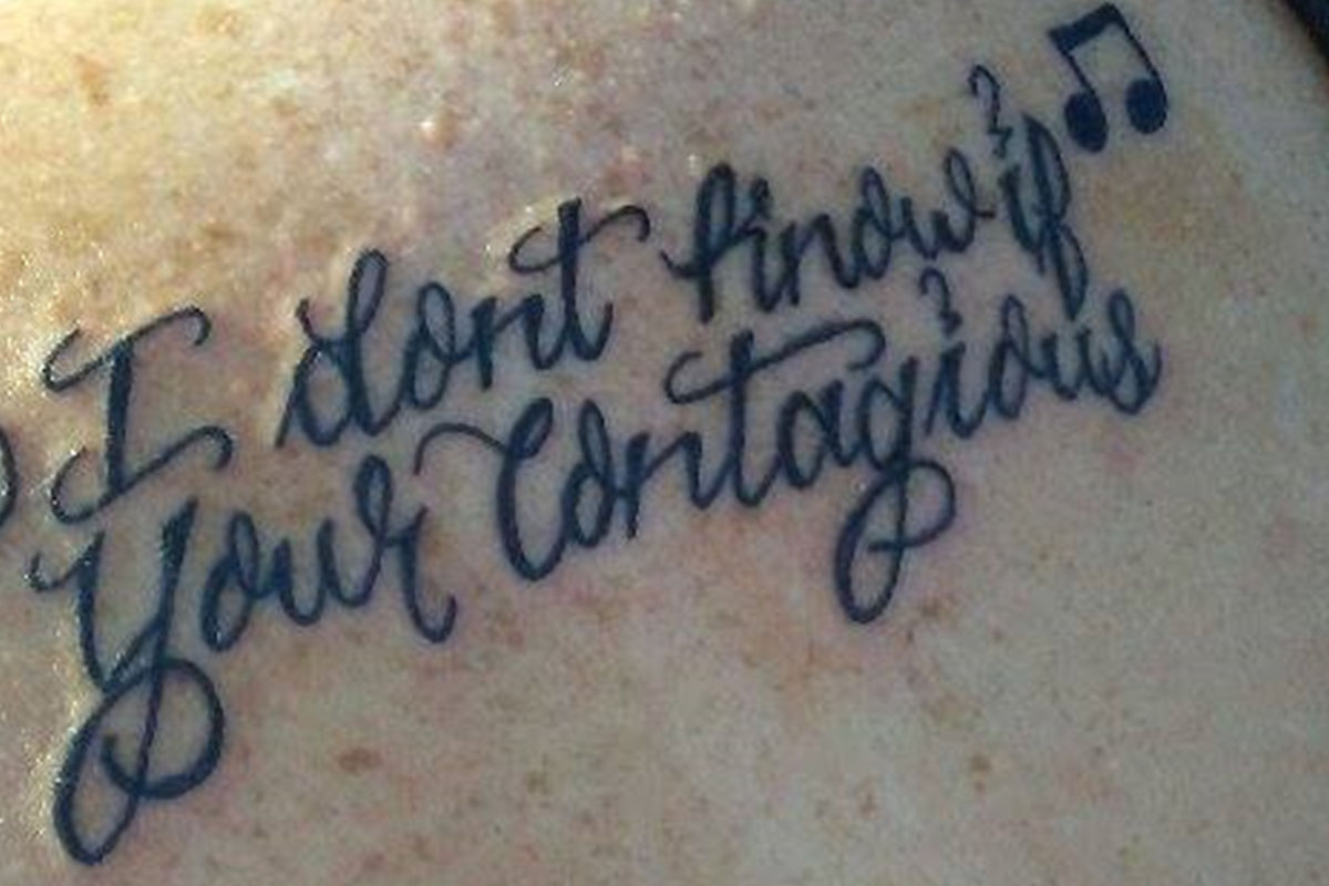
Sometimes the customer is not always right, like the person that insisted on getting this spelling error. The lettering on this tattoo is crisp and well-done, but the quote is messed up. The wrong "your" is used and the lyric is misquoted. It's supposed to say "I don't care if you're contagious," but that clearly didn't work out.
Also, just FYI, unlike the recipient of this unfortunate tattoo, I definitely care if you're contagious. So stay away.
Jesus would never say it to your face, but he hates your tattoo.

Not even Jesus is safe from the wrath of bad tattoos. This must of been the day at school when all the kindergartners tried their hand at Byzantine iconography.
Luckily, Jesus is in the business of forgiveness because both the tattoo artist and recipient are going to need a lot of it.
As if octopuses weren't creepy enough...
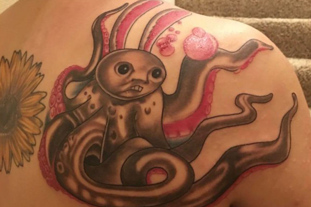
While this tattoo is actually really well done, the picture the customer chose is really creepy! It kind of looks like a mix between a bubblegum-octopus and a traumatized Thomas the Tank Engine.
Maybe you would want this on your body forever, but most people would call this tattoo a fail.
In Uncle Sam's defense, he's been dead for a while.

There's so much going wrong in this tattoo that it's hard to list it all. The linework is shaky, the image is muddy, and the shading is laughable. On top of that, Skeleton Uncle Sam was meant to be a cover-up tattoo for that leopard print in the background.
Honestly, the leopard print seems less terrible than what went on top of it. Oh well, you can always cover this one up with something else, too!
It's the thought that counts.

Hopefully, this wasn't supposed to be a memorial tattoo for a baby that passed away because the tattoo artist did the customer a serious disservice. The image has badly-drawn angel wings, baby feet that look like raisins, and a halo that looks like a turd.
What would you do if you were the customer? Besides ask for a refund, obviously--that's a given.
He may have jumped the gun...
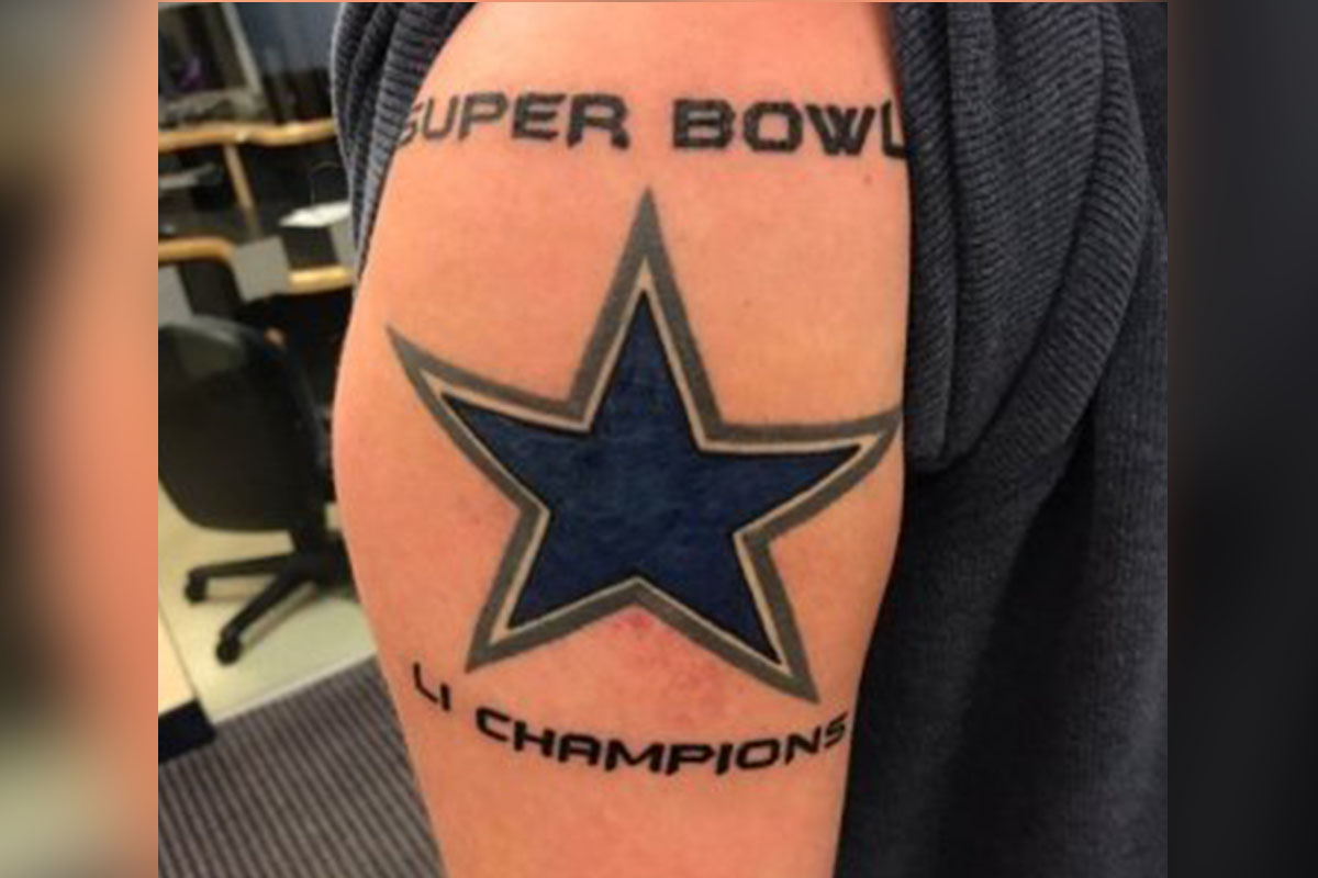
It doesn't get much worse than this. This hopeful fan jumped the gun and got a tattoo dedicated to his team, which he thought was going to win the 2016 Super Bowl. Unfortunately, the Cowboys didn't even make it to the Super Bowl, much less win. Just like his team, this guy's tattoo is a fail.
At least in 20 years no one will know or care who won the Super Bowl 2017. If you think about it from that angle, this tattoo will depreciate in stupidity over time.
A tattoo that perfectly describes itself.
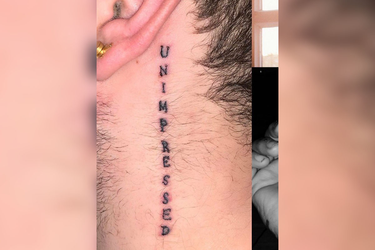
We're just as unimpressed as this guy's tattoo claims to be. It's possible that the style of tattoo is exactly what the customer wanted—stick-and-poke styles can be quite popular. From our perspective, however, this tattoo just looks uneven, unusual, and unfortunate.
At least this one is on his neck so it's easier to hide. Although if you're going to go through all the trouble of getting such an "impressive" tattoo, wouldn't you want to show it off to the world?
As cliche as cliche can get.

This girl went to the tattoo shop with every cliche Pinterest tattoo she could find, and the tattoo artist said, "I got you." This monstrosity cannot be forgiven, even if the lines are great.
Thankfully, this one is so awful that you just kinda black out at first sight. At least this way the experience is over quickly.
The only thing to do at this point is to amputate.
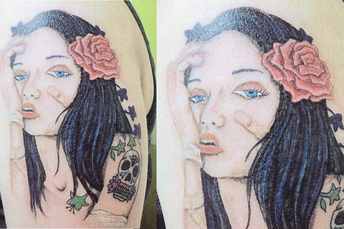
What's on her right cheek? It may be a bandaid, but it looks like a guy's...tiny nether regions. At least it can be reworked into a sugar skull, hopefully.
And if a sugar skull can't fix this, an amputation might be in order.
What a wonderful blue Dorito.

The guy called it a "cryangle," but we're going to call it a horrible mistake. We wouldn't want to "choose life" after getting this terrible tattoo.
At least if he ever gets a job as a circus clown, that side of his face will already be taken care of. What a time saver!
Talk about ripped off...

This is supposed to be the constellation Aries. Don't worry -- we can't see it either. The poor person paid $100 for this squiggly line. At least it can be hidden?
This one is particularly unfortunate because if you were just to quickly glance at it, you'd just think this poor girl has a bum vein in her foot or something. And honestly that might be preferable to this terrible tattoo.
Benjamin Franklin didn't ask for this.

This tattoo reminds us of that lady who ruined the Jesus painting and then tried to fix it herself. Obviously, the tattoo "artist" never saw Benjamin Franklin before.
Or who knows? Maybe Ben Franklin had a secret career as a drag queen that only this guy and his tattoo artist know about.
Horror movie victim or horror movie creature?

Honestly, it could be either. The person who received this tattoo probably had the same look on their face after they saw this "piece of art."
Let's just hope that this is a memorial tattoo so whoever is depicted will never have to come face to face with this psychotic representation of themselves.
This woman is a class act.
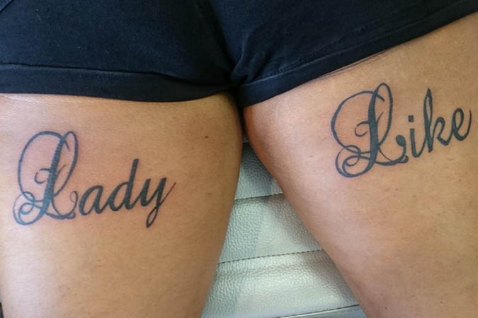
This one is a double-hitter. Not only does it show poor decision making, but it also looks wonky. Look at the "L" in "like." The two words are literally side-by-side, and the tattooist still messed it up.
Maybe next time this tattoo "artist" might want to practice with a calligraphy pen before moving onto something more permanent. That being said, even if this tattoo was technically perfect it would still be a hot mess.
No hair, no problem!
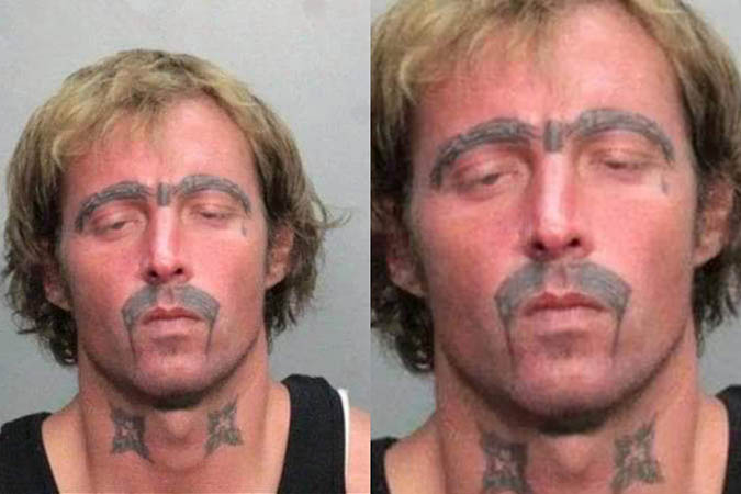
New hair loss treatment! If you can't get the tresses you want, just get a tattoo there. Easy, simple, and it looks utterly fantastic. Monobrows cost extra.
Credit where credit is due—from a distance, those eyebrows look symmetrical enough. Now, that fu manchu on the other hand...
The original wasn't much worse than the cover up.
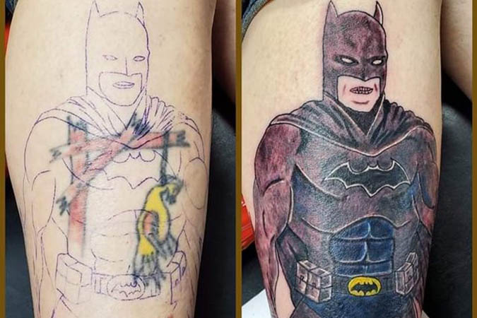
No, no. See, the cover up is supposed to be better than the original. It isn't supposed to be just as embarrassing.
Now, this poor guy has to cover up a black splotch. Good luck.
Sports or love?
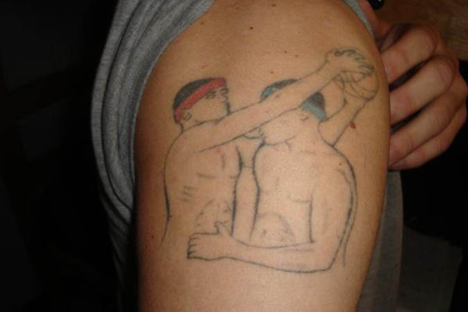
Are they playing sports or are they embracing each other? Honestly, it could be either. We just have one question: Why?
Regardless of the why, I think we can all agree that the "how" of this tattoo is just terrible.
These "dicisions" will haunt them forever.
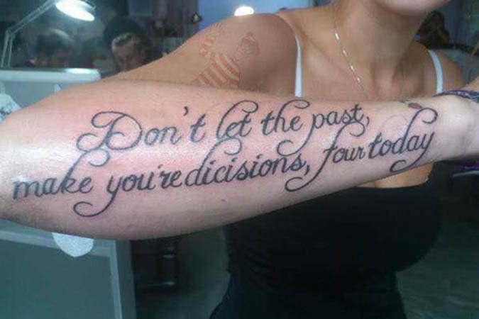
Let's break this one down. "Don't let the past, make you are dicisions, four today." Random commas, spelling errors, and grammar mistakes all around! This is my English teacher's worst nightmare.
This one is almost bad enough that I think it's on purpose. Almost.
This is a good idea, but terrible execution.
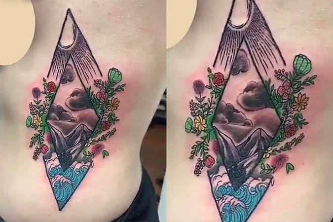
The triangles don't even line up! They had one job, and they flubbed that. The sad part is that the idea is actually pretty good.
This may as well just be an expensive, colorful bruise on the side of her torso.
Is he really that precious?

We're sure his mama thinks he's precious, but the police department didn't think so after this mug shot. This is a prime reason why you don't get neck tattoos. They rarely look good.
Honestly, the more I look at this, the more I'm worried that Precious is a woman's name. Which would just make this bad tattoo even worse.
The more you look, the worse it gets...
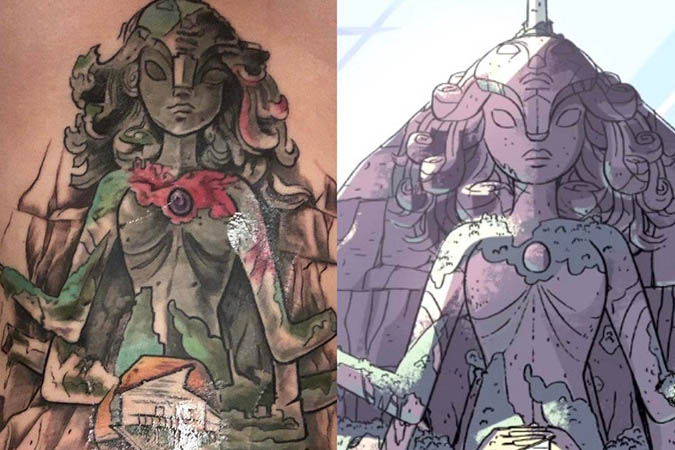
The idea is amazing, but the tattoo is just awful. The wonky eye, the terrible shading, and that red that mysteriously appeared out of no where. As we can see, the original has no red.
It would be one thing if this was just a drawing—it would almost be a solid effort. But the standards change when you're putting something permanent on skin.
These demonic little children haunt our dreams.

Filling in the eyes is a great way to make your kiddos look demonic. I can almost hear them chanting...
"Why did you turn us into a crappy tattoooooooo...."
This is nothing more than a Tinker-fail.
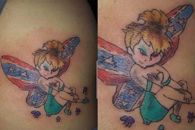
We don't even know where to start—the wings, the linework, or the color. This is about as redneck as you can get, and the makeup really sells the whole thing.
I'm not on board with this tattoo, but you know whoever this is drawn on is a good time a parties.
Simple, yet there was no plan.

Apparently "SP" stands for the band Simple Plan, but it's obvious that there was zero planning involved in this tattoo. We stopped drawing those birds in kindergarten.
Also, even with a plan this tattoo would be insane. Simple Plan has not been of note for like, what, 10 years now?
Are Charlotte and Emily okay?
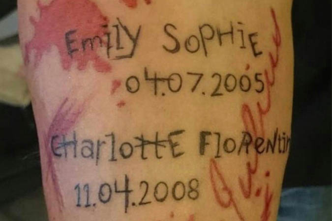
The scratchy text and the red make it look like they were murdered—were they murdered? Quick! Someone check up on Charlotte and Emily!
This makes me think this is one of those parent tattoos drawn by the children. And in that case, it just got about 1000 times worse.
Post Malone deserves better.
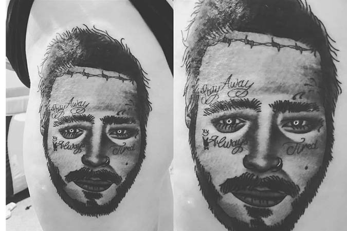
Those are the biggest bags we've ever seen. They're either eye bags or the tattooist drew his eyes on upside down.
We do have one question, though: Will this person get more additions as Post Malone gets more tattoos?
The Prince of Darkness would like to have a word with you...
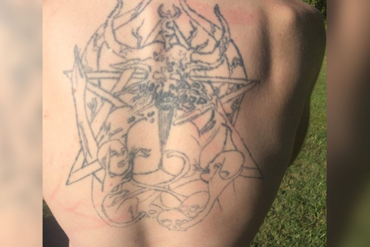
This tattoo is straight-up bad. The linework is fading and shaky, indicating that the artist didn't use even pressure for the whole tattoo.
On top of the terrible quality, the image is just plain weird. Your eyes aren't deceiving you—that really is a picture of babies breastfeeding from Satan. It's so nice to see a mother bond with her young.
This sad tiger is asking for death.
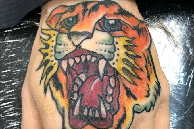
This tiger is crying out for help. You can see the sadness and depression in his eyes. "It's the cry of the tiger. It's the thrill of the sob!"
Here's hoping this one hurt a lot!
 Author
Alot Living Team
Last Updated: March 27, 2025