Subaru

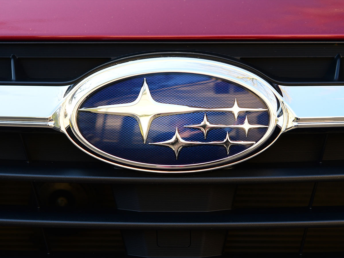
The Subaru logo, adorned with an array of six stars, is meant to resemble the Pleiades star cluster with the Taurus constellation. But the stars also have a story behind them within the company’s history.
Each of the five stars next to the larger one represents the five companies that merged together to form Subaru’s parent company, Fuji Heavy Industries, in 1953. The larger star represents that unity, and even the word “Subaru” means “unite” in Japanese.
Audi

Founded in the late 19th century, Austrian engineer August Horch started a car company (Horch & Cie. Motorwagenwerke AG), which he was eventually forced out of by his own board of directors. As a result, he started a competing car company called Audi. "Audi,” which is Latin for “listen,” was derived from the founder’s name, as Horch means “listen” in German).
Although his company was a success for a time, his luck ran out when the Great Depression hit. Audi, along with Horch & Cie. Motorwagenwerke AG and two other independent companies, in an attempt to survive during this period, merged to form Auto Union. The four intersecting rings of the company logo symbolizes that merger.
Toyota

There are a few different rumors about the meaning of the Toyota logo, but only one is true. The logo as we know it, which debuted in 1989, was made to commemorate the company’s 50th anniversary. While the logo may seem somewhat simple, there are actually a few different layers to its symbolic meaning.
The two overlapping ovals in the logo represent hearts and the symbiotic relationship between the customer and the company. They are situated to resemble not just a T-shape for the word “Toyota” but also a steering wheel on a steering column. The surrounding oval represents the larger world as a whole.
Mercedes-Benz

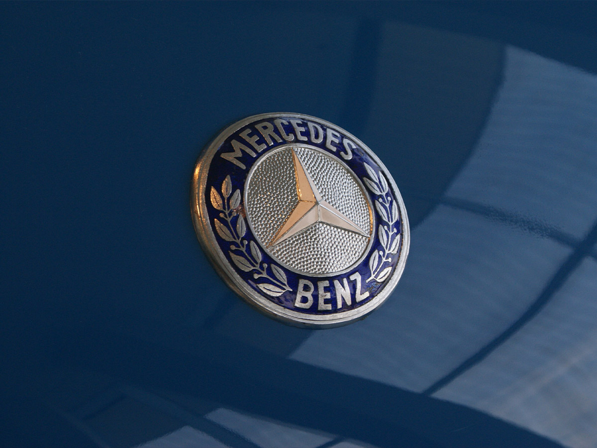
Mercedes-Benz has one of the most recognizable logos in the world of luxury cars. Its three-pointed star represents prestige to most people, and that’s pretty much what the creators were going for. The three points on the star symbolize the brand’s desire to dominate the land, sea, and air.
The logo dates back to 1909 when the son of founder Gottlieb Daimler recreated it from a “You Are Here” marker on a postcard he got from his father. The logo was then patented.
Mazda

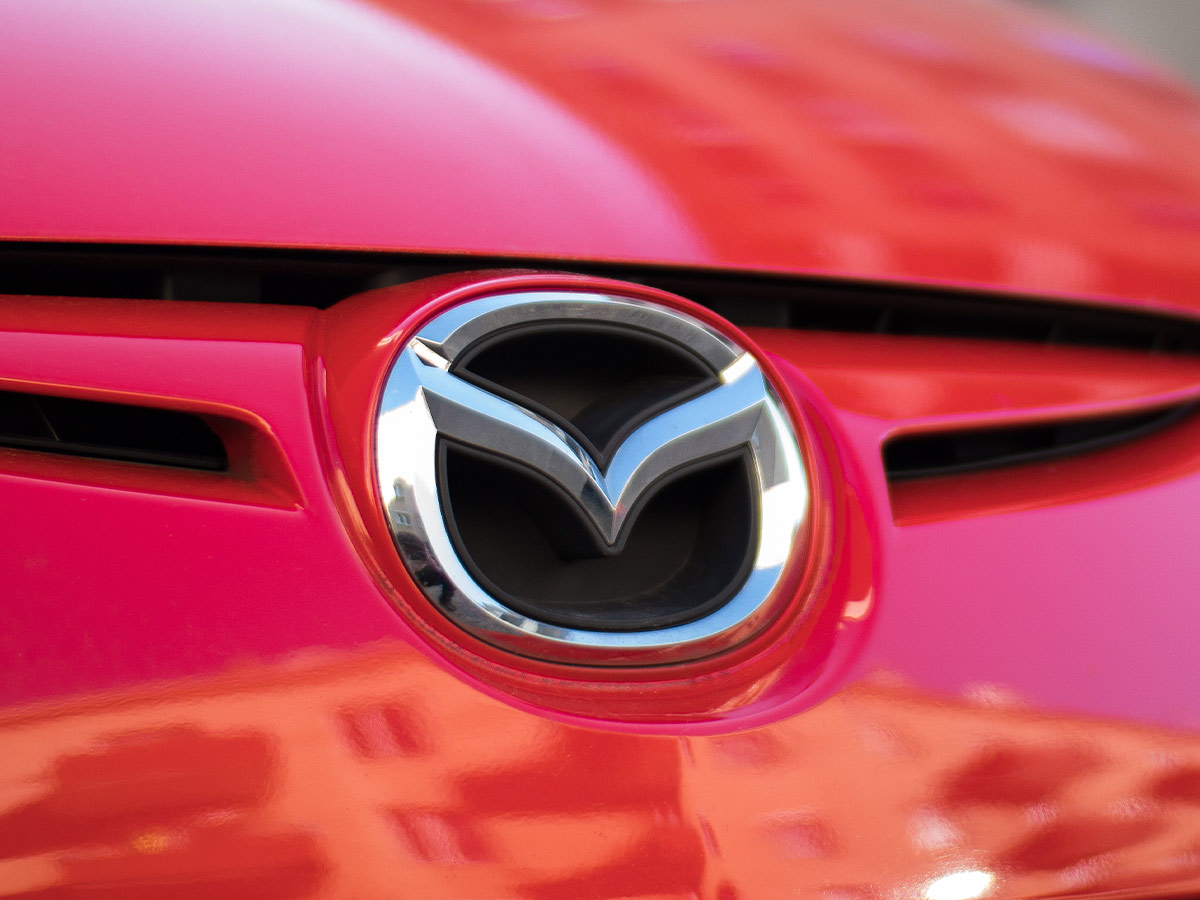
The Mazda logo, which features an arched wing inside of a rounded square, resembles the M in “Mazda,” but there’s more to it than that. The symbol of the wings is meant to evoke a sense of creativity, improvement and continuous growth, giving a sense that “the sky is the limit” more or less.
The precise and elegant nature of the brand’s metallic logo is meant to be an expression of their commitment to quality, technology and determination. And if you’ve always wondered why the D in Mazda is always capitalized, it’s simply so that all the letters can touch.
 Author
James Stephens
Last Updated: February 13, 2026