Antique Teapot Disaster | "Changing Rooms"

In what is probably the most iconic moment in Changing Rooms history, interior designer Linda Barker and DIY expert Handy Andy made a terrible mistake. The homeowners, Clodagh and her daughter Julia, were ready for their living room to get a professional makeover. They wanted something to show off their incredible teapot collection as well—it was very important to them.
The experts came up with the idea to hang an innovative, free-standing shelving unit for the collection to sit on. It included all the teapots plus a row of heavy books at the bottom. As you might guess, the shelves came crashing down, destroying the more than $6000 teapot collection. The hosts were mortified, but it was nothing compared to the residents. When apologizing for the accident, Clodagh breaks down on camera.
The Straw Room | "Trading Spaces"
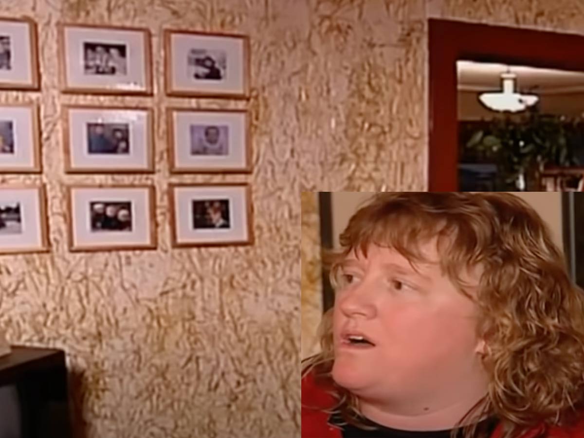
We're all for thinking outside the box and trying new design concepts, but how this ever made it past a brainstorming session, we'll never know. On Trading Spaces, two couples "trade spaces" to makeover each other's rooms. In this episode, a friendship between neighbors was nearly destroyed. It started when designer Hilda Santo-Tomas, aka Hildi, decided they should put glue on the wall and let the neighbors toss a kind of straw/hay on it.
Yes, this professional designer suggested gluing straw to the walls of a living room—and they followed through with it. It was as bad as you would imagine. When the big reveal came for the homeowner, she was extremely disappointed. "I was stunned - I said a bad word." The baby was gagging on the hay the next day. After the show left, it took five adults 17 hours to remove the glue. What a nightmare!
You Had One Job | "Trading Spaces"
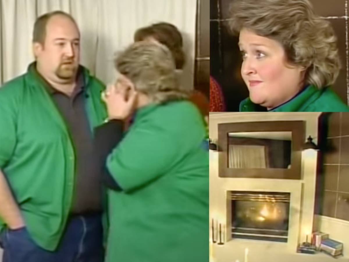
On yet another Trading Spaces flop, this homeowner was an incredibly sweet-natured woman who had one big request when it came to her home makeover — don't touch the fireplace. She loved the fireplace, wanted to keep it, and was fine with everything else being changed. The professionals thought they could win her over with their fireplace update. It did not go well.
In the infamous episode, you see the homeowner, Pam, surveying the room with a pasted-on smile. While the host jabbers on, every viewer knows what she's thinking and feeling — you literally did exactly what I told you not to do! After a few seconds of remaining strong, Pam finally states, "So, I'm going to have to leave the room." She forgets to turn off her mic. As the host continues speaking to the husband, poor Pam's sobs can be heard in the background.
“Home Work” Versus the Hawleys
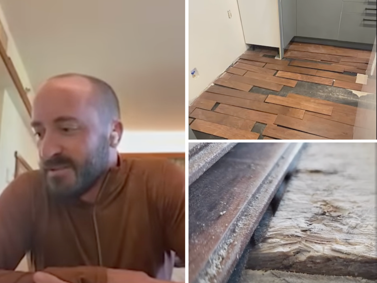
Home Work left a ton of people (and homes) in shambles after Candis and Andy Meredith began working on homes. One home was owned by the Hawleys. It’s easy to see why they were drawn in as Joanna Gaines allegedly stated that the Hawleys’ home appealed to her in particular. Unfortunately, things didn’t go as planned.
During an interview, the Hawleys stated that “one month turned into multiple,” and his remodel was quoted to be $45,0000. The Merediths blew through the budget and asked for another $30,000 just in demolition. He told them to stop, get out, and take whatever they installed. Afterward, the Hawleys got an attorney.
The Murder Room | "Trading Spaces"
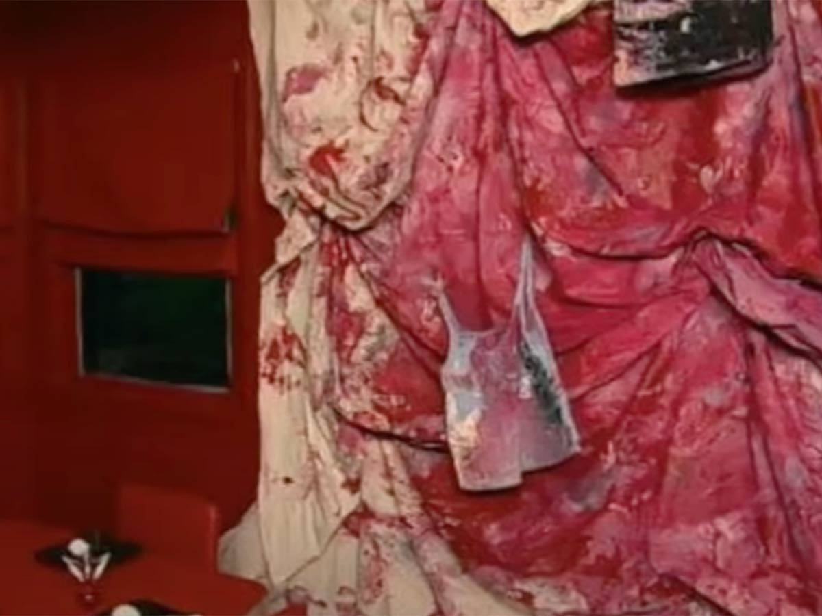
Making the list once again, Trading Spaces has had more than a few blunders when it comes to home makeovers. This time, it comes in the form of a horror show—meant for someone to actually live in it! Hildi was supposed to be helping makeover a kitchen. She must have been feeling extra over-the-top for this episode.
Painted a deep, blood-red, the kitchen included coffin-shaped shelving, red on top of red accents, and the best (worst?) part—a "blood-stained" tarp stapled to the wall as a focal piece. Just what everyone wants in their kitchen—a crime scene. Unless a homeowner specifically asks for a horror-themed room, why would anyone think it's a good idea to create a room like this? The homeowners were obviously not pleased.
The Beach Room | "Trading Spaces"
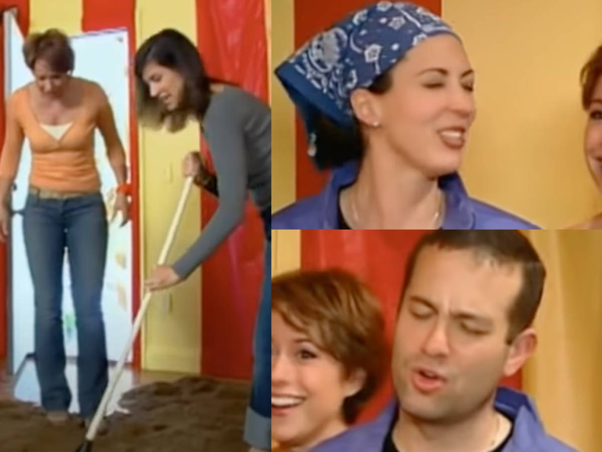
Hildi strikes again! This time, her vision includes a relaxing, beach-themed oasis. You might think this includes some white walls, flowy fabrics, and a few beachy furniture pieces. Surprisingly, that couldn't be farther from the truth. Instead of receiving a meditative area, these poor homeowners were left with a chaotic mess of a room.
With red and yellow striped walls, outdoor furniture, a tree, and an open-flame torch, Hildi tried to bring the actual beach inside. She even went as far as to haul in a ridiculous amount of sand to cover the entire floor. Most people do their best to keep dirt and sand outside the home—Hildi says to embrace it. The homeowners didn't know how to react, laughing hysterically and even falling to the ground. We're sure the room was redone after the show left.
Baby Poop Walls | "Trading Spaces"
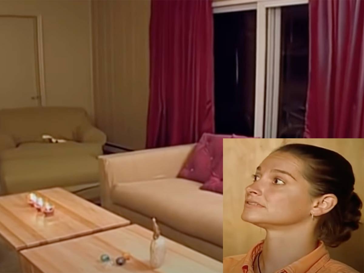
When you sign up for a home makeover, the least you expect is an upgrade from what you currently have. Apparently, that's too much to wish for. In this Trading Spaces disaster, this family went from a typical, boring living room to a downright ugly living space. We're not sure what the designers were even going for on this one.
The homeowners liked it at first glance but soon began tearing the room apart—which we don't blame them! With extremely young children, they pointed out that concrete floors probably weren't the best feature. "We'll have to put helmets on the kids with the floor." They also weren't impressed with the choice of wall color, stating that she'd changed some diapers that were that color. We prefer the "before" to the "after" on this reveal.
The Upside-Down Room | "Trading Spaces"
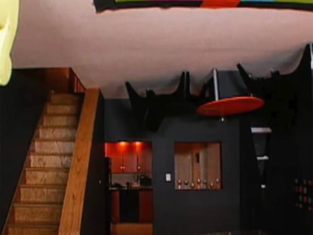
Upside-down rooms are fun to visit—at a carnival. However, no one needs or wants one in their own home. Trading Spaces strikes again with these poor homeowners. The couple wanted a living room makeover, but what they got was more of a headache and extra work after the show left.
With the furniture hanging from the ceiling, just how functional can this living room be? Not only is it not functional, but it also doesn't work aesthetically either. Imagine these homeowners inviting their friends over—to stand and look at the furniture they could be sitting on. This room was turned into nothing more than a gimmick.
Fake Plant Hallway | "Your Home in Their Hands"
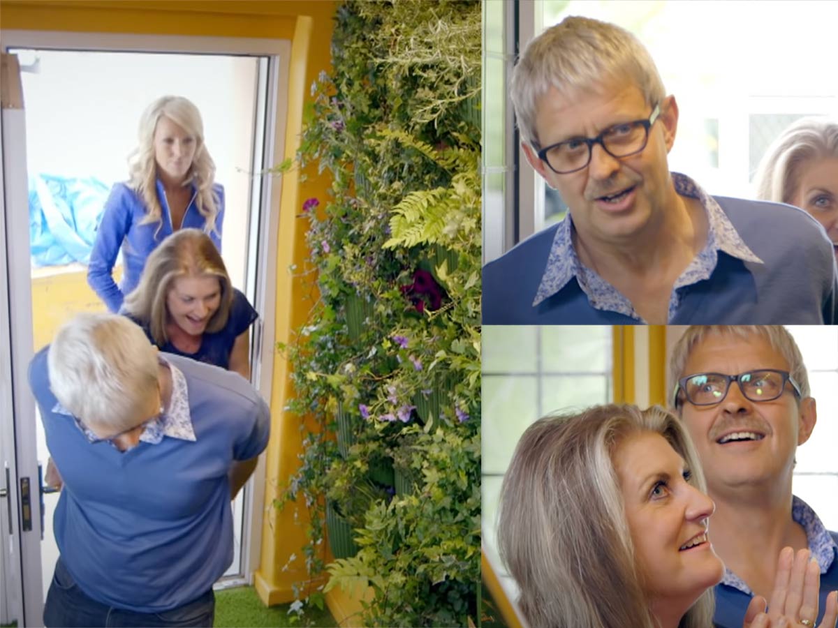
In this episode of Your Home in Their Hands, the homeowners were shocked as they opened the door to their house. While the concept wasn't bad and could have been executed tastefully, it certainly wasn't in this case. Nearly speechless, their first response was confused laughter and "Oh dear."
Looking more like a cheap greenhouse than a hallway entrance, the designers decided to cover the entire wall with fake plants. With more laughter and wide-eyed surveying, the wife states, "I wasn't expecting this at all. It's not the look I wanted. I don't really like the color" Of course, who would? While the fake plants were the first thing to grab your eye, the homeowners soon realized their staircase had been "carpeted" with turf-like material.
So Much Fabric | "Your Home in Their Hands"
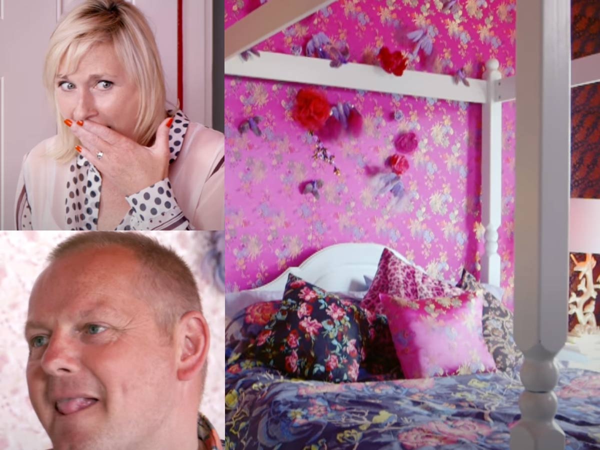
With the title of "professional designer", homeowners trust these home makeover experts to know a thing or two about color theory, patterns, and interior design. That doesn't look to be the case in this episode of Your Home in Their Hands. The couple enters the bedroom and is immediately hit with a whirlwind of fabric.
With lots of florals and clashing patterns, this room is simply chaotic. "What have we done?" cried the wife upon viewing the room. The husband shares her sentiment, stating bluntly, "I don't like it." Explaining that the room is "color overload", the homeowners tell the host that it's all just too much.
The Cartoon Room | "Your Home in Their Hands"

On this episode of Your Home in Their Hands, homeowners were transported to another dimension—specifically, a two-dimensional room. In what looks like a world designed for a toddler, this poor teenage girl looks around what was supposed to be her new teenage bedroom. What she sees is completely over the top.
For the first several seconds, she just stands in the room looking around with her hands covering her mouth—she's speechless! When she finally does find the words to say, the first thing out of her mouth is "No," followed by, "No, I hate it." She calls it "childish" and is understandably unhappy. The mom tries to help things by pointing out that none of her friends are going to have a room like this. I think we know why they don't.
Trading Spaces Caribbean Flair
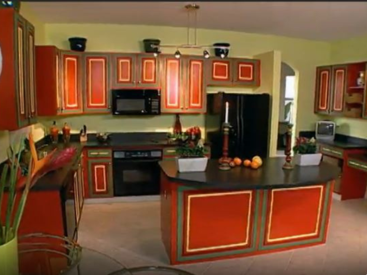
Kitchen remodels are a popular trade on Trading Spaces, but some people wish they chose literally any other room. In one episode, a couple requested that their white kitchen be jazzed up. Unfortunately, the stylist was Doug, and he went truly off-the-wall with the design choice. This renovation ended up being one of the worst on the show.
Instead of the timeless white kitchen, the couple received a kitchen with some “Caribbean flair,” as Doug put it. The cabinets were painted an orange-red with yellow lines. Not only did it make the kitchen look smaller, but it also made it look like a bunch of kids chose the paint color. Yikes. Needless to say, it went down in history books as one of the worst trades ever.
Trading Spaces “Strips and Poles”
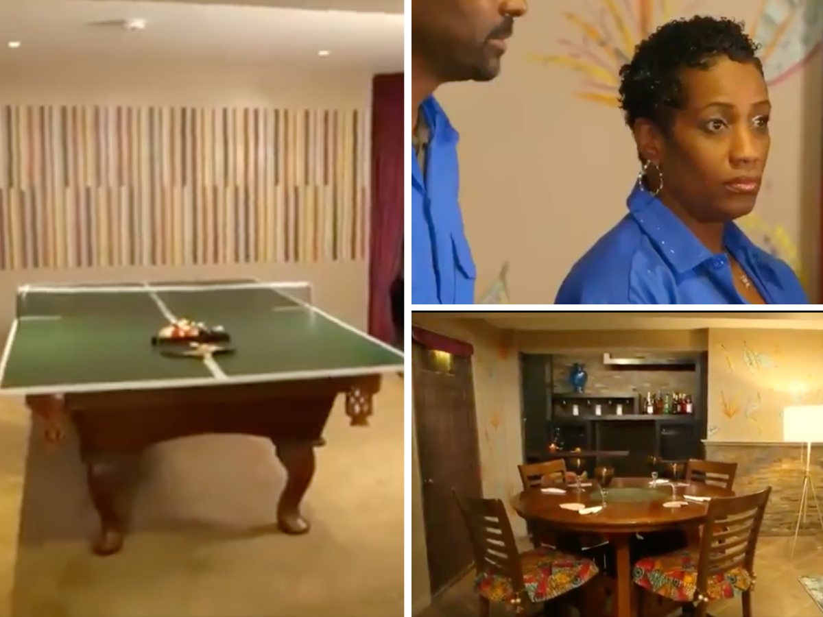
If there’s one thing we’ve learned, it’s that Trading Spaces is a huge gamble, especially when Hildi is involved. For this episode, basements were swapped, and while Hildi’s team came in under budget, the owners, Terri and Cornell Butler hated what they’d done. The basement was pretty awful. When it was revealed, Terri didn’t hold back.
The smile faded from her face, and she said, “what the. Hell to the no.” Terri’s request was that Hildi channel the musical artist Prince, but she ignored that, threw in some leaves, and did whatever she wanted. It took the couple some time to fix what Hildi had done, but they did keep some of the furniture. The funniest part was when Trading Spaces asked what their favorite part of the basement was, and Cornell responded, “oh, upstairs for me.”
Orange Retro Kitchen | "60 Minute Makeover"

A vintage-inspired kitchen sounds very reasonable. Many people love the idea and specifically design their kitchen to resemble a vintage diner. But when it comes to a show named 60 Minute Makeover, it makes sense that the execution can be hit or miss. The show is more interested in getting it done within the time limit than they are in the homeowners' requests.
When this homeowner walked up to her home and saw all her furniture out in the yard, her first words were, "I'm gonna kill you," mixed in with a half-hearted laugh. When she saw her kitchen, though, all she could muster was a lackluster "Wow." The walls were painted bright orange, a floral wallpaper covered the fireplace, and the 50s diner furniture all contributed to an over-crowded, chaotic space.
White Squirrel? | "Your Home in Their Hands"
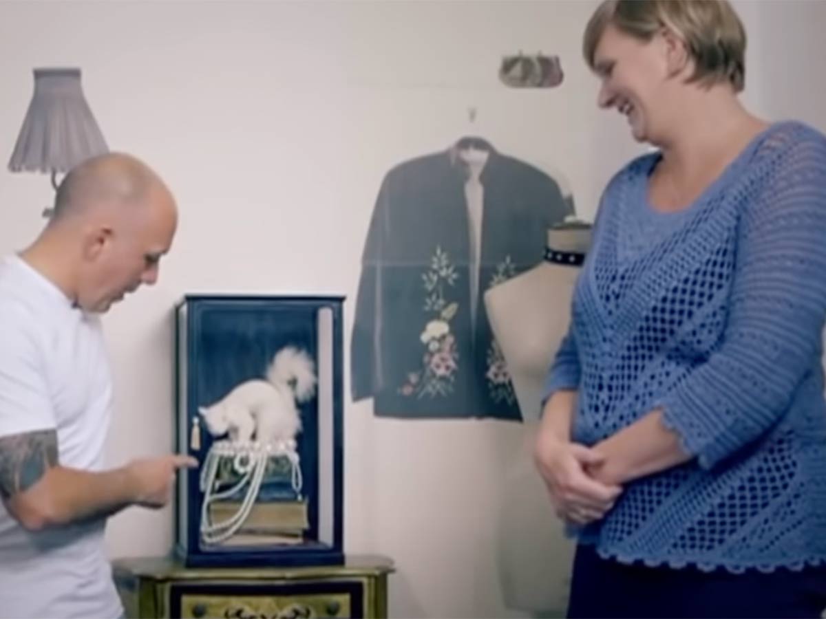
If this couple looks familiar, it's because another one of their rooms already made the list. These poor homeowners received not one bad room makeover but two! In this bedroom revamp, the wife actually kind of likes the room, saying it feels much larger than it did before. While she seems pleased, the husband disagrees.
He says the room actually seems smaller. He goes on to point out other aspects of the room, most notably the random white squirrel perched on top of pearls inside a glass case. "I really don't like the squirrel; I'm not a big fan of the pearls; I don't like the drawers..." We're with you on the squirrel decor—not something we'd like to see right before we go to bed each night.
Property Brothers “Mindy & Paul”

The Property Brothers seem almost untouchable, but this newlywed couple didn’t to let that stop them from criticizing the two. The show brought Mindy and Paul onto the show to renovate their kitchen with a budget of $110,000. All seemed fine and dandy until the work completed was “plagued with issues,” according to their attorney.
Yes, you read that right – attorney! Some of the issues the couple had with the show is that the work was just plain bad. The backsplash wasn't the one they chose, the baseboards weren't even, the electrical was questionable, doors were falling off of hinges, and that's just the tip of the iceberg. The icing on the cake is that the brothers went over budget.
The Asian-Inspired Room | "Trading Spaces"
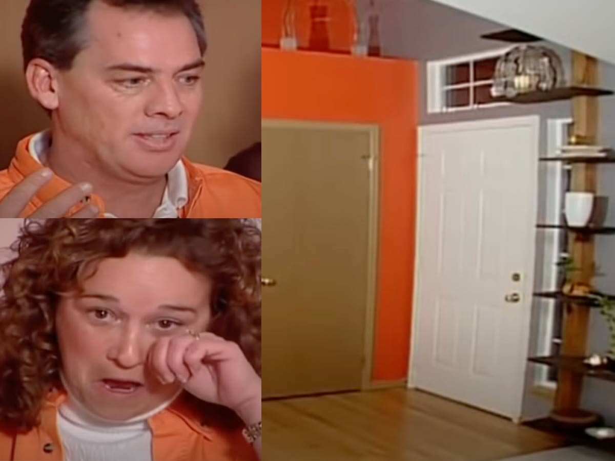
While inherently, there is nothing wrong with an Asian-inspired room, when the homeowners specifically ask for anything BUT an Asian-inspired room, you don't give them an Asian-inspired room! Hildi has already missed the mark several times on this list, and this episode was no different.
We don't know if she was going for the shock value or maybe she legitimately wanted to win them over, but this design risk did not pay off. The wife hated absolutely everything about the room—shocker—and even started to tear up over her disappointment. The nicest thing either of the homeowners had to say about the room was that it was "bright."
Hildi's Face Room | "Trading Spaces"
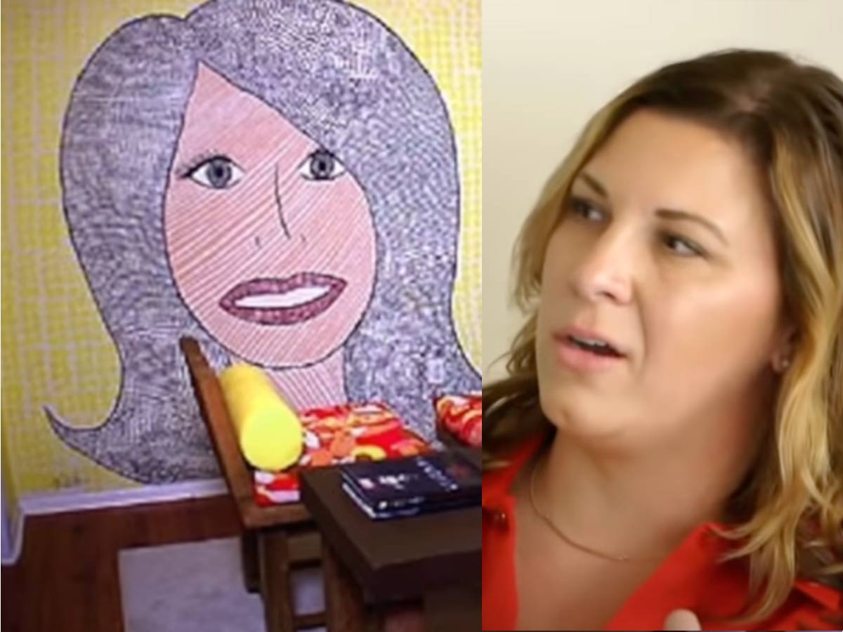
One could understand a designer wanting to leave their signature mark in a home they work on. This could be a splash of color, a small decorative item, or some other design element that says this was designed by so-and-so. However, in this Trading Spaces episode, this designer took that idea just a little too far.
Hildi is all about pushing the envelope and taking risks, and she accomplished that when she decided to install a massive mural mosaic on the homeowners' dining room wall—of her own face! What an awkward reveal! We can only assume the homeowners painted over it once the show left. Who would want to eat dinner every night with Hildi's eyes staring at you?
Vermin in the House | "Love It Or List It"
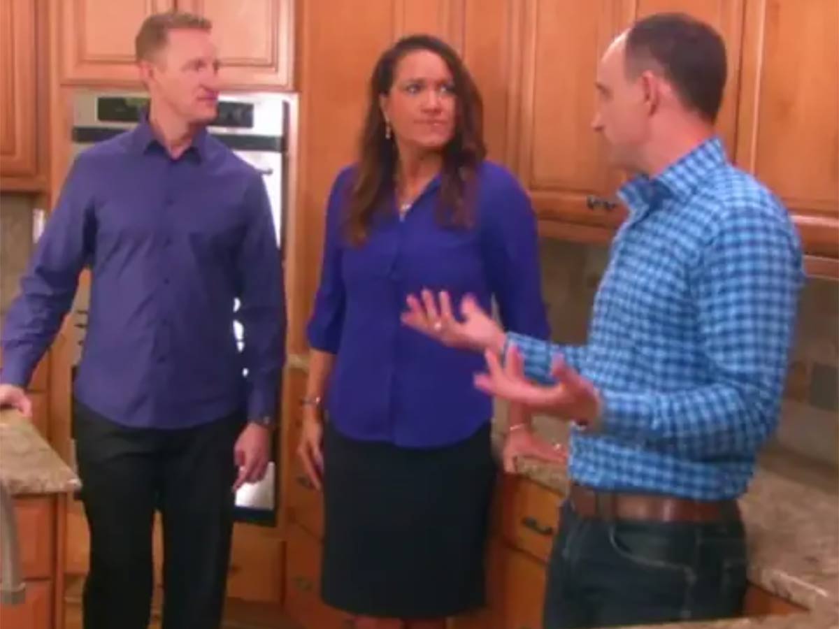
The magic of home renovation shows don’t always remain so magical once the cameras finally stop rolling. Just ask Deena Murphy and Timothy Sullivan—a North Carolina couple who were featured on the HGTV hit Love It or List It. They were so upset with the results of their episode that they actually sued the production company behind the show.
According to the couple’s lawsuit, they were required to put up $140,000 of their own money for the renovations, which they claim were not performed by a licensed architect. They also pointed out that their home was left with holes so big that “vermin could enter the house.” The two parties eventually settled out of court, so there’s no telling what kind of payout this couple possibly got.
A Bad Paint Job | "Half Built House"

Colin Gibson and Judi Campbell were UK residents who owned a home more than 120 years old. At that age, the house was in desperate need of some renovations, so the couple turned to the home renovation show Half-Built House. Unfortunately, that was a major mistake on their part.
The couple claims that, though the production attempted to pretty up the house for the cameras, the actual renovations themselves were more than subpar. Their complaints ranged from poorly installed handrails and a range hood to a window that was inexplicably painted over. Channel 5, the TV channel behind the show, claim that at the time of completion, the couple was apparently thrilled with the renovations.
Safari Bedroom | "Trading Spaces"
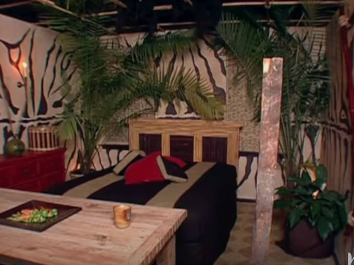
There has been no shortage of truly baffling and hideous rooms to come out of the Trading Spaces franchise. And this safari-themed bedroom is no exception to that rule. Safari is a very difficult theme to attempt without looking tacky, and let’s just say that the designers in this episode failed miserably.
There were so many things that were just so wrong with this bedroom that it’s hard to know where to begin. The fake plants, the zebra print walls—it’s all just so intensely tacky. Strangely enough, as much as audiences hated (and continue to hate) this iconic bad room, the homeowner was actually over the moon with the redesign.
Getting Used to It | "Trading Spaces"
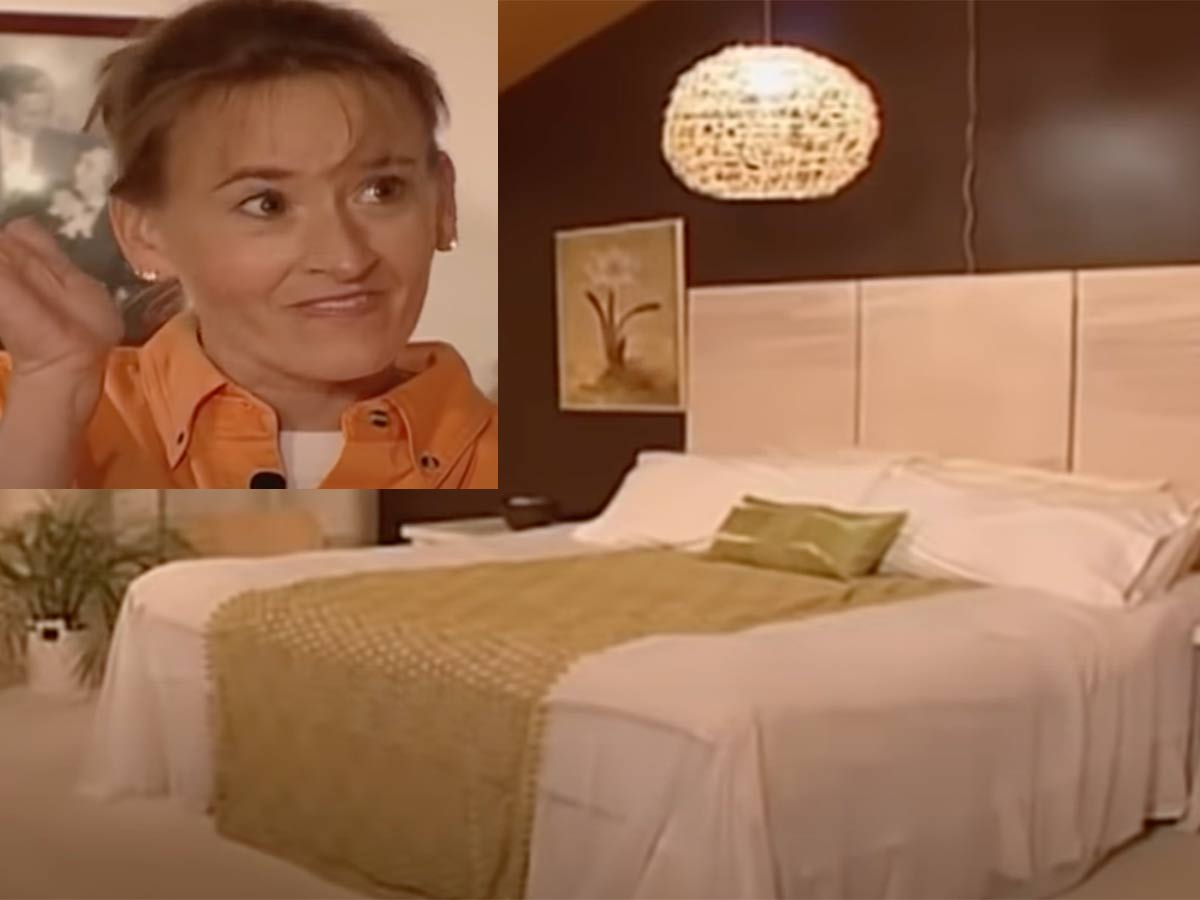
Some folks on home renovation shows are experts at hiding their true feelings. Even if they feel like the makeover is terrible, they somehow manage to grin and bear it and pretend that it’s not the worst thing they’ve ever seen. However, poor Elaine from this episode of Trading Spaces was not one of those people.
When her bedroom makeover was revealed, she tried to keep it together but just couldn’t stop repeating, “I’ve just got to get used to it.” That’s never a good sign! What’s really crazy is that her renovation was not the worst one the show ever featured. It was a pretty boring room, but it wasn’t actively insane like some of the others.
The Thing Above the Bed | "Trading Spaces"

The designers on Trading Spaces made some truly head-scratching decisions during some of the show’s renovations. If we ended up with a wall full of glued hay or a giant mural of the designer, we would be angry too! However, one of the strongest negative responses from one of the participants came from a pretty tame renovation.
In this episode of Trading Spaces, we see couple Chris and Casey as they have differing opinions on the changes. While Chris doesn’t mind them, Casey immediately hones in on “the thing above the bed” and how it “has to go.” The room definitely had a very hotel vibe to it, but we don’t think it was worthy of such immediate condemnation.
Yarn Ball Disaster | "Trading Spaces"

Trading Spaces is a show that’s clearly very concerned about coming in under budget because there are tons of episodes where some very affordable (but questionable) DIY projects come into play. However, one of the biggest DIY disasters has to be the yarn ball light fixtures from the rebooted version of the show.
The designer is trying to help the participant create light fixtures by gluing yarn onto balls and then popping and removing them once the yarn has hardened into place. It sounds like a cute idea on paper, but when you see the gluey, tangled-up mess the homeowner ends up creating, you realize this was just a terrible idea altogether.
Curb Appeal “Brick Ranch Block Corralled”

Curb Appeal looked like a fun show on the surface, but in reality, it was hell for some families. One, in particular, was Cenate and Windy Pruitt. The pair were excited when they were chosen to be on the show, but after the $20,000 makeover, the excitement drained. Being that the home is in Atlanta, you’d think the show would take that into account, but nope.
The show planted non-native plants, which ended up costing the homeowner $1,200 to $1,500 per year to keep alive. Even then, he had to replace many of the plants. Then there’s the retaining wall that trapped water, causing the basement to flood…several times. The homeowner was forced to buy a pool pump just to keep it from happening.
Japanese Hotel Pods | "Home on Their Own"

The plot of Home on Their Own is enough to know that things are not going to go so well. In this show, the parents are kicked out of the house, and the children have free reign on the design elements for the home makeover. Letting your kids be in charge of your home renovation? Probably not the best idea.
In this episode, the parents underestimated their sons' Japanese obsession. The boys tossed out their parents' bed and replaced it with two Japanese-style sleeping pods, one stacked on top of the other. Of course, upon revealing their new sleeping space, the mom was clearly not happy. The husband laughed and bantered with the host, while the mom can be seen covering her mouth and face, obviously irritated.
Windy City Rehab “Massive Giddings Street Rebuild”

Windy City Rehab was a show that didn't last very long, partially due to the poor repair jobs — some of which ended up in court. Anna and James Morrissey were just one of the many lawsuits. The couple claimed their $1.36 million home was damaged due to leaks and water penetration from windows, walls, and ceilings.
Some of this was from an upstairs shower that "drained through the kitchen ceiling whenever it was used." Then there was the issue of the "crooked" front door, crumbling exterior mortar, issues with the garage floor, and the roof had problems. Soon after that, the hosts, Victoria and Eckhardt, faced threats that their licenses would be suspended, which forced them to stop working on other projects throughout the city.
Magnolia’s “Home Work” in the Bennion Home
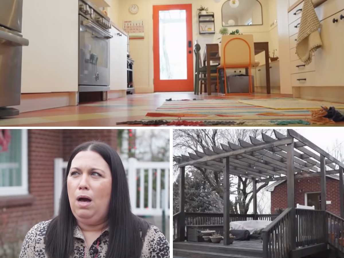
The Magnolia network needed shows, but they should have done a little more research. Home Work was hosted by Candis and Andy Meredith, and using the Gaines name, they were able to find homes to reno pretty easily. One of the homes was Aubrey Bennion’s, but it quickly became her nightmare. She was told the reno would take three weeks and take $25,000.
Once filming started, “everything lagged,” and weeks turned into months. After six months passed, she finally was able to get her hands on a cost breakdown, which revealed the Meredith’s had already spent $40,000. She pulled out of the show, but she soon realized a flooring contractor hadn’t been paid. Also, her new deck had been built directly above her sprinklers. It cost her $18,000 to fix that issue.
Trading Spaces “Prison of Love”
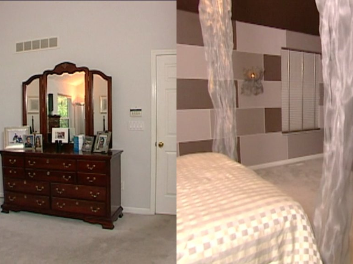
The ‘90s were great for many reasons, but the home décor wasn’t one of those. When Trading Spaces “enhanced” a space, they almost made the homeowners want to leave. That was the case of the “Prison of Love” as it’s been called. The bedroom was given to them a little outdated, but what they got was very…unique.
It featured jail-cell bars covering the windows, a terrifying mural, and a bench that was supported by two toilets. Maybe the craziest part is that host Paige Davis later defended the idea saying, “I actually thought that room was really neat! I really liked it. I did!” Maybe you shouldn’t be on a décor TV show, Paige.
Changing Rooms All White
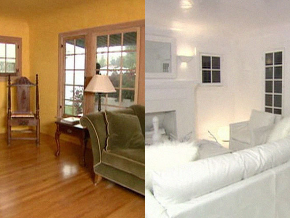
This is probably one of the funniest on the list, and it comes from a British TV show called Changing Rooms. The show took a nice, classic living room with great wooden floors and turned it into a room only Patrick Bateman from American Psycho would like. The crew made it all white – and we do mean ALL white.
The designer showed the owner the room and stated, “We thought it would be interesting to see what an all-white and an all-black room would be like.” Maybe they should have run by the person that was gonna live there? Once revealed, they were furious and immediately said, “I hate it. Get this mic off me.”
 Author
Sherrill Dean
Last Updated: August 11, 2025