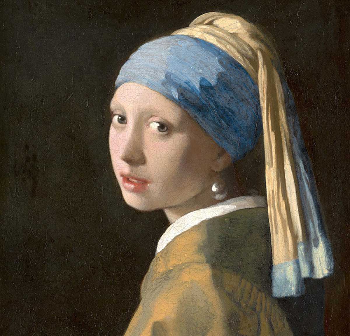
Even if you don’t recognize who painted this fantastic piece, you can likely tell that this is Girl with a Pearl Earring. It was painted by Joannes Vermeer in 1665. It’s gone by many names over the years, but it often comes back to the stunning jewelry she’s wearing in the painting.
The most interesting thing about the girl is that no one actually knows who she is. Some believe she might be the artist's daughter, but others say she could be an artist in her own right. We’ll honestly never know, and that’s part of the mystery that surrounds her and the painting.
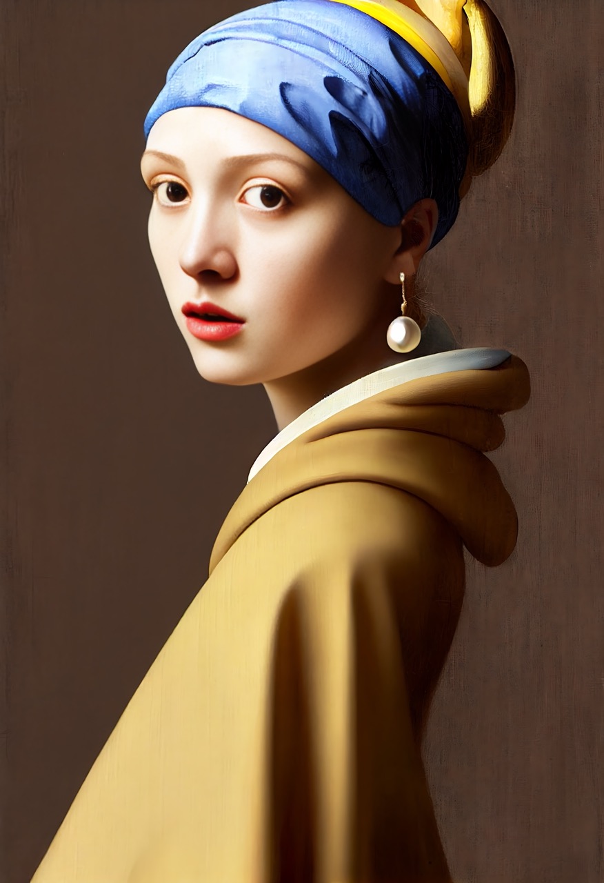
When AI was asked to make Girl with a Pearl Earring into a real person, it did not disappoint. The most interesting thing about this painting is that it took away the scarf that was hanging down behind her. In addition to that, it also made the earring a lot bigger and shiny.
No girl would be disappointed with that massive earring! The AI got super close to what the girl looked like, but it definitely slimmed down her face. Vermeer loved to paint women with full, round faces, and this is more of an upside triangle face shape.
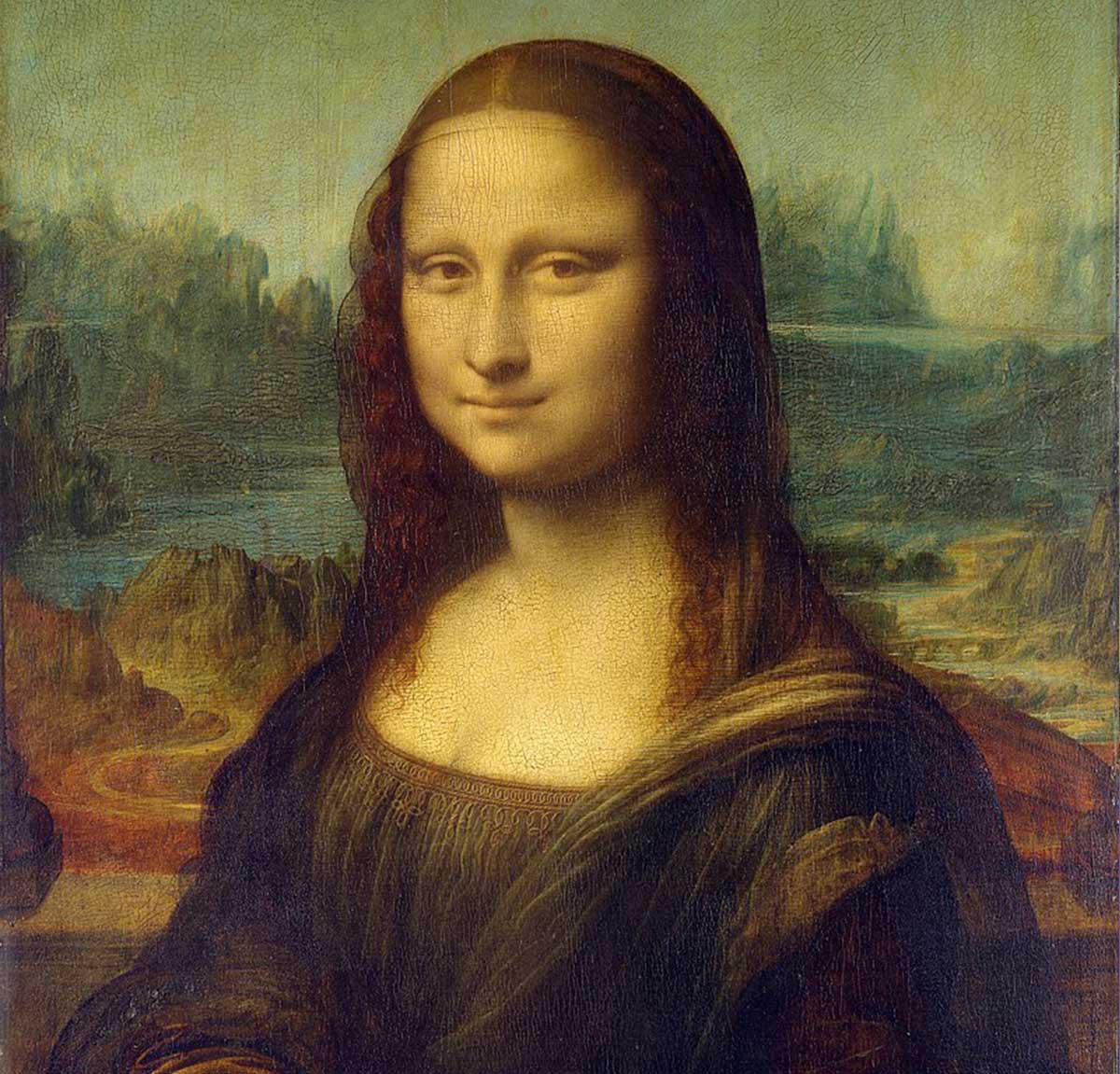
The Mona Lisa is one of the most well-known pieces of art known to man. The original was based on a woman named Lisa del Giocondo, an Italian noblewoman, so why the “Mona Lisa?” Well, turns out Mona is basically My Lady, so the painting is literally My Lady Lisa.
While many people find the Mona Lisa attractive, no one took it further than Napoleon. The guy actually fell in love with the painting and then went after a descendant of Lisa, named Teresa Guadagni. He became utterly fascinated with her, but she resisted his advances because she was just a teenager at the time.
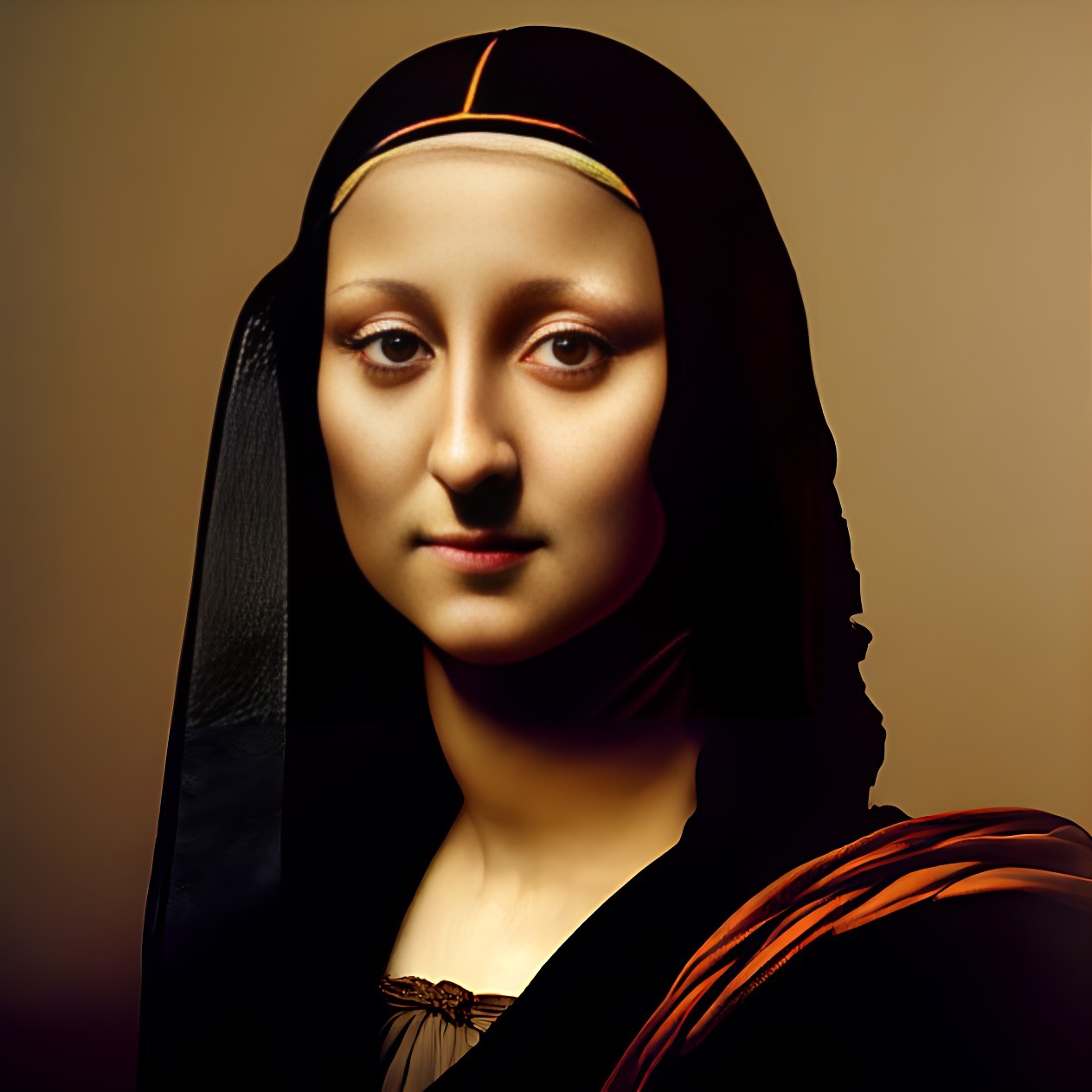
What really draws people to the Mona Lisa is her mysterious little smile and her beauty. When the AI got a hold of this painting, it certainly enhanced her beauty. In fact, she’s absolutely stunning that it puts the original to shame! The most remarkable thing about the image is that her eyes look so much softer and kinder than in the painting.
Maybe this is closer to what Lisa could have wanted. If the original Mona Lisa made men fall madly in love, we can only guess what this girl could do. Her big doe eyes are sweet, but there’s something behind her that says she’s actually a secret little vixen.

The Scream is certainly a haunting one. The painting was supposed to be about the Expressionist movement and is the symbol of the anxiety that plagues the human condition. Some even think that the painting might be about suicide, as the bridge was a popular spot for jumpers back in the artist’s day.
The Scream has certainly had its impact on culture – more than you may realize. The design of the killer in Wes Craven’s Scream was largely based on the painting. Craven stated, “It's a classic reference to just the pure horror of parts of the 20th century, or perhaps just human existence.”
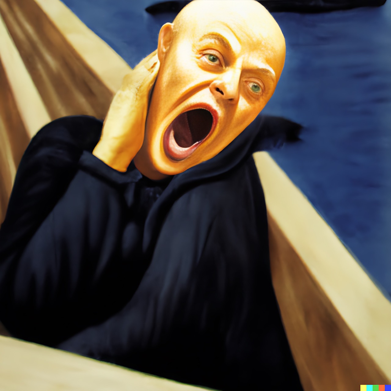
As for the AI? Well, this is something that will haunt you for the rest of your life, isn’t it? Maybe this is one we should have left alone, but we couldn’t help ourselves. The guy definitely looks like he’s got some pretty bad anxiety. It reminds us of what Voldemort mixed with a blow-up doll.
The guy looks like he’s in his 50s, so there’s no doubt there’s a lot of stuff weighing on his shoulders. We can’t imagine the horror someone looking like that has been through. Not to mention, the bags under his eyes make it clear he hasn’t gotten a good night's sleep in ages. Ugh, it sends shivers down the spine.
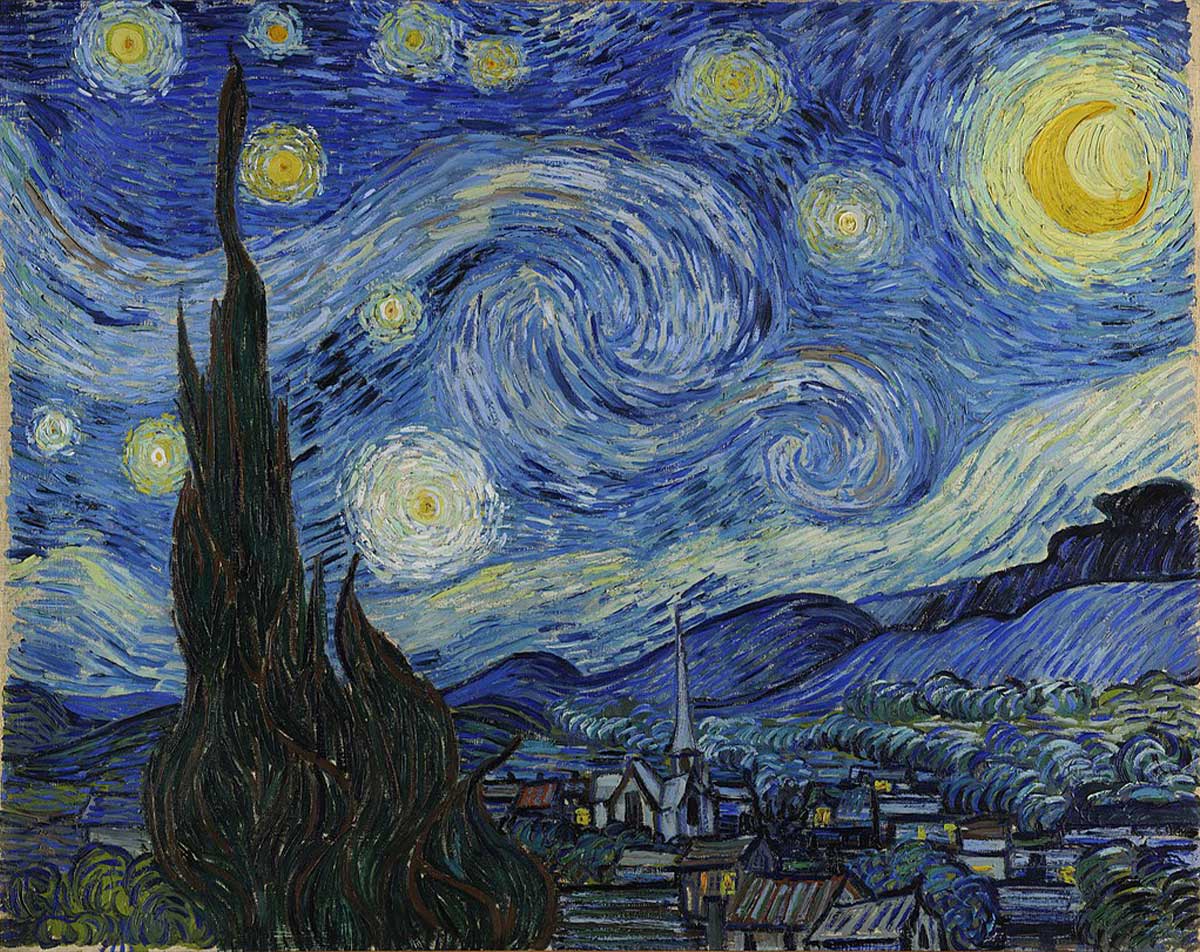
Starry Night is a painting that everyone knows. You can recognize it from across the room, or even from across the world. It's iconic—and not just because of its bright colors and swirly lines. It's iconic because it's beautiful, but there’s something a little more interesting about it if you look closely.
Some say that they can see a skull in the painting — one with a sly grin just overlooking the town. We'll leave that one up for you to decide, but it doesn't seem like that big of a stretch since many of the stars look like they have eyes in the center.
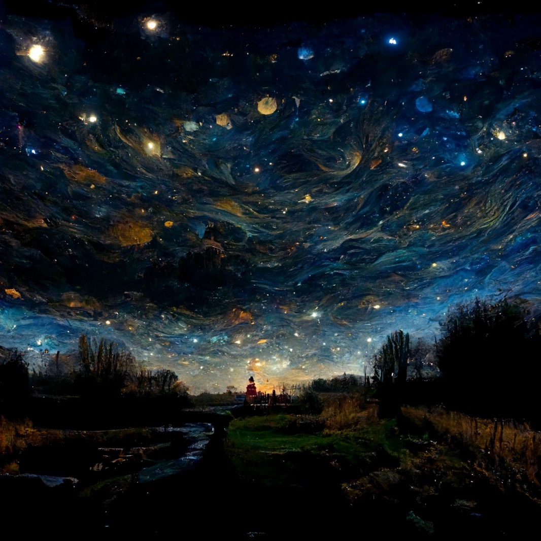
Starry Night isn’t a person, but we couldn’t pass this one up. It was just too jaw-droppingly beautiful to leave out. Wouldn’t it be fantastic to see something like this in real life? This one is supposed to be Starry Night, and we are absolutely speechless! The original painting was beautiful, but it doesn’t have anything on this recreation. It’s almost like you can see the planets in the galaxy!
We love how the AI was able to keep a lot of the swirly art from the original Van Gogh piece. One thing that is missing is the massive Moon and the mountain on the side. Rather than a town being the backdrop, it’s a single tower in a marshy wetland. This one is actually a lot better…

Van Gogh portrayed himself as unkept and sad. He painted many self-portraits, which led to many people thinking he was a bit of a narcissist. However, in reality, Van Gogh did this to portray his emotions and his passion for art. It also gave us a glimpse to see how he hurt himself over the years. One such incident was losing his ear.
The story goes that Van Gogh had a seizure during one of his many fights with his artist friend, Paul Gauguin. During the incident, he severed part of his ear with a razor blade. He then took the lobe to a brothel to give to a woman. We don’t know if she took it, but when he got back, police had surrounded his home and hospitalized Van Gogh. Turns out he’d severed an artery in his neck. Just wow…
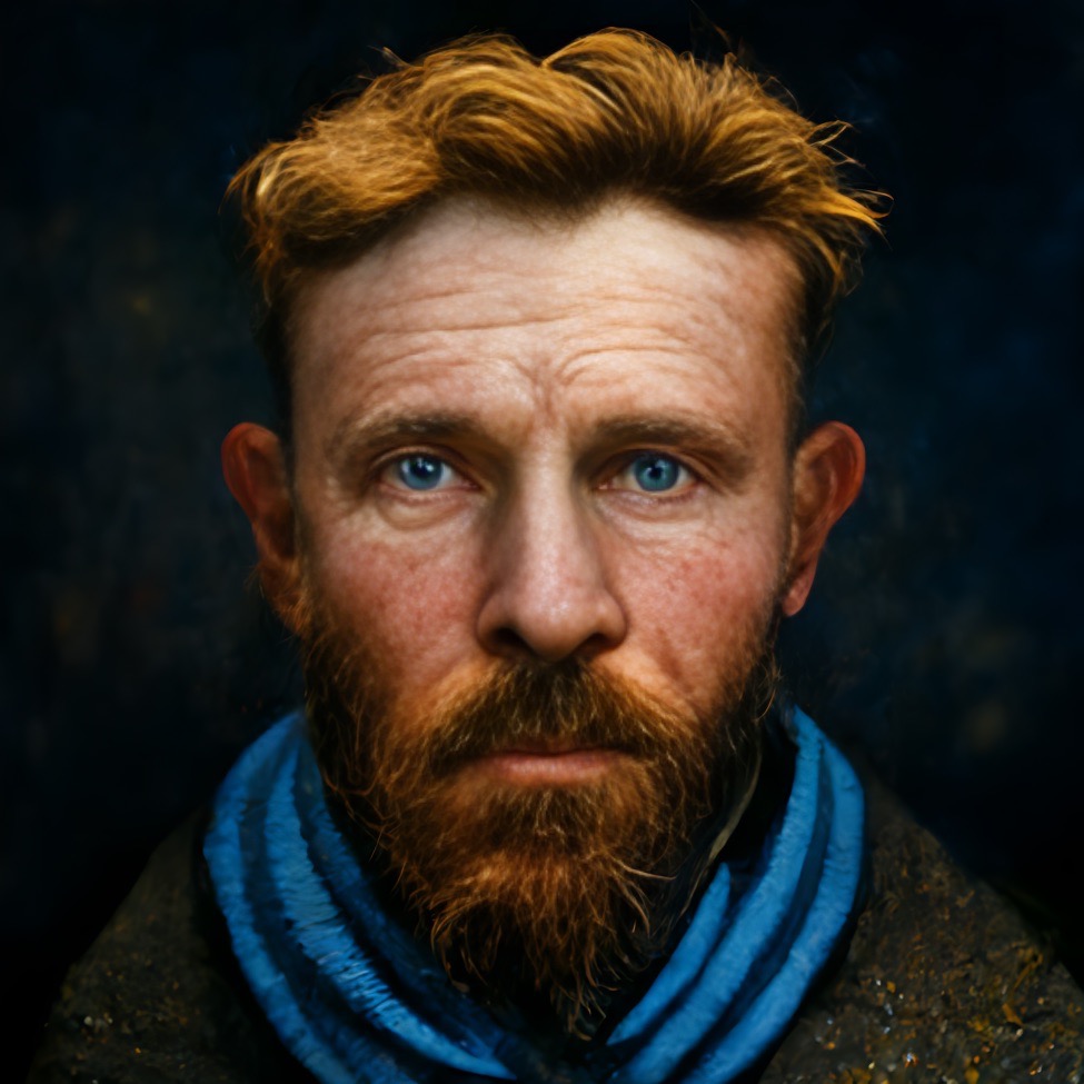
Because Van Gogh loved to paint himself, it gave the AI plenty of reference material to see what he might have actually looked like if he were standing in front of us today. The man the AI-generated is pretty close to what someone would look like if they were from Van Gogh’s hometown.
His eyes are kind, and he looks a little tired, but you would be, too, if you spent hours upon hours painting (and fighting, apparently). He almost looks like someone you might see walking around the streets of the Netherlands today, doesn’t he? Glad to see the AI gave him his full ears, too.

American Gothic is instantly recognizable. The interesting part about this is that the original painting was about the American Gothic house in Eldon, Iowa. Also known as the Dibble House, artist Grant Wood painted who he thought lived there and what they would look like. The funny part is that the woman standing next to the farmer is supposed to be his daughter.
Wood entered the painting as part of a contest, and the judge deemed it a “comedic valentine.” However, a museum patron persuaded the jury to award the painting a bronze medal, so it earned a $300 cash prize. Guess Wood was glad the patron was there, huh?

While Wood swears up and down it isn’t a caricature of Iowan people, the AI made it really look like people we’ve seen out and about (no matter where you live). The weird part was that the AI got the subject matter a little off. Apparently, the AI also thought it was his wife, like many other people have.
On top of that, the AI really aged the two and gave the man a pretty substantial beard. You know, we kind of prefer it that way. These two definitely look like someone we’ve seen at the supermarket when grabbing some groceries. We don’t see it as comedic at all. Instead, just two hard-working people living their lives.
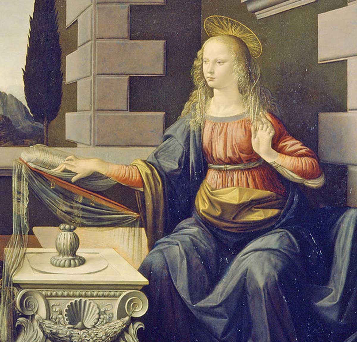
Annunciation is one we’ve all seen a million times in our lifetime. It was painted by Leonardo da Vinci and is one of his earliest works. It depicts the angel Gabriel touching down to announce to Mary that she would conceive a son, who would be named Jesus and called “the Son of God.”
Interestingly enough, there are actually two versions of Annunciation. The original was painted by da Vinci somewhere between 1472 and 1475, and it ended up going to the Uffizi. The second was also painted by da Vinci a few years later between 1478 and 1485. That one hangs in the Louvre.
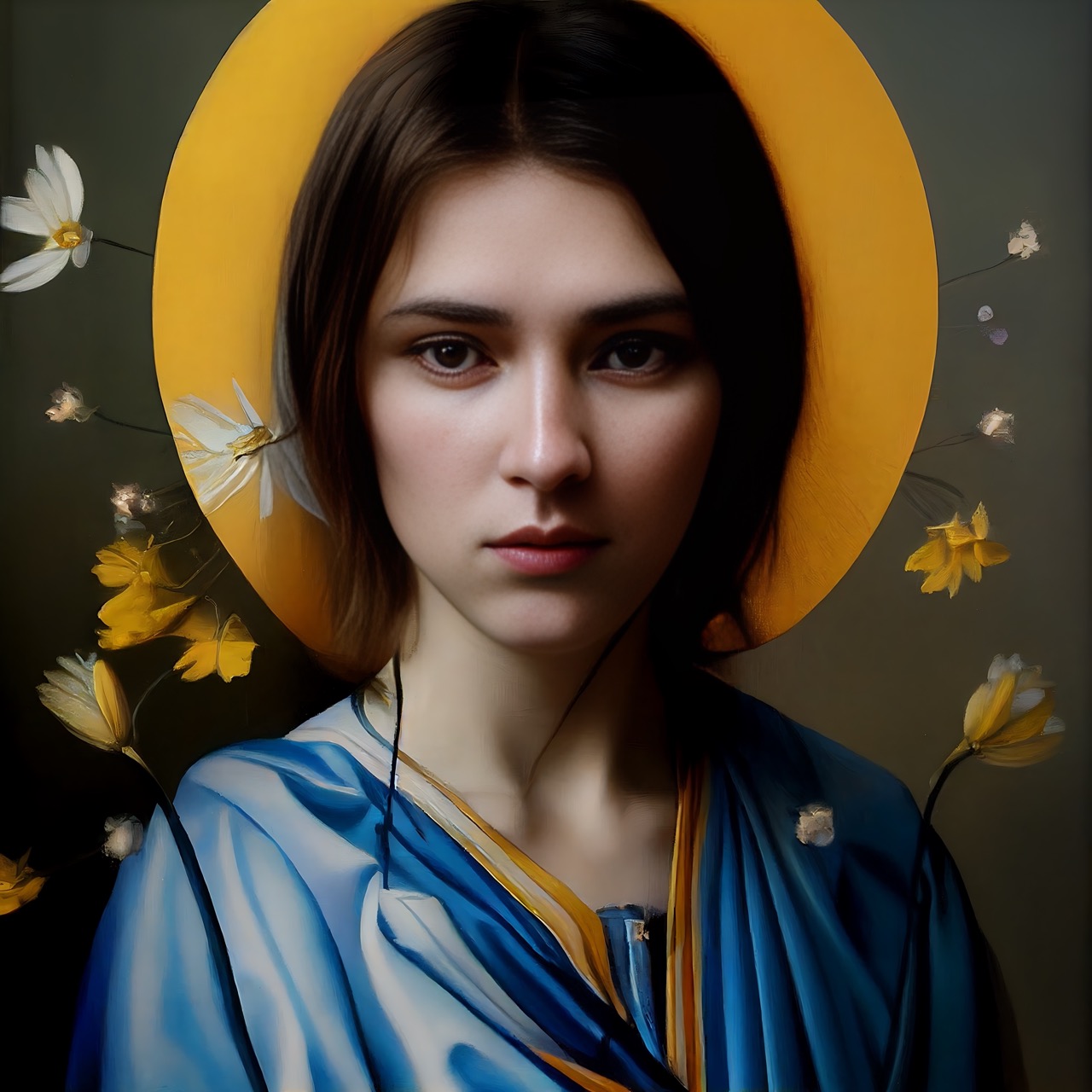
We asked the AI what it thought the painting would look like if the people were real. It instantly focused on Gabriel, made clear by the brown hair. The flowers around Gabriel are absolutely beautiful. Having an angel like this come to visit us would certainly put us at ease, so we understand why Mary would be so welcoming of Gabriel.
If we ever saw an angel in real life, this is what we’d want to see. Think about this: if Gabriel is this pretty, what did Lucifer look like? After all, Lucifer was said to be the prettiest of them all. One thing we did want to point out is that it seemed to make Gabriel a woman…or a very feminine man.
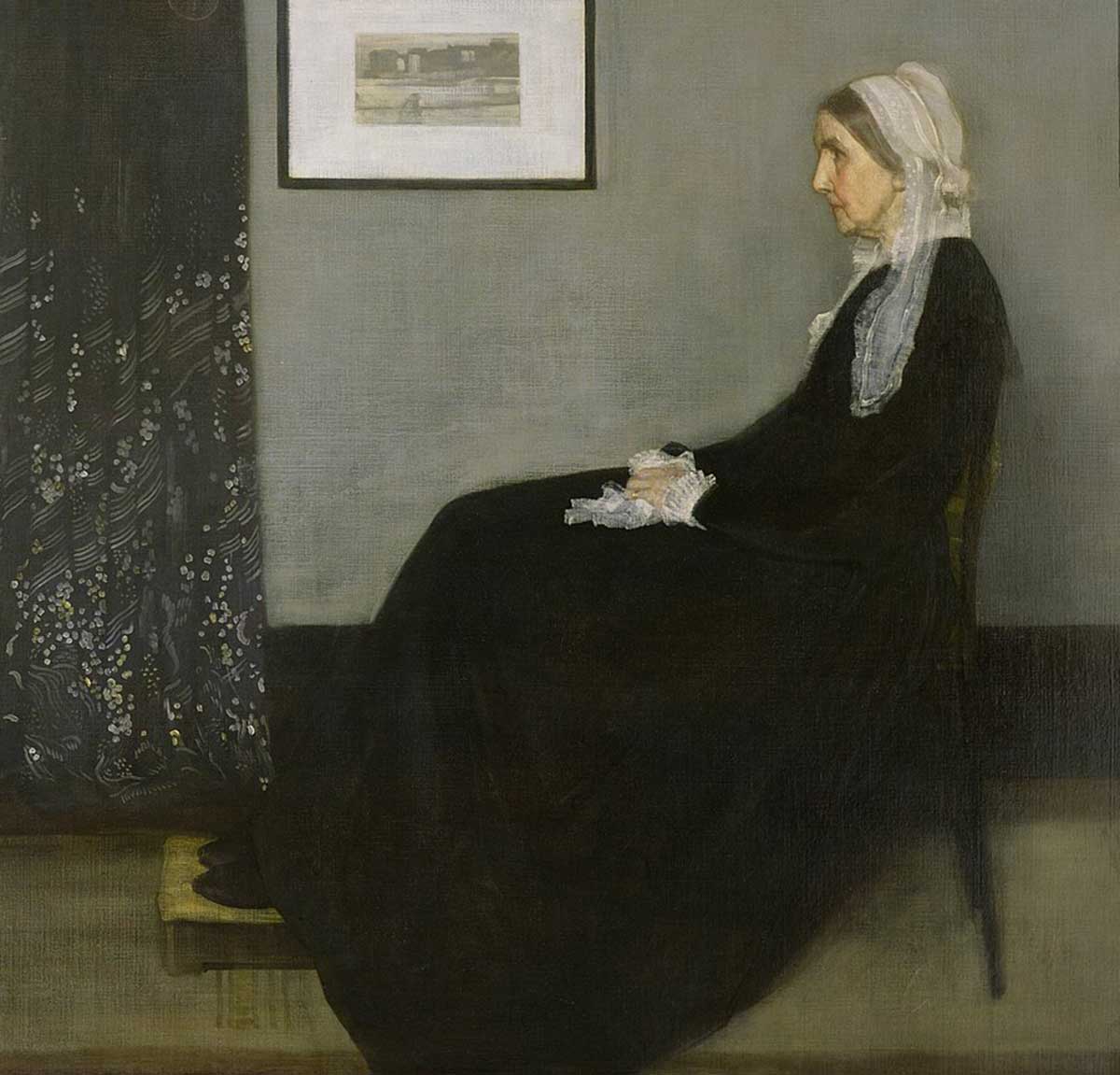
Whistler’s Mother is probably another one you’ve seen a time or two in your life. The painting was by James McNeill Whistler and was about his mother – we know, shocking reveal. The painting was created on a whim, and Whistler originally asked his mother to stand. Anyone would know that would be hard on an older woman.
In a letter to her daughter, she wrote that she stood “bravely, two or three days, whenever he was in the mood.” We’re glad Whistler changed his mind and had his mother sit for the rest of the painting. It doesn’t seem right to have your mother standing for that long while you paint.

No doubt that the AI aged Whistler’s Mother quite a bit, but this is almost exactly what Whistler’s mother would look like after she’d aged a bit more. She very much looks like the woman the painting represented – a woman that lived through the Great Depression, raising three children.
The AI did a great job capturing Anna Whistler, and we’d like to think she’d be happy that people still remember her today, especially since her son somehow forgot he even painted her in this incredibly famous artwork. While she may have died in the 1870s, we’ll always remember her today.
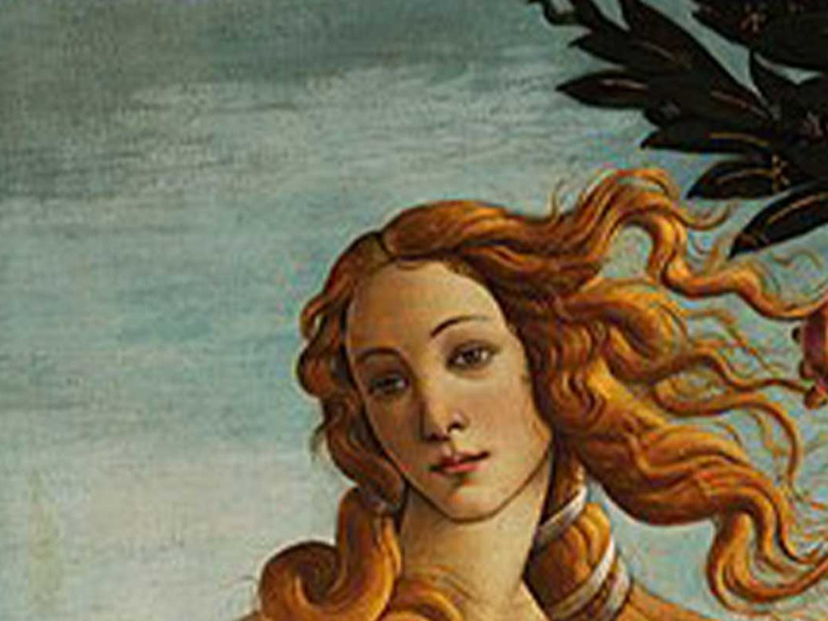
Birth of Venus is incredibly iconic. The painting itself was painted by none other than Botticelli, one of the best artists of the Italian Renaissance period. It’s supposed to represent feminine grace and beauty, and it does a great job of doing just that. It does that and more, actually!
When it was originally painted, Venus’s nudity was groundbreaking. During the Middle Ages, nudity was pretty much avoided and rarely portrayed. However, Botticelli broke that and gave Venus that striking birthday suit we’ll never forget! Another fun fact, there are actually hidden genitalia in the painting.
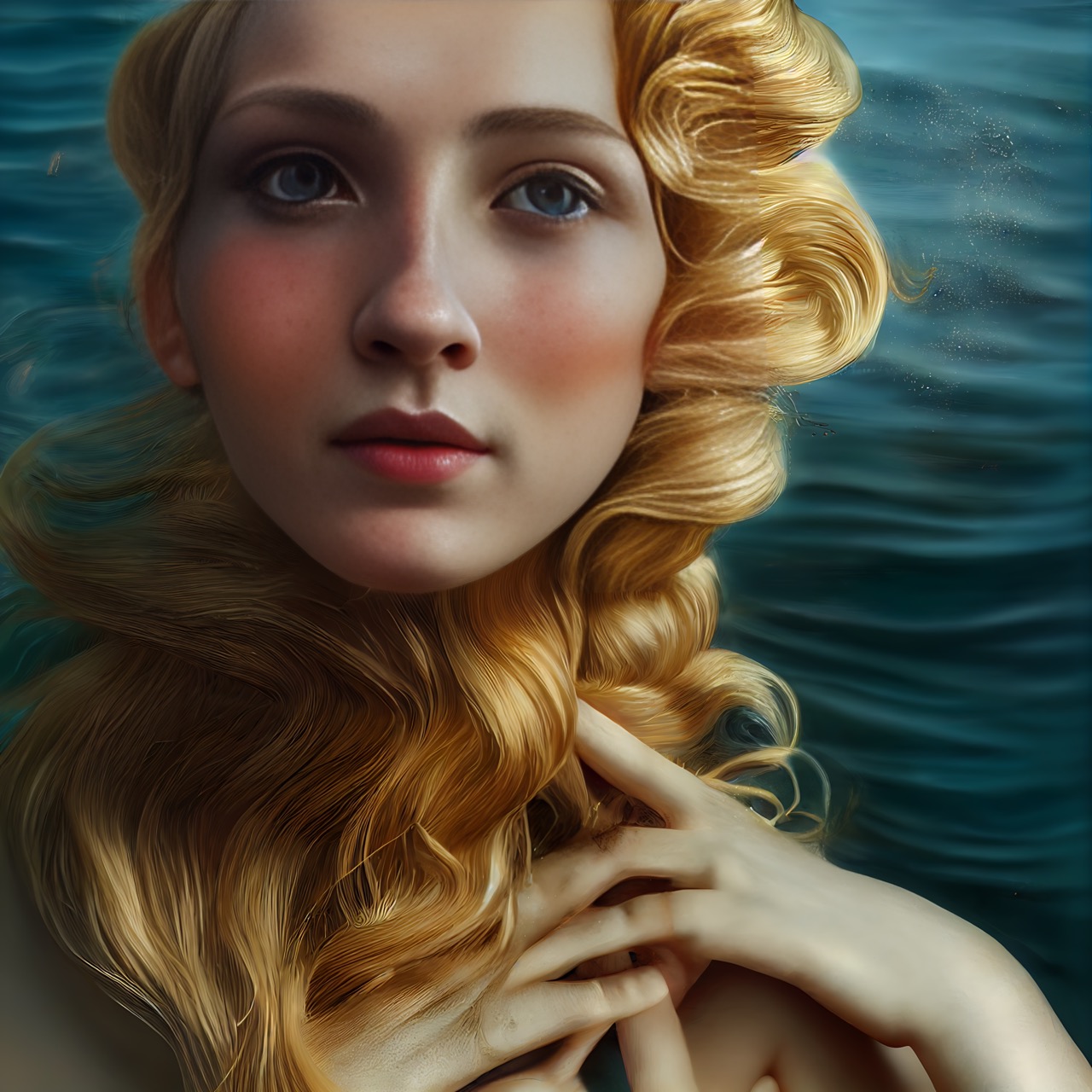
As pretty as the original Venus was, she has nothing on the AI version. This Venus is jaw-droppingly beautiful. Helen, who launched a thousand ships, who? This Venus certainly captures everything Botticelli wanted and more. Her features are feminine, and the slight blush of red on her face makes it that much better.
We love how her hands are playing with her curly blonde locks. Another thing we love is the slight smile on her face. It’s like she knows something that we don’t quite know just yet. It’s really interesting that the AI put the ocean behind her. It really sends the whole theme home.
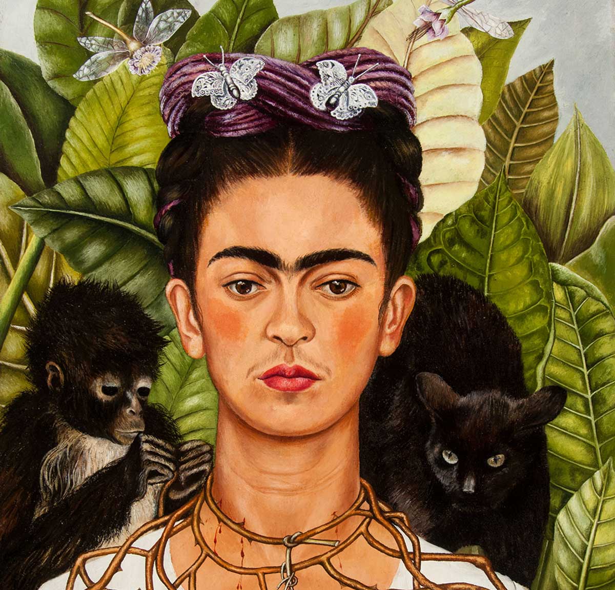
One question a lot of people have is, “why did Frida Kahlo paint herself so often?” You know, that’s a fair question. She really did paint herself often, but it was one of her ways of expressing herself and who she was. This became especially important as she became an artist soon after a horrific accident.
In 1925, Kahlo and her friend Alex were riding in a bus. Then, suddenly, it crashed into a street trolley car! Recovering from this accident took over a year, and during this time, she had to give up her pre-med program. Painting helped her cope with this incident.
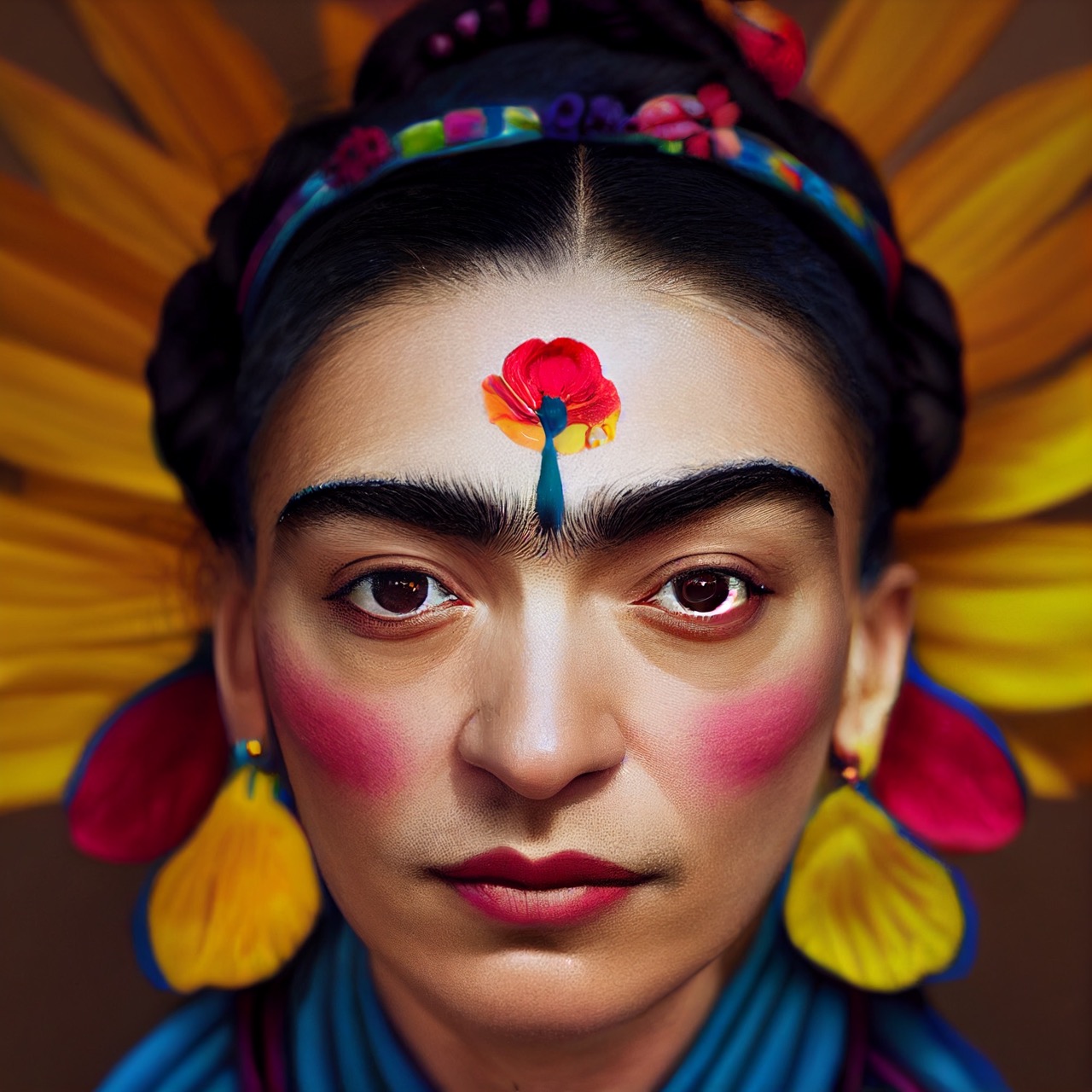
We’d like to think the AI would make Frida Kahlo proud. It features a lot of the things Frida loved in her paintings like flowers, deep saturated colors, and of course, that mustard yellow. The flower on the forehead was a surprise, but it adds a certain femininity to the piece.
The only thing that seems off is that it did make her features overall more delicate. It seemed as though Frida Kahlo gave herself more masculine features. Regardless, this is actually closer to what she looks like on the outside compared to her photographs during her time period.
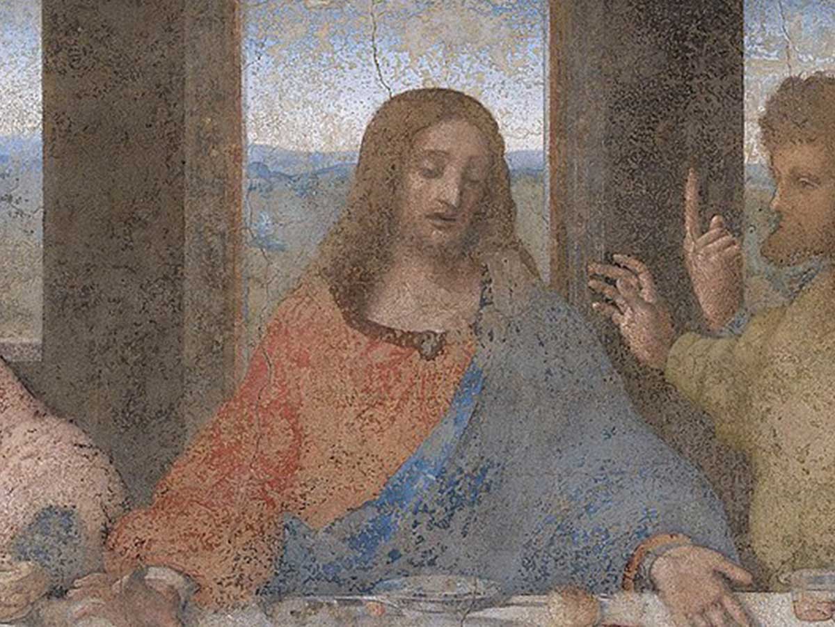
Leonardo da Vinci is famous for more reasons than most, and one of the crowning achievements in his lifetime was his painting, The Last Supper. The painting depicts one of the most famous scenes in the Gospels shortly after Jesus announces to his disciples that one of them will betray him.
The painting was commissioned by Santa Maria delle Grazie monastery in Milan, Italy, and da Vinci painted the mural on the wall of the dining hall and finished the piece sometime around 1498. The painting underwent a controversial restoration in 1999, which drastically altered the colors and even some of the faces in the mural.
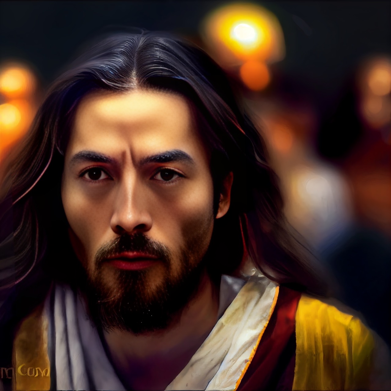
As far as AI image generators go, the program did an okay job of depicting Jesus—most people would be able to guess who this is supposed to be. But is it better than what Leonardo da Vinci gave the world? Not by a long shot! I don't think flocks of people are going to travel the globe to get a glimpse of this one.
The one actually interesting thing about this image shows up in the lower left corner. It looks like the program added some sort of word to the image. Is this supposed to be like an artist's signature on a painting, or is this illegible word trying to tell us something about Jesus?

If you've ever visited the Sistine Chapel in Vatican City, there's a good chance you left with a cramp in your neck thanks to staring up at Michaelangelo's masterpiece, The Creation of Adam. The fresco was painted on the ceiling of the chapel and took Michaelangelo roughly four years to complete.
The picture features a bearded God reaching down to touch Adam to pass on his spark of life. There are also several other figures surrounding God, and their identities have been debated since the painting was first created—some say they represent the human race, while others have posited that the woman next to God is Eve or the Virgin Mary.
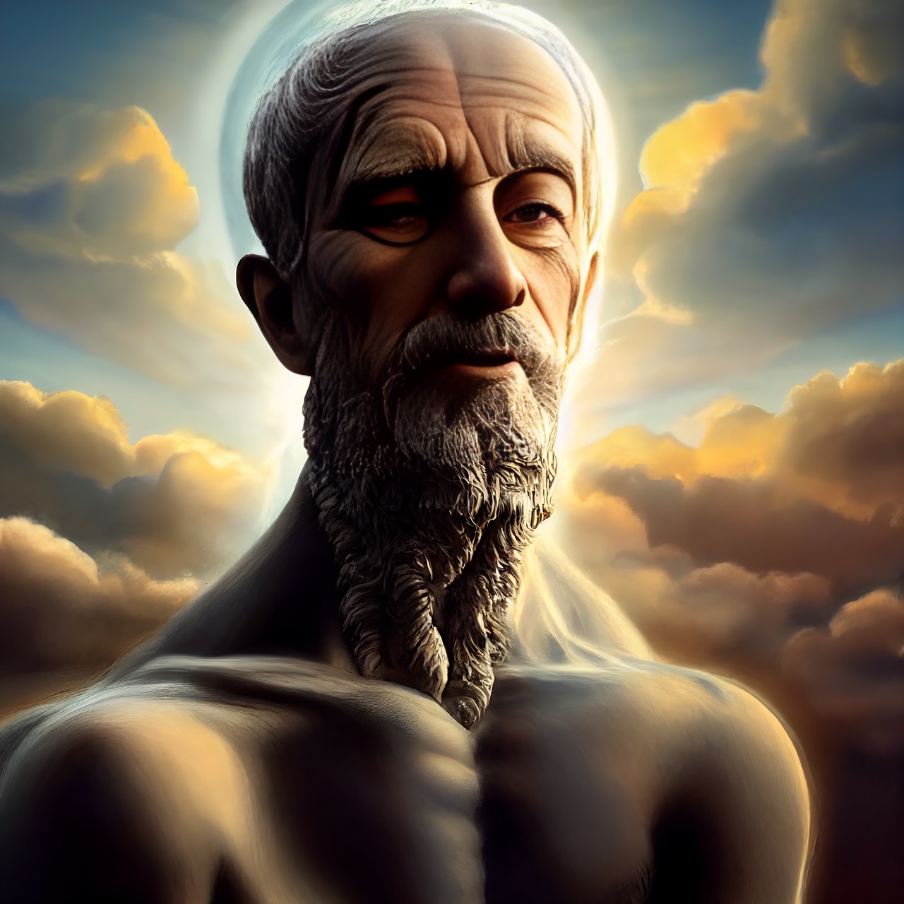
Once again, the AI image generator does a decent job of depicting the subject, but it pales in comparison to the beauty of the original. This image definitely looks like it could be God, but it's a much creepier version. Someone should tell him to throw on a robe or something!
Probably the most disturbing thing about this image is that God seems to be missing an eye. His left eye looks normal-ish; however, his right eye look more like an empty socket. God doesn't just need a robe in this one—it looks like he could use an eyepatch too!
Lady with an Ermine might not be Leonardo da Vinci's most famous painting, but it's definitely one of his funniest. The portrait depicts a very royal-looking, courtly woman who happens to be holding an ermine (also known as a stoat). Rodents have never looked as beautiful as this one!
It's believed that the woman in the picture is Cecilia Gallerani, who was a mistress of the Duke of Milan. Da Vinci was a court painter for the Duke, so this explanation makes sense. However, why the painting includes an ermine has been debated to ridiculous lengths by alleged "serious" art critics.
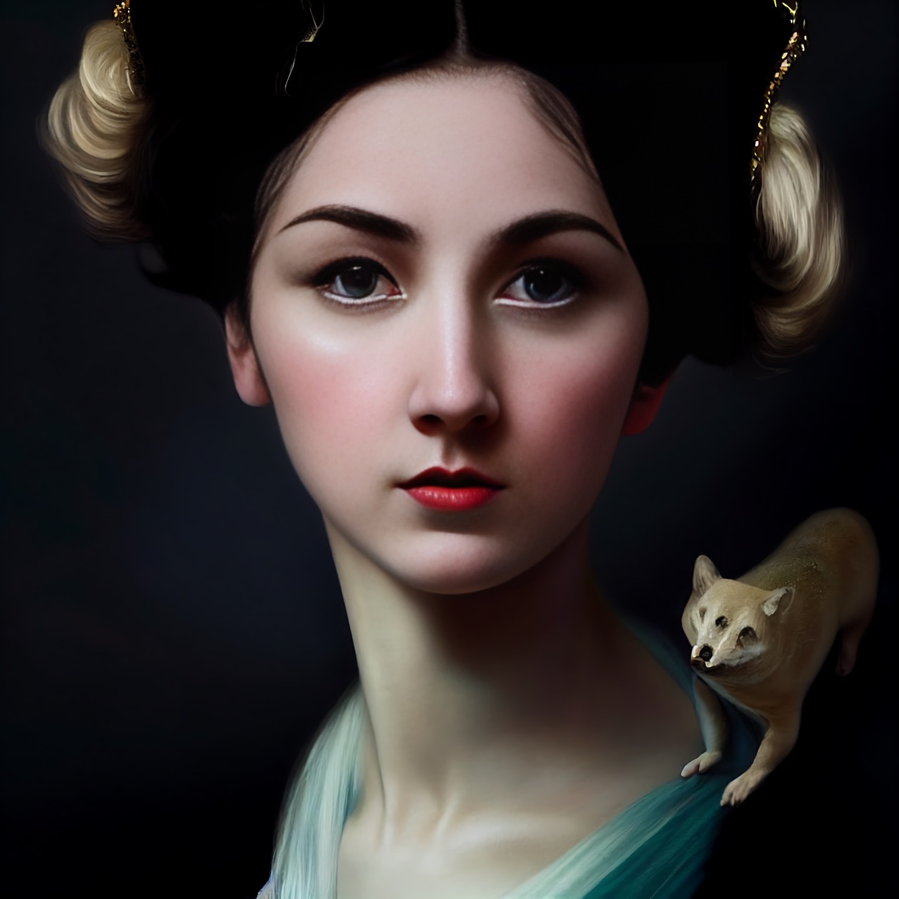
If this image is any indication, let's just say that AI image generators don't have a promising future in the world of fine art. Once again, the program has given us a reproduction that is somehow both inferior to the original and also much more bizarre than the original.
While the lady is ostensibly the focus of the work, how are you supposed to take your eyes off that terrifying thing sitting on her shoulder? It appears to have three eyes and a skull for a face. It almost looks like a tiny, terrifying Shiba Inu dog just chilling on her shoulder.
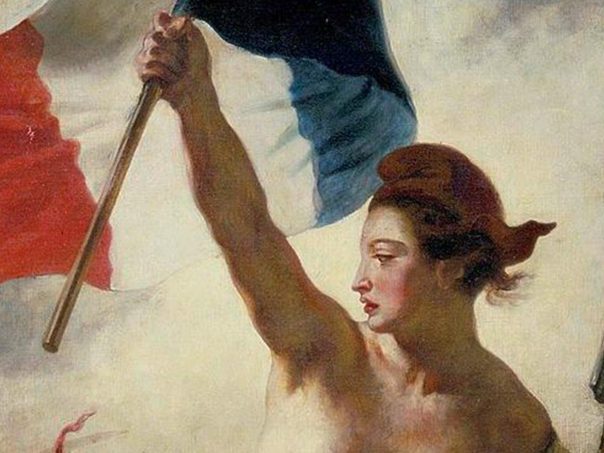
Liberty Leading the People was a painting by French artist Eugène Delacroix who was inspired by the events of the Second French Revolution of 1830. What can we say? The French want their paintings beautiful and their streets running red with blood. The painting is now displayed in the Louvre.
The painting prominently features a female personification of liberty, with the French flag in one hand and a gun in the other. It's believed that many of the other figures in the painting were borrowed from another famous French artist of the time, Nicolas Charlet.
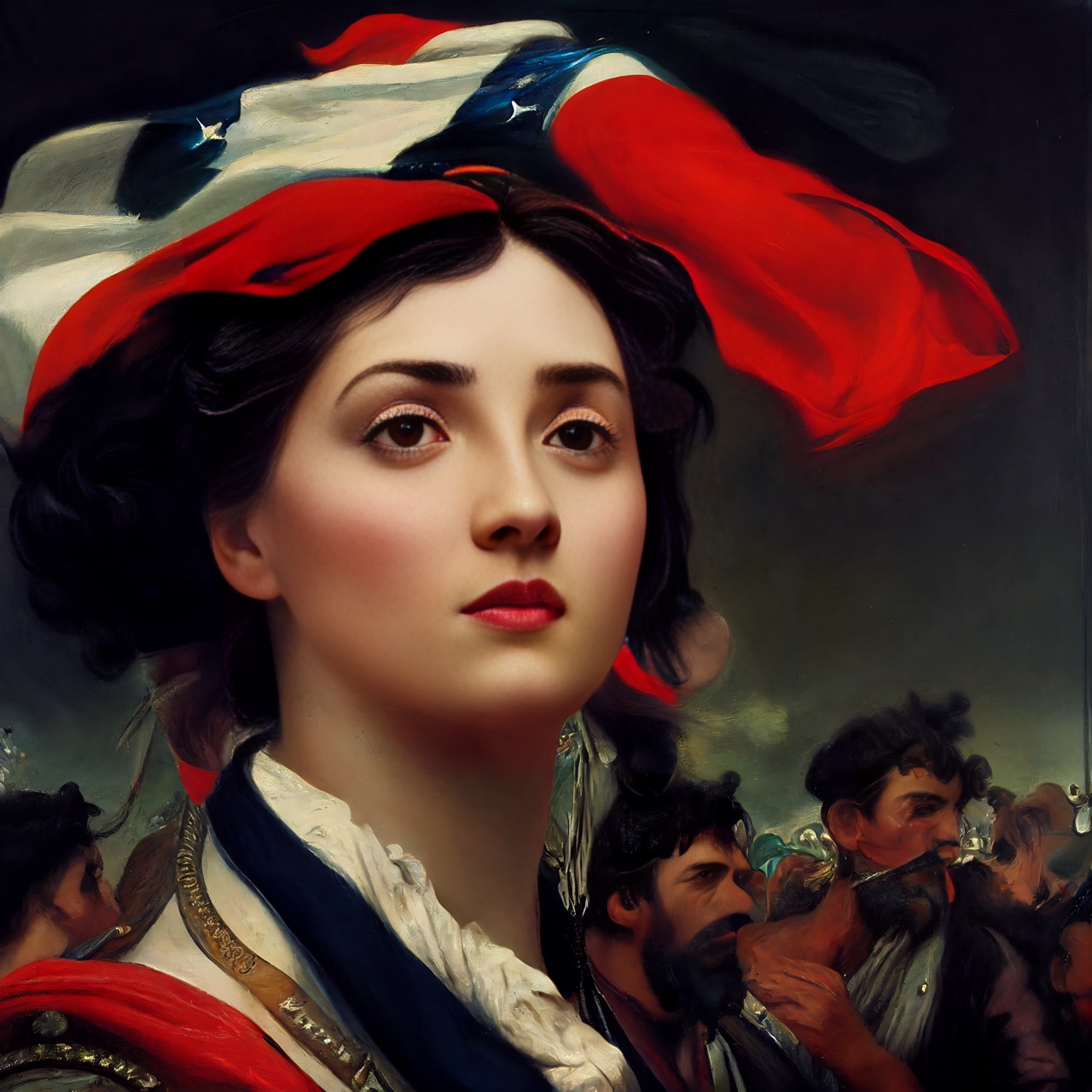
This may be one rare instance where the AI-generated image is actually better than the original. At the very least, the AI version makes Lady Liberty much more of a looker than she was in the Delacroix original. However, if you look closely, you'll start to see that telltale AI weirdness that we all love.
While Lady Liberty may be looking hot in this image, we can't say the same about the rest of the people featured. They're definitely a little too "melty" looking for our comfort! We're not sure what kind of instruments of war could do that to a person, and we don't want to find out!
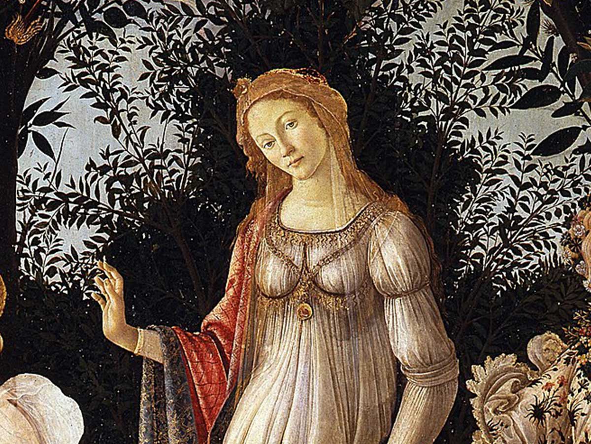
Primavera may be one of Sandro Botticelli's most famous paintings, but it's also one of his most controversial. Mainly because no one can seem to figure out what in the world the painting is depicting. Each of the figures is from Greek mythology, but there are no myths that put them all in the same place at one time.
Front and center, we see the goddess Venus, and while she looks as fabulous as ever, she also appears in need of a good neck brace. The mystery surrounding this painting may never be resolved, but that hasn't stopped it from becoming one of the most well-known paintings in history.
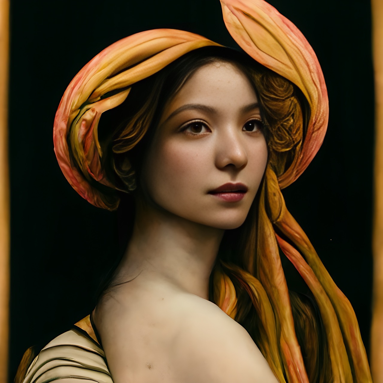
This is one AI-generated image that we would have never guessed was Venus if we didn't already know it. The woman depicted is beautiful but is she really goddess of beauty material? And don't get us started on all the weird elements in this picture...because there are a ton of them!
In this image, it looks like Venus may be wearing some sort of head wrap, but it also looks like it could be some sort of terrifying tentacle monster that's attached itself to the goddess. Also, what's going on with the lump on her side? It looks like she's standing sideways, but then that would mean the lump is her other shoulder that's been pulled back into a terrifying position.