Pastel Bathrooms

Nothing is wrong with having pastel colors in a bathroom, but feeling like you're in Barbie's Dream House is just too much. Nothing’s wrong with wanting to spice up your bathroom decor with some color, especially if your powder rooms are notoriously monochrome. But once it breaches the Candyland realm, you need to reconsider your level of taste.
In the 1950s, bathrooms were decked out floor-to-ceiling in pink, powder blue, or mint green paint and tiles. We can thank Mamie Eisenhower for introducing pink to American consciousness. When she wore a pink gown to the inauguration ball, the public was hooked and immediately took to her favorite color combination: green, pink, and creme. Thus, the stereotypical '50s bathroom was born.
Patterned Linoleum

Linoleum itself isn’t the worst flooring choice you can make if you need to save money. It’s smart to invest in cost-effective dupes for expensive materials. The patterned versions, however, are the stuff of home decorators' nightmares! There’s a fine line separating the decorative and the tacky; unfortunately, most linoleum patterns are teetering at the edge.
Fun fact: the toxicity of vinyl flooring used to be a major concern for public health, so linoleum proved to be a safer, “all-natural” solution for your flooring needs. Just know if you’re wanting vinyl floors instead of linoleum, make sure that your local store has phthalates-free vinyl in stock.
Wicker Furniture

Wicker was super prevalent in the ‘80s and ‘90s. Also known as rattan, this material doesn't last a long time. We’ve all been hanging out on a friend’s porch and had to sit in the ratty old wicker chair with pieces sticking out at every angle. You can’t but wicker chairs on their own without investing in a cushion of some kind or it’s not worth sitting in.
The style is a great rookie choice for those moving into dorm rooms and first apartments, but for the more mature folks among us, it’s time to phase it out. It's time for something a little more permanent and comfortable, so you aren't just wasting money on a showpiece that looks like a glorified porcupine.
Fuzzy Toilet Seat Covers
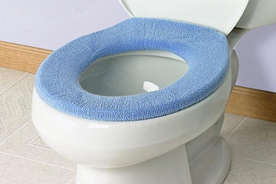
Ah, fuzzy toilet seat covers and U-shaped rugs. You’re the reason there was so much mold in my bathroom growing up. You may be cute to a little kid, but adults know you’re a home décor faux pas. Nobody wants to clean you or even touch you at all. Honestly, you don’t even look that good, either.
Most of us growing up were personally victimized by the mere existence of soft toilet seat covers. They look fuzzy and fun from the outside but the more you think about its function and proximity to the bowl, the more disgusting it gets. Not only are these little gremlins incredibly outdated, but are exceptionally unsanitary.
Deep Shag Carpeting

Our concerns for deep shag carpeting aren’t that far off from our fuzzy toilet cover critiques. Cleaning them is a nightmare, and there aren’t a lot of plus sides to the material. You can't vacuum them effectively, spot cleaning is a nightmare, D-I-Y cleaning hacks don’t work, especially for odor, and there’s no “cheap” option for sanitizing them.
Does anyone really want their floor to look like a Muppet? This isn’t a diss on the beloved Muppets, but come on. What’s the point? You know that they don’t belong on your living room floor. The only thing good about shag carpet was that it made an epic jungle for your toy army men.
Green and Gold Appliances

This wasn't pretty green and gold. This was the era of "Let's see if we can make people throw up" green and gold color schemes. Whole kitchens were apparently not sufficient enough if they didn’t "show off" these horrid hues. Bathtubs, shag carpet, and phones were also victims, as you can probably guess.
The issue isn’t a lack of trying. White cabinets, tile countertops, and stainless steel appliances aren’t the look for everyone, so it’s natural to want to add a splash of personality to a space you use every day. However, if you don’t understand the basics of color theory, please ask for second opinions on your color choices, or your kitchen appliances will end up on this kind of list in the future.
Glass Block Walls
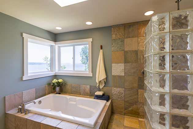
Glass block walls began in the ‘30s, but it didn’t really become a “thing” until the ‘80s. By this time, tens of thousands of homes had this cringy design. It’s phased out now, thank goodness, but some homes still contain lingering reminders of this horrible design choice, usually featured in bathrooms.
And these blocks are not a cheap addition to your home! You need to be serious about this design choice before you put it in your home because one window can cost you upwards of $1,000, which translates to about $15 a block, with certain types of frosted or colored blocks can cost about $50.
Water Beds
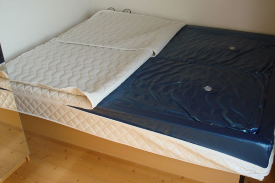
Although they're impractically big and clunky, waterbeds became incredibly popular after being patented in 1971. Their sexy image was perfect for would-be "ladies men," and added mood lighting plus a velvet bedspread completed the look. Since their heyday, water beds have (thankfully) digressed to being campy, annoying, and cheesy.
What exactly is a water bed, you ask? This fun invention is basically just a vinyl mattress filled with water that was initially used in the 19th century for hospital patients. The main reason this cushy mattress went out of style boiled down to the cost of maintenance. From conditioning the vinyl and patching leaks to actually filling up the bed with water, people quickly realized that nobody has time for that mess.
Country Chic

The 1980s saw muted baby blues paired with geese motifs sprinkled across kitchens and various other rooms of the house. Throw in a few rooster figurines here and there, some "vintage" wooden cut-outs, dusty rose accents, and flea market knickknacks on every spare surface, and congrats! You've accessed the "country" look.
Country chic makes sense for some households... if the structure was built in the '40s. Reserve the goose wallpaper and pastel pinks and blues for the baby room. In fact, it's best to avoid wallpaper unless is the most universal motif that you can manage because we all know how much of a hassle it is to scrape that stuff off after ten years and you realize it looks terrible.
Pink Everything
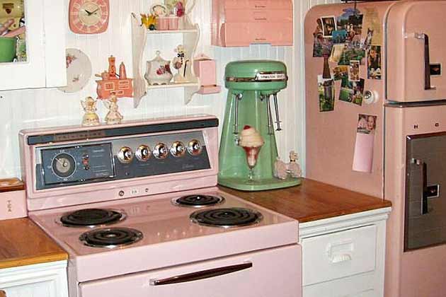
The ‘50s brought on the pink-pocalypse. The kitchen and the bathroom were the main victims of this pink overload. The cabinets, the fridge, the toilet, the sink—it didn’t matter. All of it was pink. Nothing against pink. Pink is beautiful and pretty and valid. But remember what we said about the Barbie Dream House? You don't live there and shouldn't pretend that you do.
There's something exceptionally charming about a cleverly decorated and color-coordinated room, but that typically follows the basic rules of color theory. You know, tasteful arrangements of complementary colors, no clashing hues -- things like that. Unfortunately, the concept of "monochrome" has been severely mistranslated to mean as long as the colors are pink, then it matches. No!
Sponge Painting
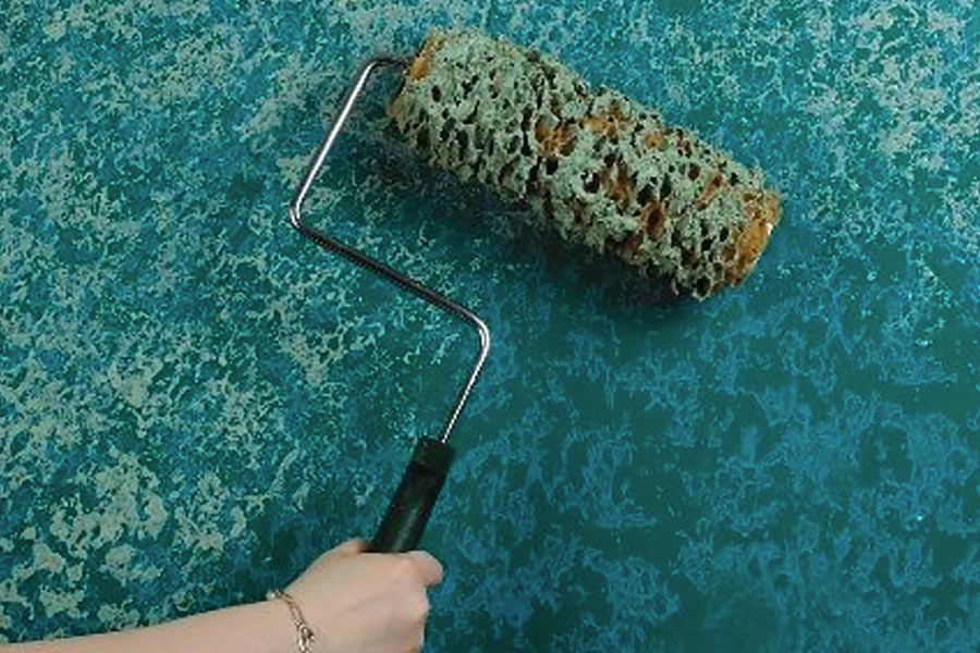
There was a pineapple under the sea... Oh, wait -- this isn't a weirdly realistic Spongebob Squarepants episode? No? Then why are we taking sponges to the wall? Many different decades saw their own version of sponge painting, whether it was for texture or to create a multi-colored look. Today, this just looks cheap and tacky.
Flat, matte walls are a much better option and less time-intensive. Plus, think of how much paint is wasted when you use sponge application techniques. Sponges are meant to absorb, so say sayonara to a quarter of your paint supply. At least you have an uneven and outdated paint job now. Congrats!
Bad Paneling
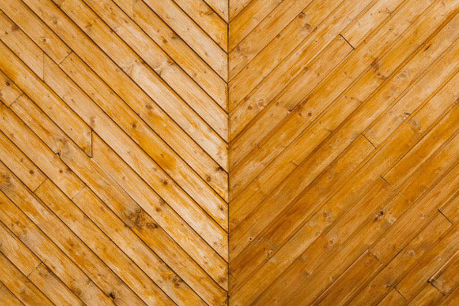
We all love natural wood textures, especially as the population grows more educated regarding the damaging effects of plastic overconsumption. Wood should also be used consciously as a building material, like anything else really, and a master craftsman can churn out beautiful handmade pieces that are unique to your home and personality unlike anything churned out by large corporations.
Unfortunately, many of us don't have the drive or money to invest in the best of the best wood paneling for our homes. It is unclear when bad paneling began, although it certainly flourished in the 1970s. The ugliest paneling had exaggerated wood grain and fake wood knots. There was also "knotty pine" furniture if having it on the walls of the den wasn't enough.
Big Ruffles
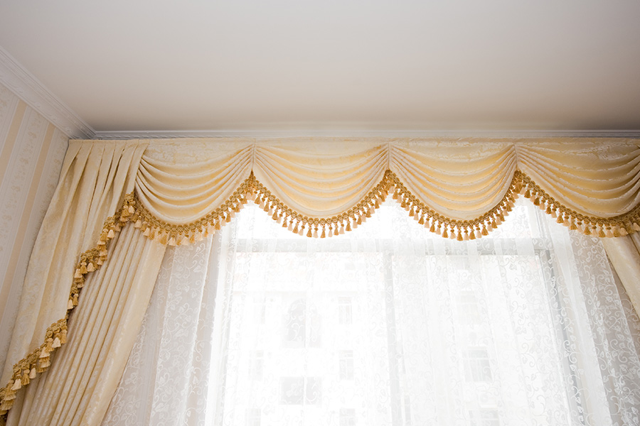
Though this curtain trend is primarily lived in the 1980s, it also appeared on bedspreads, table cloths, and any other fabric surface people could get their hands on. Fabric was tightly gathered, draped, and ballooned into billowy poofs, all in an attempt to resemble Princess Diana's wedding dress. A noble cause, to be sure, but not exactly timely.
Ruffled curtains do have their time and place these days, usually reserved for English palaces, five-star hotels, and overpriced wedding venues. So don't get us wrong, they can really elevate a space to a level of boujee celebration. The problems arise with an oversaturation of the texture in one dedicated space and are terribly exacerbated by gaudy, outdated patterns.
Foil Wallpaper

On an accent wall, this type of wallpaper can really make a room pop, especially if you're going for a retro-inspired space without wanting to engage in fancy painting techniques. But on all four walls, however, this wallpaper reflects way too much light to sit comfortably in a room. Honestly, it’s just plain painful for your delicate eyes!
And if you thought applying paint to walls was tedious enough, don't even get us started on the process of wallpaper application. Add foil into the mix, and you're risking losing a lot of hair after pulling it out from frustration. The application process needs to be pretty precise if you want to maximize the shine and reflectivity of the material, which is the whole point, right?
Inflatable Furniture

The '90s brought us inflatable furniture. It's like taking a beach vacation home with you! If you decide to follow this trend, your home will end up looking like a frat house on a budget. If that's your thing, go for it, but for the rest of you, save it for camping.
If you must use this furniture somewhere that isn't by a body of water, a kids' room is a more appropriate spot. It could actually be a really fun piece for them to use instead of having to invest in high price wood pieces that they'll end up spilling glitter glue all over.
Vinyl Dining Tables

When the space-age futuristic theme took over, vinyl dining sets became incredibly popular. This cringy trend started to take hold in the ‘50s and was a nice break from ruffles for a few decades. They were easy to clean but had relatively few benefits compared to the very obvious cons.
A great aspect of this furniture is the range of colors you can choose from to complement any space, but it doesn't exactly age well like a higher-quality leather chair would. And while vinyl is easy to clean, vegan, and doesn't fade quickly, this type of furniture tear easily, especially when using it on a daily basis.
Carpeted Walls
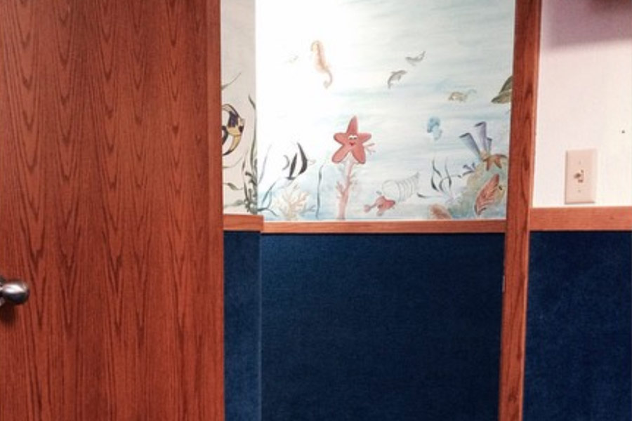
Not content with being long and shaggy on the floor, 1970s carpet began to climb the walls in a horror movie fashion. It seemed to be the most popular in family rooms or dens, but no room was completely safe from the creeping trend. We understand the appeal of having everything cozy and warm, but this is a bit too far.
We don't even want to think about the upkeep required to maintain these walls. Walls are typically neglected during daily and weekly cleaning sessions, so adding carpet on the wall not only increases the amount of cleaning you'll have to do, but it's such an awkward angle for... brushing? Vacuuming? Whatever.
Beaded Curtains
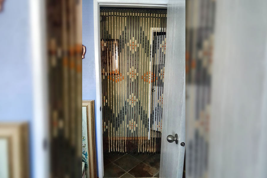
There's something quite ethereal about beaded curtains in certain spaces, like a hippie's house or psychic lounge for a palm reading. You can't deny that they're just plain fun! The United States in the 1960s was influenced by Asian culture, which isn't a bad thing on the surface. Unfortunately, we distorted that influence into something no one ever wants to see in a house again.
Let's be honest, if your house doesn't have a certain "vibe," beaded curtains don't belong in that space. It's completely unnecessary and actually pretty annoying. They can be a fun alternative for a privacy curtain, but if you have any four-legged friends sniffing around, dangling beads are screaming to be torn down by their playful paws. Also, this decoration is NOT safe for babies, so keep that in mind!
Chunky, Gold Furniture

The glamour of the 1920s brought the world chunky, metal, overly fancy furniture, and an unhealthy obsession with the glitzy and expensive. Think The Great Gatsby, and you'll understand what we mean. But for this day and age, chunky gold furniture is just plain creepy, if you catch our drift.
Gilded edges on furniture looks like they should belong on the set of an action film for when the protagonist tries to invade the villain's glorious mansion. Not everything needs to look like it cost three paychecks to pay for. There's something charming about lowkey, comfy pieces for the home that you'll actually sit on every day.
Swinging Egg Chairs
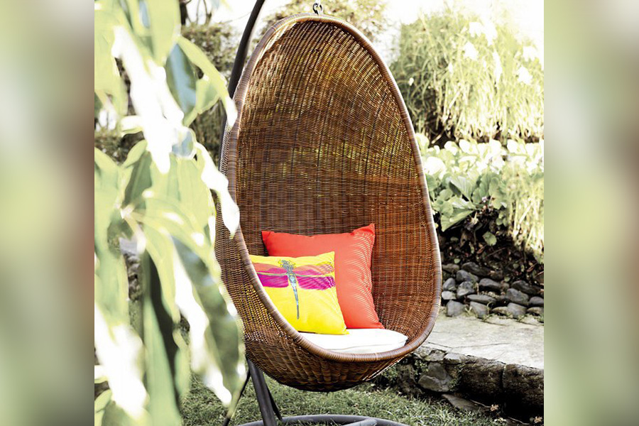
Originally Danish high design, egg chairs are a modern classic. By the 1960s, they made people look as if they were actually in an egg. The feeling of comfort and security the shape of the chair provides is incredibly appealing for many people. A tasteful addition of the furniture to your outdoor space or sunroom can be super cute!
Unfortunately, we can't say that this trend doesn't still make us cringe inside. The fact that the largest appeal of this chair is its ability to hang automatically limits who can use it. The maximum weight capacity ranges from chair to chair, but they're not exactly the sturdiest pieces. Also, the price can be a major con as a piece that probably won't be used through every season and can't be relied on to retain its quality.
Plastic Furniture Covers

Almost every '90s sitcom had a grandmother’s house with plastic furniture covers. If you’re that paranoid about your couch getting ruined, it should probably be preserved in storage. The whole point of a couch is to use it. That means sitting on it comfortably without a plastic barrier separating you from the fabric.
Not only is plastic waste incredibly damaging for the environment, but the process of producing plastic also isn't much better. The monetary cost of these covers might not be steep, but the cost of the climate is much higher. It's not worth buying this product because you'll end up disposing of it soon enough after you realize it looks terrible.
Macrame
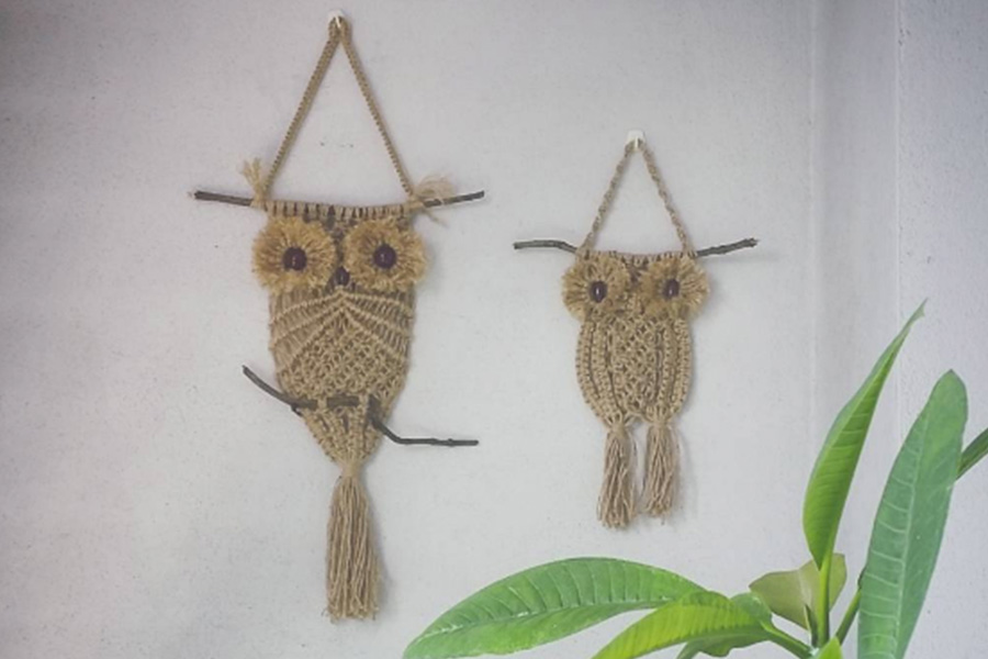
The lost art of knotting cords of various materials is known as macrame, and it's certainly becoming popular again as people invest more time in hands-on hobbies. The quintessential examples in homes were wall hangings and plant holders. Their abundance certainly supplied garage sales throughout the 1980s and 1990s after the explosion of the trend in the '70s.
Macrame is a great option for decorating your house with hanging plants and potholders, but we advise against making them yourselves if you're not particularly patient. And please, for the love of all things holy, don't plan a date around macrame making with your significant other unless you're both working on your own piece. Trust us on this one.
Optical Illusion Wallpaper
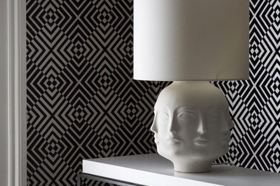
These wallpapers weren’t made with optical illusion in mind, but their patterns created them anyway. Unless you want your guests’ eyes to hurt when they walk in a room -- and more importantly, your own eyes because you'll be the one looking at it every day -- avoid this dated trend.
Think back to what we said about the foil wallpaper. It can make for a neat accent wall but don't subject yourself to applying the stuff everywhere or you'll regret it for many, many reasons. Not only is the process physically taxing, but such heavy designs can make your space feel more enclosed than it already is.
Overzealous Chandeliers

Chunky gold furniture has a good friend in gaudy chandeliers. Because the '20s was the decade of glamour, everyone wanted a piece of glitz in their home. This demand meant even middle-class families tried to fill their homes with over-the-top chandeliers. They simply made homes look smaller and creepier rather than fancier.
A chandelier in your formal dining room is fine, if not expected. But it can feel out of place if the rest of your home embodies more modern trends like monochrome minimalism or vintage chic. Neither of those styles is screaming for a gaudy light fixture that's a pain to clean and eats up electricity.
Crazy Carpet Colors
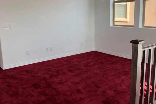
Okay, where did the obsession with carpet in the mid-'20th century come from? From shag to wall coverings, you couldn't escape this cushy material or its array of color choices. Crazy carpet colors are another trend that’s leftover from the ‘60s and ‘70s. For some reason, people thought it was a great idea to have green or red carpet.
In today's day and age, modern decorators are knowledgeable enough to realize that wildly dyed carpet looks incredibly tacky. That's not to say that you can't invest in colored carpeting to a tasteful degree, but it takes a specific person to really pull it off. When in doubt, stick with wood floors. They're inherently neutral, forgiving, and much easier to clean.
Brass and Gold Light Fixtures
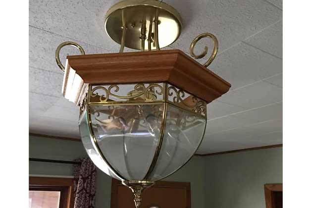
As evidenced by the golden furniture we mentioned earlier, brass and gold tones really hung around for a while as furniture, wallpaper, and even light fixtures. Today, the overdependence on these materials for home decoration just makes us cringe. Nowadays, people are painting their old light fixtures black or white as a neutral base for their other decor.
That's really the problem with overdone brass and gold light fixtures. These pieces shouldn't draw all the attention away from your other decor, like paintings, vases, and rugs. Their primary purpose is to light the room, and nobody needs to get eye damage from constantly looking at the blinding light fixtures because they're the most interesting part of the room.
Popcorn Ceilings
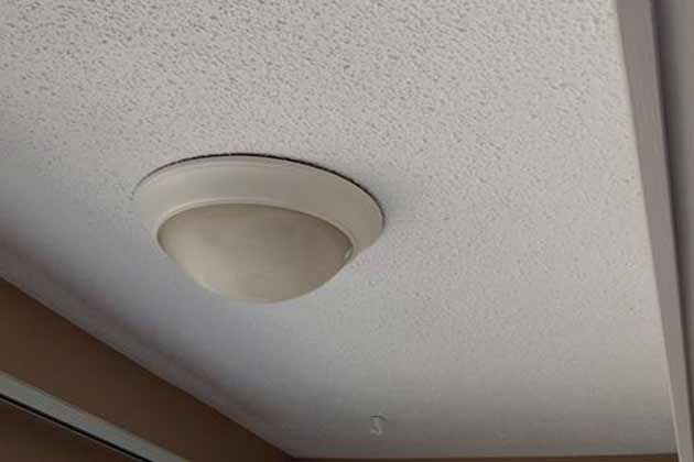
Popcorn ceilings may have added a little pizzazz back in the day, but now they’re one of the most annoying things in a home. This trend is leftover from the ‘70s and ‘80s, a time when textured ceilings were incredibly popular and prevalent in many homes if they had lower ceilings that were more noticeable.
Name one person who likes when something sheds on them. Even if it's their beloved pet or their own hair, shedding is gross and we all want to avoid it at all costs. So why would you want a ceiling that sheds on you, too? It's honestly kind of offensive that they named this trend after a yummy snack because nothing about it is tasteful in the slightest.
Tile Countertops
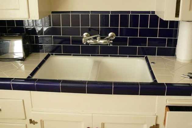
Now, it’s all about granite countertops, thank goodness. Tile countertops seem like they're a fun, unique way to spice up your kitchen decor, but all they do is make your surfaces blend into the background and shrink your space.
Plus, they're not even that durable even though you'll be using that space daily. Chipping tile is not fun to deal with but incredibly likely to occur with these countertops.
Ditsy Florals

One consistent theme running throughout these cringy home decor trends is this: the floral patterning. Ditsy florals were a leading trend for quite a while, and this fad became incredibly popular during the ‘60s and ‘70s. It could be an advantage to some people that their designs scream “flower power,” but it’s mainly something that makes interior decorators hate their clients.
Just because florals are a spring fashion trend doesn't mean that the pattern transitions well into a routinely lived-in space. Strike a good balance between retro and modern by sprinkling in heavy patterns throughout your decor in small sections with neutral color blocking acting as the foundation. That way you won't feel like you're being buried alive by flowers even if you haven't stepped outside of the house.
Tie-Dye Furniture

What wasn’t tie-dye in the ‘60s and ‘70s? This technique has it's season of popularity every ten years or so in the fashion industry, and we've come full circle with these DIY clothes in this new decade. Yet tie-dye furniture was one thing that never should have caught on. At least no two pieces looked alike, so people had that going for them. Each one was uniquely ugly.
The main issue with tie-dye furniture isn't the concept of tie-dye itself, but its relation to the rest of the furniture in the room. Tie-dye is known for it's unpredictable patterns and bright mix of colors, so unless your crib is a psychedelic paradise, your furniture is going to stick out like a sore, multicolored thumb.
Oak Cabinets
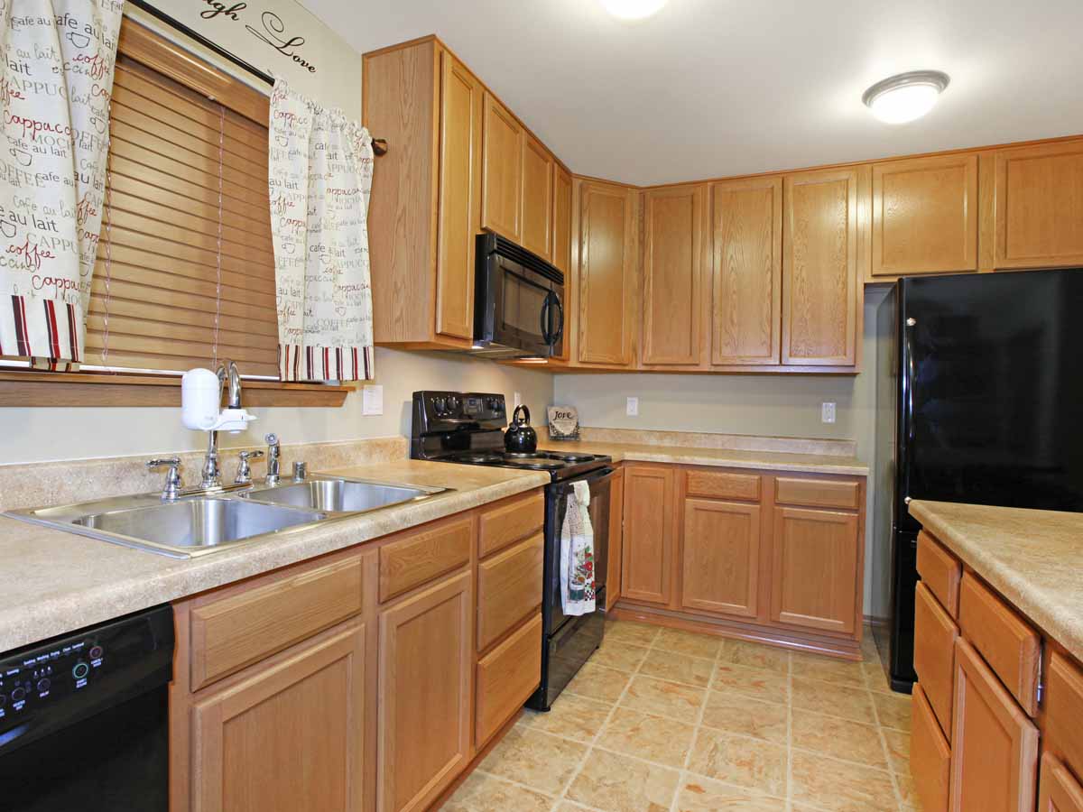
Oh, oak cabinets, you’ve been the bane of homeowners' lives for countless years at this point. Back in the day, homeowners were proud to show off that their cabinets were made of REAL oak. For those that couldn’t afford them, they even settled for cheaper oak veneers! However, that golden wood went on to become something we all hated.
Many people still swear by their oak, saying they’ll never be out of style. Those people are completely delusional. No one likes oak cabinets anymore. If they still have them in their homes, they’re actively planning their demise. People would rather cover-up that ugly oak with a cheap cabinet paint kit from Lowes rather than live with them.
Cherry Wood Furniture
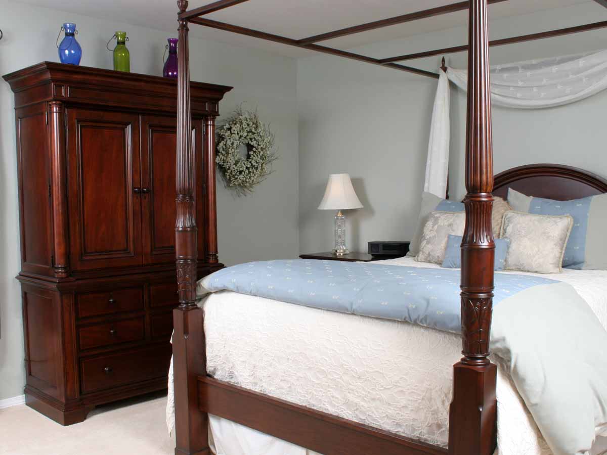
Dark cherry wood furniture was all the rage for a few decades. However, when people realized that those dark furniture sets made their home look dark and depressing, they started opting for different stains and finishes. What was once a luxury now can be found at consignment stores everywhere. Cherry wood is out and has been since at least 2004.
This furniture does not go with any modern color scheme or design. If you’re that desperate to cling to that tired furniture, at least give it a nice refresh with a new stain or paint. Furniture is expensive, we understand, but whatever you must do to get a new look we support you. Take that cherry wood to the donation center and get something more up-to-date.
Kitchen Ivy
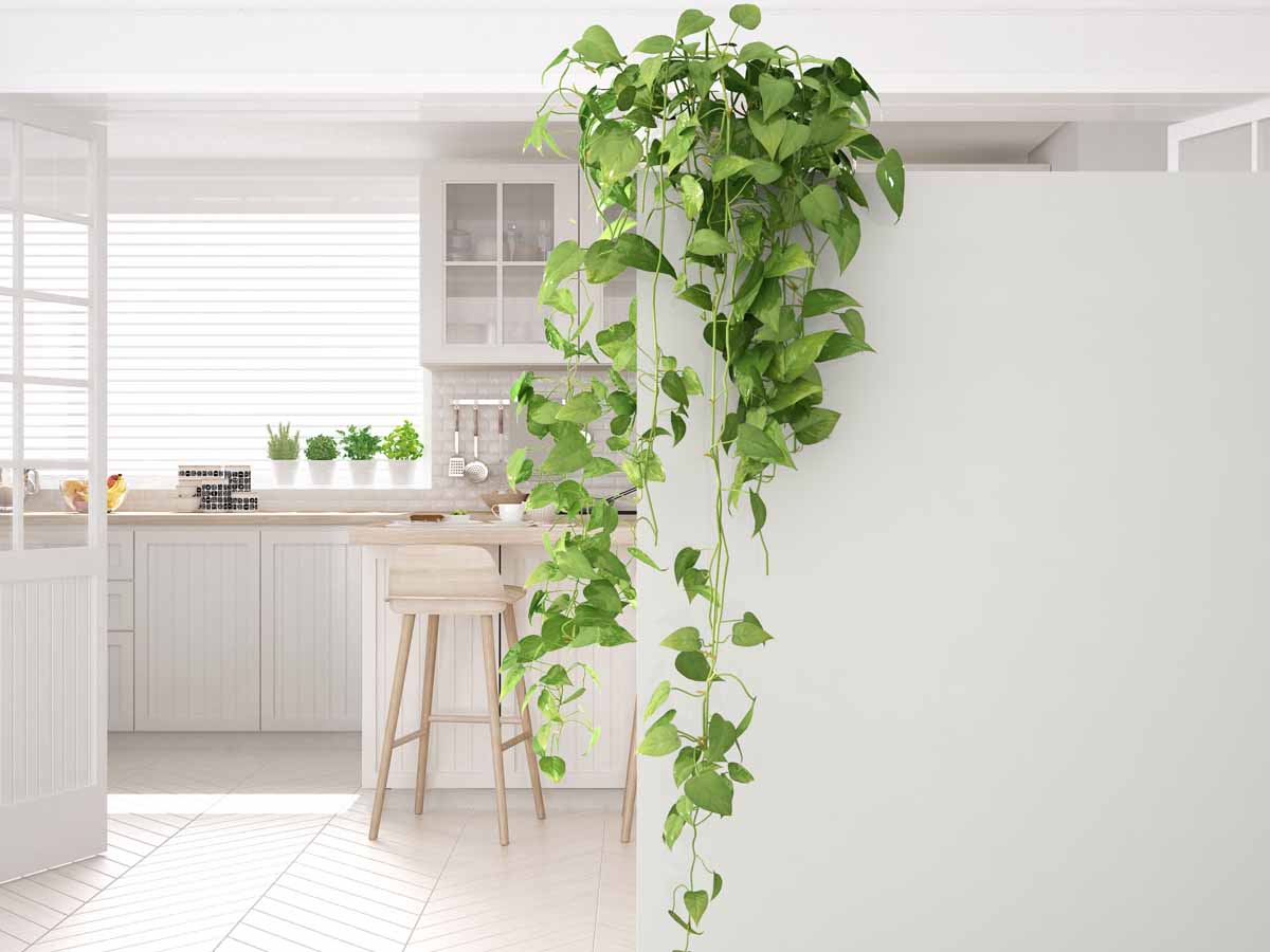
Back in the day, it was a novel idea to adorn the tops of your cabinets with the cheapest, scraggliest strand of faux ivy you could find. People just put them up there and totally forgot about them for 30 years! If you’re not going to put the work in to really decorate above your cabinets, just don’t do it at all!
If you’ve ever ventured to the tops of your cabinets, you would know those are poison-ivy dust -traps that are sure to be causing you allergy attacks. These things are useless and very dated. Unless your house is a ‘90s time machine, ditch these crumby vines and put some nice kitchen accessories or baskets above your cabinets.
Kitchen Ferns
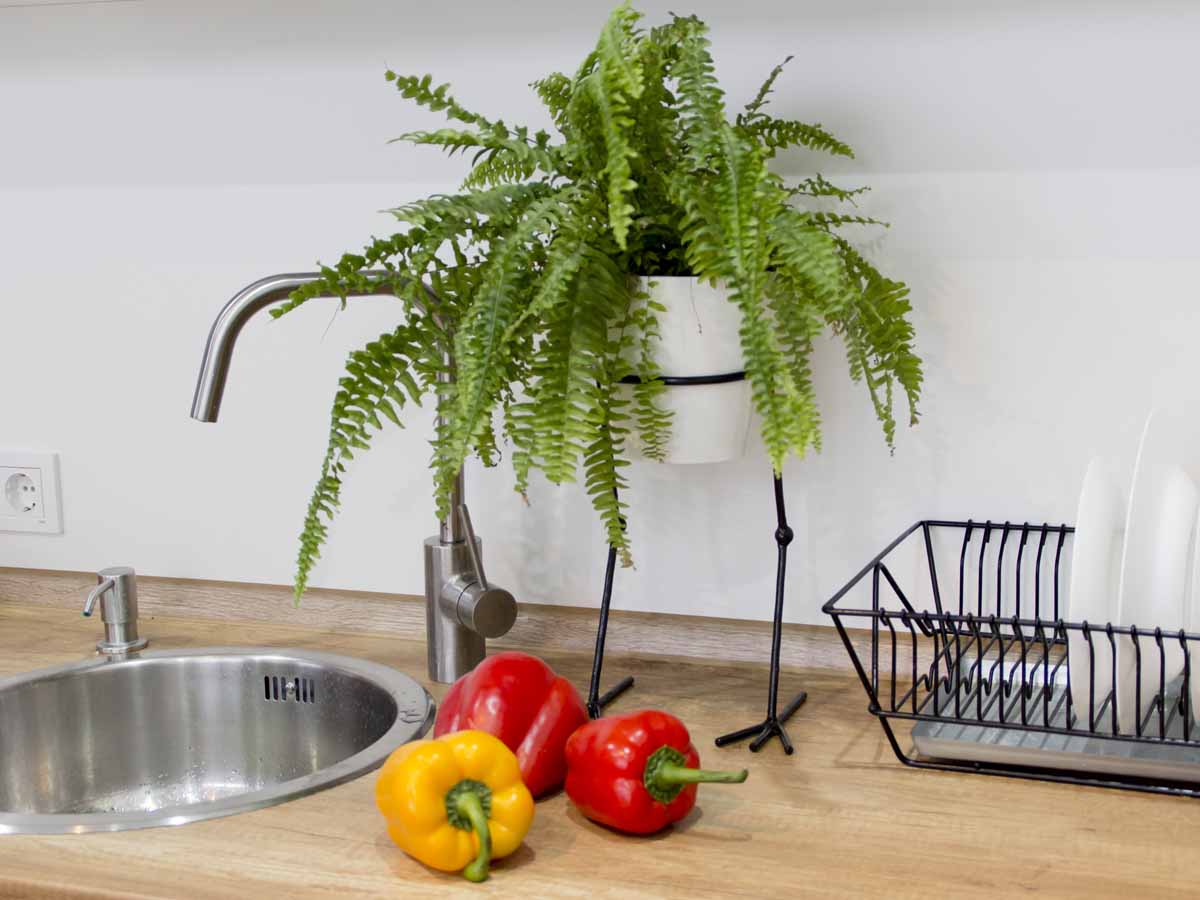
We know buying houseplants is a wonderfully whimsical experience. However, if the thought crosses your mind to buy a fern, remember this bit of advice. Ferns belong in retirement homes, and no one wants to sweep up after that mess anyways. Seriously, those ferns are a nuisance! There are much better houseplants available.
Even if you’re considering putting your ferns on the front porch, just remember that Cracker Barrel does the same thing. Do you want your house to look like a Cracker Barrel? We hope not! Every year there’s a new popular houseplant, so pick one of those instead. Give your ferns to your grandma, and if you are a grandma, we guess you get a free pass on this one.
Floral Wallpaper

Wallpaper, in general, is a no-go. But FLORAL wallpaper? Unless you’re decorating for an editorial magazine, floral wallpaper does not need to be in your house. Your walls should be a neutral space that supports your decor, not the loudest piece of decor in the entire room! Patterned walls close in on your space, suffocating anything else.
Loud patterns on the wall sucks all the air out of the room, and that’s not what today’s trends are all about. If anything, interior design as it stands today verges on bleak! So, floral wallpaper is entirely off the beaten path of what’s approved now. Soak that wallpaper with some fabric softener and peel it off. It’s terrible.
Figurines and Chachkies
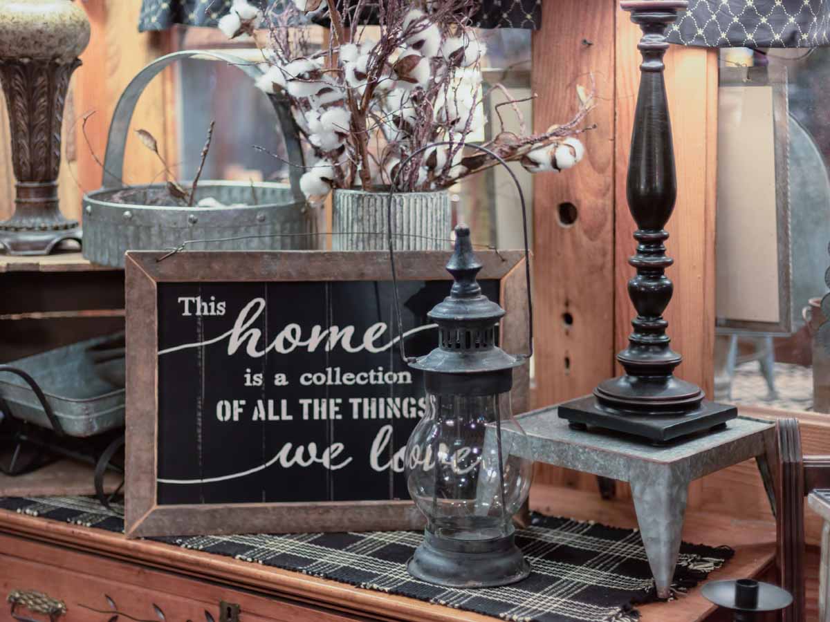
Clutter, in whatever form, is entirely terrible. Figurines and chachkies are things that don’t serve any other purpose other than adding to the clutter of your home. One chachki is perfectly fine, but as with most things, it should be used in moderation. We know those collections are close to your heart but consider storing them out of sight.
Large collections of small items can start to turn your home into a flea market, and no one ever wants that! Keep these collections out of sight, and maybe even in their own designated space. While they make great talking points, a horde of knick-knacks can overwhelm your guests and make them feel uncomfortable.
Wall Clocks
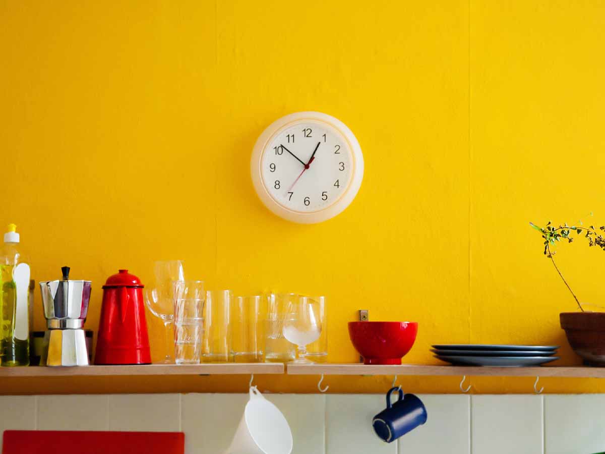
The days of the functional wall clock are over. Gone the way of the wall phone, wall clocks were totally replaced by smartphones. Half of the people out there can’t even read an analog clock, so those people are completely confused by what’s on your wall. We’d even venture that some kids have probably only seen a wall clock like twice in their lives.
For a short time, decorative clocks made a comeback as kind of a vintage feel. People were crowding their walls with giant clocks - some of which didn’t even work. If you’re obsessed with clocks, try a countertop clock as an accent piece on a shelf or something similar. A decorative wall clock is tacky, and a functional clock is unnecessary.
Silk Floral Arrangements

Nothing is more outdated than dusty silk floral arrangements. In grandma houses across America, this is the one thing that will be in every corner, floating shelf and coffee table. Keep the silks at bay. If you need an acronym, just remember this M&M - Modern and Minimal. Silk florals are hit and miss. A few stems could be nice but nothing more.
We know what you’re thinking, and yes, a touch of florals can brighten up any space. However, if those arrangements haven’t been dusted off and refurbished in a year, you’re on the verge of “granny-chic,” and it’s not a good look. Make sure your florals are fresh, but if you can’t commit to that, then don’t even bother.
Appliance Cozies
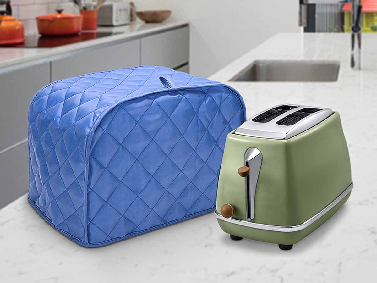
Sometimes it can be necessary to store our appliances on our counter, so someone along the way decided a “Cozy” to cover your small appliances would be genius! They were wrong. Some are crochet, others are quilted, but they’re all hideous. There’s absolutely no reason for these germ and grime traps!
Throw those tacky appliance cozies in the garbage and let that equipment breathe! If you’re that desperate to hide your extra small appliances have a built-in cubby installed in your cabinetry. There are tons of designs specially made for each piece. So, do some searching and find the one that works perfectly for you.
Plastic Left on Lampshades
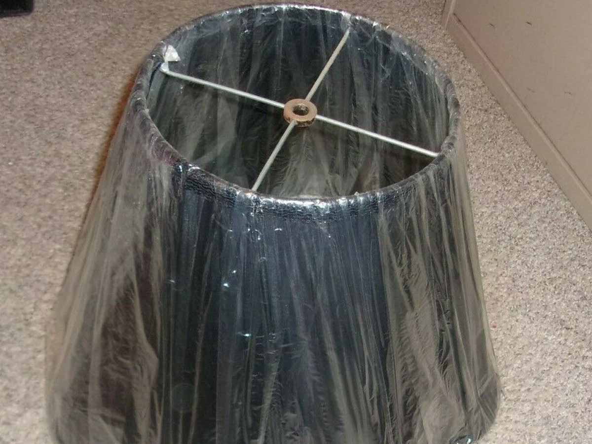
In an effort to preserve the beauty of a lampshade, it was the trend to leave the plastic wrapping on them to protect them from aging. Whoever in their right mind made this a thing, was ridiculous. Doing something like this is like leaving the price tags on all your clothes. You bought it, so use it!
No to mention, that plastic could potentially be a fire hazard! The heat from a bulb could easily set that plastic ablaze in just a few hours of use. This trend is ugly, dangerous, and just all-around silly. Take the wrappers off your lamp shades and just buy a new shade if it starts to look less than desirable one day.
Overbearing Window Treatments
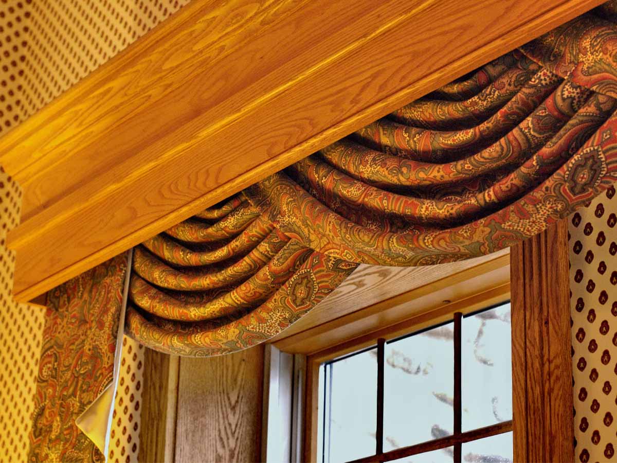
These days, it’s all about light, bright and airy! Excessive window treatments go completely against all those things. Buying curtains, drapes, and valances used to be the main event when decorating a new house. It was almost like the darker they made a space, the better! Now, if your name is Count Dracula that’s fine, but if not… that’s just depressing.
Thick curtains and drapes are a dust and dander trap and having them in your home could cause your allergies to ruin your life. Not to mention the lack of sunlight. Switch those bad boys out for a nice pair of light-filtering curtains, preferably in a light-colored material. Your house will look much more modern and enjoyable.
Brown Carpet

It’s no surprise that carpet of any kind is on this list. Some advocate for ripping all of the carpet out of your home and others say it’s fine just for the bedrooms. However, there’s one carpet that is never okay no matter how you cut it - brown carpet. Sometime after shag carpet and before neutral carpet, brown carpet stepped on the scene.
We’re not sure why anyone would put this in their homes, but for some reason, it was totally a thing. These days if you are going to choose to have carpet in your home, make sure it’s a neutral one that goes with nearly everything. A soft grey or cream is what you’d need to stick with. Otherwise, just rip it all out for LVT.
Brass Cabinet Pulls
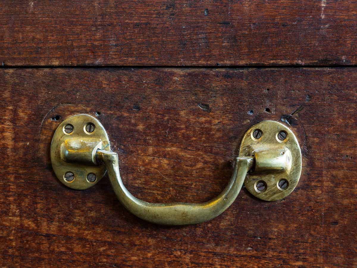
For a moment there, we thought brass was coming back around. Admittedly we all stuck our toe in the trend again a couple of years ago, but luckily, we came to our senses. Brass cabinet pulls (especially combined with tired oak cabinets) are one of the many things that shows a kitchen or bathroom’s age.
Brass was everywhere for several decades, and it’s just time for another finish to have its chance. For cabinets, if you want the “rich” look go for a champagne finish, not a yellow brass. Otherwise, stick with a dark bronze or brushed nickel. After all, it’s just cabinet pulls. So don’t overwhelm your space.
Overhead Cabinet Rope Lights

Accent lighting is amazing and can totally transform a space. However, some people took this trend in the wrong direction. For several years these rope lights were all the rage. People were snaking them around the tops of their cabinets, thinking no one would notice that they weren’t real, professionally installed lighting.
Plot twist, we noticed. If you’re going to light your overhead cabinet space, have the real deal installed! Your lighting will be much more even, and there are even led color-changing bulbs you can use to control the warmth and color of your lighting. We’ll admit that lighting your overhead cabinets is a bit of a splurge. So, if you’re not committed to it, just stick with lighting the underside.
Bird Baths
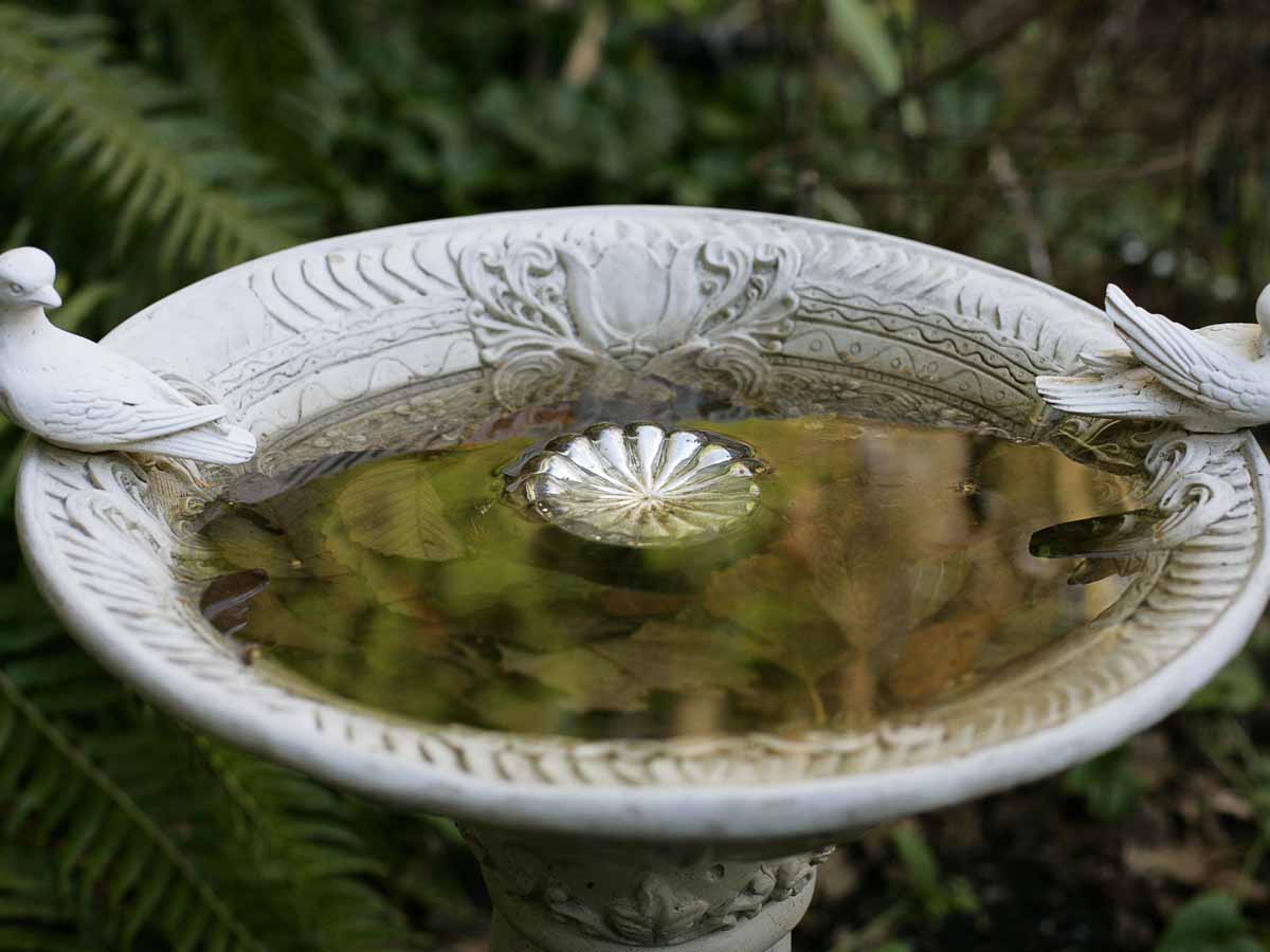
Bird baths at least serve a useful purpose - unlike most things on this list. However, let’s get real about this for a minute. There are several “useful” things that completely become useless because, well.... we’re lazy. It’s just a fact of life, just like that elliptical that’s currently a drying rack for your knits.
Good intentions don’t get you very far, and that’s just the case for that nasty stagnate birdbath. If you were a bird, would you want to take a bath in that? No! So, unless you’re going to care for that birdbath, just don’t bother. Change it out for a fountain or something if you’re just dying for a water feature.
Cat Statues
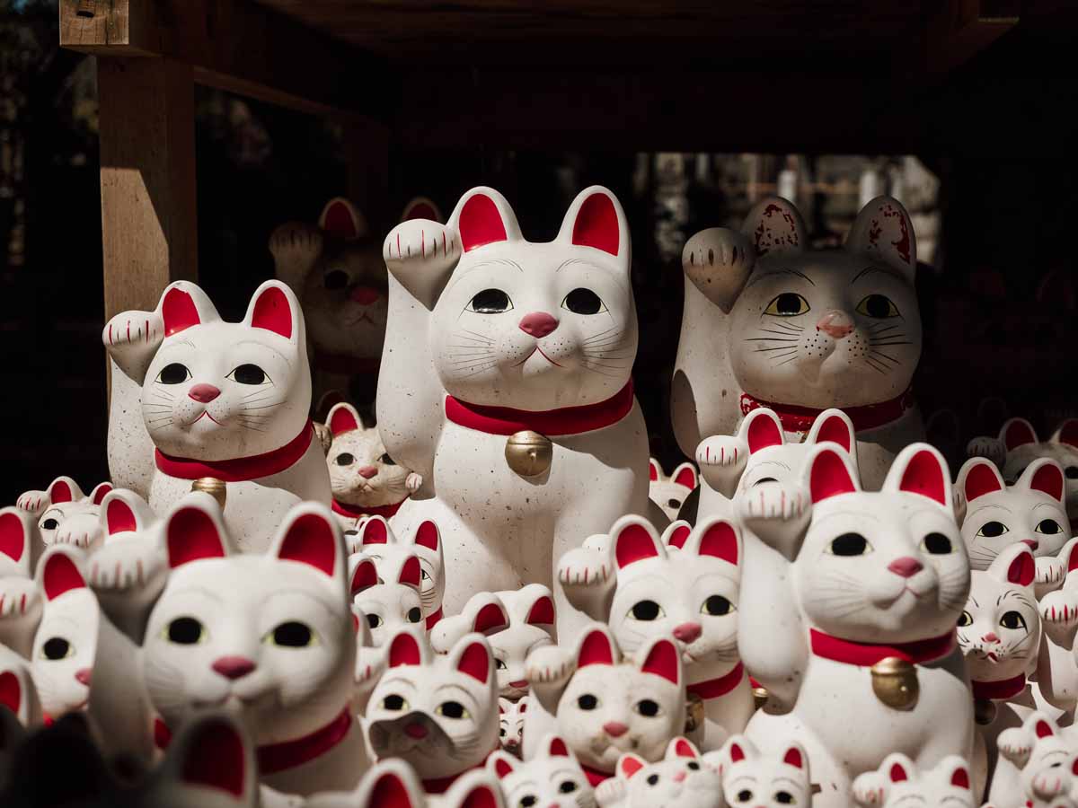
We’re not sure where these creepy, ultra-life-like statues came from (probably the same place as those precious angels) but these faux felines need to become alley-cats. As in, in the trash - in the alley. Cat statues are just always staring, motionlessly judging all of us for our bad life choices! Who wants to live with that?
In all seriousness, if you love cats that much just get a real one. We promise they’ll sit there with the same soul-piercing stare as your statue, and at least bother themselves to knock a few knick-knacks off your shelf. Let's face the music, these cat statues are weird and creepy. Ditch these kitty cats and figure something else out.
Patriotic Décor
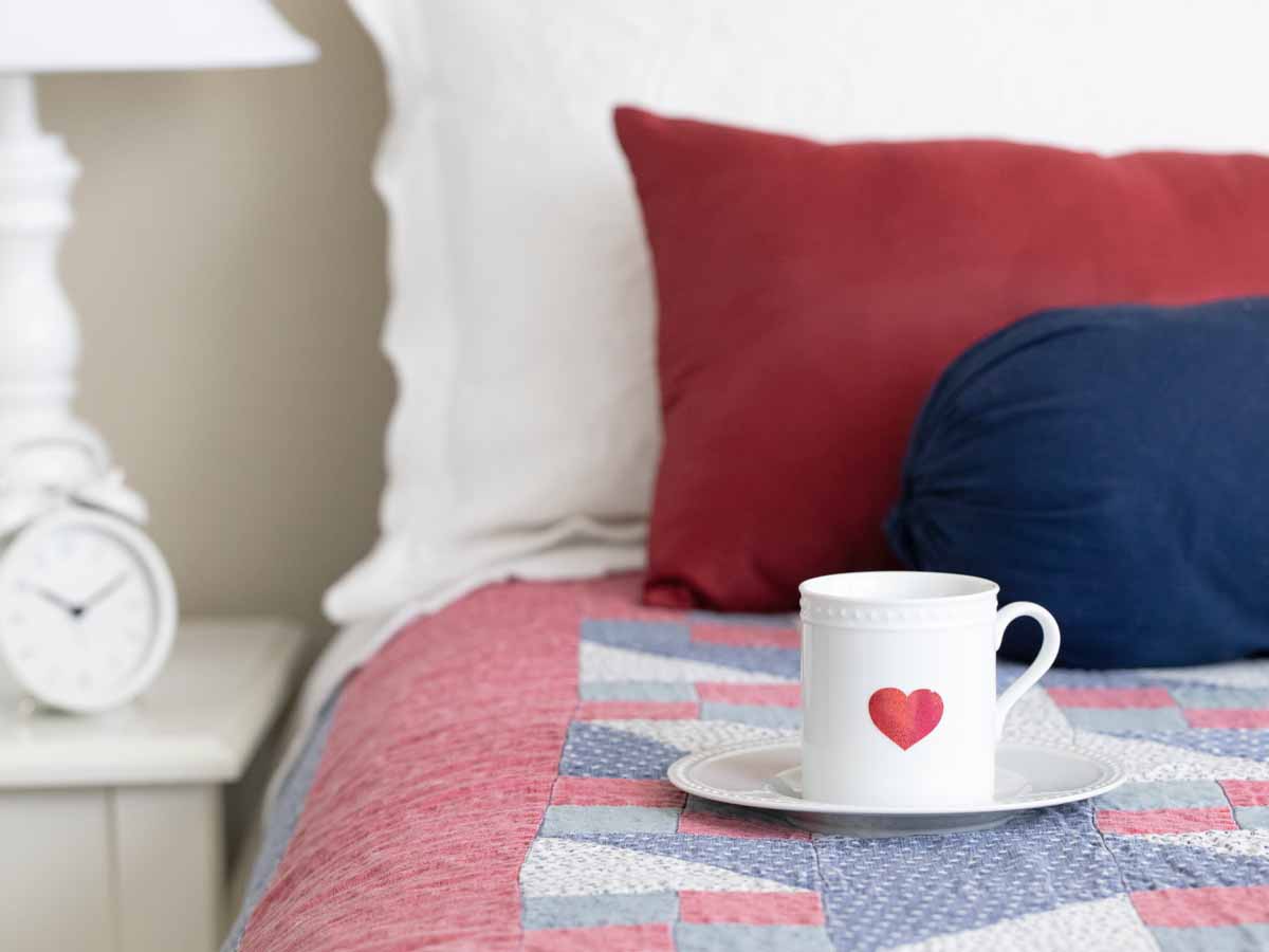
America the beautiful! We love America, and we bet you do too (at least mostly), but sometimes patriotism can go a bit too far. Adorning your home with too much patriotic decor can make your home feel a little uncomfortable. Patriotism definitely has its place and time, like the fourth of July! But sometimes it's nice to get away from it all.
Furthermore, red, white, and blue work great for banks, schools, and government buildings; but in the home, it’s a little overbearing. Not to mention not that pretty to look at. Our recommendation is to bring the patriotic decor out for Independence Day, and then put it back in storage. But the beautiful thing about America is you can do whatever you want to!
Anything Safari Themed
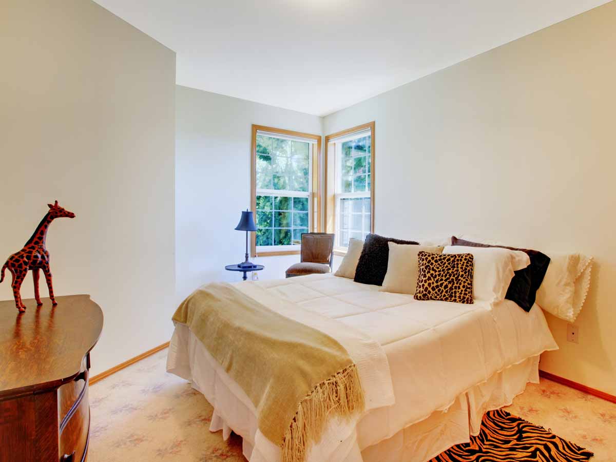
Leopard, giraffe, and zebra print were anywhere and everywhere for YEARS! Our homes literally turned into African safaris, and it was… too much. WAY too much. This theme went so far that there were monkey lamps, bamboo light fixtures, and even lion crown molding! We like accessories as much as the next person, but this was a lot.
There are two types of people in the world, a less is more kind of a person and a more is more kind of person. This trend was for those who genuinely feel like more is more. Now we look back and cringe at how far we took this trend. But at least we found our limits, right?
“Hollywood” Vanity Lighting
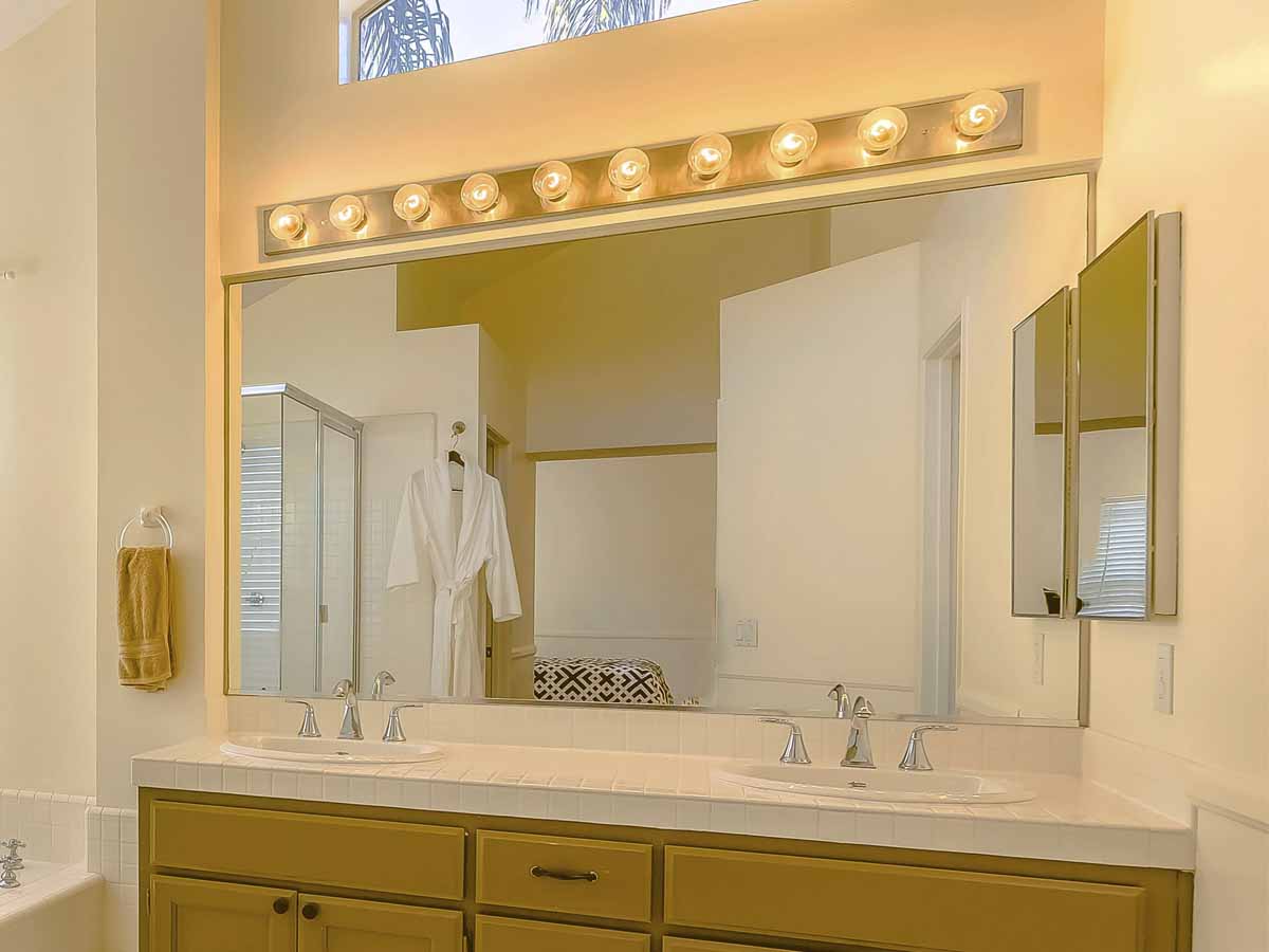
We all want to see our name in lights, but those huge round bulbs are nothing but tacky these days. Having adequate lighting on your vanity is crucial, but there are way better ways to go about this. A light ring and an LED-backlit vanity are just a few examples of updated versions of this trend that perform way better.
Besides being generally tacky, these are pretty difficult to clean. They collect dust like nobody's business and let’s get real, none of us are really going to clean our light bulbs. It’s just not a feasible expectation. Swap these light fixtures out for something that’s much more modern and current. You’ll thank us later.
Coat Racks
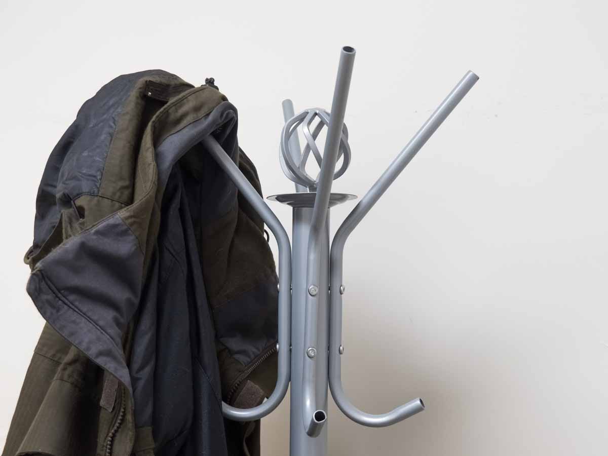
Coat racks are classic pieces of furniture that serve an actual purpose. But just like birdbaths and exercise equipment, nobody ever uses it and it's just another excuse to throw your clothes on something rather than hanging them up in their closet. Coat racks are a useless waste of space that no one actually needs.
If you’re just dying to hang your coat on something when you walk through the door, install some hooks on your wall or something. It’s much more functional and it’s at least more organized than a messy coat rack. Or you could just be an adult and hang it up once you're done. Besides, unless you live in an area that’s constantly cold or rainy, you don’t even need a coat rack! Our cars, houses, and most transportation have air conditioning.
 Author
Alot Living Team
Last Updated: February 18, 2026