Barn Doors
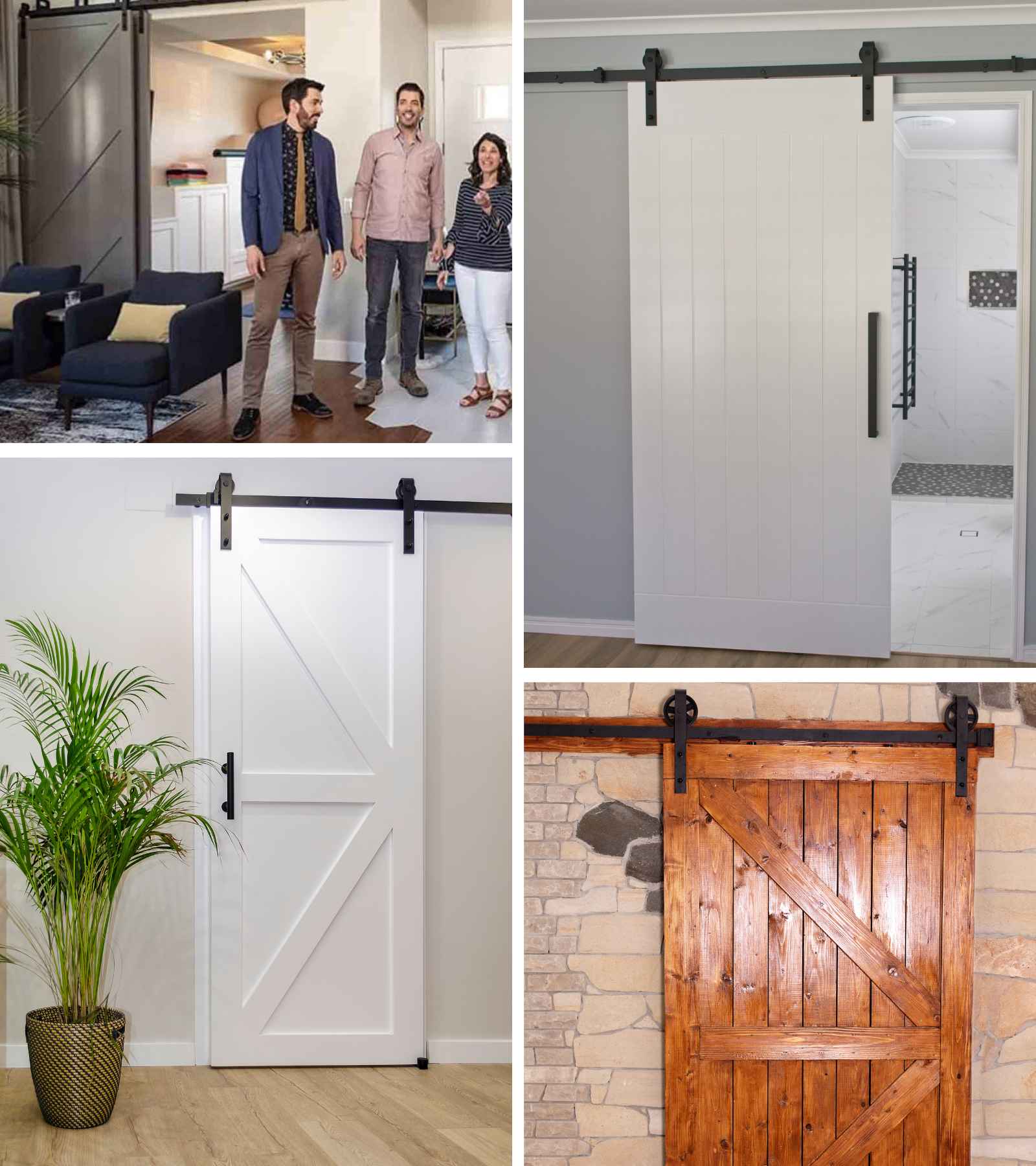
Oh, these again. HGTV you should have known better. Barn doors were all the rage, and there wasn’t a renovation where you didn’t see one. Here’s the problem: these planks of wood on rollers are not functional! They scratch your walls, they never work correctly, and all in all…they’re just not worth it.
Barn doors were one of those trends that anyone could have. It appealed to regular people who wanted something cool in their space. We don’t fault this trend for being accessible…just ugly. A particularly funny result of this trend was those “Barn Door Fails,” where we learned barn doors do not make good bathroom doors!
Cream, Linen and Wood Decor Schemes
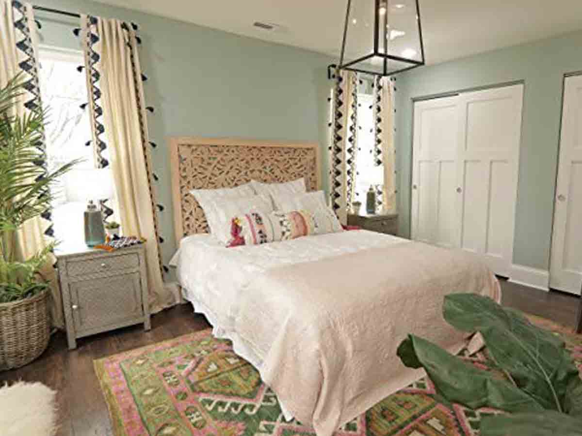
We love creams, linen, and natural wood…however, too much of a good thing starts to turn sour quickly. That’s exactly what happened with this design scheme. HGTV pushed this theme to its max, and now it’s tired and kind of dated. For a few years, it’s all you could find in big box stores!
We love clean decor with some natural elements. There’s a definite reason why these trends were so big, they look great! However, if it's done in excess, it'll start to look like the brown trend of the '90s. Remember when everything was brown?
When done in moderation, this is certainly a nice clean look that's also inviting. Hopefully, this trend cools down a bit, and we can have a little bit of a breather with cream, linen, and wood decor. In the meantime, we’ll keep complaining about not having any other options.
Back Splash Trends
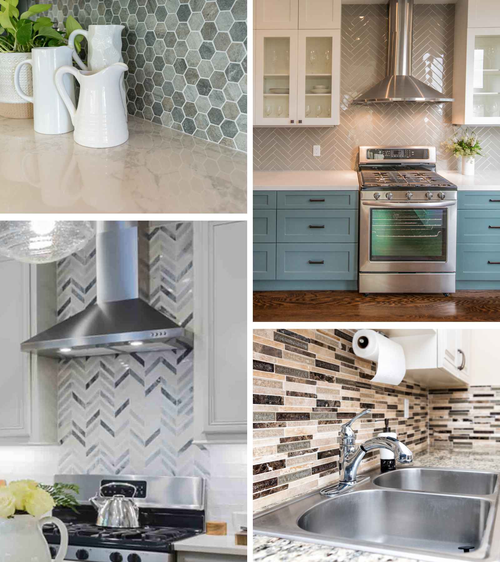
For some reason, the home decor industry just can’t leave tile trends alone! We get it, it’s one of the few places you can add some detail and a little personality, and it not be a jarring mess. However, have you ever bought a home and actually liked the backsplash someone picked out? No! There’s a reason why.
Backsplashes are subjective and because people choose to use this area as a form of self-expression, chances are the next person really isn’t going to vibe with the choice. If you love it, then that's great, but don't expect your neighbor to love it. There's only one surefire way to get something most people like.
No matter how hard you try to get on board with this season's hottest new backsplash tile design, chances are you'll be looking for a replacement soon enough. Our advice is to stick with a timeless tile. Don’t follow this year’s trend, or you’ll end up with the next tacky chevron.
Faux Taxidermy
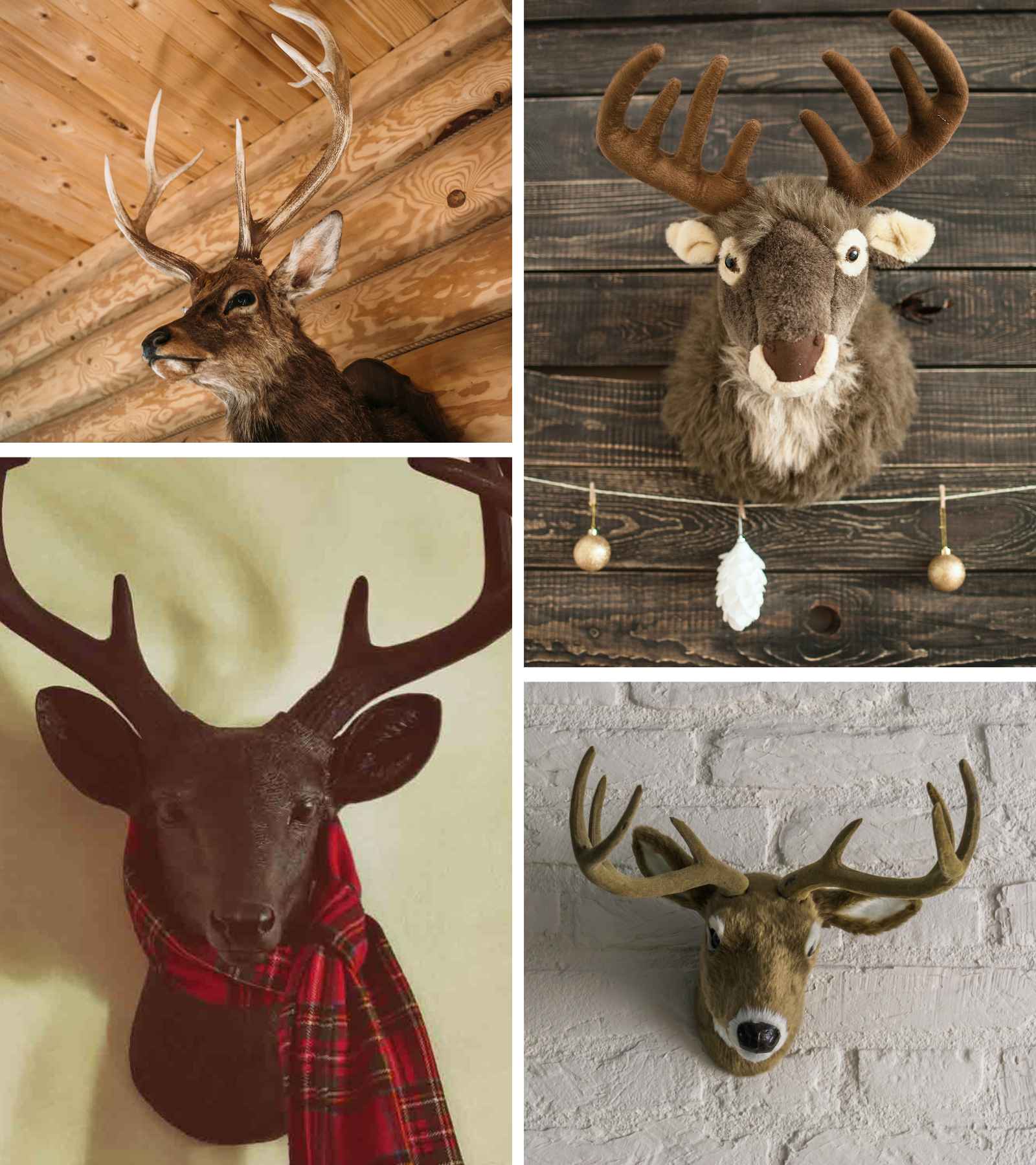
Taxidermy on its own is already a tacky thing to have in a home. Faux taxidermy is that much worse! HGTV is to blame for reviving this trend with a twist. From stuffed animal taxidermy to accessorized thrifted finds we are ready to see this trend go!
Have you ever walked into a person's house and noticed a cow skull hanging on their wall like they live in a saloon straight out of a western movie? This trend took the U.S. by storm in 2015 and we’re still trying to live it down. The trend got so out of hand that they even started dressing the skulls up with little cowboy hats.
Liminal Children’s Rooms
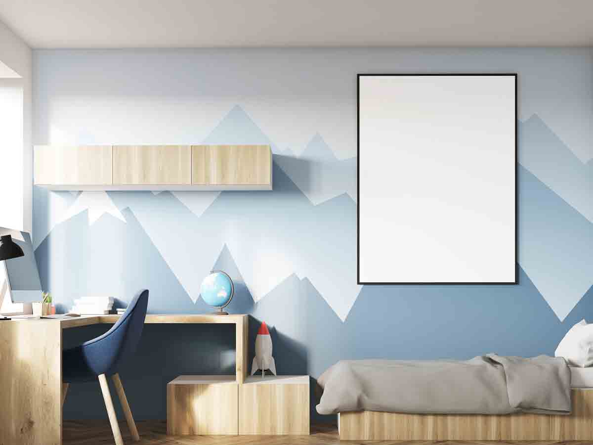
You know something is bad when your fans are regularly complaining about something. One thing that most HGTV viewers have groaned about recently has been the inundation of bleak baby rooms! Nurseries should be full of color and fun things that teach children…not make them feel like they're in a padded room!
It’s honestly pretty sad that children’s decor has gotten so minimal. Childhood is the one time when you can be tacky and playful without being judged for it. Kids are supposed to have weird paint colors and cartoon characters on the wall. Let kids be kids! Let them pick their own decorations and get obsessed with the latest Disney movie.
It’s perfectly fine for kids to have an ugly room…and it doesn’t mean you’re bad at decorating, either. A kids room is supposed to be inviting and make them happy — not make them feel like a 30-year-old HGTV home decorator.
Entryway Benches
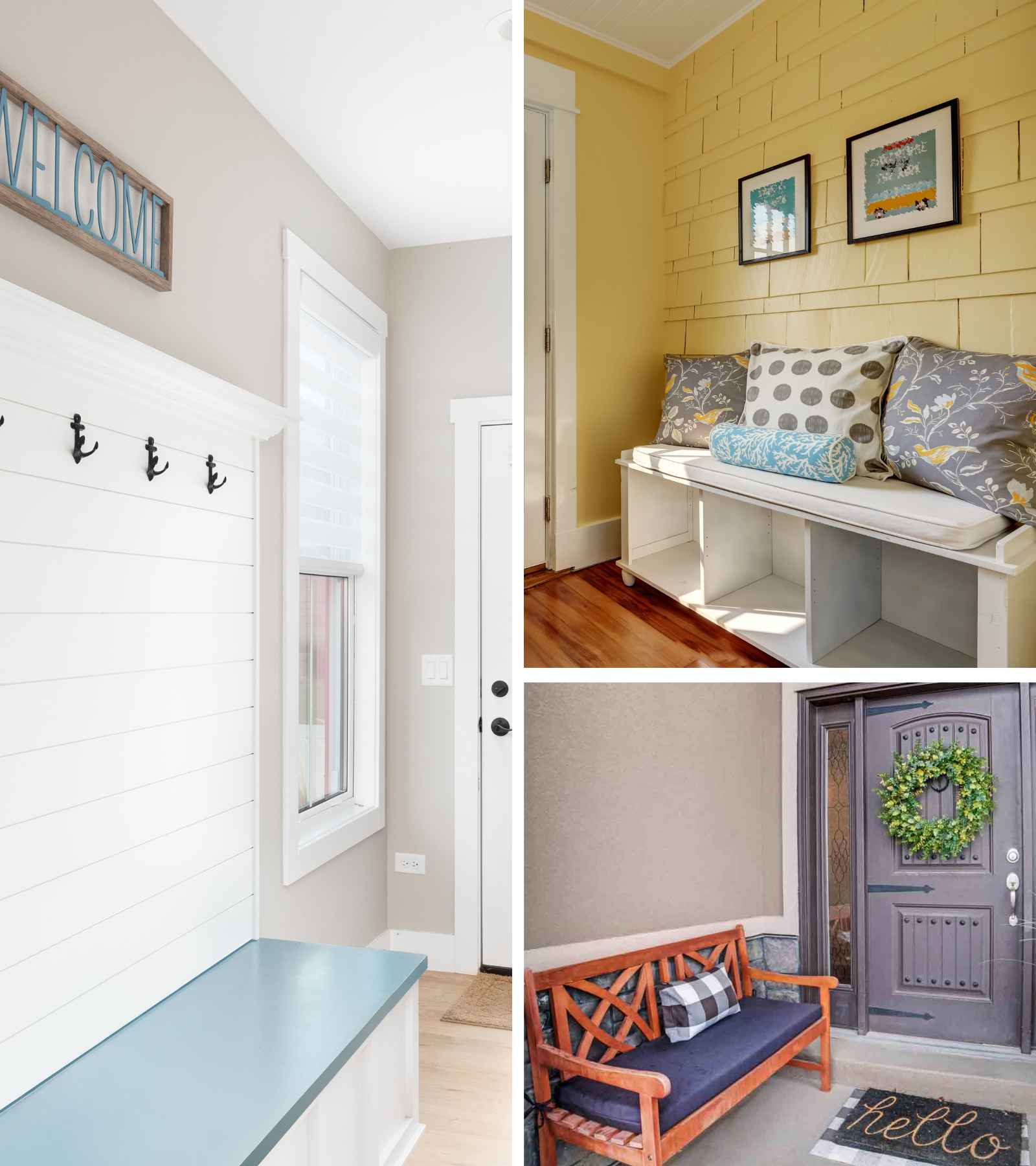
After the invention of the “Mud Room” came the necessity of entryway benches. Benches at the entrance of commercial buildings have been around for hundreds of years, but in the home, it hasn’t been quite necessary. However, in recent years, we haven’t seen an entryway without a bench!
HGTV tries to conjure up another trendy piece of furniture for every space. People saw tiny scenes of homes on TV where every inch of space was decorated. What they didn’t see was how cramped those homes felt in real life when the camera wasn’t perfectly angled.
Nothing is worse than walking into your entryway and having to maneuver around the bench awkwardly. If you want your front to look cozy, try some rocking chairs or a nice little bistro set where you can take your morning coffee. Make the space usable for you — not just pretty for guests.
Mid-Century Modern Revival
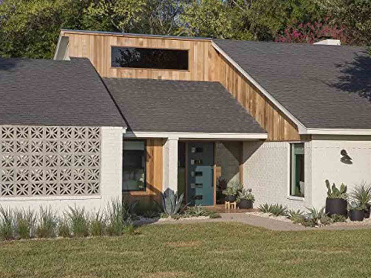
Listen, we love mid-century modern! It’s arguably one of the most balanced home decor trends of all time…but HGTV ruined it. HGTV brought mid-century modern to the mainstream and the design methodology has gone downhill ever since.
Unfortunately, the home decor world was polluted with cheap knock-offs and blasphemous attempts at this wonderful design style and the public has had enough. It’s sad that this wonderful design period has been tainted by the big-box commercial decor industry. Let’s give this trend a rest; maybe it can be done better in a few years.
Overdone Outdoor Spaces
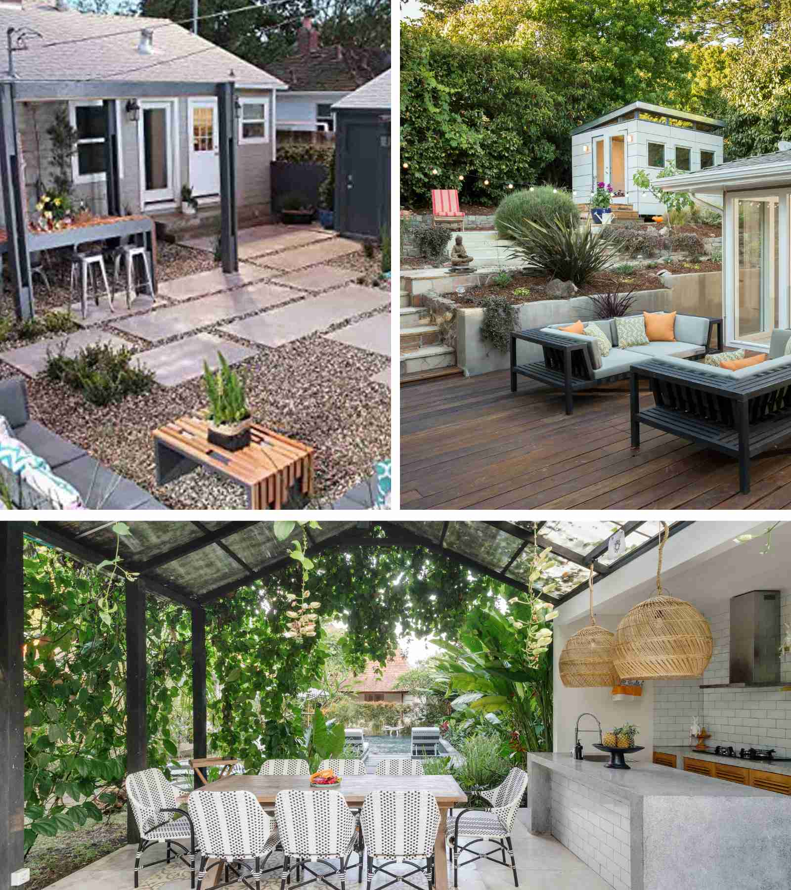
One particularly funny trend we see in all HGTV houses is incredibly overdone outdoor spaces. HGTV influences use the yard to show off their design prowess…we get it; gardening has been a hobby for centuries. However, they’re not just making manicured flowerbeds.
They’re making grade-A money pits! The upkeep of extensive landscaping can grow quite costly. From firepits (gross) to ridiculous outdoor offices (dumb), HGTV is constantly looking for another way to squeeze a buck out of the rest of us. Here’s a bit of advice…you don’t need an outdoor kitchen, office, or sleeping nook. You’ll never use it.
When HGTV remakes someone's home with one of these money pits, they don't even consider the natural ecosystem. One person had to spend thousands a year just to keep their lawn alive after planting non-native plants that were heat-intolerant...in Atlanta! Can you imagine? Low-maintenance lawn all the way.
Fire Pits
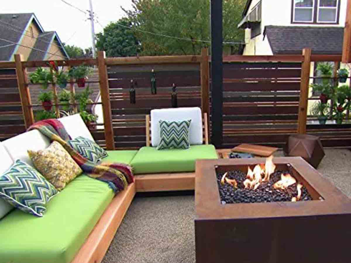
Not every house needs a firepit…there we said it. Half of us out there aren’t responsible enough to handle an open flame, let alone a gaping flaming hole in our yard! Seriously though, people will spend a whole weekend dredging through their Bermuda grass just to build a firepit they’ll use a few times a year.
It’s cool when a campground has a firepit, but if we see one more hole in the ground lined with cheap landscaping stones from Lowes, we’re going to scream! These DIY hell-holes are rarely lined with weed-blocker, so that clean gravel circle around the firepit usually has weeds growing through in less than a month.
We're not even talking about clean-up if you decide you don't want to have a firepit anymore. You'll be picking that gravel out of your grass for years to come, and hopefully, it won't tear up your lawnmower! Instead, just go to a campsite and use their firepit whenever you get a wild hair.
Shiplap
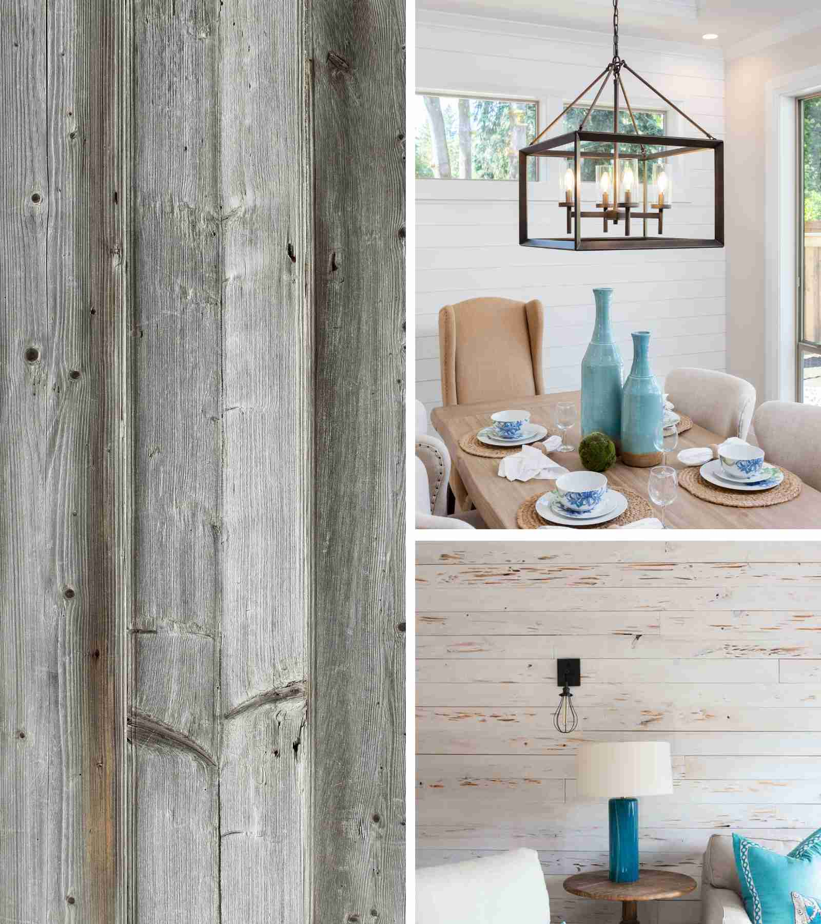
Thanks Joanna Gaines. HGTV, with the help of their favorite fixer-upper, had half of America ripping out their sheetrock and hunting for wooden boards! For those who don’t know, shiplap is horizontal board backing that is commonly found in older homes. Joanna Gaines exposed shiplap in many of her projects, and people lost their minds.
Unless you want your home to look like the inside of a Cracker Barrel, or the outside of a barn…we suggest leaving this trend to those who wish they could relive the dustbowl. To be completely honest, this HGTV trend is just plain dumb. In a few years, people will wholeheartedly regret participating in this fad.
All Black & White Pictures
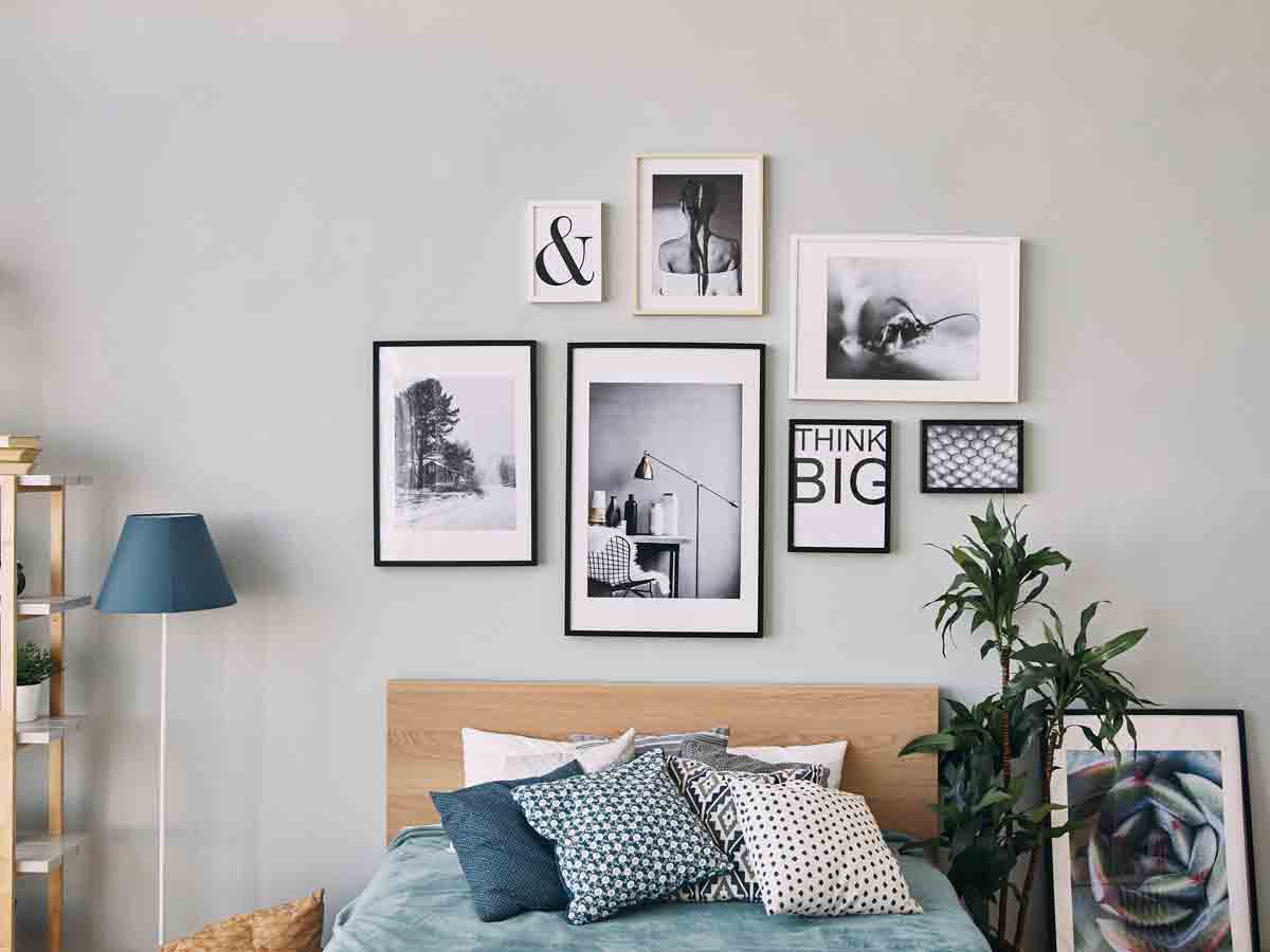
Since when did it become an interior design fail to have pictures of your life on the wall in full color? For some ridiculous reason, people watching HGTV got the notion that having pictures of your life in your house was tacky, and if you were going to have them…they had to be in black and white to match.
This trend is absurd. It’s your house, your family, and your life. Hang the pictures in color! If you’re concerned about them matching, keep groupings of the same photoshoots together, so they at least look similar. Pictures of friends and family are the most beautiful decoration you could have in a home.
Hang that picture of your family when they were acting silly on vacation or the photo you took with your best friend when you were younger! It's the memories that matter, and you're the one that's gonna be looking at them every day. You want to remember those memories vividly!
Putting Packaged Household Items in Unbranded Containers
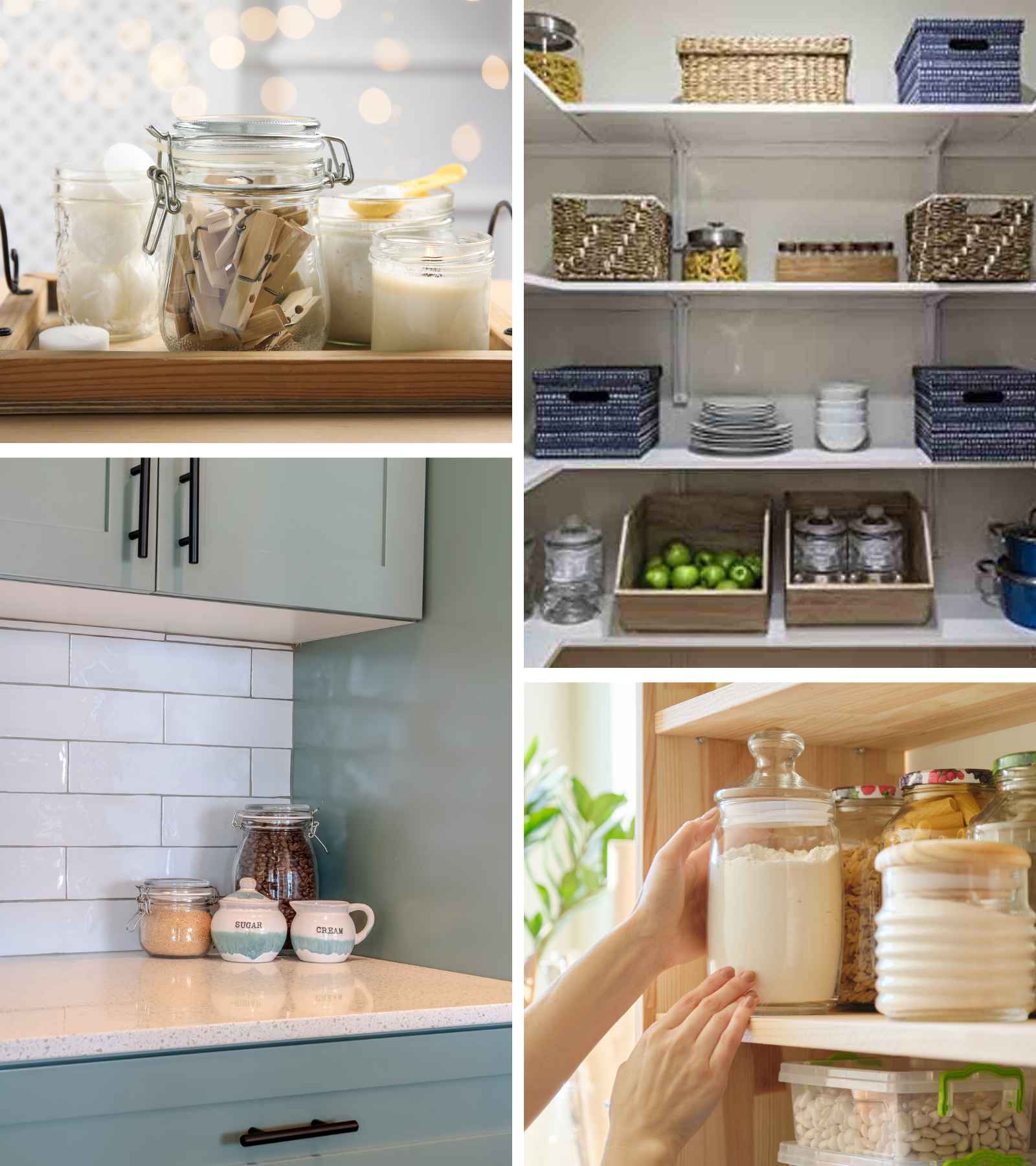
For whatever reason, HGTV convinced millions of people to take their commonly used household items out of their branded containers and put them in neutral unlabeled jars and baskets. Listen, if you don’t want a bag of flour on your countertop, get a container. However, spending hundreds on unlabeled containers is just absurd.
We’re here to tell you that this trend is overrated. Not every room in your house needs to be styled to the nines. It’s okay for your laundry room cabinets to be a little messy. It’s a workspace. Your pantry? It’s storage.
Cram as much as you can in your storage spaces. Yes, it should be organized…but for the love of all things holy, don’t stress yourself out over a tide pod. After all, your neighbors and friends aren't going to open your cabinets to see how organized you keep everything.
Oversized Wall Clocks
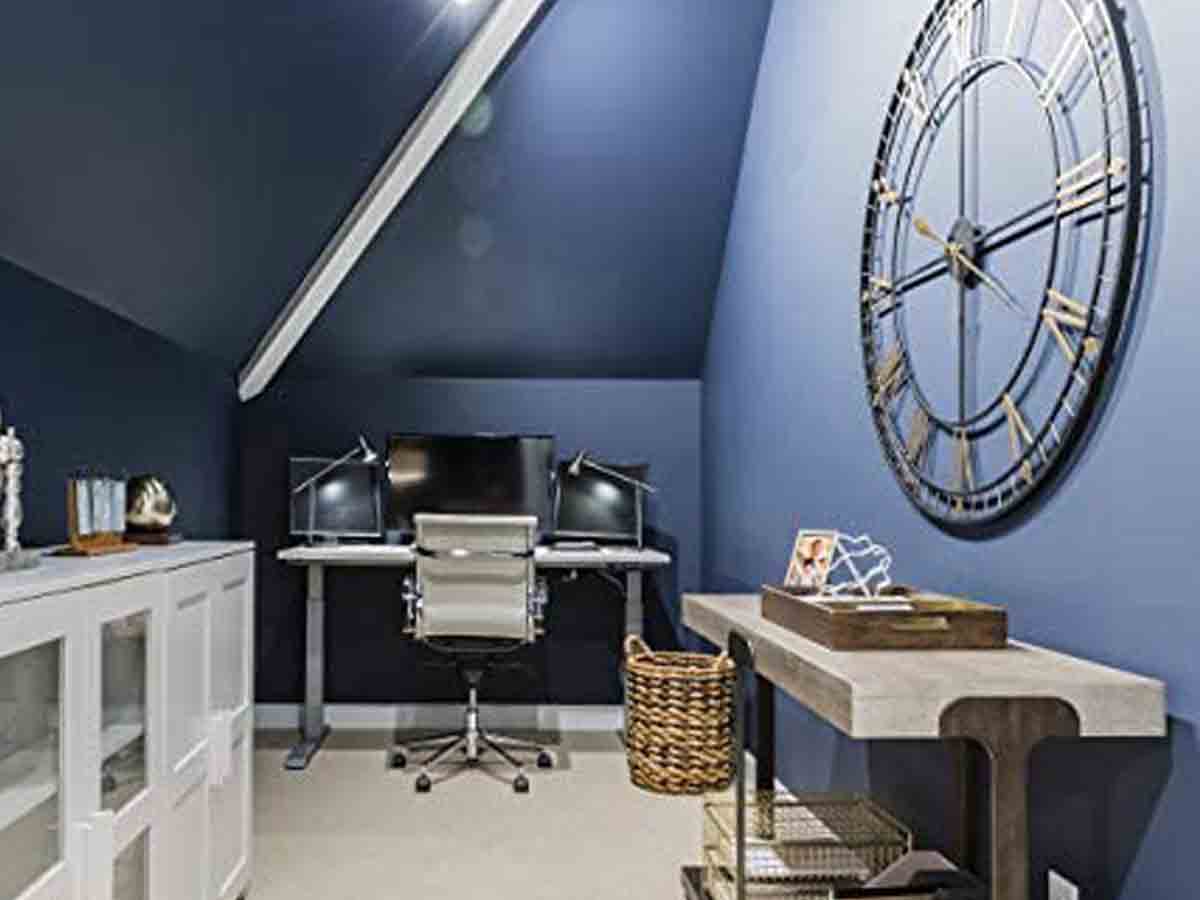
Does anyone else remember the time when clocks were all the rage? Giant clocks, small clocks, galleries of clocks! It was like a bad episode of Doctor Who! It seems like HGTV picks an emphasis piece every few years to commercialize, and this is just one of them.
Wall clocks were in every shape and size imaginable for years! People were even painting clocks on their walls and attaching motorized hands to make giant “wall” clocks. This trend got out of hand and there’s no one else to thank for it other than HGTV.
People also made gallery walls full of clocks. Let's just stick with maybe one clock per room unless you're a watchmaker and timepieces are your hobby. Heck, most kids nowadays can't even tell time using a classic analog clock!
Fiddle Leaf Figs
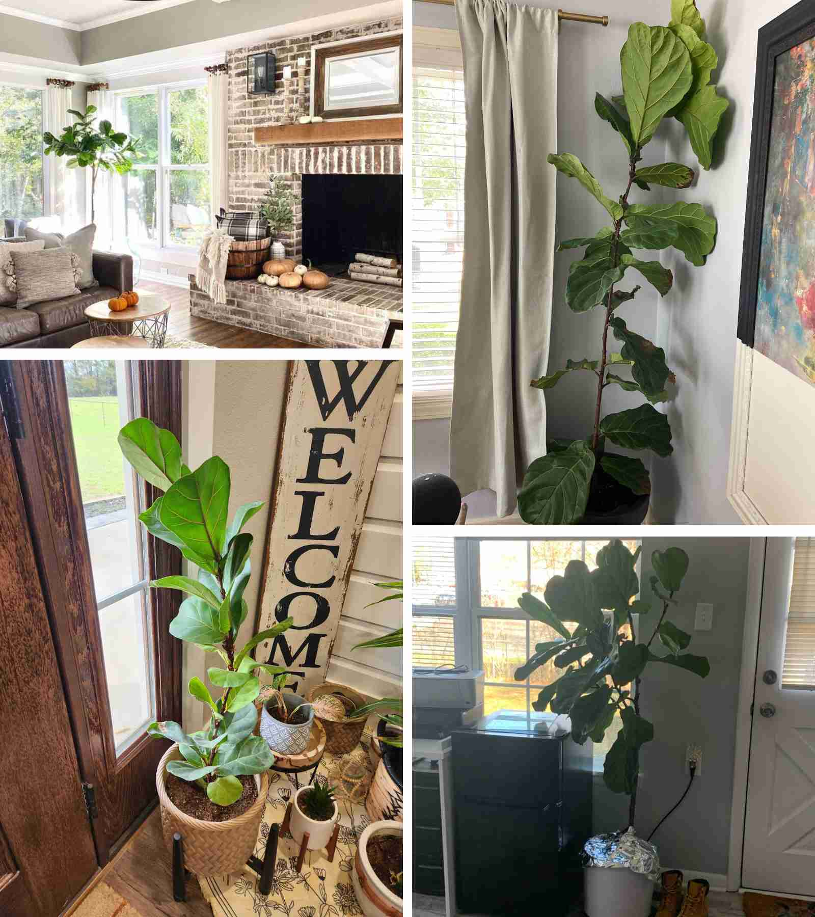
While the Ficus lyrata, known as the Fiddle-Leaf Fig to us common folks, is a gorgeous plant that nicely lives in any space…those suckers are so hard to keep alive! They’re also egregiously expensive for no reason at all. Over the past few years, we’re quite sure keeping these pesky plants alive has formed a billion-dollar industry.
Honestly, from the soil to the water you’re supposed to give it this plant has a specific set of needs that verge on “needy!” Even after taking care of it like you're told to, the leaves will likely still turn brown (or have red spots from too much water).
HGTV pushed these plants on us, convincing us all that we must have one in our houses. Little did we know we would be inviting someone more high-maintenance than our mother-in-law! Go for something easy to care for like a pothos if you really want a live plant.
Animal Hide Rugs
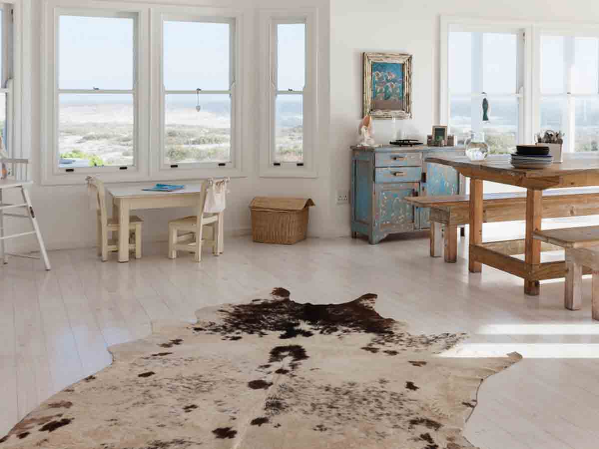
What is it that compels people to skin an animal to use as a rug in a house? Maybe if we lived in a pre-cotton gin time, I could understand. These days we can make rugs almost out of anything! Honestly, animal hide rugs are just plain tacky!
People want their homes to fell fancy, we get it, but HGTV started this trend of cowhide and rabbit fur rugs again. Most people opt for faux fur, but for those that don’t…this trend is irresponsible and a little gross. Walking on animal skin? No, thank you.
Another reason this trend sucks is that it’s incredibly difficult to clean fur rugs. Cleaning them is nearly impossible since they're often made of cheap materials that will fall apart as soon as you try and get them cleaned. If they're real, then you can't even clean them the traditional way!
Bamboo Shower Floors
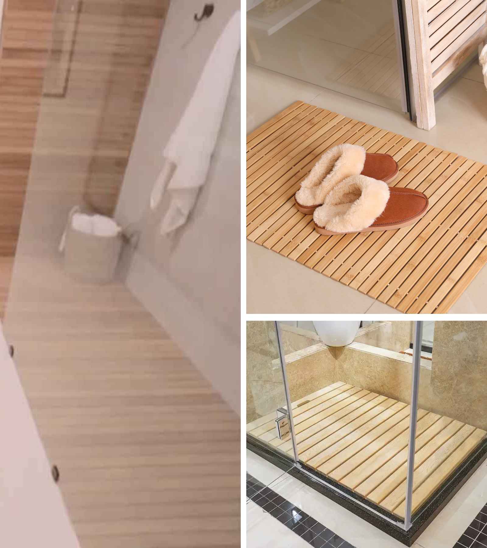
This is another horrible trend that should never have happened. Having a nice surface to step on with wet feet is awesome, but when your shower floor isn’t scrubbable, or bleach-able, you could be in big trouble hygiene-wise. The bathroom isn't the room you want to use porous materials on.
Bamboo shower floors are just plain gross! With all the soap scum and hair that gets caught in drains, imagine what is hiding between those planks and underneath! We’ve seen people with these shower floors complain of a smell in their shower, only to be horrified by the science experiment growing right under their feet.
If you really want the bamboo look, add a few natural elements elsewhere (other than the floor). Then go with something that's easy to clean because you'll be on your hands and knees trying to scrub the mold out of those bamboo slats at the end of the day.
Unnecessary Modern Minimalism
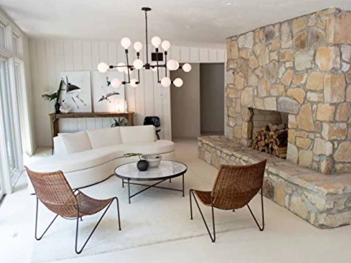
Minimalism became HGTV’s motto for about a decade, but honestly, we’re tired of it. Modernism and minimalism are great, don’t get us wrong, but at some point living in a minimal space just gets a little uncomfortable.
Some of these homes look like a dentist's office. The whole minimal fad works great in public spaces, but in a home, you’re missing a key component…comfort. Minimalism looks nice when its first put together, but afterward, it's hard to not look lived-in. Things end up misplaced since you have little space to put stuff.
HGTV pushed modern minimalism way too hard, and it’s time we push back a bit. No more empty rooms, harsh materials and bleak color schemes! Throw in some personality and show off your home the way you want to see it!
Tacky “Glam”
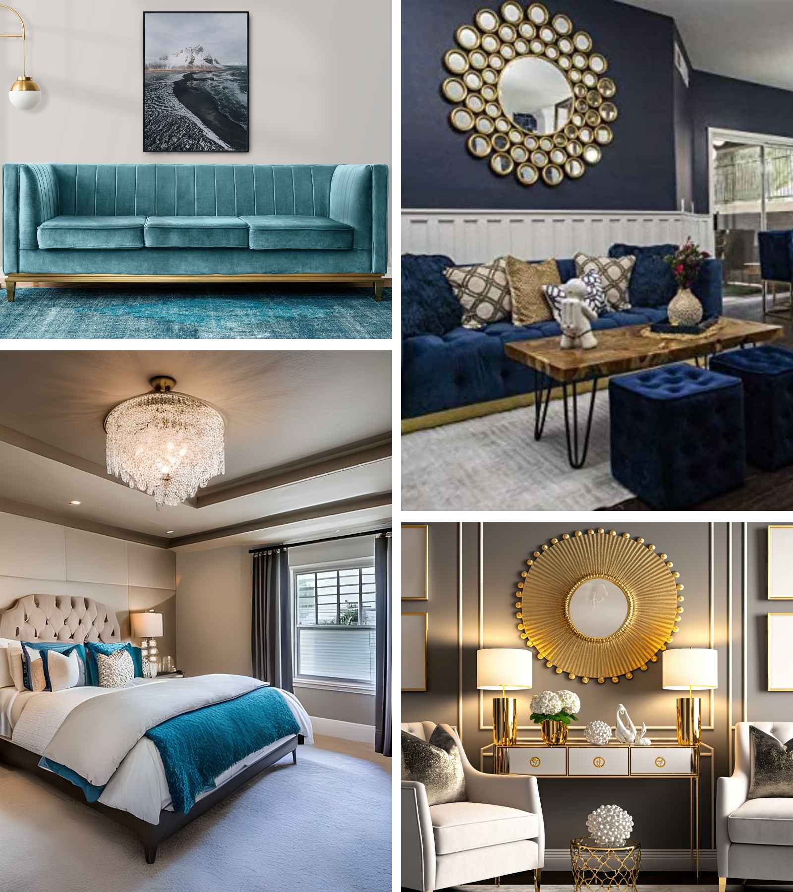
They’re nothing tackier than people trying to look rich! That’s exactly what this HGTV trend is all about. Mirrored furniture, ridiculous decor, and knockoff luxury artwork doesn’t make you look cool…all together, it just makes you look cheap!
Adding a bit of glamour in your home is great, but HGTV pushes glamour over the edge. Scale it back a bit. Glamour is quiet, intimate, and tastefully expressed. Small moments of glamour in your boudoir and entertainment spaces are what it’s about. Just remember, if you’re trying to show off…everyone will know you’re compensating for something.
This type of "glam" has another word — us old folk like to call it gaudy. If you want to show off glam tastefully, choose a nice material to use throughout the room in small amounts instead of all big and gold right in your face.
Ripping Out Mature Landscaping

The first thing those HGTV influencers do when they get their hand on established landscaping is rip it all up. If you have the budget to replace your existing foundational landscaping with new mature shrubs and trees, go ahead! But if not, think twice about ripping out old for new.
Buying mature landscaping can cost thousands more than just sprucing up what you have. Using babies will take years before you can enjoy the fruits of your labors. Our advice is to not believe everything you see on HGTV and utilize what you can of your existing landscaping.
Ripping out a mature tree to put in a different one is rough when you realize a tree can take anywhere from 15 to 20 years to mature fully. In the meantime, you've lost shade and landscaping that makes your yard look more inviting.
White-Washed Brick

Is there anything wrong with a white house? Absolutely not! White can be classic and beautiful. However, too much white starts to look a little…minimal. A wise person once said: “Neutrals are for people who have no taste.” Meaning that if you can’t play with color on a home…you really don’t know what you’re doing.
White is a total cop-out! It’s safe and will probably sell to anyone later, and we get it. But do you want a home that conforms to the masses or stands out for being beautiful? It’s sad to see beautiful brickwork covered up with white paint (especially when half of these people pick the wrong white).
Like that one song goes: "Little boxes on the hillside, Little boxes all the same." Don't let your house look boring and like all the others in your neighborhood. Standing out with a little color is also much more inviting than making your home look like your local doctor's office.
Kitchen Cabinets Without Doors
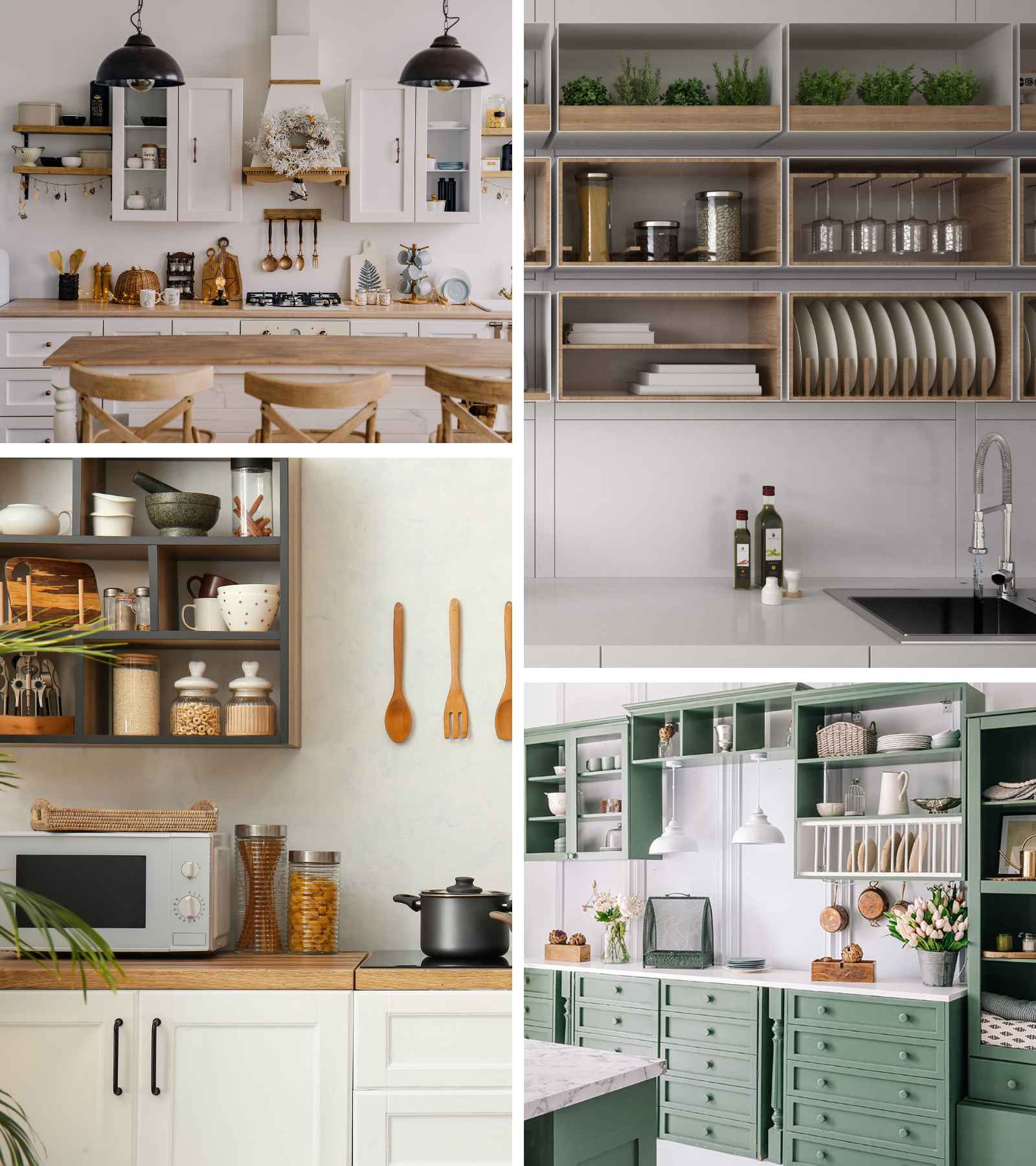
Doorless kitchen shelves completely miss the whole point of kitchen shelves—keeping your junk safely hidden from view! Have you ever wanted to dust your plates before dinner? Well, without doors on your cabinets and shelves, you’ll probably have to do just that every time because there’s nothing there to protect them.
We're guessing most people don't look at their homes and think "how can I be forced to clean more?" That's basically what the open cabinet concept does for you. Not to mention, it also means you can't have mismatched dishes...unless it's intentional.
Plus, doorless cabinets are just a total eyesore. HGTV types might think it looks chic and modern, but honestly, it just makes your kitchen look unfinished. When people see them, they aren’t thinking, “Where can I get some of those?” Instead, they’re thinking, “Why couldn’t these people afford to add a few doors?”
Gallery Walls
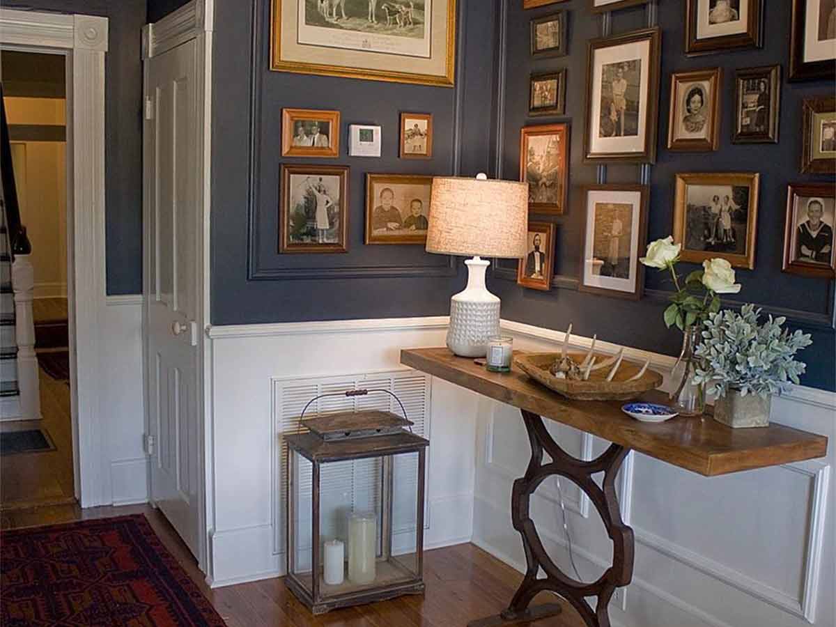
It’s almost like HGTV is constantly looking for more ways to decorate every square inch of a space. No other trend from HGTV accomplishes this like those tacky gallery walls. Gallery walls are a cluttered hodge-podge of different wall decor crammed together in a semi-harmonious fashion.
Do they look good? More often than not…no, they don’t. This is just another cash grab from HGTV. This trend is similar to those candy and lighter displays at the checkout. It’s just another way for stores to up-sell you to the very last drop. It’s definitely okay to hand decor on your wall, but less is definitely more.
Plus, all those frames will accumulate dust and that just means extra cleaning for you. Naturally, HGTV says you need only a frame that their brands sell. Unless you want to show off a million photos, go with something a little more timeless.
Tons of Throw Pillows on the Bed
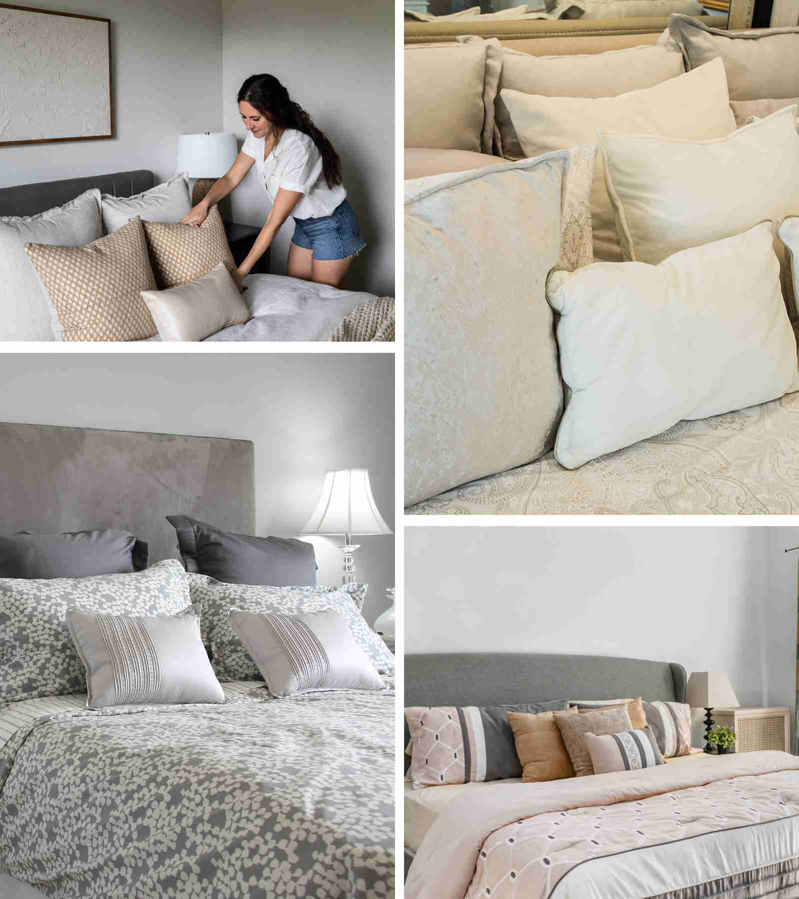
Call us crazy, but we thought beds are for sleeping. However, if you only paid attention to HGTV, you’d be forgiven for thinking that beds are merely a vehicle for storing and displaying throw pillows. Every bedroom in their shows looks like it belongs to the princess from “The Princess and the Pea.”
And it’s not just that a mountain of throw pillows looks ridiculous, either. They’re also wildly impractical. Imagine it—you’re ready to hit the hay after a long, exhausting day, only to realize you have to spend the next 10 minutes excavating your bed out from under a mile of throw pillows.
Then, every morning when you get up, you have to move the pile of pillows from the floor (which is where we'll all put them) back onto your bed in a nice way so they don't look like a pile of fluff. That's too much work at the times when we're the most tired.
Accent Tiles
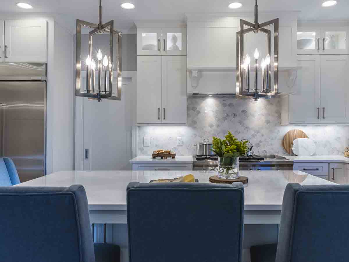
In an effort to give a space a little “personality” HGTV pushed the trend of using accent tiles in backsplash designs and showers. Tilework has been around for literal centuries, but we’re not talking about a beautiful mosaic…we’re talking about those tacky pebble accents in subway-tiled showers.
In recent years, every new build and remodel we’ve seen feels the need to add a little razzle-dazzle to their tile work, but the fact is it just looks bad. It’s a great idea in theory, but in practice, it's really just over the top. The last thing you want your home to be is “too much.”
These accent tiles also use a lot of grout, which means more cleaning for you, and more grout to reseal once a year if it's in the shower. Then, you can't really easily change the decor in your bathroom or kitchen because your tile would clash. That's a lot of work for not much in return.
Moss Walls
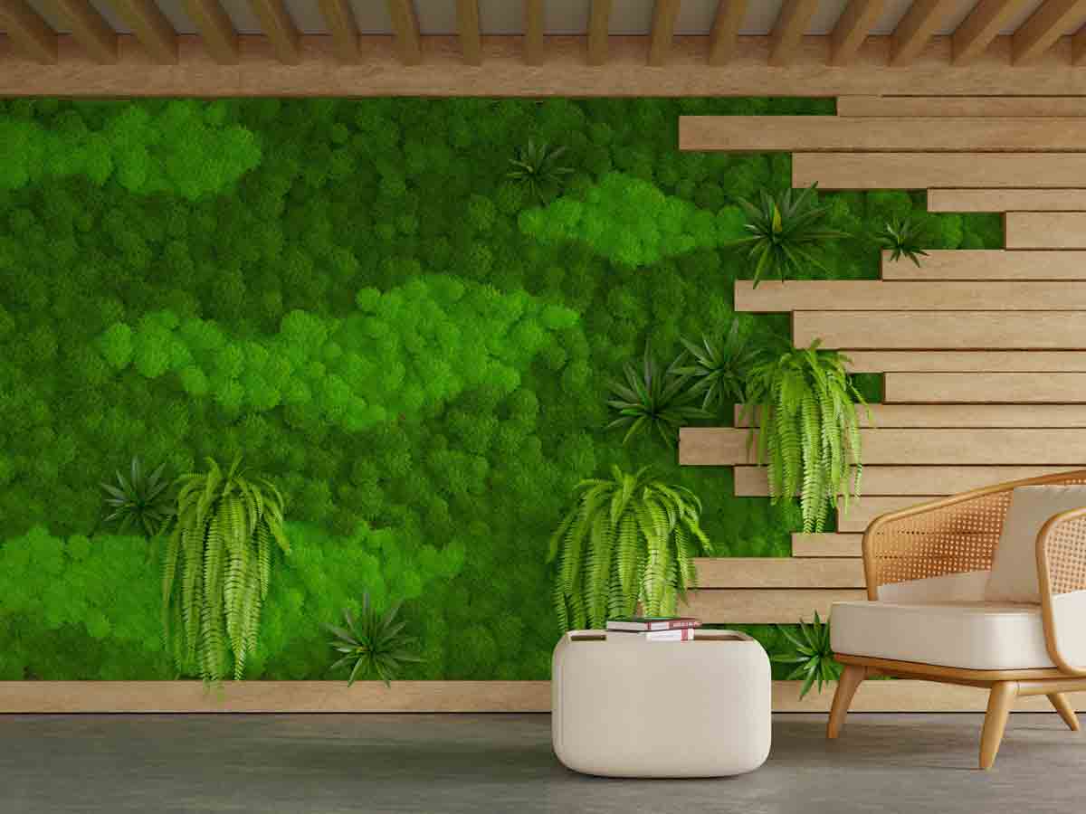
This is another HGTV trend that is great in theory but not in practice. Moss outside is gorgeous! It piles on rocks and trees and brings life to damp areas. But there is one thing you don’t want to have in your home: damp sheetrock! Damp + Dark = Mold.
If you think about where moss grows naturally (especially on your home), it isn't where you want it. Moss around your outdoor faucet? That means your faucet is leaking! That could also mean mold will take hold sooner rather than later.
If you’re going to have a moss garden, keep it in a container! Better yet, keep it outside and away from your home! There’s just not a good reason to have a living moss wall inside your home. Maybe one day when we have super cool non-microbial building materials, but until then…stick with some normal wall art why don’t ya!
Open Concept Bathrooms
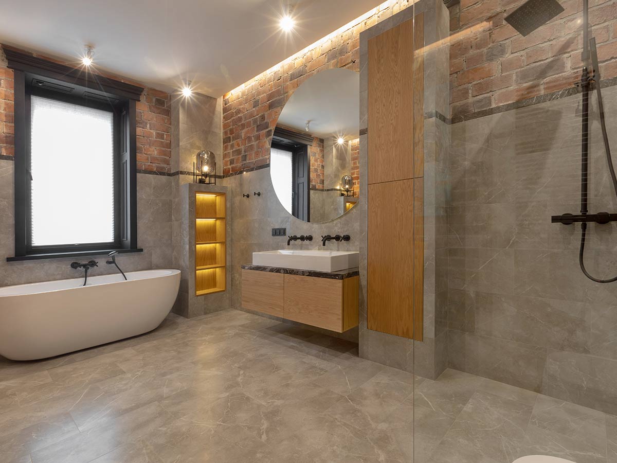
HGTV and other decor trend chasers have already ruined homes by making everything an open floor plan. However, an open-concept bathroom is truly unforgivable! Of all the places to just let it all hang out, the bathroom is definitely the worst. We can’t understand why anyone would want one.
If you have a small bathroom, then it totally makes sense to not have walls separating everything, but if your bathroom is large? An "open concept bathroom" isn't gonna work for several really good reasons.
The biggest problem with open-concept bathrooms (besides the hilarious lack of privacy) is that it’s just a complete waste of space. Who wants a bathroom that’s the size of a bedroom? Couldn’t all that extra space go to some other room where it’s more needed?
Floating Stairs
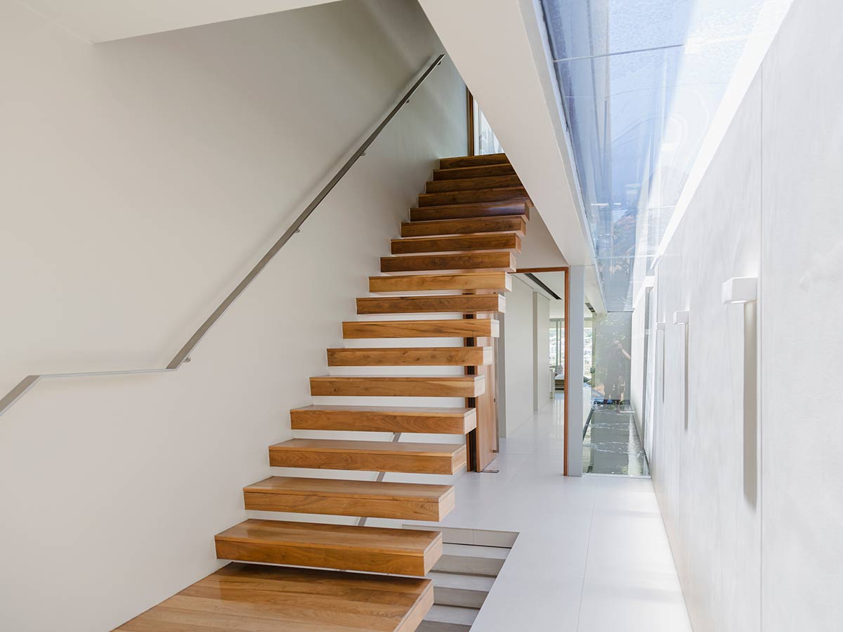
We have to admit—there’s something about floating stairs that actually look kind of neat. When done correctly, they can look very modern and a miracle of physics. Hey, what can we say? Even HGTV gets it right every once and a while! However, these are still a terrible idea for your home for much more practical reasons.
We’ll give you two guesses what the problem is with floating stairs. If you said it’s because they’re a painful fall waiting to happen, you are correct! People are in love with floating stairs right until they take a tumble in the middle of the night trying to get a glass of water from the kitchen.
It also doesn't really tackle the fact that nothing is holding the other side of the stair in place. Could you imagine moving something heavy upstairs? Say you got a new bed set and you need two people to carry it up — you'll potentially have hundreds of pounds on a single step that's being held up on one side of the wall.
TVs Above the Fireplace
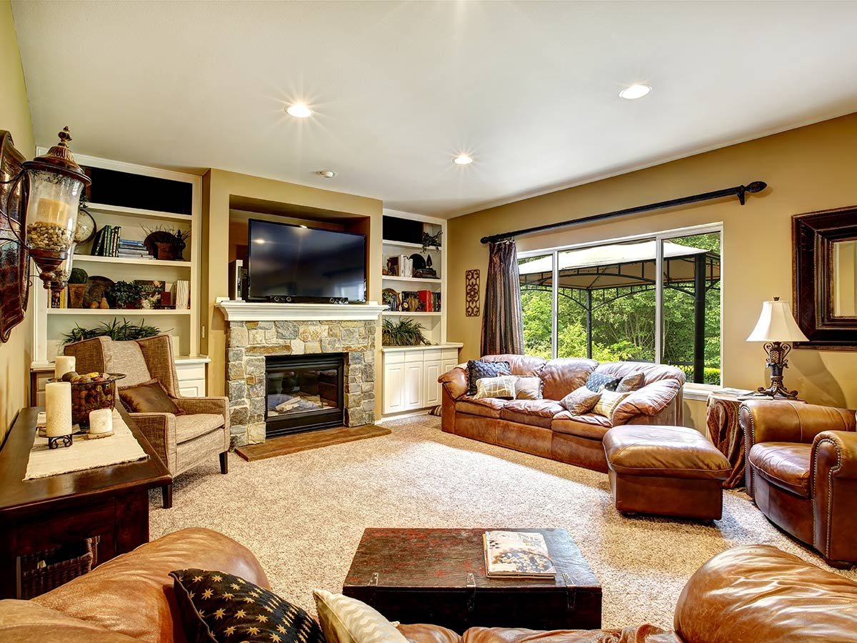
Is there anything cuter or more modern than a flat-screen TV over the fireplace? If you only watch HGTV, you might think so. However, we’re here to tell you that this configuration is not nearly all it’s cracked up to be. In fact, it could be one of the worst places in the house to put your TV.
For one, putting your TV over your fireplace could be a potentially very serious fire hazard. If it’s not placed high enough, the heat from a fire could melt or even ignite parts of the TV. Since good TVs are skyrocketing in price to be $800 to $1,000, you don't want them to melt.
On top of that, this layout is also just a major pain in the neck…literally! Who wants to constantly be craning their neck up just to see what’s on the TV? It's like sitting in the front row at the movie theater. Ouch!
Cotton Stems
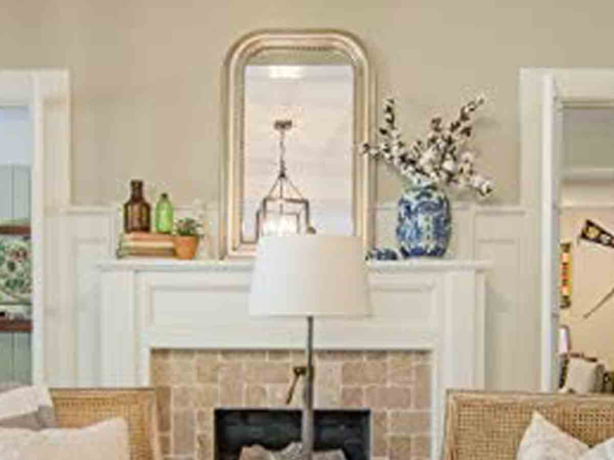
Cotton stems, where do we start? This trend straight from Joanna Gaines and HGTV was just stupid! Decorative stems are great, but this cotton trend went way too far! We hope everyone enjoyed picking dust out of those cotton balls over the past five years.
What’s ridiculous is that these stems are absurdly expensive only because everyone and their mother ran and got them in 2015. It’s time for this trend to go. Write it down in the history books as something to never pick up again. Looking back, people are going to think we’re absolutely crazy.
Prominent Windows with No Curtains or Blinds
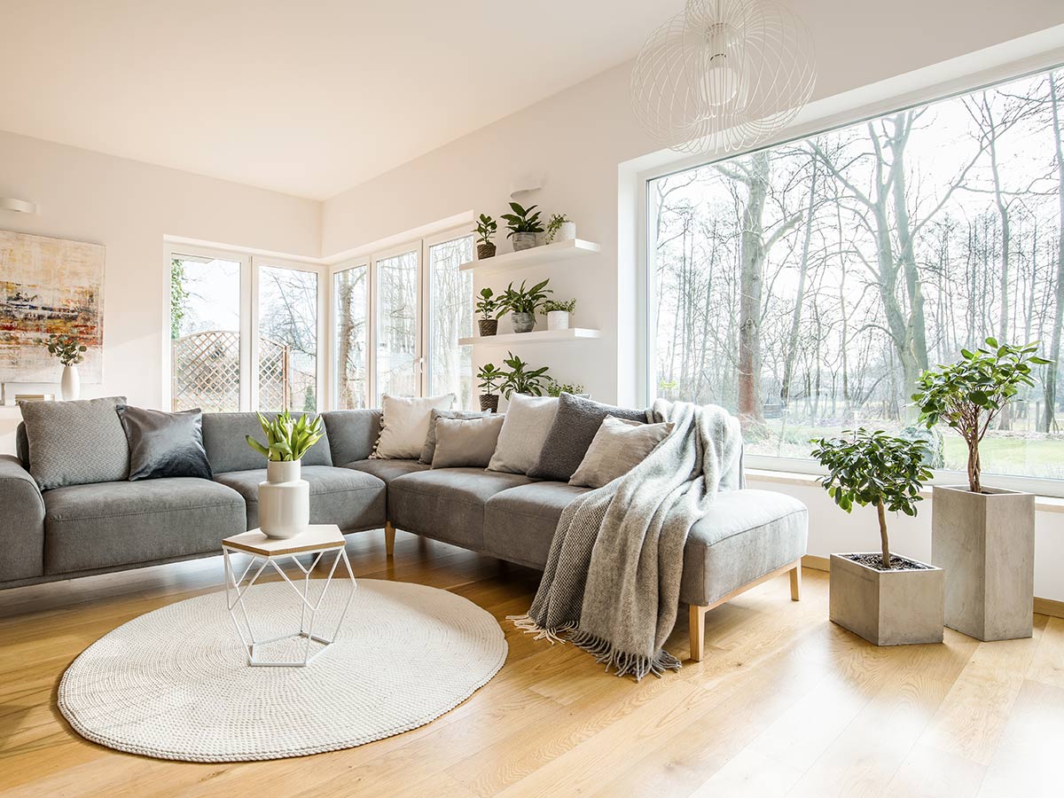
We understand being proud of your immaculately curated home, but everyone needs a little privacy now and then. That’s why we’ll never understand why many homes on HGTV have large, prominent windows without blinds or a curtain in sight. You don’t have to tell the world what you’re up to 24/7!
Plus, it can be a serious safety issue. If someone wants to rob a house, they're going to pick the place that can be easily window-shopped. That ADT sign isn't going to protect you if you're openly displaying something that's worth a lot of moolah!
Even if it isn't someone that wants to break in, do you really want any passerby to be able to stop and gawk into your living room window? If you can’t bear to part with all that beautiful natural light all day, at least cover up after the sun sets!
 Author
Alot Living Team
Last Updated: September 28, 2023