Beach-Themed Bedrooms
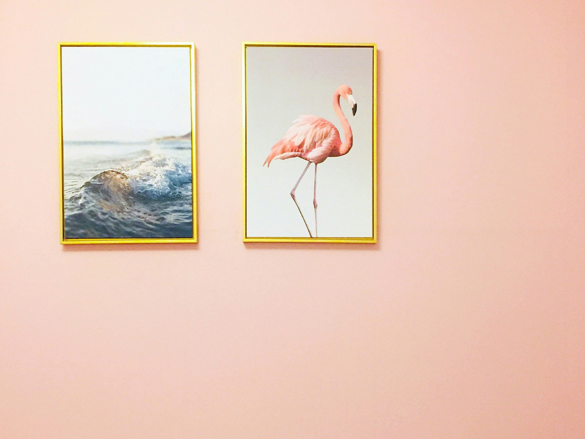
It used to be commonplace to have a beach-themed bedroom or bathroom in the home, but this extravagant decorating style looks tacky today.
If you want to incorporate elements from the beaches of Sardinia or the mountains of Montana, you should do it very sparingly. Consider a teal-and-white theme to represent the beach or a rustic wood dresser to evoke a ski lodge.
Buying Patterned Sofas or Loveseats
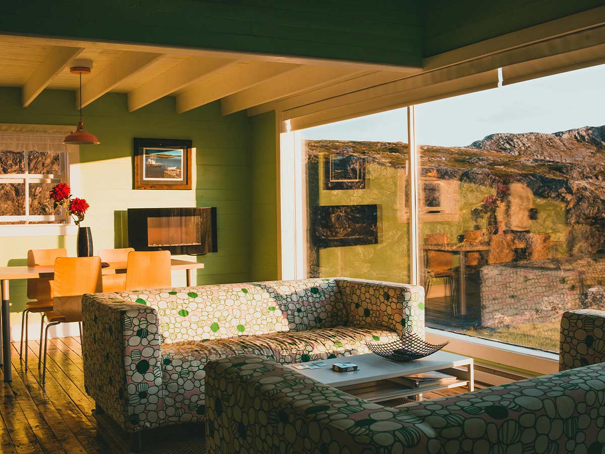
To modernize your home, you buy a sofa that doesn’t have a pattern. Any pattern automatically makes your home look kitschy at best. At worst, it seems like someone stuck in the '60s designed it.
Floral sofas and loveseats are especially “senior” looking.
Covering All Surfaces in Framed Photos
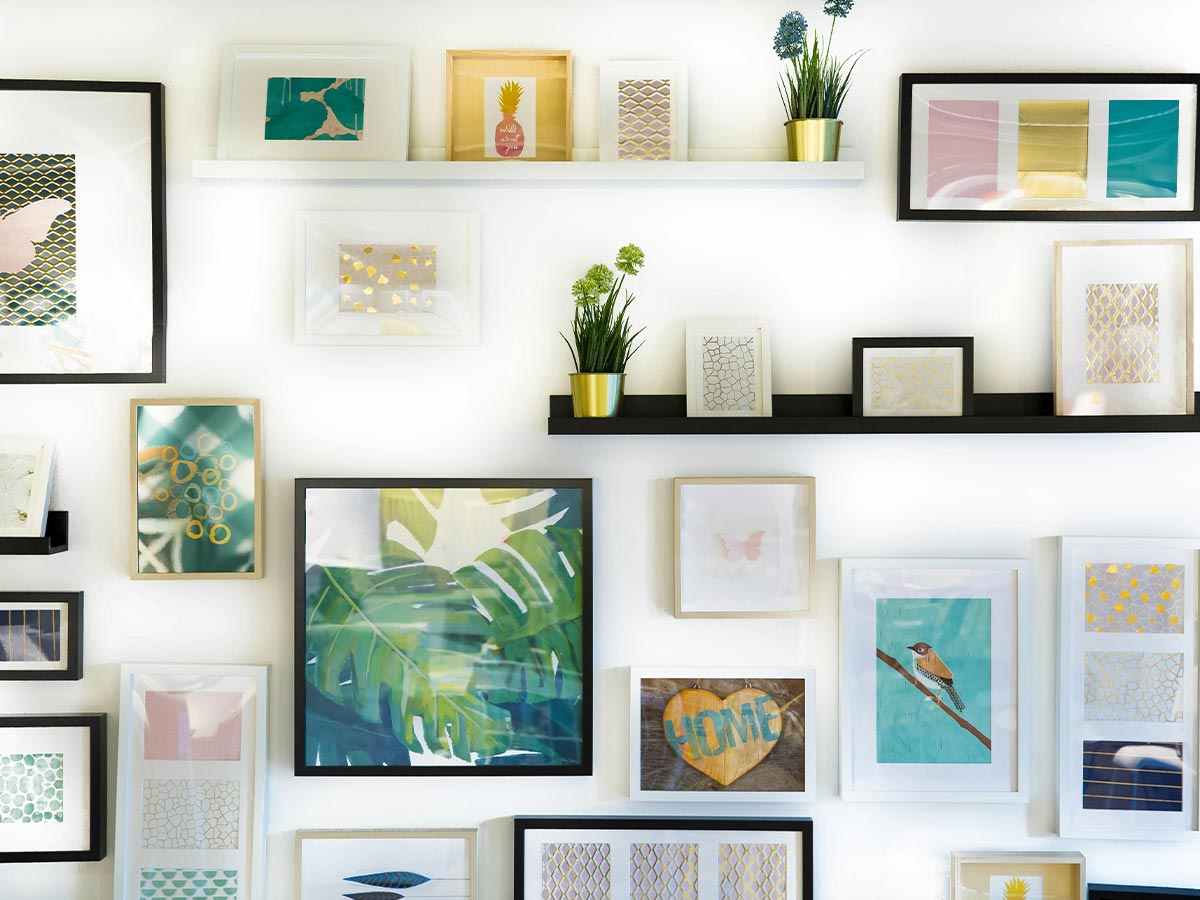
You do want to show off photos of those you love, but displaying more than a couple of frames in a room immediately screams “grandma’s house.”
A better alternative is to purchase a digital photo frame that sets all of your favorite photographs to a slideshow. This way, none of your grandkids get left out and your walls won't look too busy.
Using Floral Print Furniture
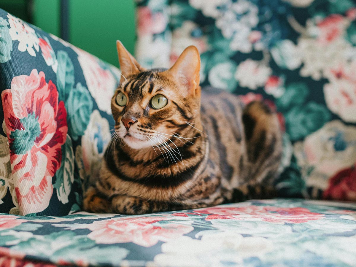
Florals are currently big in the fashion world, but not so much in the home decor world.
No matter how long you’ve had that floral sofa, you need to get rid of it! Floral furniture is a dead giveaway that your house is an “old lady house.”
Failing to Organize Clutter
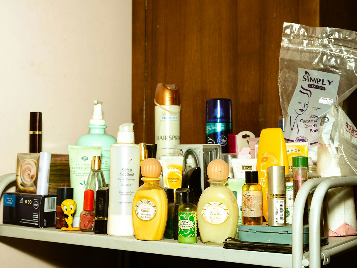
If you have random items just sitting beside the sofa or on countertops, you should consider a better organizational system.
Take a look at Pinterest to find creative storage solutions, such as ottomans with hidden compartments or nifty baskets to keep on your bookshelves. Your home will instantly have a put-together feel!
Keeping Old Electronics
Using Toilet Rugs and Covers
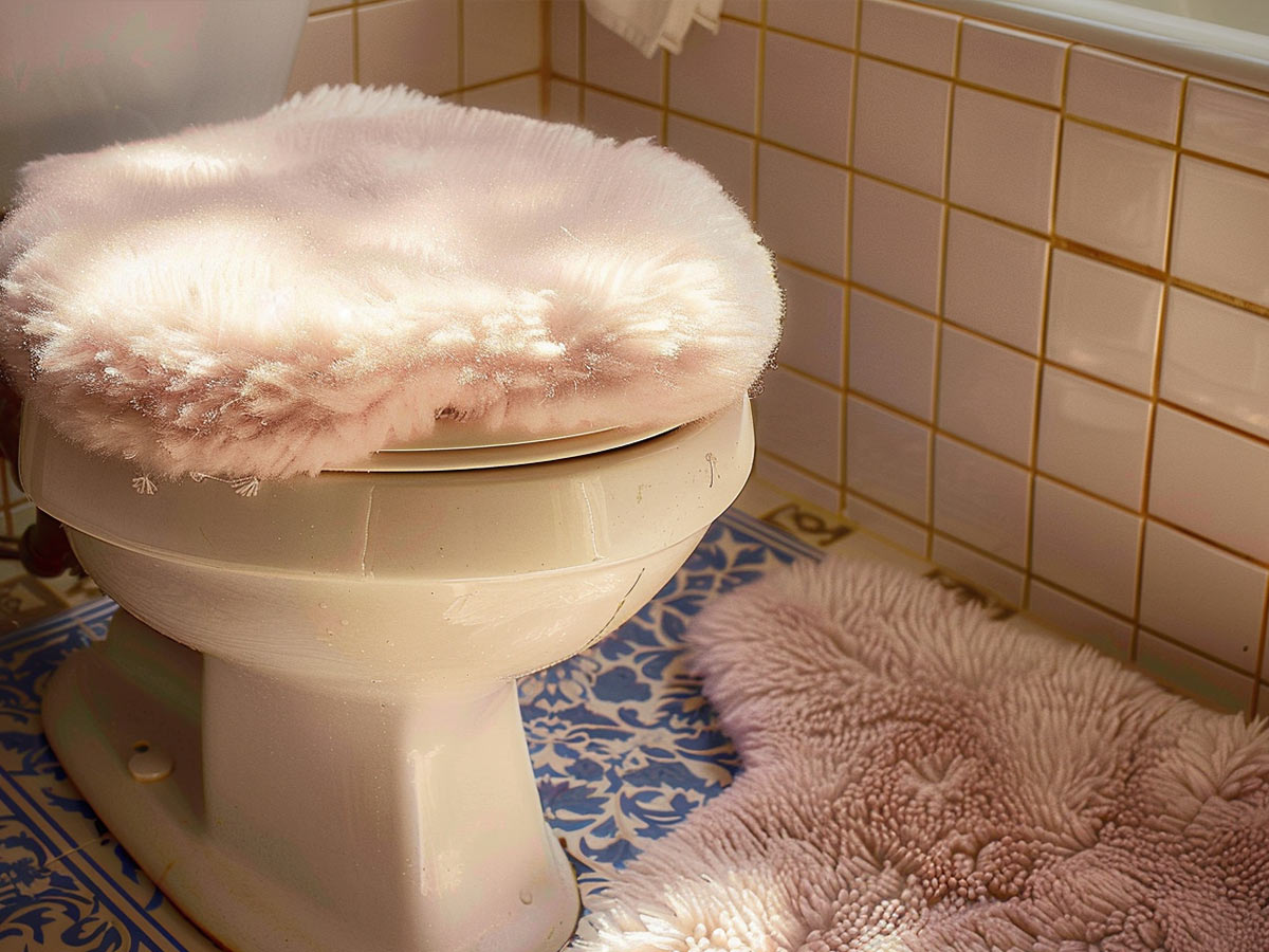
Fuzzy toilet covers and rugs are about 20 years out of date, so if you haven’t tossed yours already, you should do so right this minute.
These pieces make your bathroom look straight out of the '90s, so it’s best to replace them with a single, rectangular shag rug to keep your feet feeling warm and bathrooms looking modern.
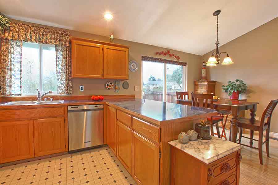
Not Refinishing Your Oak Cabinets
Hanging Decorative Teacups
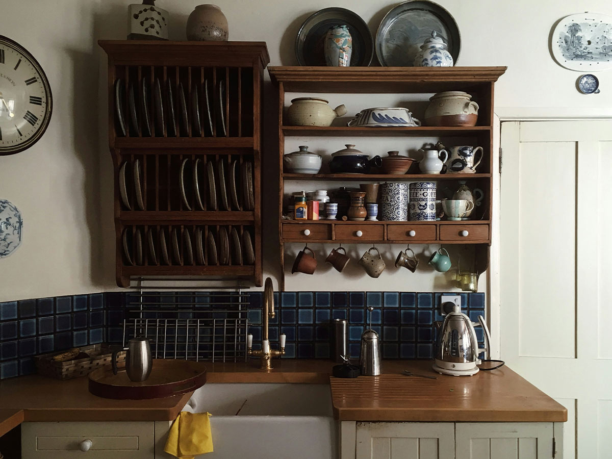
In all honesty, no one uses teacups anymore. Most people use mugs because they hold more. Teacups also come off as posh and outdated.
Hanging them gets even worse since they’re not really “decorative” in the first place.
Covering Your Tables in Doilies
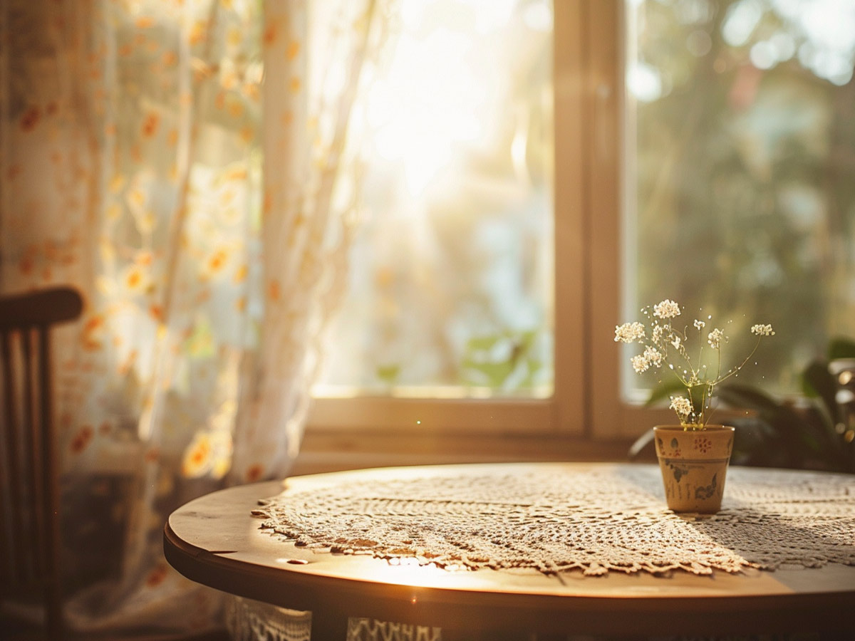
If you’ve always covered your end tables and coffee tables in doilies, you should start transitioning away from this outdated trend.
The cheap doilies take away from the natural beauty of your glass or wood furniture, so you should embrace those pieces on their own and clean them on a regular basis to keep them looking their best.
Creating an Excessively Formal Living Room
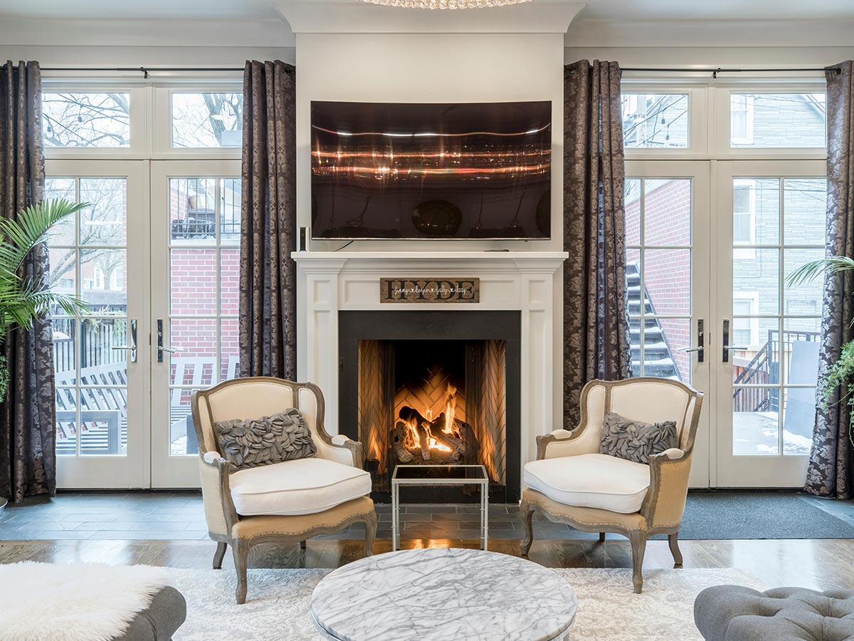
Having one room in the house that looked like something the Victorian royals would have in their homes used to be big, but nowadays, usability is preferred over luxury.
Ditch the hard furniture, dozens of throw pillows, and delicate vases. Replace them with pieces that are modern and functional, such as a chaise lounge or an angular coffee table.
Using Vertical Blinds
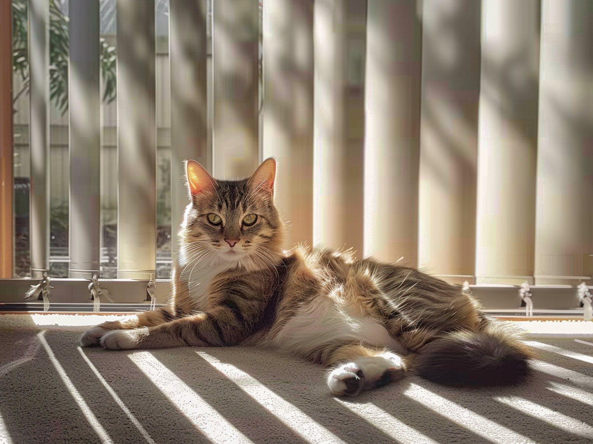
These blinds are as outdated as they are ineffective. Vertical blinds can make your home look like a sketchy roadside motel from the '80s.
Not to mention they've never been attractive or practical. Thank you, next.
Replacing Your Existing Furniture with La-Z-Boy Pieces
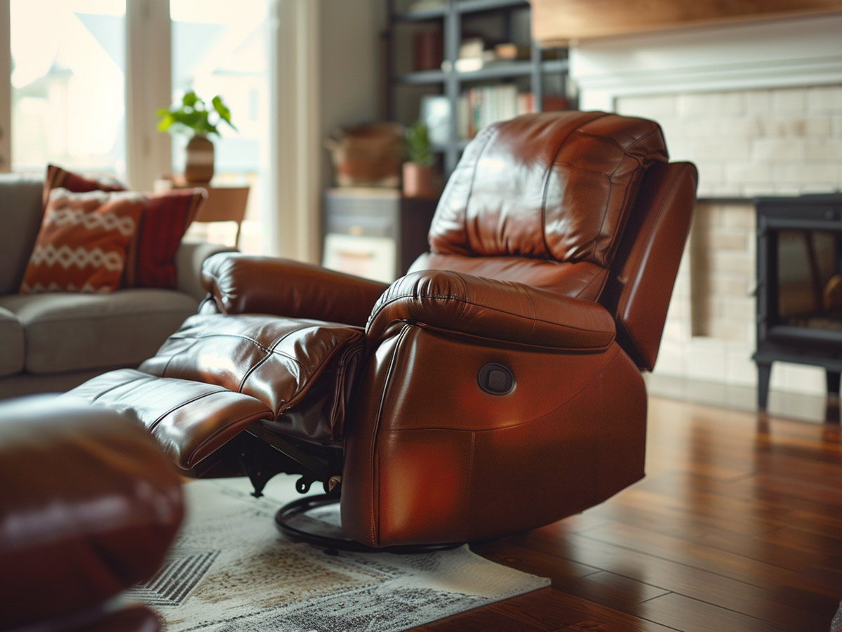
La-Z-boy furniture is comfortable, but it is clunky and can realistically only seat one person. And let's be honest, they're not the most stylish looking things ever.
If your living room is almost entirely comprised of La-Z-Boys, you should consider ditching them in favor of modern sofas, love seats, or benches. Your room will appear much larger, and you’ll no longer have to pull out the folding chairs when you have guests!
Displaying All Your Antiques and Collectibles
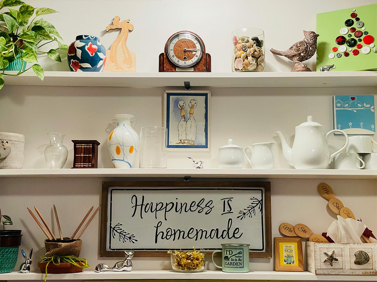
Sure, you’re probably proud of your vintage bucket collection, but you have to realize that antiques normally aren't the most aesthetically pleasing decorations in a home.
Keep the majority of your collection on display in the basement, and instead incorporate one or two of your favorite items into another form of decoration, such as a shadow box or floral arrangement.
Covering Your Sofa in Plastic
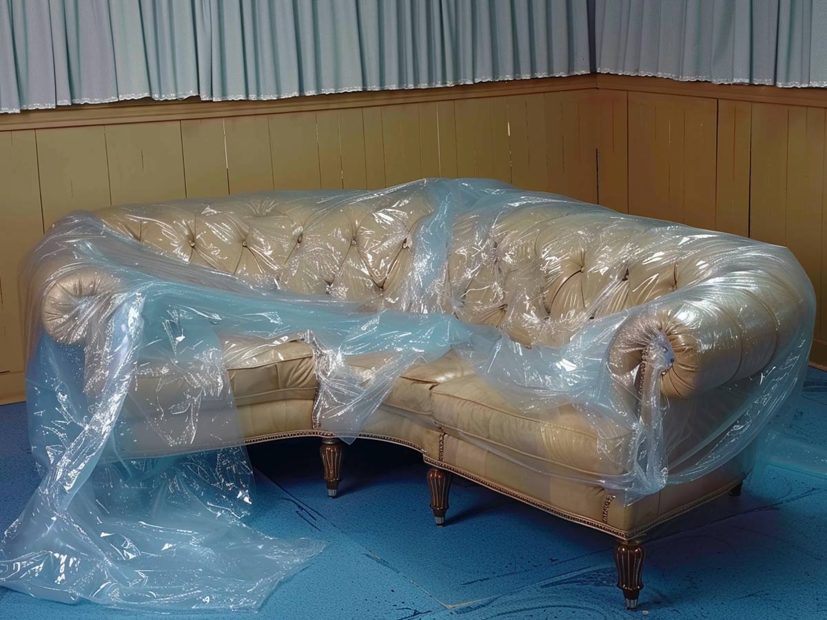
We understand that you want your sofa to last as long as possible without wear and tear, but covering it in a plastic cover is not the way to do it. This horrendous cover makes your sofa look ugly its entire lifetime, even if it is in pristine condition under the cover.
Instead, take on a little risk and leave your sofa out in the open, covering the most vulnerable parts with a throw. You’ll love the way it looks a lot more...we promise!
Displaying Your Pickle Jars
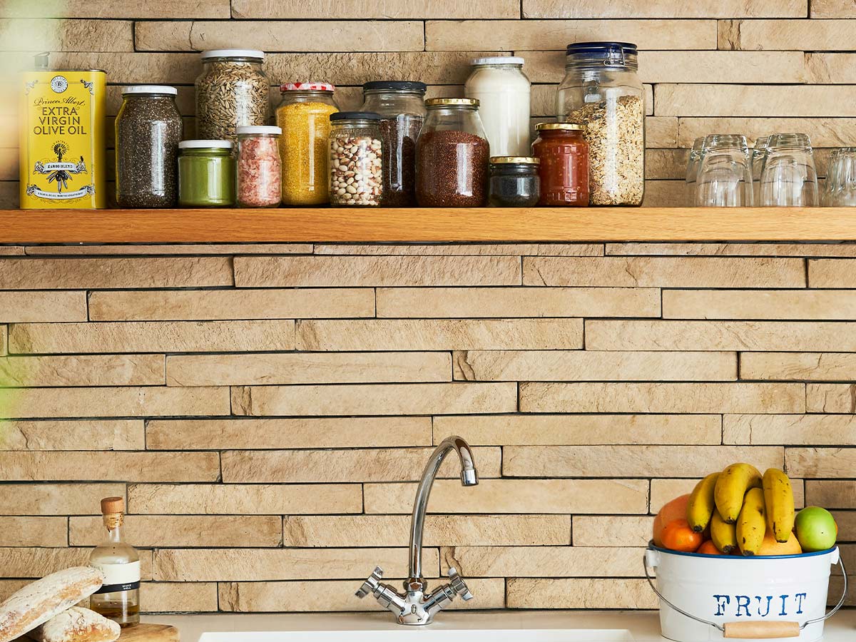
Let’s be honest, most of your pickle jars have been sitting on top of your cabinet for more years than your children have been alive.
It’s time to ditch them for good or stick them in the pantry where no one can see them.
Hoarding Decor
Not Replacing Old Fashioned Fixtures
Anything “Farmhouse”
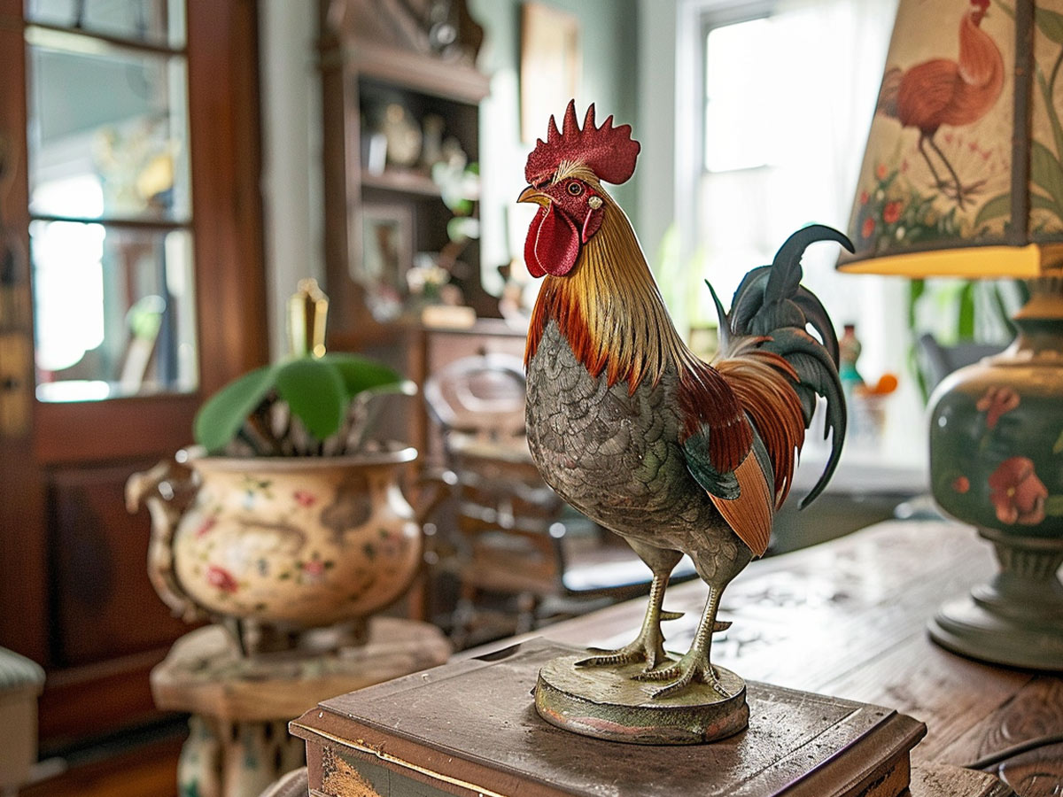
Something about farmhouse décor makes your home look old. Maybe it’s because no one lives on a farm anymore.
Regardless, chicken lamps or rooster plates aren’t a theme you want to use if you want a modernized look.
Decorating With Fake Plants
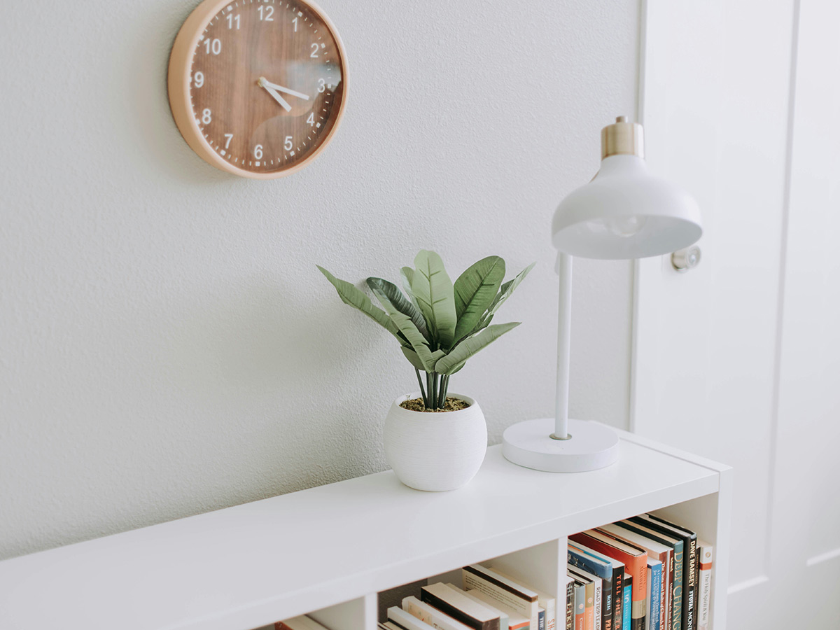
It’s obvious to all of your guests if your plants are fake.
It will also make your house look like it is a portal to the '90s.
Making Everything Match
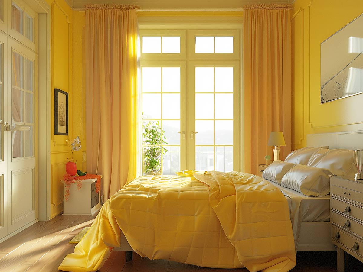
If your guest bedroom is painted a shade of blue, there should be almost nothing else in that room that is blue.
Your current guest bedroom probably doesn’t adhere to this hue rule, so you should revamp it and decorate with curtains, bed sheets, and furniture that are different colors than the walls. Not everything has to match!
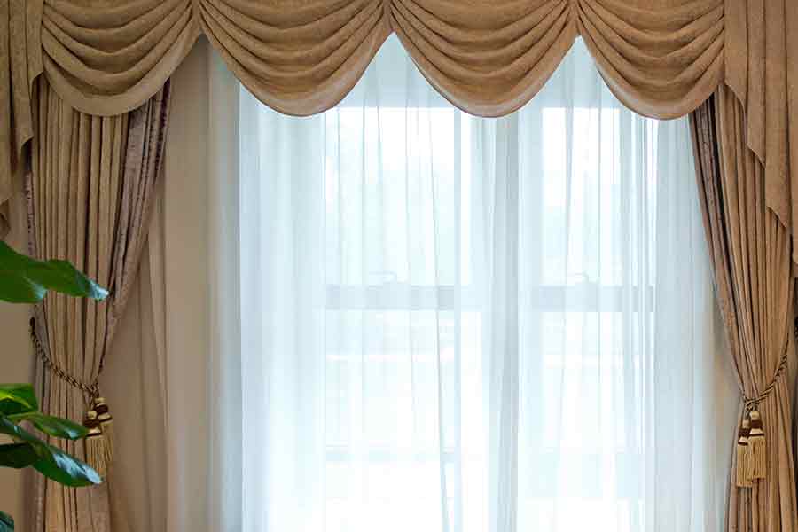
Using Heavy Fabrics and Tassels as Window Treatments
Displaying Sofas with Fringe or Tassels
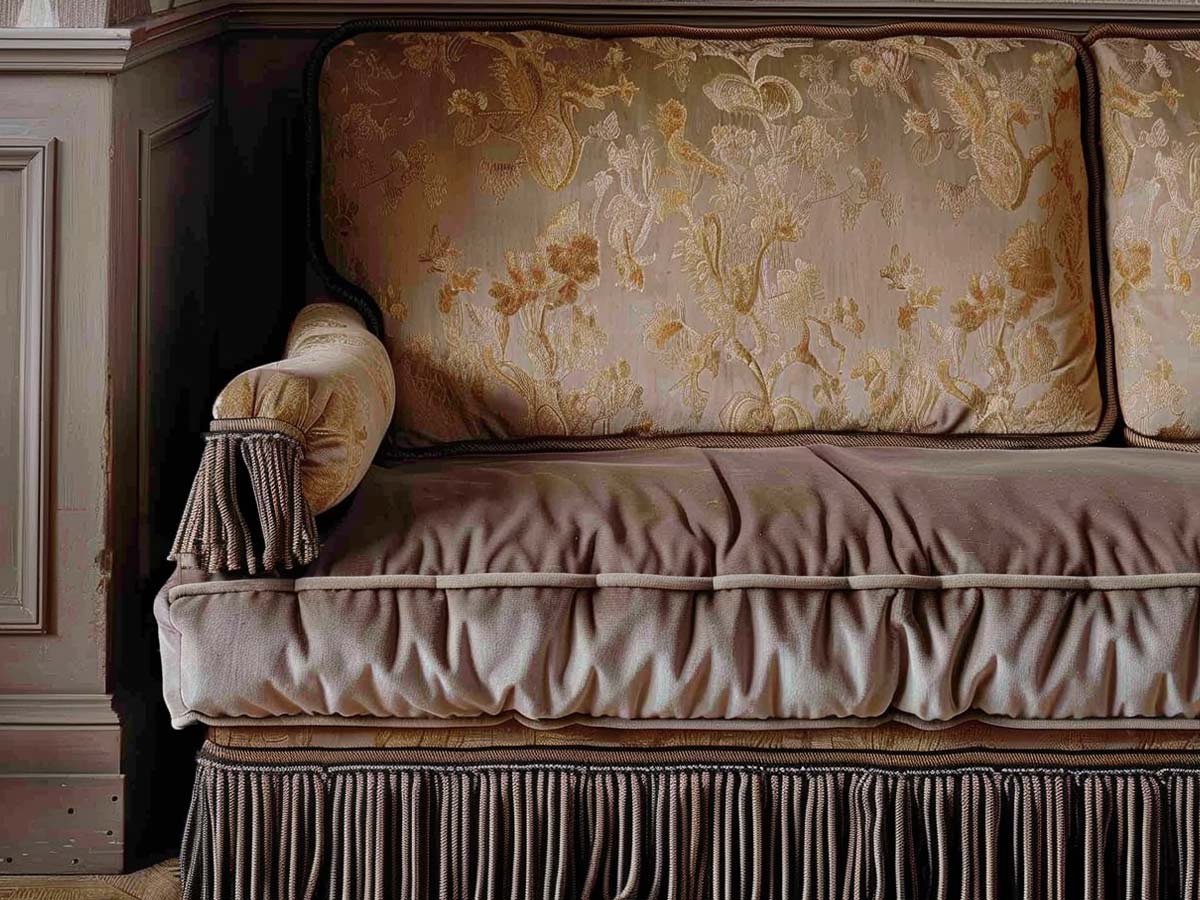
Fringe and tassels don’t look great on curtains, but they’re even worse on furniture.
Most places that use tassels or fringe do it to make the room look dated and “regal” purposefully.
Having Popcorn Ceilings
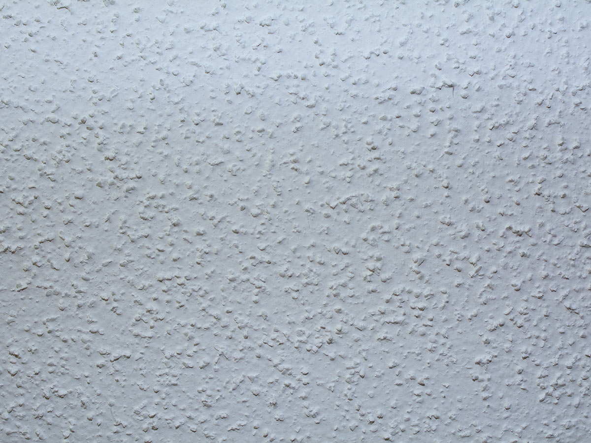
Does anyone else ever just want to take a flat scraper and get rid of popcorn ceilings? Popcorn ceilings are hard to clean and paint. Plus, they cast shadows that create the illusion of the ceiling being darker and lower than it actually is.
Typically, it's recommended that you avoid textured ceilings in general to prevent that dark and dated look.
Keeping Wood Paneling
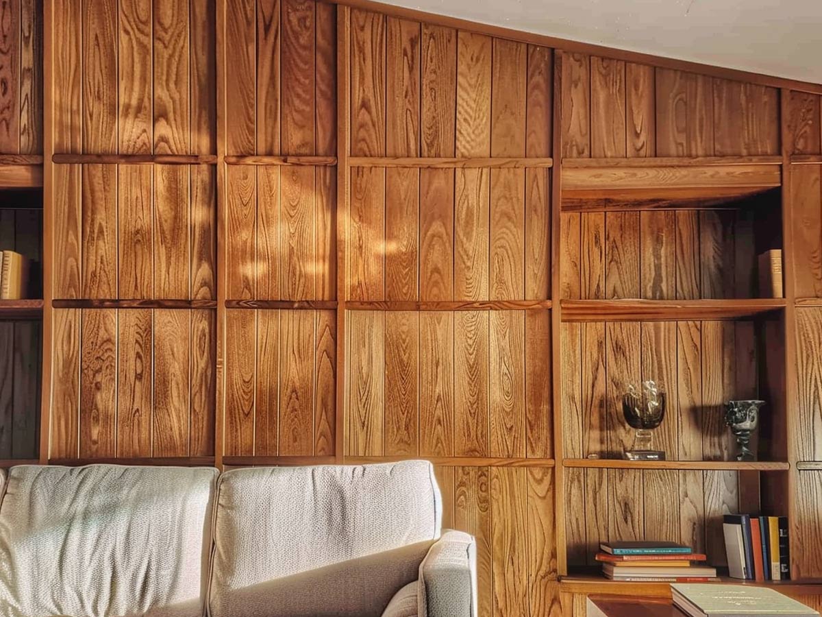
This might have been in style in the '60s and '70s, but now wood paneling (specifically fake wood paneling) is just an eyesore.
It's recommended to just paint over cheap, fake wood paneling, but if you're lucky and have nice, real wood paneling then it's at least a little more acceptable. Unless you just have a significant dedication to the '70s vibe, avoid the wood.
Hanging Gaudy Shower Curtains
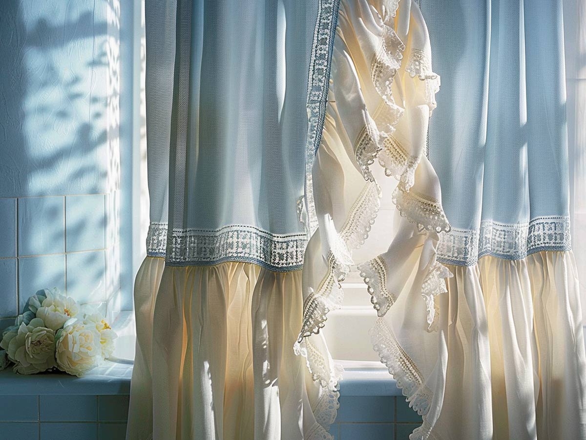
If your shower curtains have ruffles or look ornate enough to belong in a castle, it’s time for them to go. The age of minimalism is upon us, so keep it simple and elegant.
You can jazz up the bathroom with other accessories, like rugs and metallic trays.
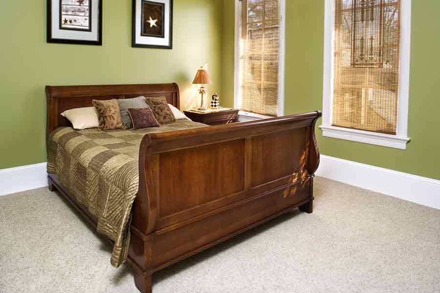
Hanging On To Your Sleigh Bed
Using Shag Carpeting Anywhere
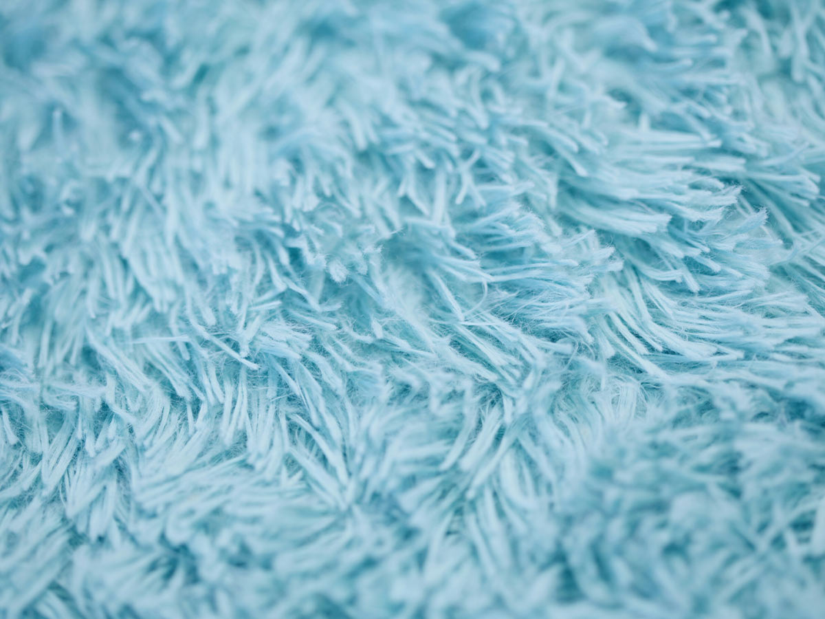
Shag carpet should have stayed in the ‘70s where it belonged. One of the biggest issues with shag isn’t that it makes your home look dated, but that it’s pretty difficult to clean when compared to regular carpet.
Instead, opt for a Ruggable rug! They're machine-washable, unlike shag.
China Cabinets in General
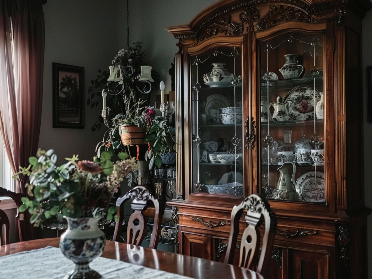
Pulling out special dishware for holidays is one thing but owning a china cabinet with dishes that never get used is another.
It’s best to store your dishes in the cabinets and pull them out as needed.
Keeping Wall-to-Wall Carpeting
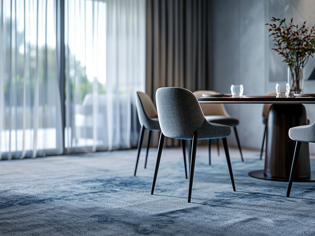
Wall-to-wall carpeting isn’t ideal. It can cause issues with allergies, and it’s more difficult to clean when compared to hardwood or laminate.
Hardwood flooring needs rugs, but you can change them out and switch color themes without working around the carpet.
Gold Framed Mirrors Everywhere
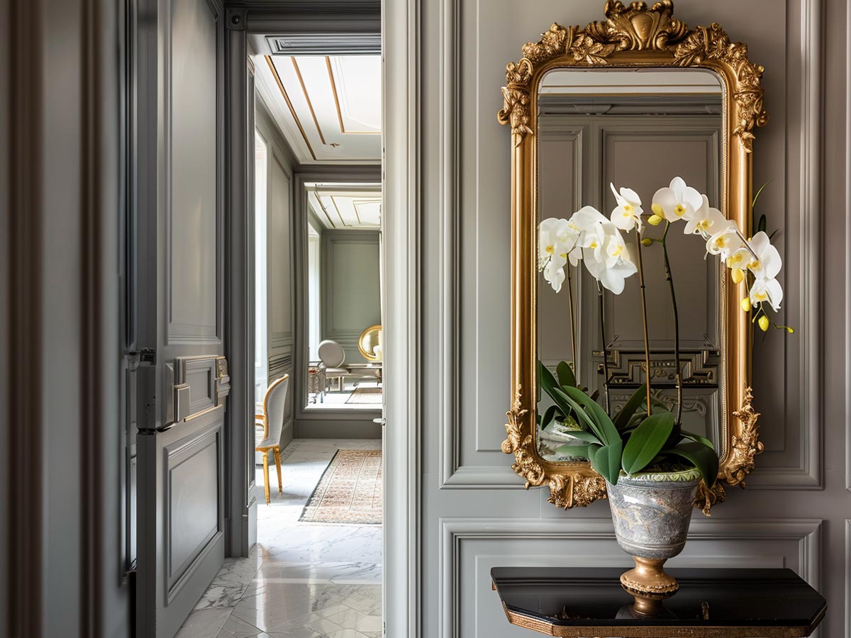
Mirrors can make your room look larger as long as your walls aren’t covered in them.
Not to mention, mirrors with no frames look more modern than the antique gold ones.
Keeping Old Wallpaper
Decorating with Soft Pink and Blue Hues
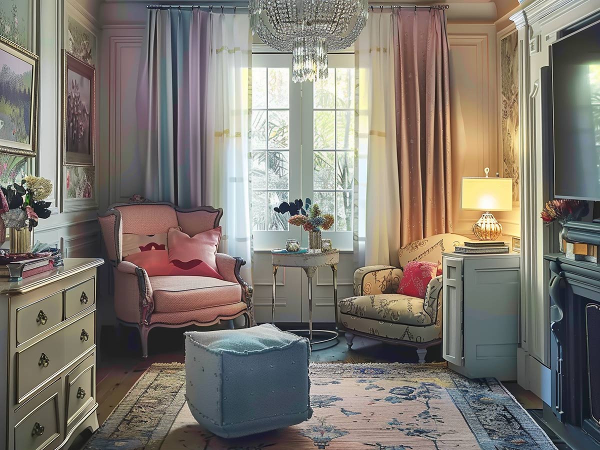
Soft pinks and blues can be used if they’re paired with accentuating shades. For pink, go with rose gold or another complimenting color.
Blue can be paired with a number of things, but we suggest using a navy blue rather than a light shade.
Using Too Many Colors and Patterns
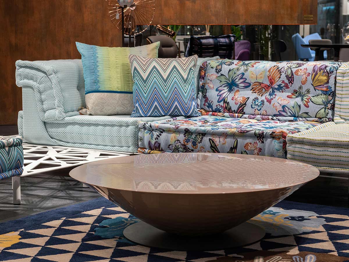
We said that you shouldn't match everything, but too many patterns and colors are just as bad. Try to go with a color palette with a single pattern.
Having the walls, curtains, bed sheets, and furniture all completely different colors can be overwhelming and distracting. Some contrasting patterns and colors are okay, but don't go too overboard.
Decorating with Tile Countertops
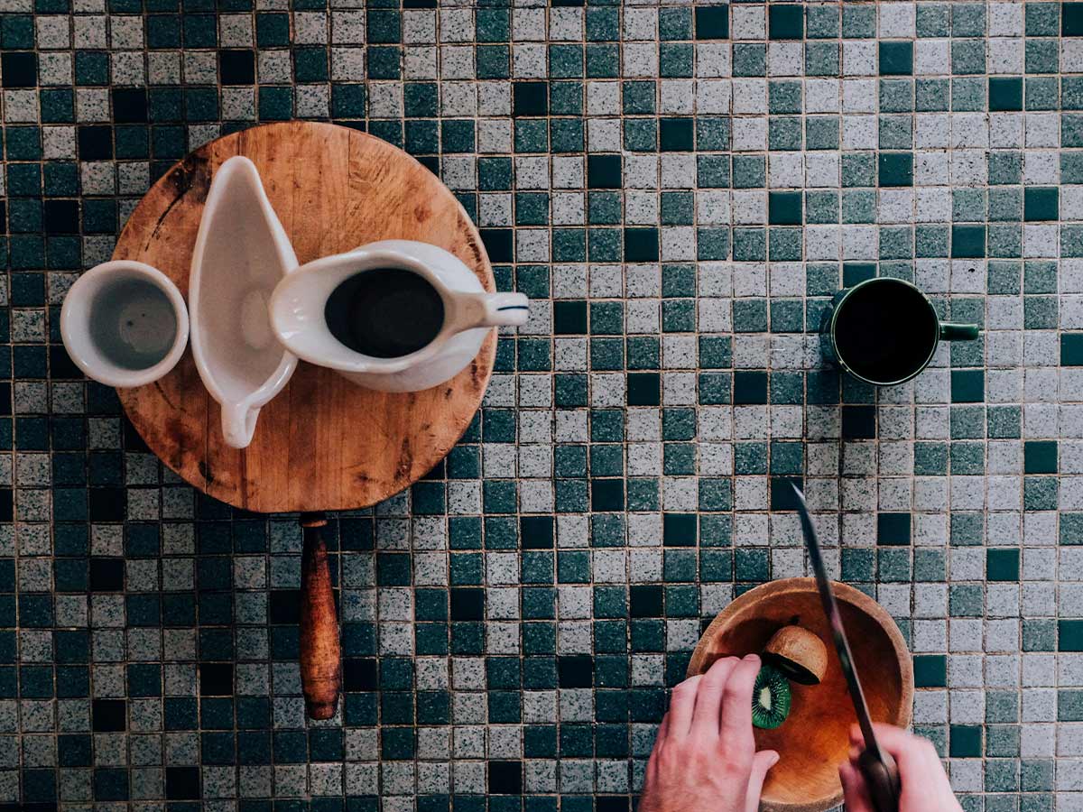
Tile countertops are another popular trend from the '70s, but now they're just hard to clean and more than a little unsightly. Countertops may not be something you really think about every day, but they can date your home at least 40 years.
Consider swapping those tiles with marble, wood, or even granite–things that most likely won't go out of style in the next 10 years.
Hanging Frames Too Low
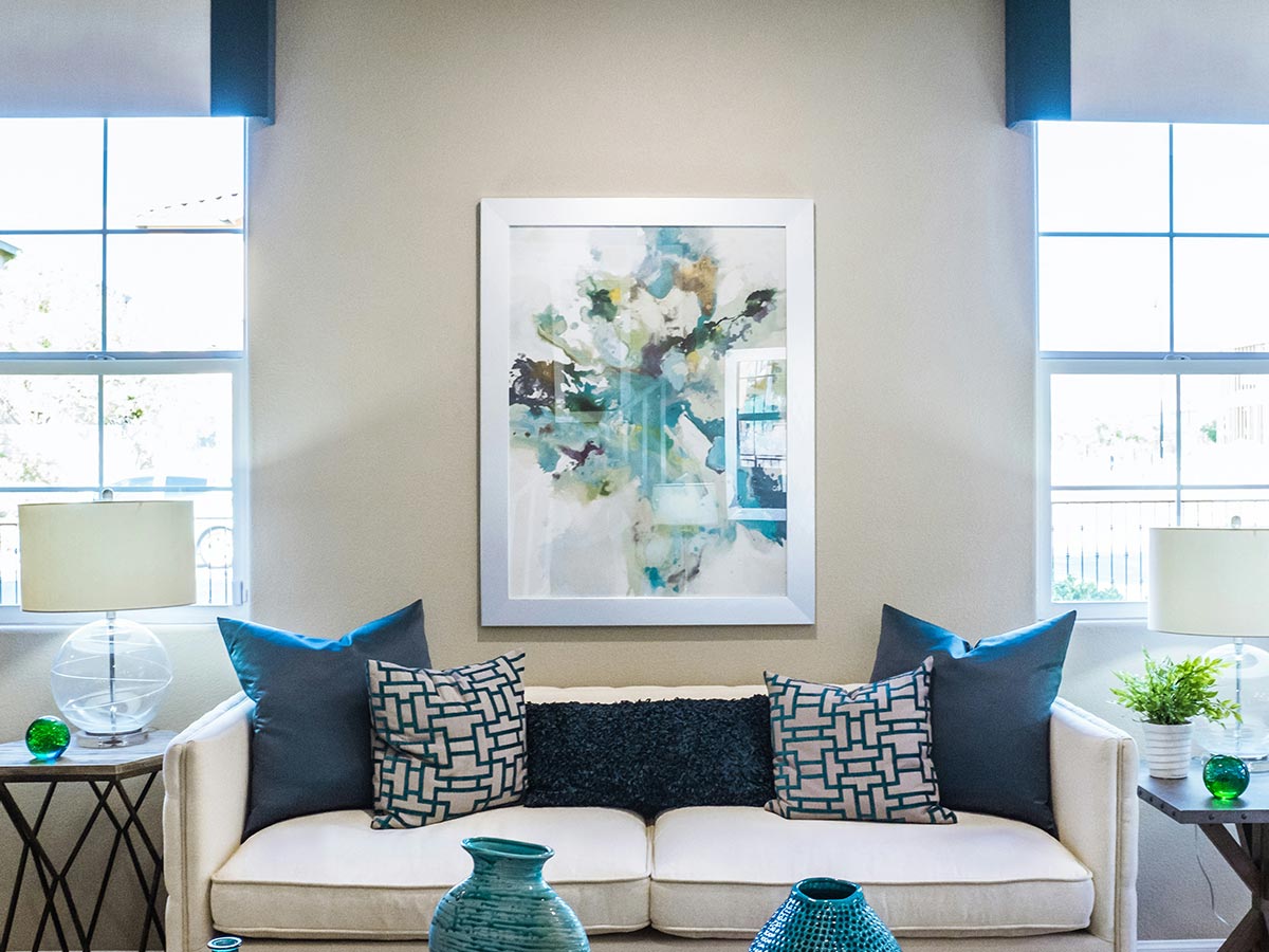
If you have to crouch or crane your neck down to look at a picture or piece of artwork, then there's an immediate problem (not to mention you could hurt your neck from doing it). When frames are hung too low, it creates the illusion that the walls are much shorter than they actually are.
To keep your home looking up-to-date and not to stunt its height, try to keep frames hung up about 60" from the ground.
Decorating with Too Many Pillows
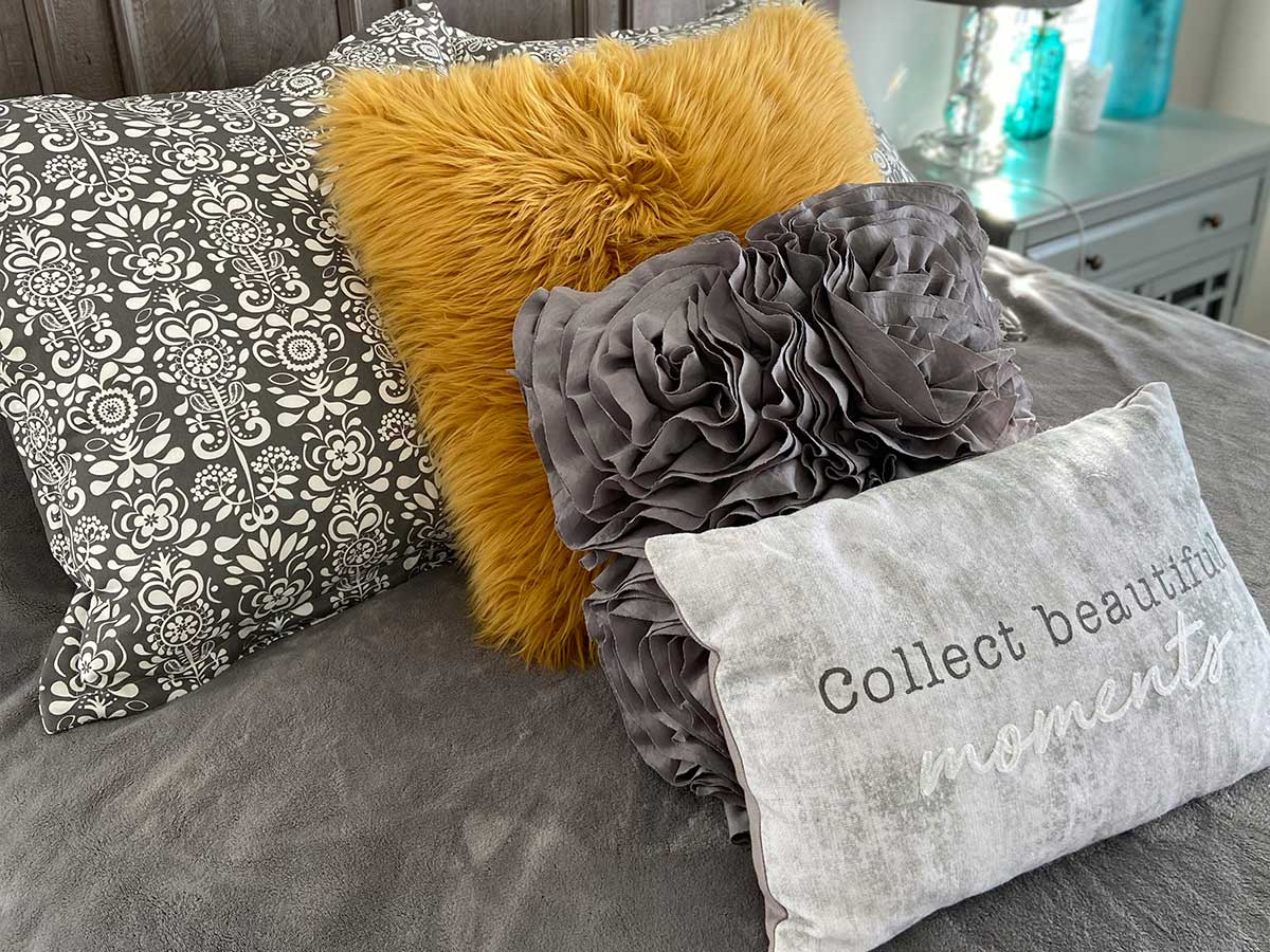
Pillows are great, but too many pillows (whether they be throw pillows or bed pillows) can be a significant problem.
If your guests are having trouble sitting on a couch or laying on a bed, then you might have pillow overload.
Pushing Furniture Against the Walls
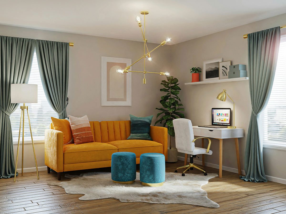
This is a super common mistake that a lot of people are guilty of. You may think that it makes the room seem larger or have more space, but it's the opposite.
It may give you more walking space, but the room looks uninviting. Doing this doesn't give the furniture enough breathing room and discourages conversations.
Hanging Cat Clocks
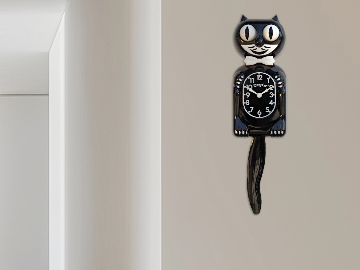
Okay, so this applies to all novelty clocks, not just cat clocks, but cat clocks are the most well-known. Cat clocks are creepy (if we saw those eyes in the middle of the night, we'd immediately assume there was some kind of monster in the house) and dated.
If you don't want a house that looks like you just stepped out of the '50s, kick that cat to the curb.
Keeping Floor-to-Ceiling Mirrors
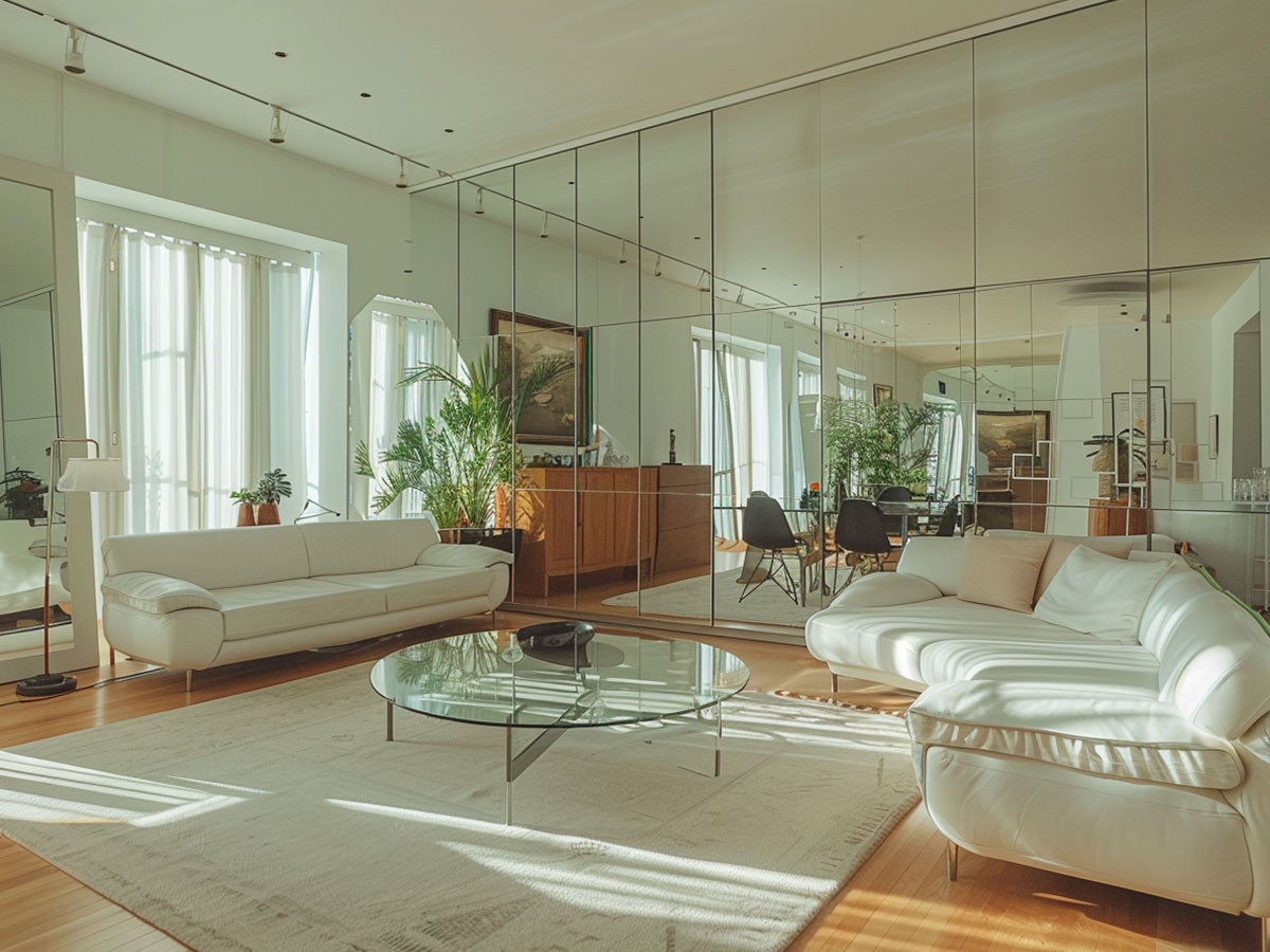
Remember when it was popular to have floor-to-ceiling mirrors all over the house? Yeah, it looked awful. It was one of the biggest ways a house could be dated.
They’re no fun to remove, but it isn’t something an adult should have in their home. The only excuse for this one is if they’re using it for a home gym or studio.
Keeping Linoleum Flooring
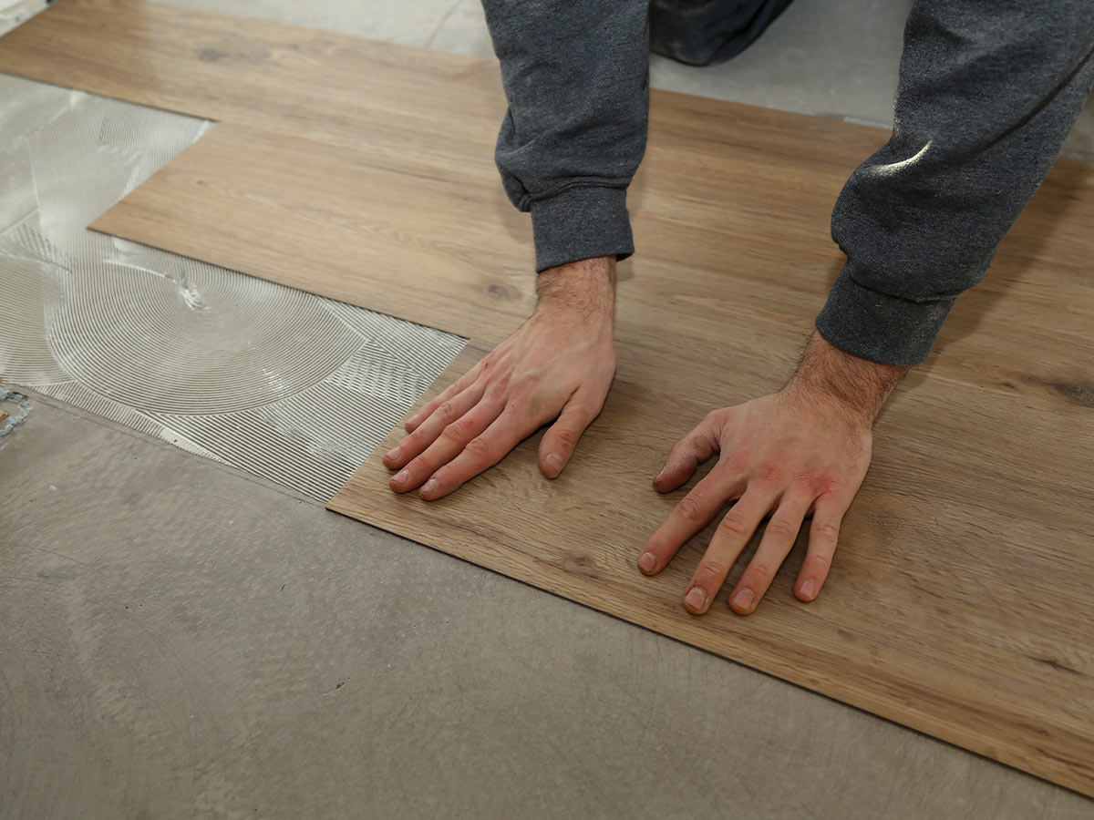
This is essentially the same as wall-to-wall carpeting, and it looks just as bad. Linoleum brings a cheap, old look to any home and can drag down the look of any room it's in.
Do yourself a favor, ditch the linoleum.
Hanging Shiplap Anywhere

Even if you aren’t going for the whole “rustic farmhouse look,” some people think shiplap is acceptable in their homes. No. No, it isn’t.
It may look alright now, but in five years, (or less) it’ll be what carpeted bathrooms were in the ‘50s. Don’t even get us started on the faux-shiplap wallpaper stickers. Those are even worse.
Still Using Ancient Analog Thermostats
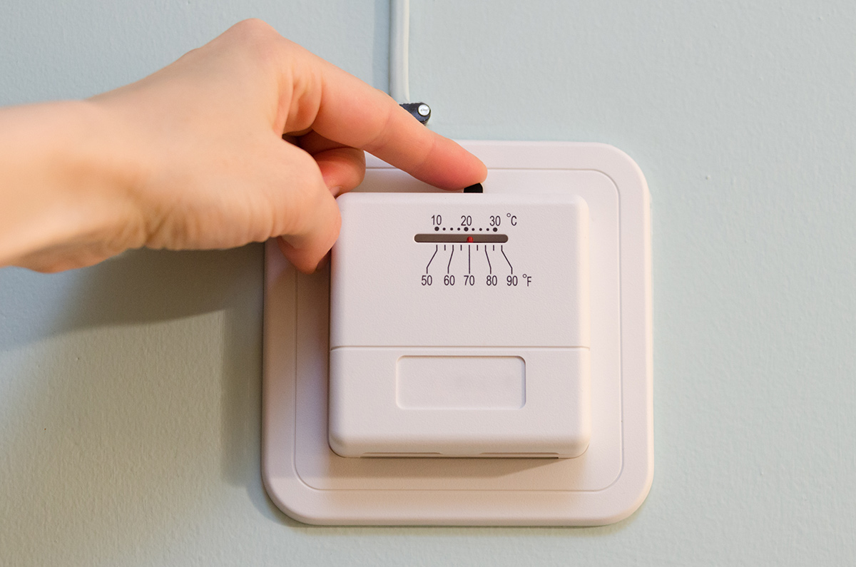
Technology isn’t everyone’s forte, but that doesn’t mean you should keep those ancient analog thermostats. Nothing looks worse and dates a home more.
These just can't compete with smart thermostats. Once you get one, you’ll never want to go back. It’s beyond convenient, especially when it starts to figure out your patterns. They also look much better.
Not Replacing Old, Cream-Colored Outlet Covers
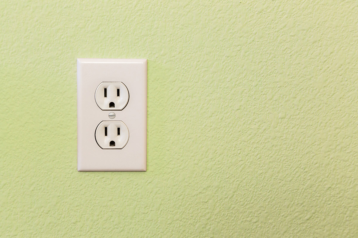
Nothing dates a home more than the old, cream-colored outlet covers and light switches – you know the ones. Even when cleaned, they look dingy and dirty.
Replacing light switches and outlet covers isn’t the cheapest home DIY you could do, but it’s one of those things that makes a huge impact. Plus, you can choose from a huge variety of styles available these days.
Using Textures on Walls
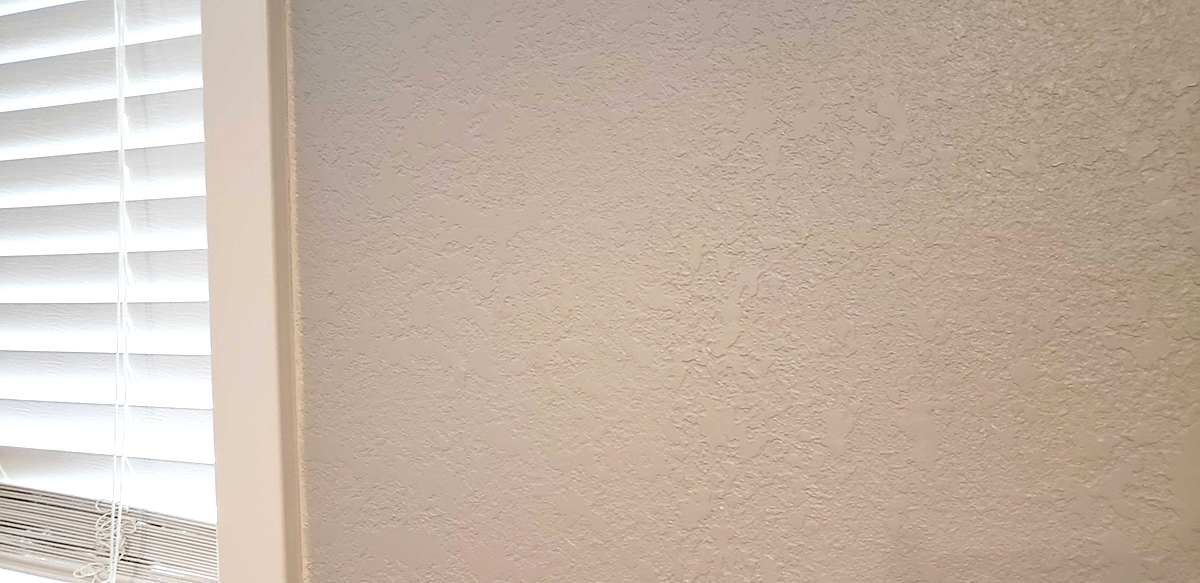
It’s time that we, as a nation, put our foot down and say no to textured walls. They don’t look good, they’re time consuming to create, and it’s a pain to fix any holes.
This doesn’t even get me started on the poor soul that has to come along and fix the awful texture. Overall, no one over 45 should have walls like this.
 Author
Rachel Downs
Last Updated: December 07, 2025

