Tetris Cabinets
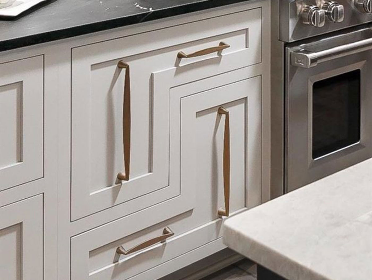
We’re quite sure whoever designed this…unique…cabinet design thought they invented the next hit trends taking over kitchens everywhere. At first glance, you wouldn’t even notice that this set of drawers is completely insane! We’re not completely sure what the inside looks like…but we could only imagine.
What would you even put drawers shaped like this? Someone, please fill us in, because we’re not trying to play a game of Tetris every time we put away the dishes. Could you imagine how frustrating buying kitchenware must be for these poor souls? They must have that drawer’s measurements memorized.
It’s Just Being Supportive
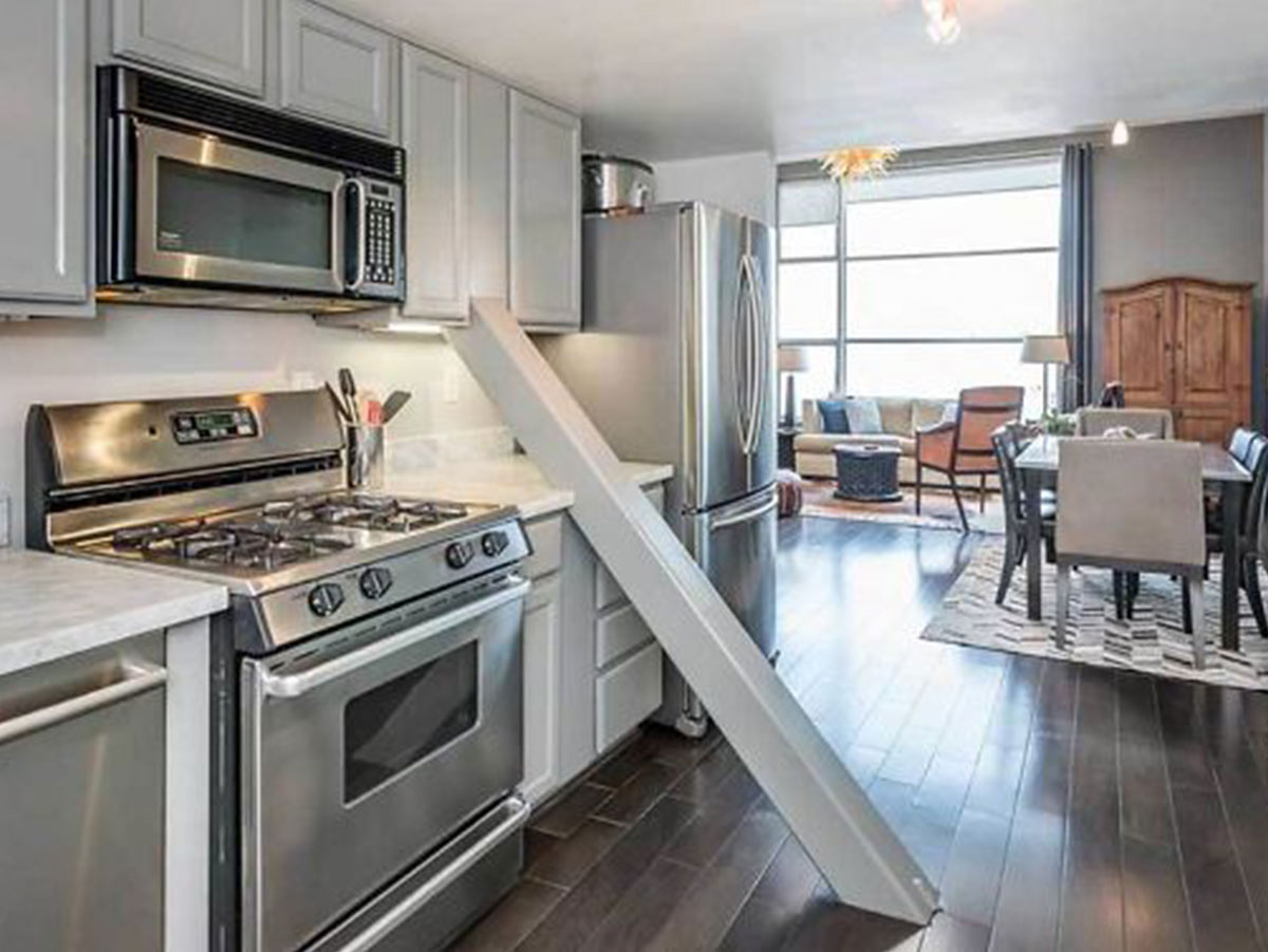
Okay…anyone who lives in a big city knows that housing gets a little “creative.” However, this is just obnoxious, especially in a million-dollar loft in San Francisco! Whoever lives here must have shins of steel because we’d be bumping into that beam every time we had a bit too much to drink.
At least the builder took some time to frame the cabinets and countertops around this ridiculous support beam. Our question is, what is this beam even supporting at this angle? In no way are we claiming to be engineers…but come on! Support beams are vertical. Surely this is just a bad joke.
We Just Need a Little Space
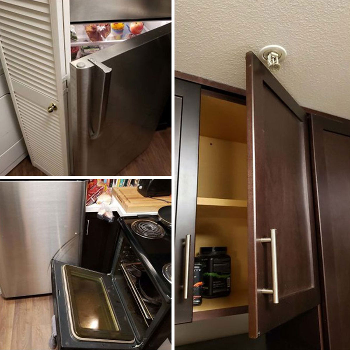
There’s probably nothing more frustrating in this world than trying to cook in a cramped kitchen…these poor souls are probably dealing with the most difficult kitchen we’ve ever seen! One wrong move and you’re setting off the building's fire alarm system, costing thousands of dollars worth of damage!
Beyond that…opening your oven beyond a measly 6 inches means scratching your refrigerator down to the bare metal! This is outrageous, and we’re quite sure this ridiculous kitchen is in a city where rent is more than most people’s mortgages! This is beyond tolerable.
A Little Too Open Concept
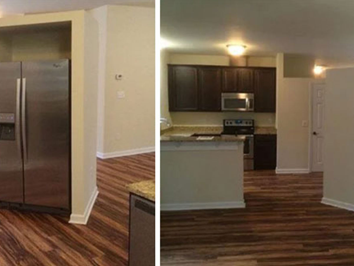
Okay, whoever dreamt this kitchen concoction up was nothing short of sinister…What’s this house’s fascination with half walls? Looking at the kitchen from what’s presumably the living room, there’s just a floating box of sheetrock that’s not connected to anything at all…On the other side, you have a lone refrigerator.
You might as well just throw the fridge in the middle of the floor and call it good…covering it up with walls isn’t doing any better! Whoever did this needs their license to build revoked! If that’s not bad enough, it looks like the front door faces this monstrosity! Welcome home, here’s our floating beige box.
Moldy Tile

Wow…just when you thought things couldn’t get worse in the flooring department, we see this. The only thing we can muster to say about this horrific flooring is “Why?” Why was this ever, ever, ever considered? Also, why was it ever made? Maybe from a distance it kind of looks speckled.
But no, it just looks like black mold all over the floor. Maybe this all is a setup to hide a very real mold problem…or maybe it’s just hideous all on its own. We’re not sure who in their right mind would pick this flooring choice, but they did…and now people like us on the internet get to stare with wonder.
Ummm How Does This Work?
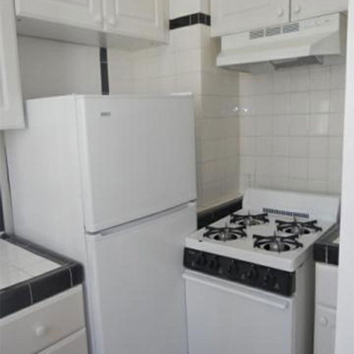
Okay, now this is just too much. There are certain aspects of this kitchen that are really cute…so we’ll give this one the ol’ compliment sandwich. (When one provides critics by sandwiching the insult between two compliments.) The tile work is lovely, and the white cabinets are liveable.
However, that refrigerator and stove need a bit of space to breathe! Someone had to have mismeasured! Whoever’s kitchen this is, we hope you got a serious refund because this is literally unlivable. You can’t even open the refrigerator at all! Would you just move the stove every time? No thanks!
The Fridge Only Works in the Dark
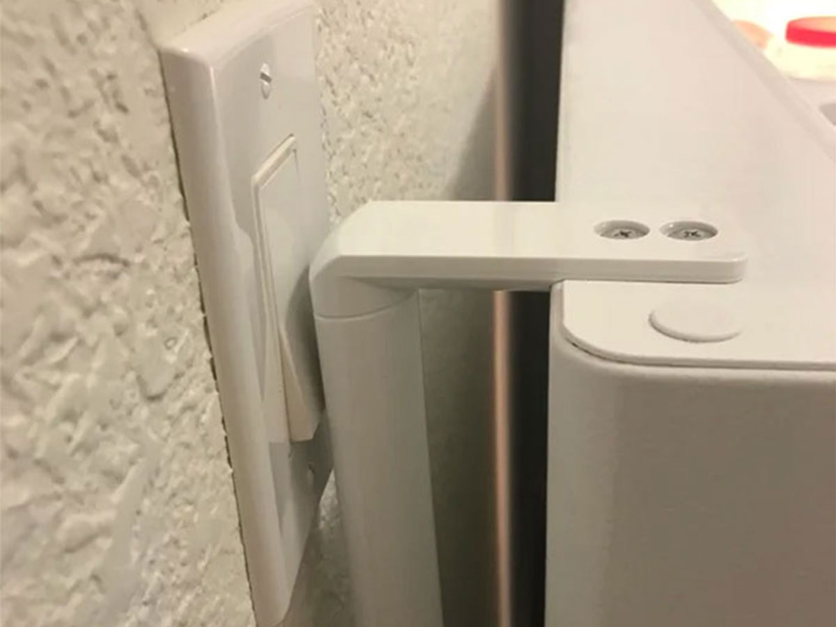
This may just be the most frustrating thing we’ve seen yet. In this kitchen, we have a refrigerator that opens right into the light switch. The best part? That switch is a paddle switch…so all it takes is a bump on each side to turn it on or off.
The handle on the fridge perfectly catches the light switch when opened straight out. Imagine your lights suddenly turning off when you go to open your fridge. We’re sure it took the residents of this home quite some time to adjust to this light switch nightmare. Things like this are subtle enough to really drive you crazy day to day.
We Hope Eleven is Your Favorite Number
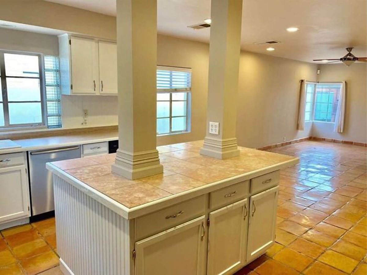
Looking at this kitchen, we’re hoping that at least one of these pillars is supporting the structure. It’s not common for you to need two pillars right next to each other when building, so we’re guessing one of these pillars is for aesthetics only!
It’s kind of like how the Titanic had a fake smokestack to round out the look of the boat. That’s not the only weird thing about this kitchen. When you get past the terrible pillars, the island cabinets are a different color than the rest of the kitchen, and we’re seeing some lovely glass blocks right next to the window over the counter. Which of course, isn’t centered.
Whoever Built This Needs to be Fired
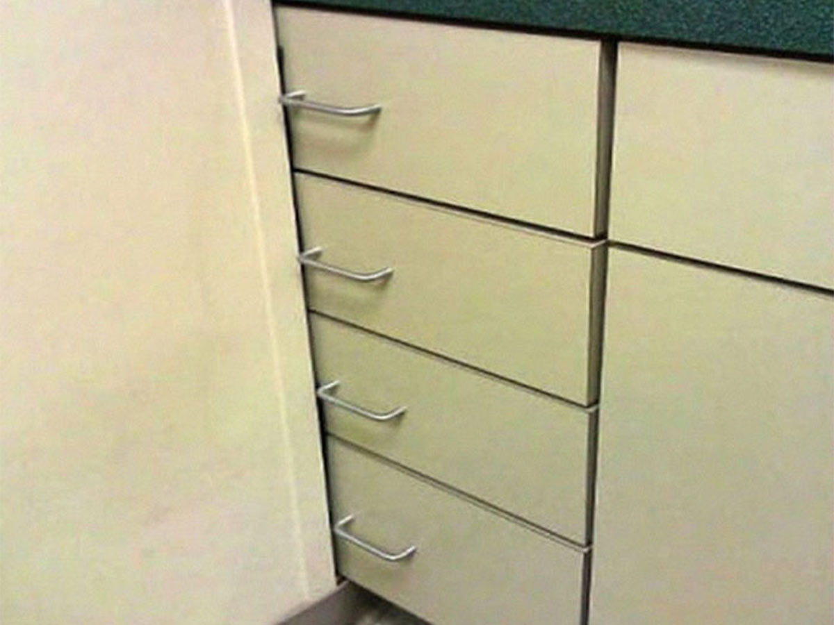
In what world is building a wall over your cabinet drawers okay? None! Whoever built this kitchen needs to be fired. This is an entire cabinet that’s been rendered useless by this wall. By the looks of this, this seems to be one of those tired office building kitchens.
What likely happened here is one of those low-budget office remodels where they rearrange everyone’s cubicles and act like they did something productive. Oh, you think your landlord does terrible work? Wait till you see the bare-minimum effort corporate America puts in.
Talk About Living Minimally
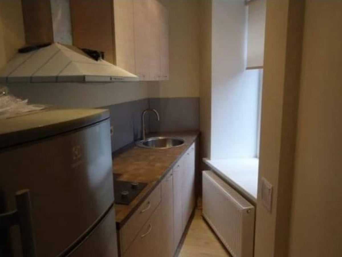
Wow, all we can say is…wow. We don’t know if this is what it looks like to live with “just enough” like all of those minimalist life gurus try to preach at us. But, what we do know is that this kitchen would drive us crazy. If the angle itself wasn’t bad enough…there’s a radiator right under the window to burn your leg on.
At least maybe you could sit on the window sill while you’re working in the kitchen. Could you imagine trying to clean that absurd corner though? Unfortunately…this isn’t the worst kitchen we’ve ever seen, but it is definitely not one we would choose for ourselves.
The Sink O’ Death
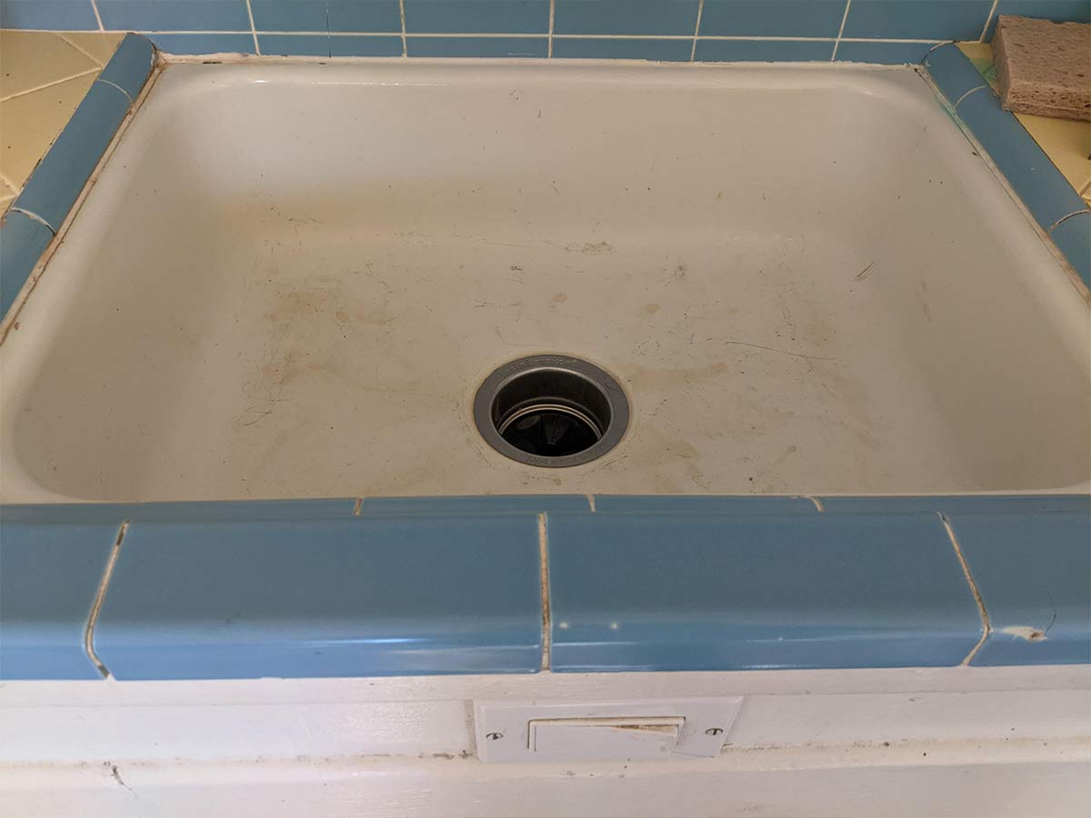
This sink is something out of a Final Destination movie. Right where your stomach hits the cabinet when you’re using the sink, someone had the bright idea to put a paddle switch for the garbage disposal! Whoever owns this house needs to have that fixed immediately! That’s a horror movie waiting to happen.
Beyond the obvious danger of getting your hand mangled when you drop something in the garbage disposal, imagine that loud noise turning on every time you wash your hands. No thanks! Whoever installed this switch owes the world an apology!
Luxurious Kitchen Carpet
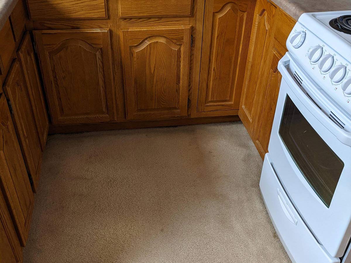
Want to know what’s worse than a carpeted bathroom? This absolutely horrific kitchen carpet! Who knows what kind of bacteria is living in that fabric! Besides the obvious health hazard…there’s no way this isn’t a fire hazard! Those fibers would burst into flames at the first opportunity.
Hopefully whoever buys this home next will have the sense to replace that carpet with something more suitable immediately. We’re surprised to see it relatively unstained. Marinara sauce would be everywhere!
Dishwashers Make Dishes Easy…Right?
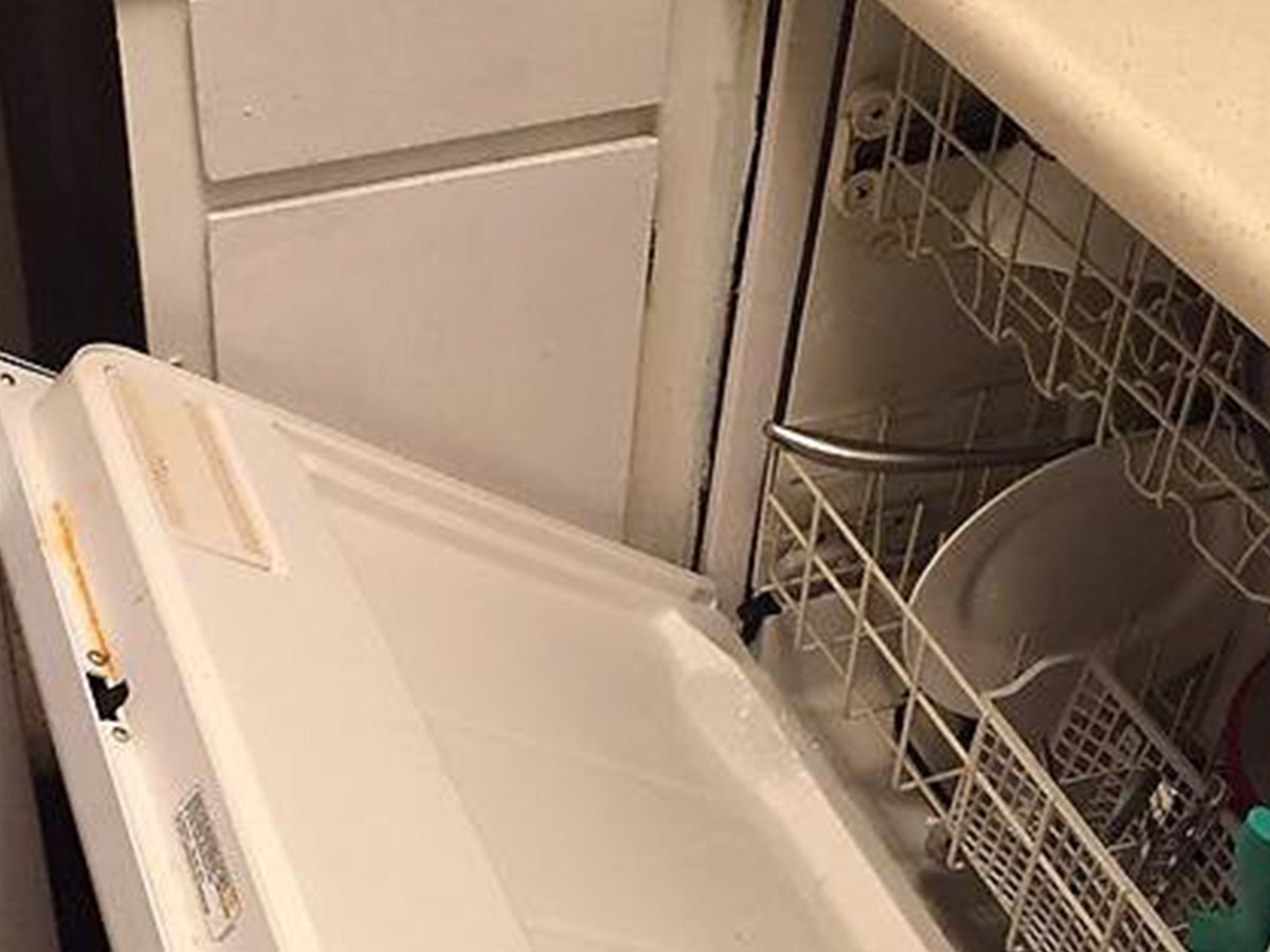
Dishwashers are supposed to make doing your dishes a breeze…but if you were working in this kitchen, you’d probably prefer to do them yourself! Dealing with this dishwasher situation would drive us crazy. It’s basically unusable.
As you can see from this picture, you can’t even extend the rolling tray on the bottom to place dishes in there correctly. There are only a few dishes placed on the bottom shelf, barely enough to justify the use of the dishwasher!
This Cabinet Couldn’t “Hang in There” Anymore
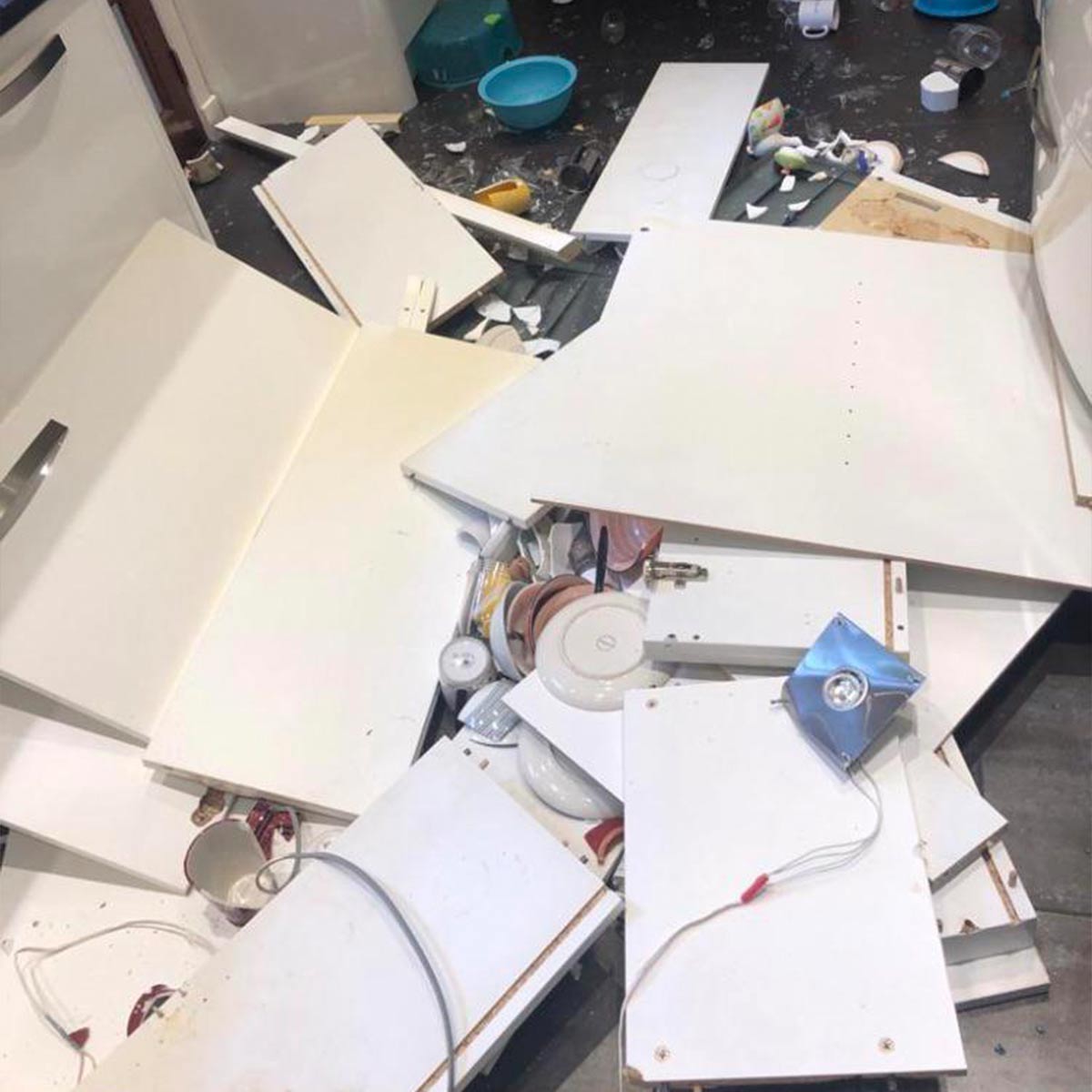
This must have been a horrifying sound to wake up to at four in the morning! Reddit user @weejwontC10 posted this picture saying “Kitchen cabinets decided to yeet themselves at 4 in the morning.” We’re guessing these cabinets were installed without the appropriate supports.
If this were our problem to deal with, we would probably inspect the rest of the cabinets before they all started dropping like flies! Thankfully, no one was hurt. A heavy kitchen cabinet falling from the ceiling could have caused some serious damage.
More Obnoxious Pillars
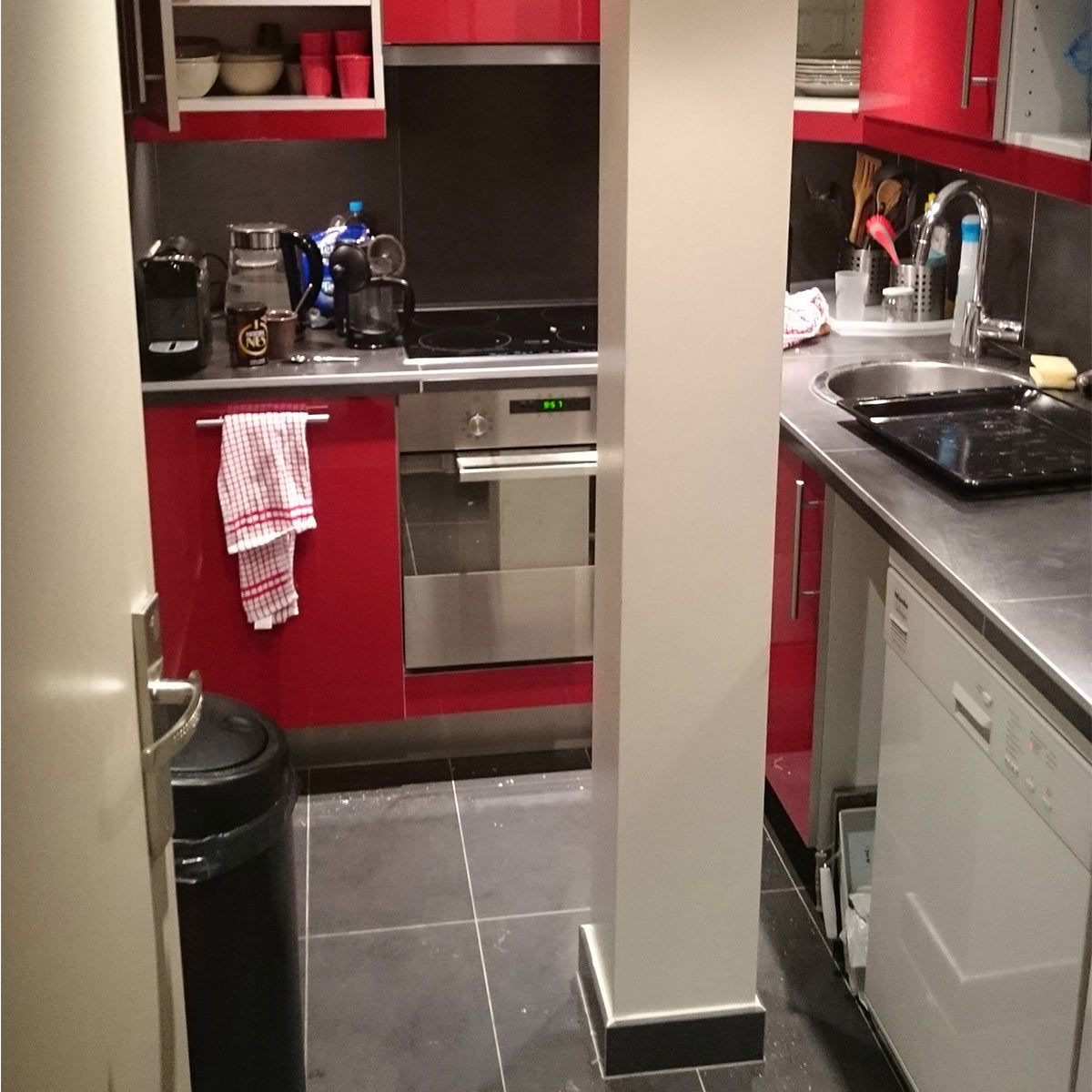
What is it with kitchens and these ridiculous pillars? This already small kitchen is effectively cut in half by this pillar. It looks like, despite the nuisance, all of the appliances can open fully, so that’s a win at least.
Surely there was a better placement for the kitchen! Imagine carrying a hot baking sheet and running into that pillar…food, everywhere! This kitchen is definitely an eyesore, but it is still usable. This means whoever owns this kitchen will more than likely never fix it.
For that Nice Wood Char Flavor
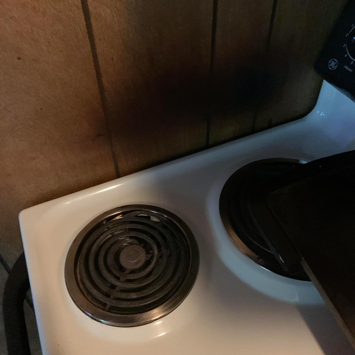
A fancy method for adding that enhanced smokey flavor to a dish is to cook it low and slow on planks of wood! Well, now you could get that same flavor all the time! Yikes, this looks like a house fire waiting to happen. What were they thinking? Look at how the paneling has burned over the years.
Furthermore, who still has paneling? We’re hoping these people received an intervention before it was too late. Besides the fire hazard, wouldn’t that porous wood be prime real estate for bacteria to live? With all that cooking grease and grime soaking into that wood..you would never be able to disinfect it.
What’s Even Happening With This Sink?
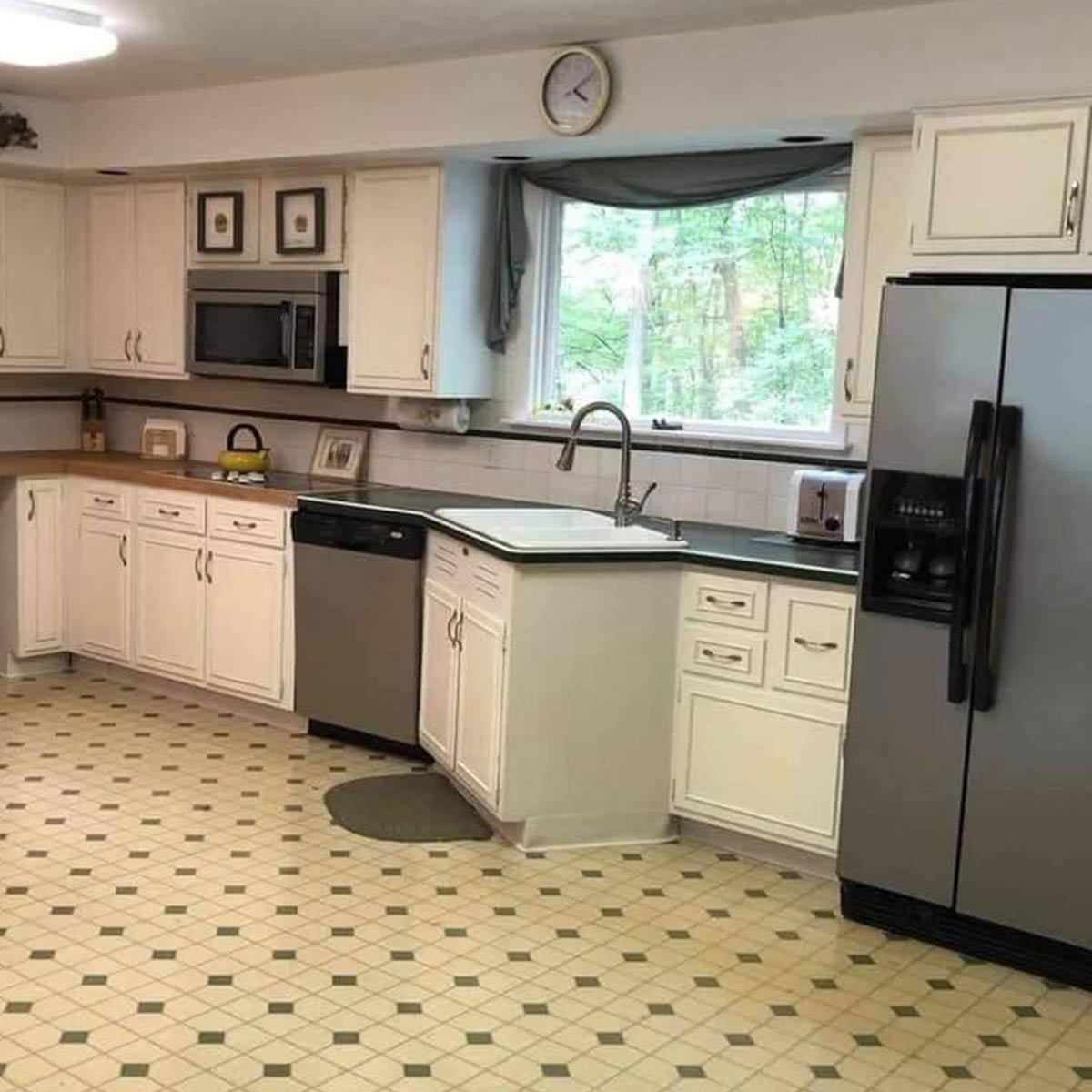
Let’s talk about a few things in this horrific kitchen. Let’s start with the obvious…the ridiculously strange placement of the sink. Nothing’s stopping you from building your kitchen like this, but take note of why you wouldn’t want to. There better be the view of a lifetime through the corner of that window!
Beyond the dreadful sink situation, this linoleum and mix-matched countertop are enough to send anyone over the edge. Also, what’s going on with this cabinet to the right of the sink? The microwave doesn’t fit its space, and there’s absolutely no workflow in this kitchen! Someone must have built this themselves.
NY Apartment Life
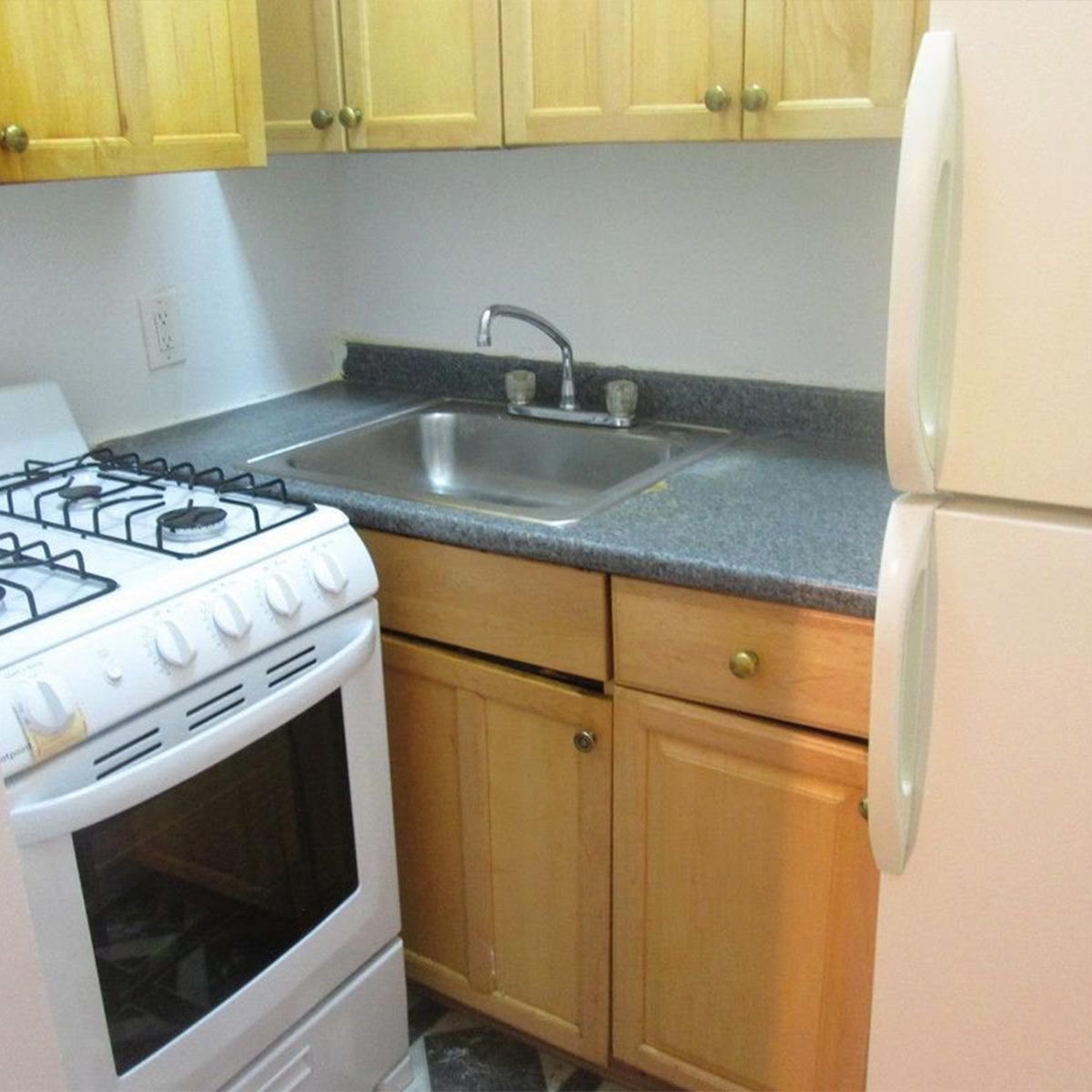
New York apartments be like, "Here we have the quintessential landlord special." All of the components are there, but do they make sense? Not at all! Reddit user u/cbartlett posted this picture with the caption “Manhattan apartment kitchen $1485 per month.”
Living conditions like these should absolutely be illegal in a country like the United States! You would think they would at least move the sink over a bit so that it’s actually usable. This is just ridiculous! But, it’s technically usable so it will probably stay like this forever. It looks like the cabinets are placed over each other on top too!
The Shy Outlet
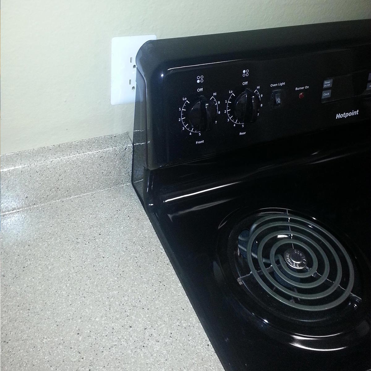
Reddit user u/Sariel007 posted this unnerving picture of their new kitchen. Here we have the typical apartment kitchen…well, except for this rather shy outlet peeking out from behind the stove. It’s just a little bit of charm right? No…that’s called a lazy landlord! The outlet may as well not be there.
Maybe you could at least move the stove out from the wall a bit when you needed to plug something in. Hopefully there are a few other outlets around the kitchen because living with just this one would be a pain. This outlet should at least be moved up a bit, it wouldn’t cost much to have the outlet moved.
Seriously…Did No One Catch This?
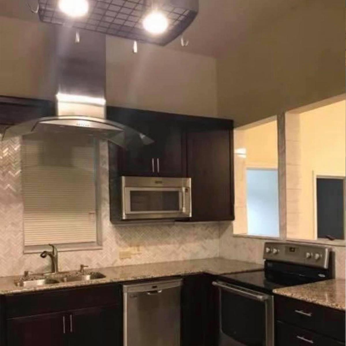
This lovely kitchen is put together all wrong. There’s really not a great decision to be made with this layout, but a better attempt could have been made. First of all, why is the vent hood over the sink? That makes no sense.
You really shouldn’t have the stove near the cutout ledge, but it’s not the worse thing we’ve ever seen. But what would bother us the most is that the sink is slightly off-center from the window. Honestly, it would take a total gut job for us to consider living in this house.
Closet Kitchen
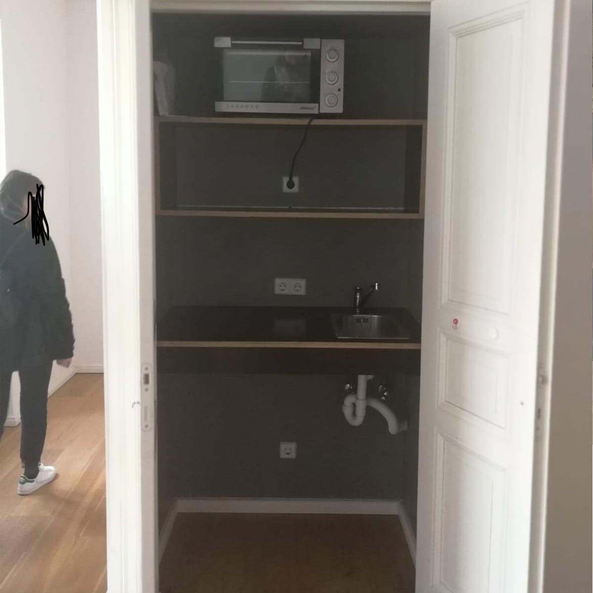
Reddit user u/plueschlieselchen posted this picture with a caption saying, “A friend just sent this picture to me saying: Rent advertisements in Berlin be like built-in kitchen.” At least if your kitchen was dirty, you could just close the door and forget about it! Talk about living minimally..this place only comes with a countertop convection oven!
It at least has a lovely set of double doors as an “entrance” to the kitchen…that’s fancy, right? There’s just no way a kitchen like this would cut it in the United States. How are we supposed to make our absurd portion sizes in these conditions? We’re hoping this person skipped this rental and moved on to something better.
This Can’t Be Real
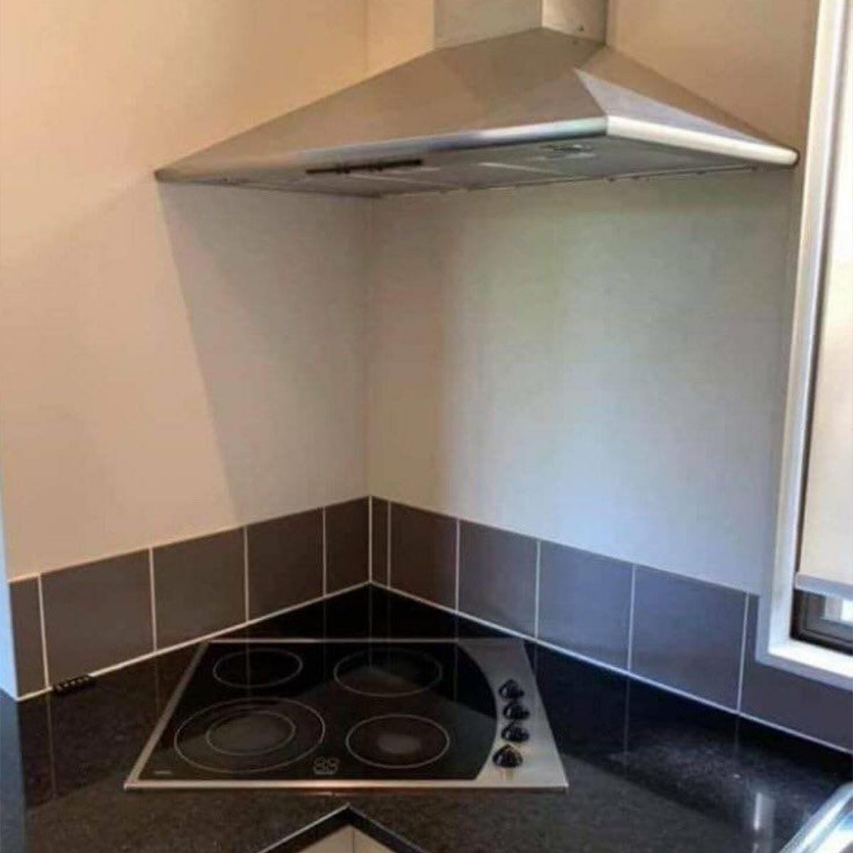
Now, this kitchen would be particularly frustrating. Reddit user u/SlaughterheartMagus posted this picture with the caption simply stating, “This Kitchen.” Enough said because this kitchen sucks! For one thing, your cooktop is in a corner…off-center of course.
Whoever built this kitchen didn’t even have the courtesy of centering the vent hood over the cooktop! If you were a person on the shorter side, you wouldn’t even be able to reach that back burner appropriately! This just wouldn’t do.
The Landlord Special
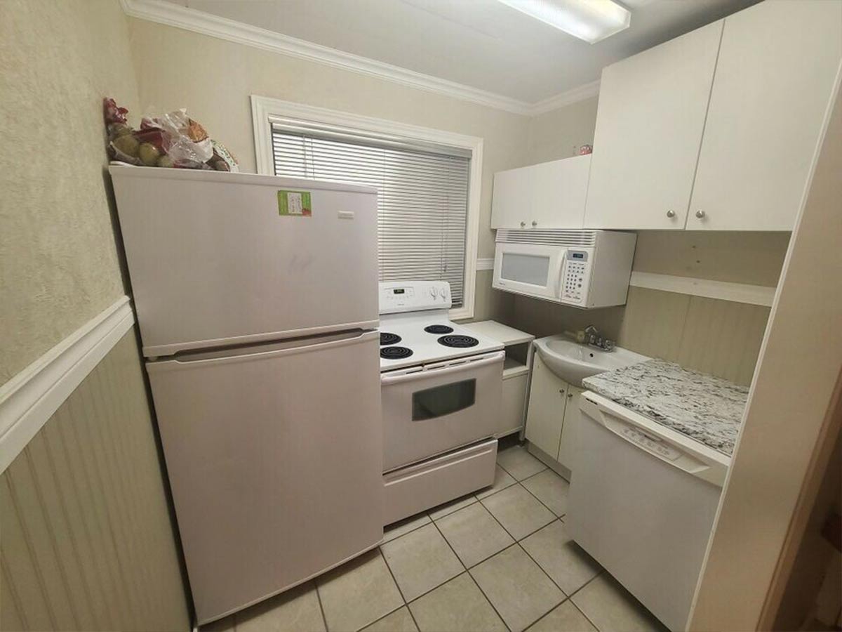
What’s all white and makes no sense? This horrible kitchen. This place looks like someone went to the clearance aisle at Lowes and walked out with everything. Where do we even start? The kitchen should have definitely gone on the right by the wall. The shorter cabinet is meant to be hung higher so that the microwave is flush with the bottom of the cabinets.
Why in the world is there a bathroom vanity in the kitchen? They could have put a lot more counter space if they wrapped around the corner! It would have been tight, but not any worse than any other apartment kitchen. This is criminal if you ask us! At least it has a dishwasher…you would need it since your sink is hiding under your microwave.
The Perfectionist's Nightmare
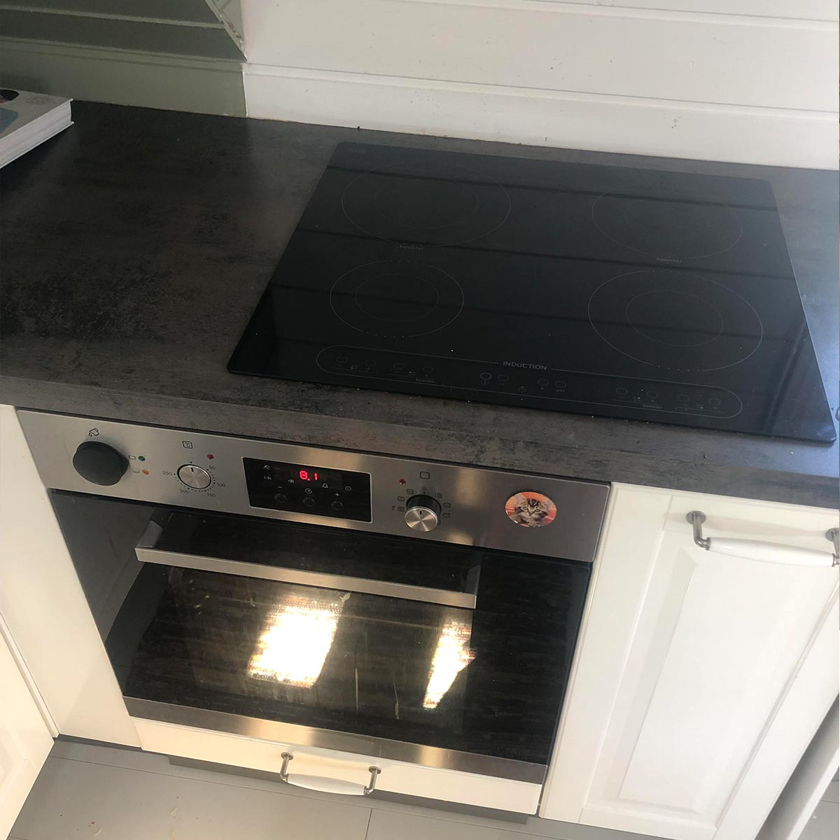
Why? Just, why? This is unacceptable! Whoever installed this ruined a perfectly good kitchen with the placement of this cooktop. It’s not criminal to have a small kitchen, but throwing appliances around a kitchen willy-nilly just is not good workmanship! Is it functional? Yes…but come on.
There better be a good reason for why the builder decided to offset the cooktop from the oven. Maybe the electrical just couldn’t all be fit in the space? We don’t know, we’re not electricians. All we know is Reddit user u/ItsYaBoiPjotr deserves a gift card to buy a new stove.
Yet Again…Another Pillar
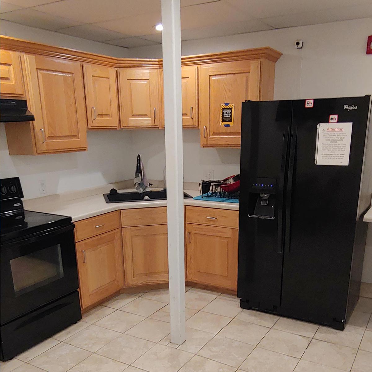
With any structure, there’s one evil you could never get around…support pillars. If it needs support, there’s no way around it! In this kitchen, we have yet another obnoxious pillar right in the way of everything.
Our guess is that this kitchen is an add-on, and they couldn’t get around the need for support. They should have definitely hired a better contractor…because this is totally unacceptable. Maybe they did this monstrosity themselves?
It’s Just that Ugly
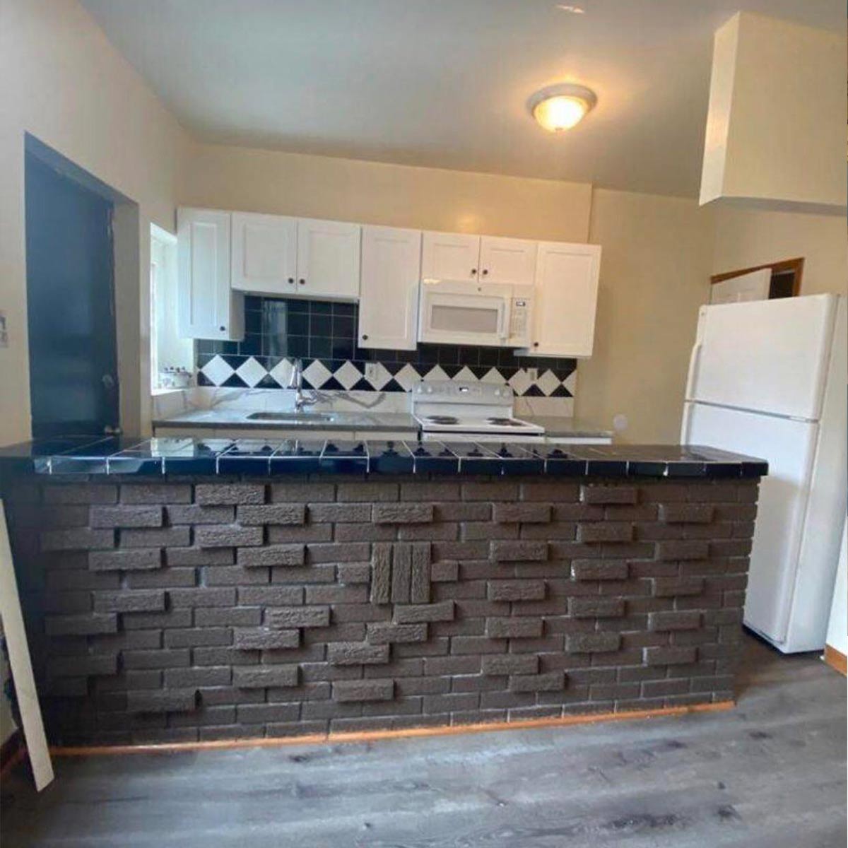
Reddit user u/JIA7767 posted this kitchen with the witty caption “Finally found my dream kitchen.” Let’s be real, this is no one’s dream kitchen. In fact, this may be the kitchen of our nightmares. Besides the hideous brick wall, that refrigerator is entirely too close to the side of the bar!
Let’s not forget that lovely black subway tile on the countertop and backsplash. To make matters worse, the brick has some sort of incoherent design to really add a little bit of pizzazz. There is also a lovely strip of oak half-inch-round trim to finish off this “stunning” kitchen. After all of that, we couldn’t ignore this prison door leading directly into the kitchen. What’s up with that?
Whoever Did This Needs to Be Fired
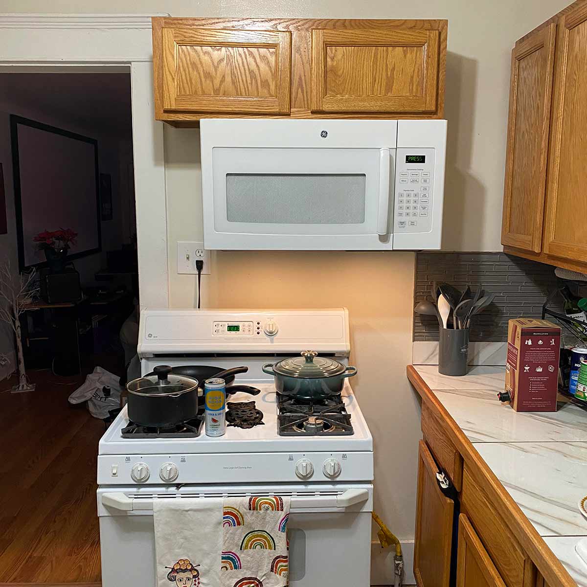
Okay, this is just cruel. There is so much wrong with this picture, where do we even begin? Reddit user u/joebrown75 posted a picture of their new kitchen saying this, “Just bought a house and I love everything about it - except our terrible kitchen.” Terrible is putting it nicely…this kitchen sucks!
Let’s just start with the lazy placement of this stove. No one puts a hot stove right by a walkway, that’s just a safety hazard! Someone should have done the work correctly and fixed the footprint of this kitchen. Beyond that, we have a whole cabinet that opens into the side of the stove, and a microwave that is hilariously off-center.
What a Lovely Remodel
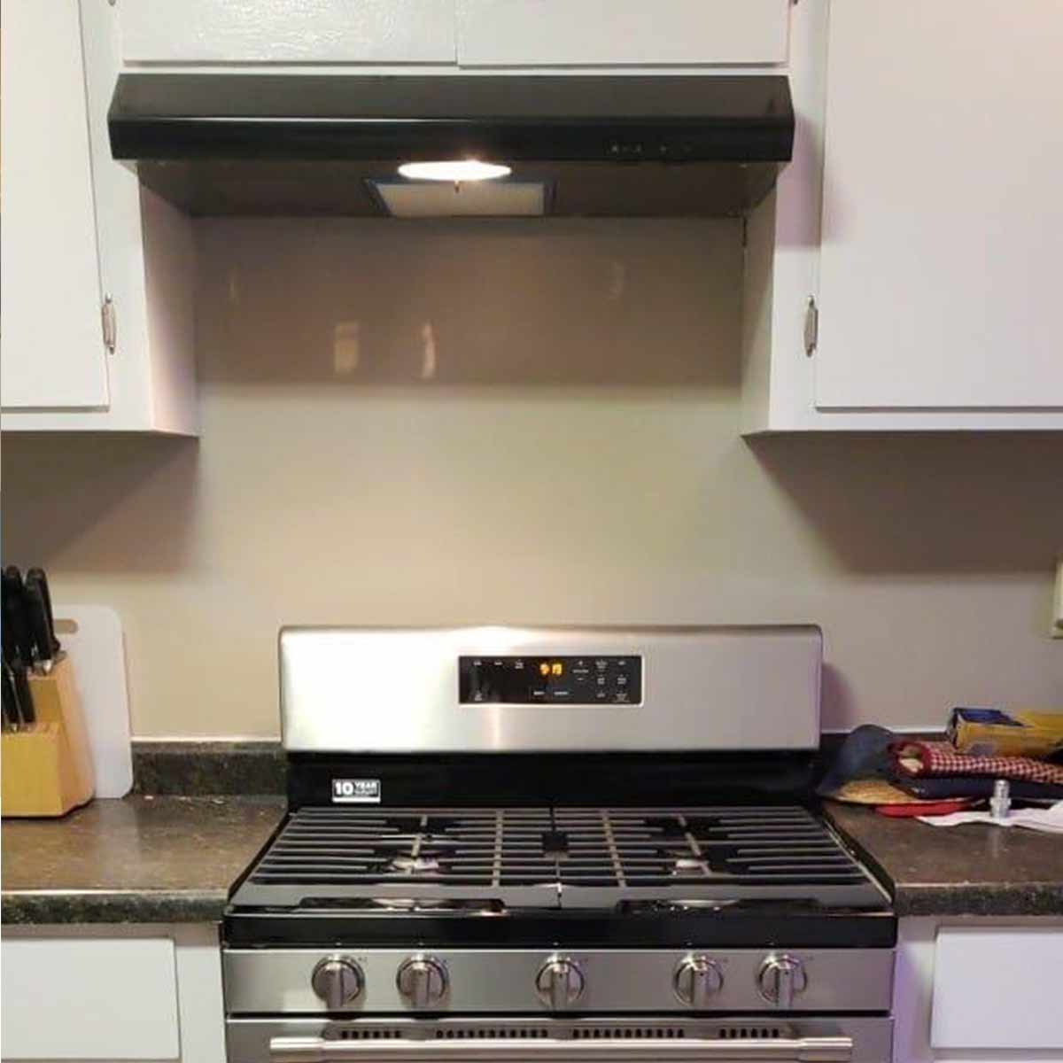
There’s nothing more awkward than going to see your friend’s newly remodeled kitchen only to find out it looks like a 5th grader did the work. Reddit user u/SirCadwaladr posted this picture of his friend’s kitchen design fail with a caption saying, “My Friend Just Finished a Kitchen Remodel.”
Who wants to break the news that his kitchen needs another remodel? That Maytag stove is lovely, but the outcrop in the overhead cabinets is totally off-center! If you’re a perfectionist…good luck living in this house! Sorry man, but what you have on your hands isn’t a kitchen remodel, it’s a kitchen fail!
Absurdly Shallow Cabinets
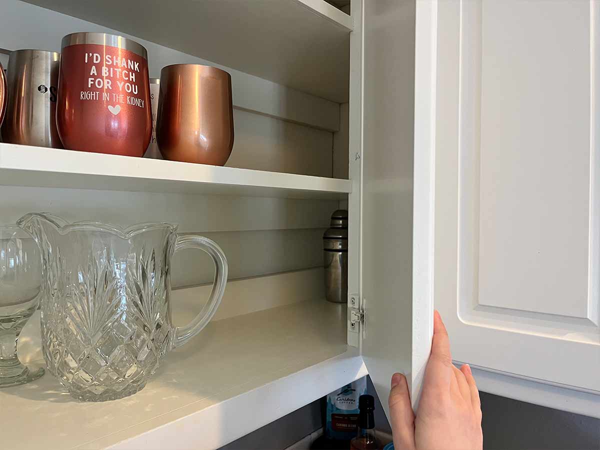
Storage, storage, storage…It’s all about storage! But what happens when your storage is a little too shallow? Well, this person is dealing with kitchen cabinets that couldn’t even fit a dinner plate! Where did these cabinets come from, a dollhouse? This would be incredibly frustrating to deal with.
When your cabinets are this shallow, your only option would be to store things on their sides. But what if they fell over? Other than that, the kitchen looks perfectly fine. It’s unfortunate that this kitchen needs a total gut-job just because of those stingy cabinets!
A Day Late and an Inch Short
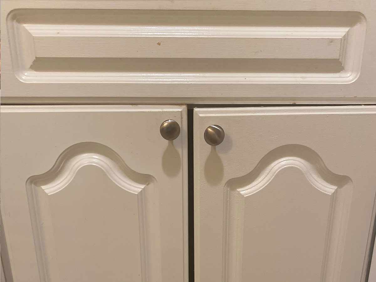
Wow, just wow. Whoever cut this cabinet door to size needs to find a new job. Let this be a warning to anyone who thinks they can remodel their own kitchen. Measure once, measure twice, and measure a third time for good measure! Having to look at this cabinet door all the time would make us scream.
Thankfully, it’s totally fixable. But it makes you wonder what other atrocities are lurking right out of sight! This kitchen looks like an apartment kitchen, so guess what? That cabinet isn’t getting fixed anytime soon! It has a door that works, and that’s all a landlord needs to know.
 Author
Jennifer Freehill
Last Updated: January 02, 2026