Chef Kitchen Theme
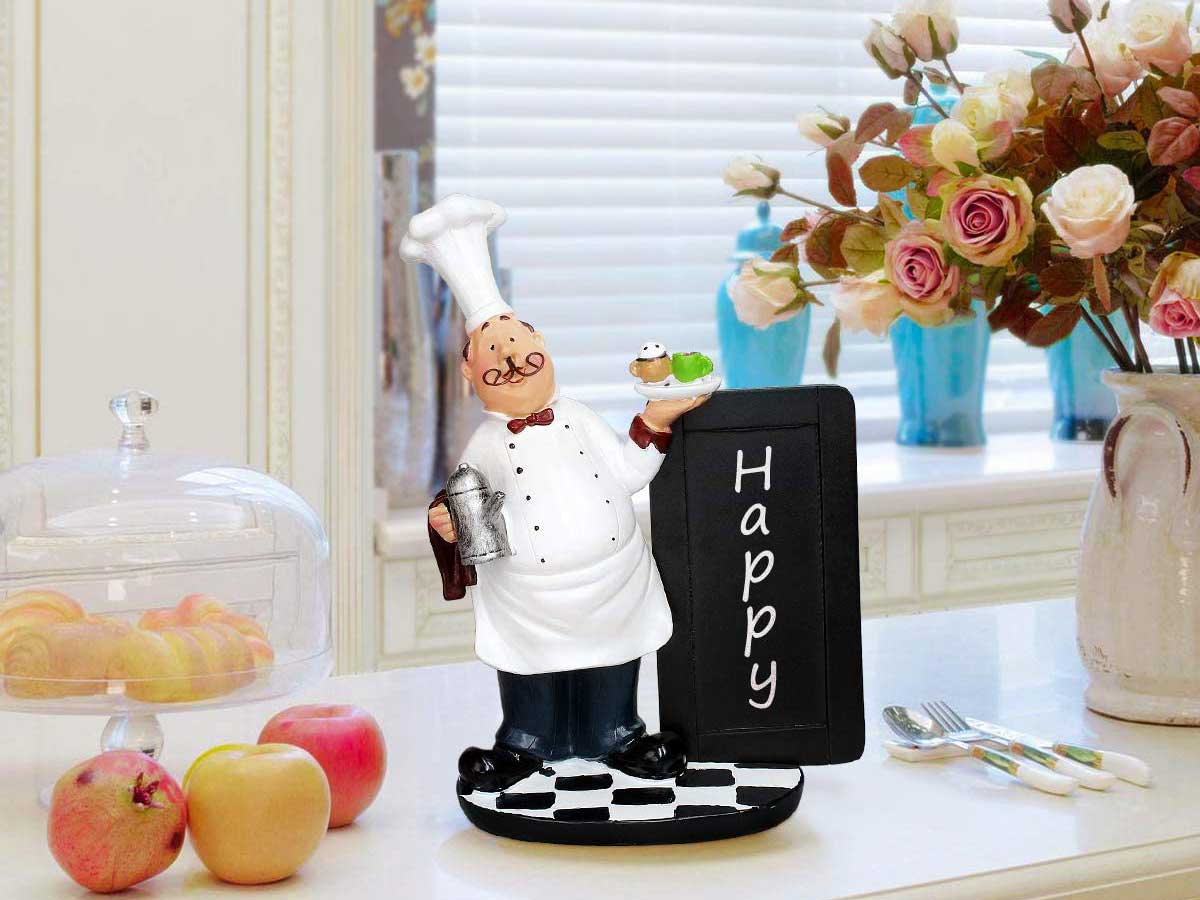
For whatever reason, in the mid 2000s chubby little chefs invaded our kitchens! People had chef-themed dish towels, rugs, and even salt and pepper shakers. They were seriously strange then and definitely are now. Ask anyone who cooks for a living and they’ll tell you that there’s only room for one chef in the kitchen.
These collectibles were in almost every kitchen across the country for years. This phenomenon took hold because this theme was easy to accomplish. Not everyone is a capable designer, so easily obvious themes are easier to fully express. In the kitchen, decor can be pretty limited. Unless you’re creative, the most you can get by with are a few hand towels, cookie jars and figurines.
Man Cave Theme
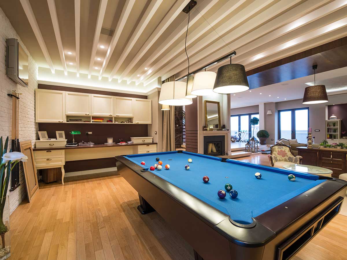
The man cave craze took us by storm, and suddenly everyone was flipping their guest rooms and garages to the “Man Cave.” Besides being completely obnoxious, this theme just reinforces an annoying stereotype about men being barbarians. If your guy needs his own room separate from everyone else, he probably should work on that antisocial behavior.
Besides the principle of the idea, most of the “Man Cave” decor is just bunk. You're either committing to a room covered in drinking paraphernalia or the vibe of a Midwestern Buffalo Wild Wings. Reclaim that garage for its intended purpose and bring your man back into your home life by ditching the man cave.
Safari Theme
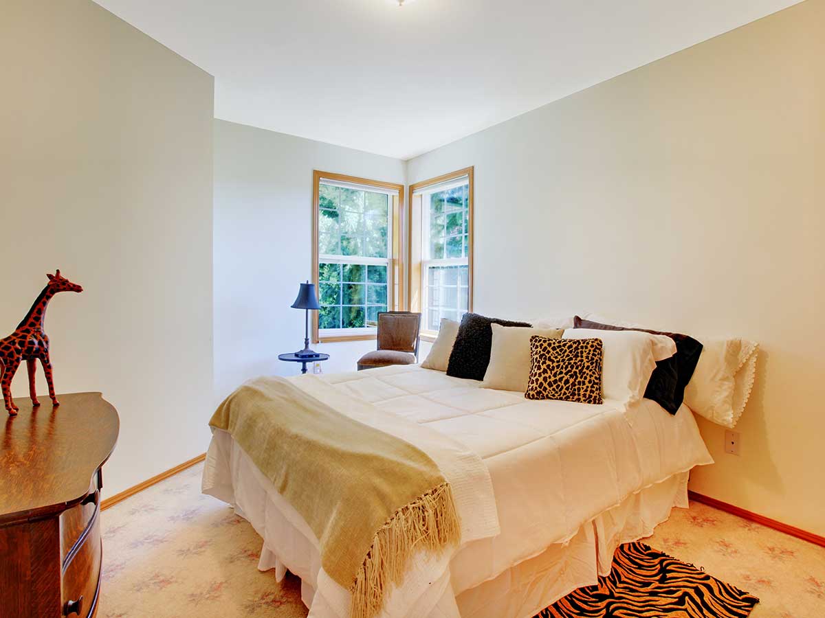
This theme is for those “more is more” types of people. We’ve decided that this theme was more about having the free reign to mix whatever animal print you wanted and cram as many fake plants as you possibly could in your living room. This trend feels a little forced. Forced as in taken from other people’s cultural surroundings.
Unless you’re living on the Serengeti, it’s probably not an appropriate use of a safari theme. Otherwise, you’re just trying to make your home look like the inside of a Rainforest Cafe or Disney’s Animal Kingdom. It’s ok to appreciate the safari vibe, but don’t turn your suburban home into something it’s not.
Tuscan Kitchen Theme

Those that couldn’t afford to visit Tuscany just bought cheap knock-off decor and called their kitchen "Little Tuscany"! From obsessive grape motifs to ridiculous faux finishes, this theme took a while to shake off. Everyone wants a taste of the good life, and the Tuscan lifestyle definitely is the good life.
The rolling countryside of Tuscany matched with the great textures from terracotta, and cream limewashed brick makes living there seem like a summertime daydream. Everyone wants to bring a bit of paradise to their home, but it just doesn’t look right unless you’re actually living in a vineyard in Florence.
Appliance Cozies

This craze was absolutely insane. Who in their right mind would take the time to knit a toaster cozy or purchase an ornate cover to place over their appliances? There is literally no point to these, and, honestly, it seems like a bit of a hazard. All those flammable textiles also seem like a health hazard.
If you wanted to hide your appliances that bad, why not commit to some hide-a-way appliance storage? There are tons of concealed storage solutions for small appliances that keep them accessible while out of sight. It's much better than fabric-covered figures hanging out on your counter tops. Ditch these appliance covers.
Rooster Kitchen Theme
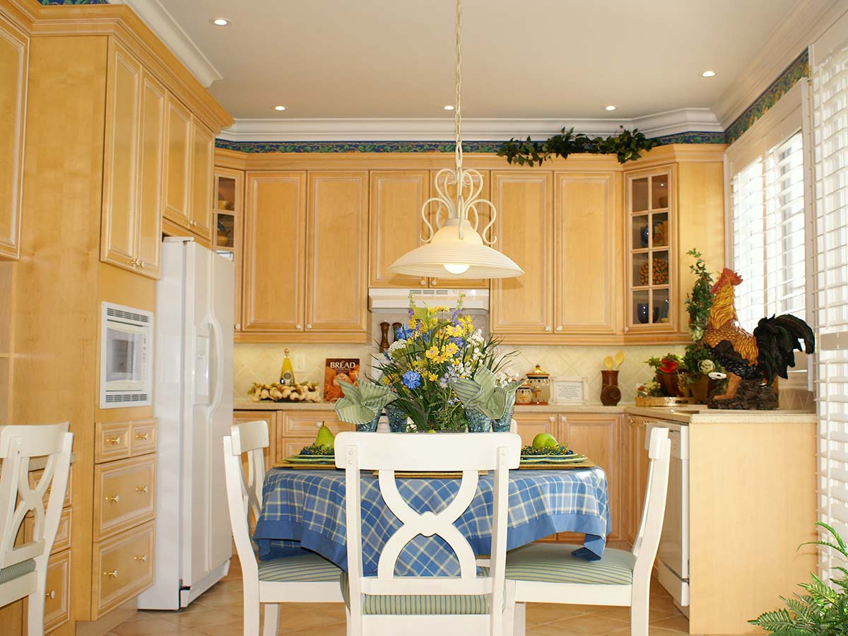
After the chubby chefs had come and gone, roosters came in and ruled the roost! People were diehard collectors of colorful chickens both small and large. We’re pretty sure that the space above your cabinets was exclusively built for your chickens to live on. You might as well call that space the chicken coop.
Yes, chickens are fabulous…in a barnyard. Unless you're fascinated by fowl, roosters in the kitchen just seems a little coo-coo bird! People were trying to pull off that fabulous farmhouse kitchen feeling, but the truth is, folks living in an actual farmhouse wouldn’t let a chicken in their kitchen unless it was getting fried.
Toilet Cozies
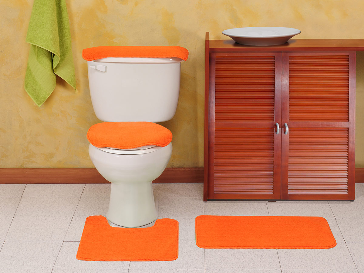
Along with the bizarre appliance cozies were the seriously unhygienic toilet seat cozies! Just what you want--absorbent cloth wrapping the one place that probably needs it the least. The toilet cozy phase still hasn’t left us, but we’re hoping it will any day now.
Hopefully, people wash those things every now and then, but they probably don’t. You’d be surprised to know how unhygienic people actually are. There are tons of people out there that would never even think to pull those cozies off and give them a wash every now and then. If you put those things under a black light, you’d be shook.
Shabby Chic Theme
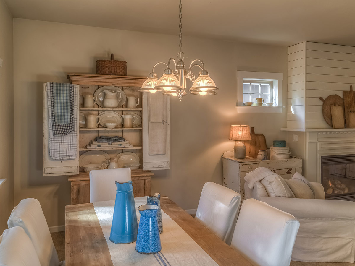
Hey! Here’s a great idea. Why don’t we all go to our nearest junkyard and pick our favorite pieces of trash, give them a spit shine and pack our houses full? Honestly, this trend got so out of hand, people were screwing old doors and shutters on our ceilings, and that’s just too far.
Shabby chic is really just shabby. If ninety percent of your home decor comes from a beat-up old junkyard, your home may start looking like a consignment store. Not that there’s anything wrong with consignment stores--it’s just that you probably shouldn’t be living in one. Keep this limited to a few pieces.
Faux Paint Finishes
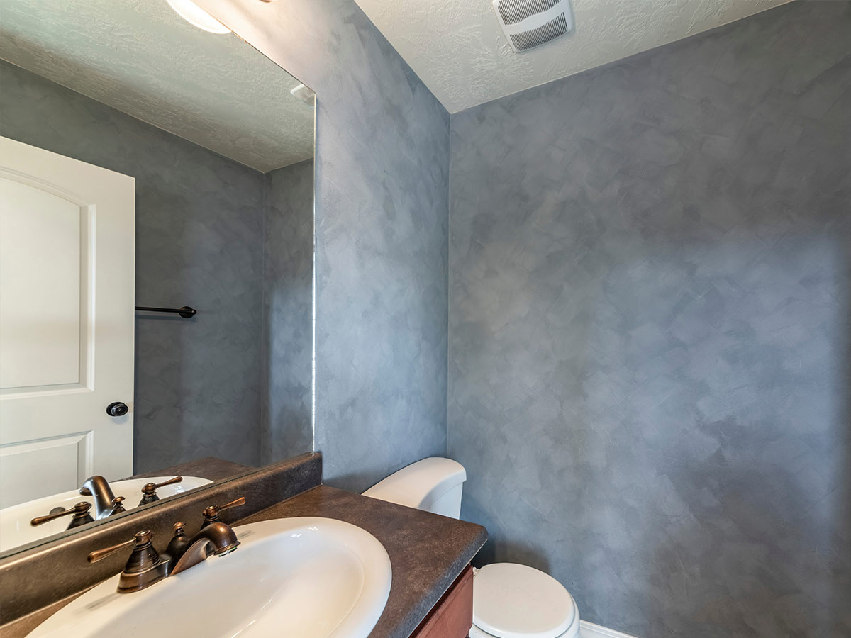
If flat walls weren’t your thing in 2008, you had options! Faux paint finishes were all the rage. All you had to do was go to your supply closet and grab the nearest thing in sight - a trash bag, sponge or broom, then dunk it in your paint bucket and smear it on your wall for a fabulous texture.
If you were feeling extra crafty, you could even double layer the textures with complimentary colors for extra effect. The problem with this trend was that people do what they do and took it too far. All of a sudden people were drawing on chipped stucco covered brick walls and trying to pass it off as the real deal.
Fisherman Themes

Gone fishing or gone too far? Fishermen-themed decor was a seriously strange sequence of events where people were stringing nets on their walls and ceilings and placing Styrofoam fish and bobbers in them! Wow, who doesn’t want their house to look like the inside of a tackle box? People who fish apparently.
People are definitely passionate about their hobbies, but people who overwhelm their homes with their hobbies may be on the verge of hoarding. Fisherman themes are cute for a moment, not a live-in home. So, keep this theme at the lake house or nowhere at all. It’s just too much for any other kind of home.
Gas Station Theme
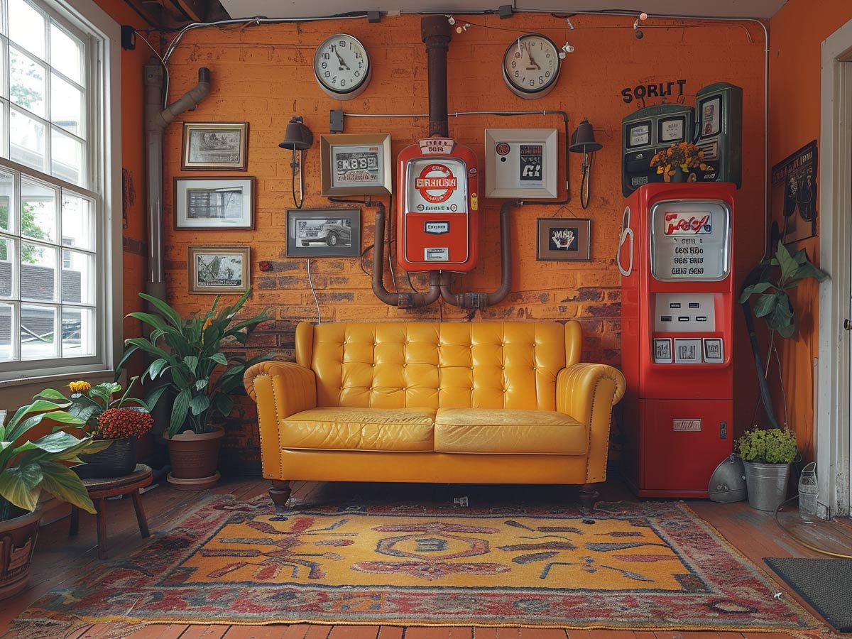
Apparently, people were craving that real Americana nostalgia, and the only thing that satisfied that craving was bringing rusty gas pumps and sheet metal signs in their homes. How...nifty? Not really--it was more than a little unnecessary. We appreciate the look and design of old-timey automotive memorabilia too but not in our living rooms.
Leave the gas station decor for the gas station. It just doesn’t belong in a home. Even if you’re planning on decorating your garage in this theme, just don’t and say you did. Your garage is a utility space, not a showroom. Sure, it can be cleaned up and pleasant in there, but at the end of the day, it stores your cars and power tools.
Black Bear Theme
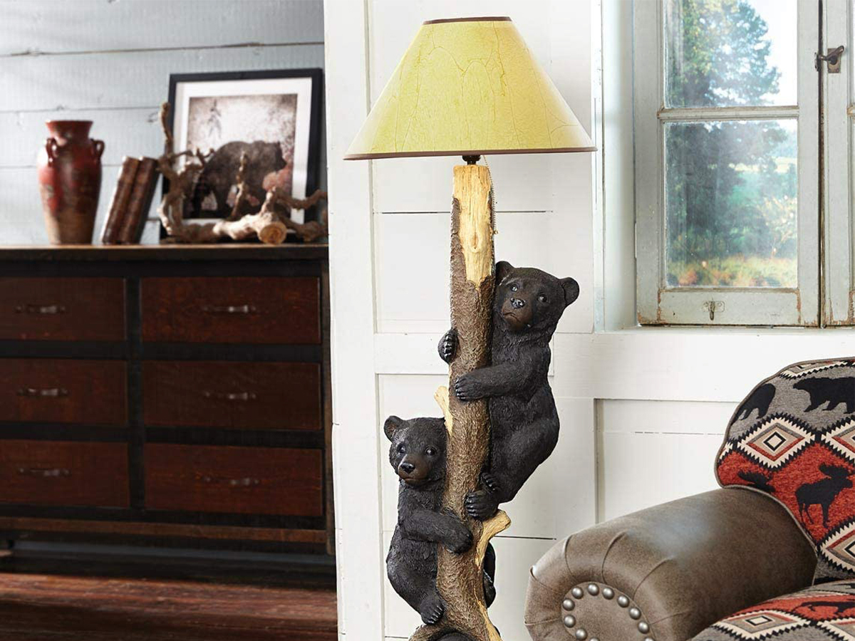
Lions and tigers, and bears. Oh my! Bears are great and all, but is it really necessary to have your whole house set up as a bear shrine? There are black bear rugs, dishes, and even toothbrush holders. This craze went wild (pun intended) with people striving for that secluded log cabin feel.
Bears are cute, and maybe one cutesy picture of a bear is perfectly justifiable. But unless your name is Yogi, you probably don’t need a family of bears living in your house. Besides, the whole idea of using black bears as an interior design scheme is a little chintzy. It’s like those dreaded roosters or yellow rubber ducks.
Coca-Cola Theme
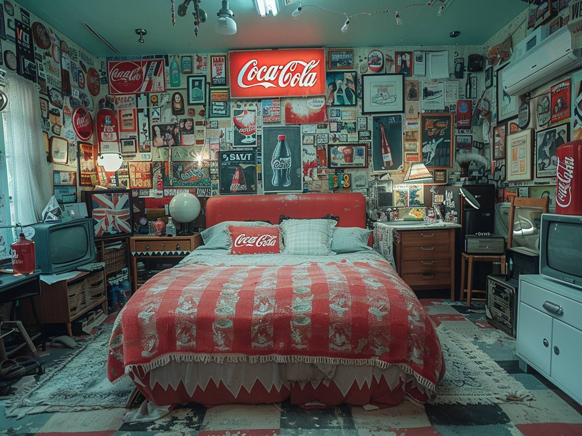
Some like Coke and others like Pepsi, but one thing is for sure…Coke fans are a little crazy. People like Coca-Cola so much that they show off their Coke pride in their homes. Geez, talk about die-hards. Coca-Cola Christmas is it’s own phenomenon that we’ll cover another day, but we’re talking about the true collectors.
People collect all kinds of things, but Coke collectors are their own special breed. From vintage signs, bottles, trucks, and even fixtures, these fanatics do everything they can to tell you they need to drink more water and less soda. In this day and age, everyone is aware that sugary soda will rot your teeth, among other things. So maybe chill out a little.
Poker Theme
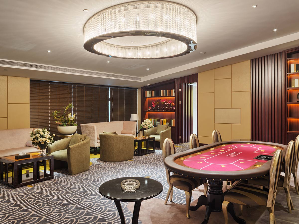
Gambling can be so much fun! Some people love the casino so much that they never want to leave. That must be why poker-themed decor became a thing. Seriously folks, leave the cards and the chips at the casino. Having a ridiculous collection of poker-themed decor just seems like a red flag.
Anyone can be passionate about something, but being obsessed with the Los Vegas casino aesthetic verges on questionable. At the end of the day, do what you want with your home, but just know you’re raising all of your guests', friends', and parents' eyebrows when you’re showing off your poker pride.
Moroccan Décor
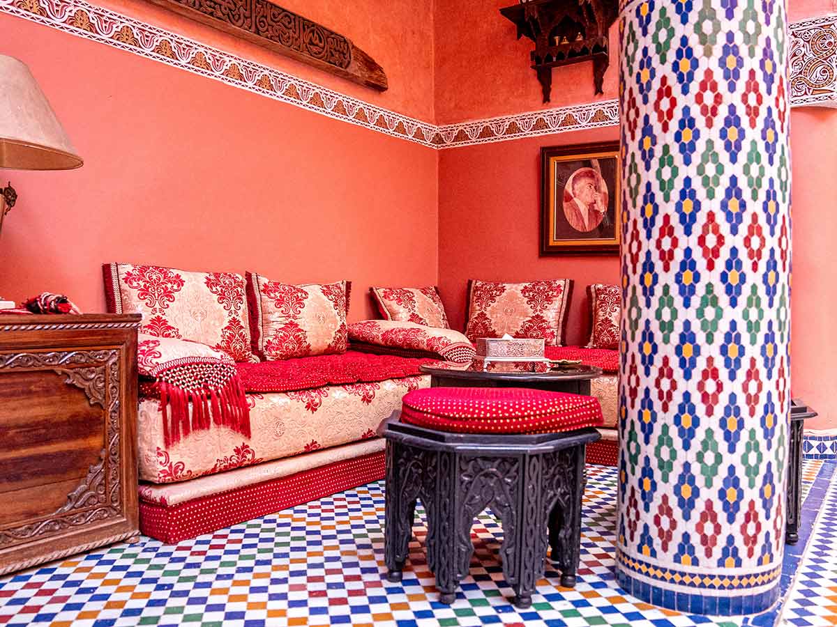
It’s easy to be mesmerized by hookah-hazed Moroccan aesthetics. We’re not sure why people absolutely love dressing their house up like a completely different culture than their own, but it seems a little out of bounds. The Moroccan theme appeared overnight, along with stores like Urban Outfitters who supplied these fiends.
All jokes aside, it’s probably not a good plan to rip-off someone else’s cultural aesthetic just because you saw it on the internet. Again, do as you please. Just know that the rest of us out here may think less of you for it. Let the Moroccan themes stay in Morocco. They do it better anyway.
Train Theme
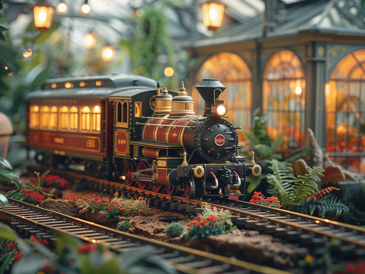
Kids like trains, right? RIGHT? Seriously, parents force this theme into their child’s personal space all the time. You say you like trains one time, then boom. Your nice little bed turns into a giant steam engine. Stay away from the trains, kids--it’s just not worth it. Just hear us out parents: not every kid wants to live in a train garage.
A little here and there is fine. Keeping it subtle is key when you’re trying to incorporate your child’s favorite things into their decor. It’s no secret that children’s room decor is a little over the top, but decor themes like these take the obvious things (trains, sports, Disney princesses, etc.) way too far.
Patriotic Décor
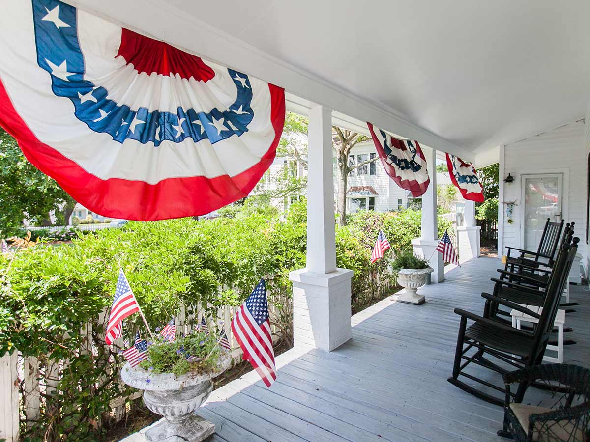
Loving your country is a good thing, but these people take that to the next level. All it takes is one too many sets of stars and stripes and you’ve slipped into full blown ‘merica territory. Just stick with a flag in your yard; it’s safer that way. If you’ve got your heart set on showing your patriotism, save all that energy and go big on the 4th of July.
Red, white, and blue are great separately. However, together it’s just bold and brash. The point of a country’s colors is to boldly show who that country is. While that’s great on a flag, trying to pull that into your home makes a space a little loud. If you’re matching this with patriotic-themed trinkets and memorabilia, your home may start to feel more like a museum.
Inspirational Wall Decals
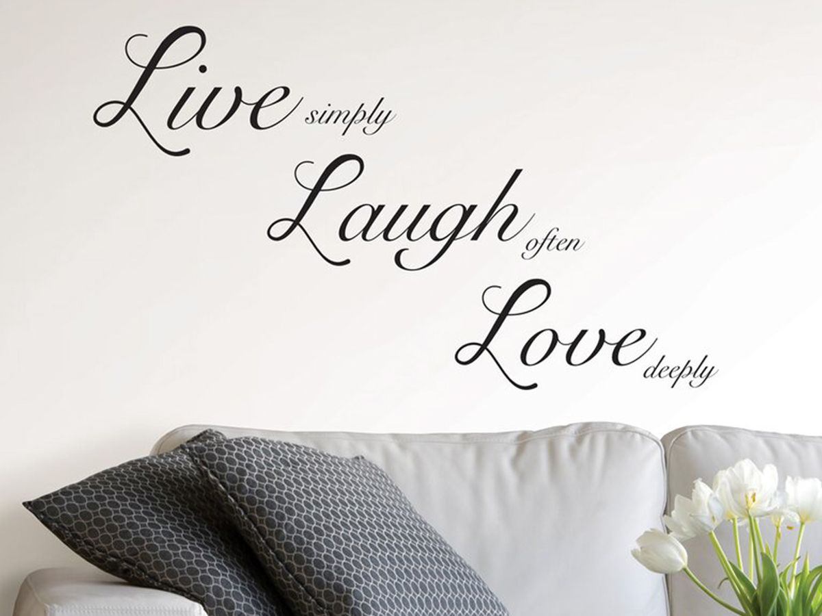
We get it--positive affirmations can really change your life. However, plastering these cheap sayings on your wall makes it look like you’ve got something to prove. We’ve never met a person who had "Live, Laugh, Love" on their wall that actually meant it. If you need the reminder, you’re probably not living, laughing, or loving enough.
Wall decals in general can be hit or miss. While there is no shortage of beautiful sayings, putting a sticker on your wall just looks like what it is... a sticker on your wall. Maybe keep these inspirational words as a smaller detail. If you’re one of those people who needs a reminder to be happy, you can still keep your inspiring words--just not stuck to your wall.
Silk Plants
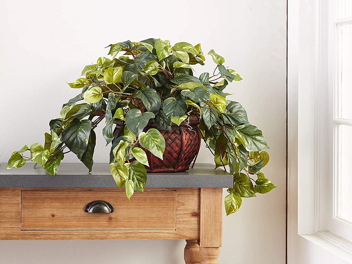
Silk plants took all the hassle away from actually owning a house plant, and people went wild. However, along with that meant sacrificing all the benefits of having plants indoors. It basically left us with horrible, crunchy, dust collectors. Real plants do wonderful things for our homes--they pull out moisture and even purify the air.
Having a house full of plants is fabulous, but when they’re all fake… our house may start looking more like Grey Gardens. Silk plants start to get dingy overtime. Eventually those once-realistic leaves start to get coated in dust, and pesky house bugs may set up shop in them.
Monochrome Theme

Living in a house that is wall to wall the same color sounds like a living hell. It started with white washing, then moved to grey, and now we’re seeing people match their walls, floors, and ceilings the same color! From pinks, blues, yellows, and even greens, people are going all out with monochrome, and it’s like a ‘70s daydream.
Monochromatic rooms seem very surreal. If living in a home in which you’re constantly going through an existential crisis is your thing, then sure go all out. But for those of us who want to be comfortable in our homes, we’ll just stick with more traditional schemes instead of floating through space and time in a Pepto-pink living room.
Fireman Theme

Unless you live in an abandoned firehouse, like Anderson Cooper, fireman-themed home decor is just bizarre. Even Anderson’s house doesn’t go too over the top with the theme. The people with this kind of decor exist adjacent to those with the patriotic decor obsession. This screams early 2000s.
We suggest boxing up all that themed decor and maybe replacing it with one, singular fireman wall calendar. Then you’ll at least get a little enjoyment from your firemen. Some people’s jobs become their whole life, so if you or a loved one are part of the force, we suggest a little work-life balance.
Harry Potter Theme
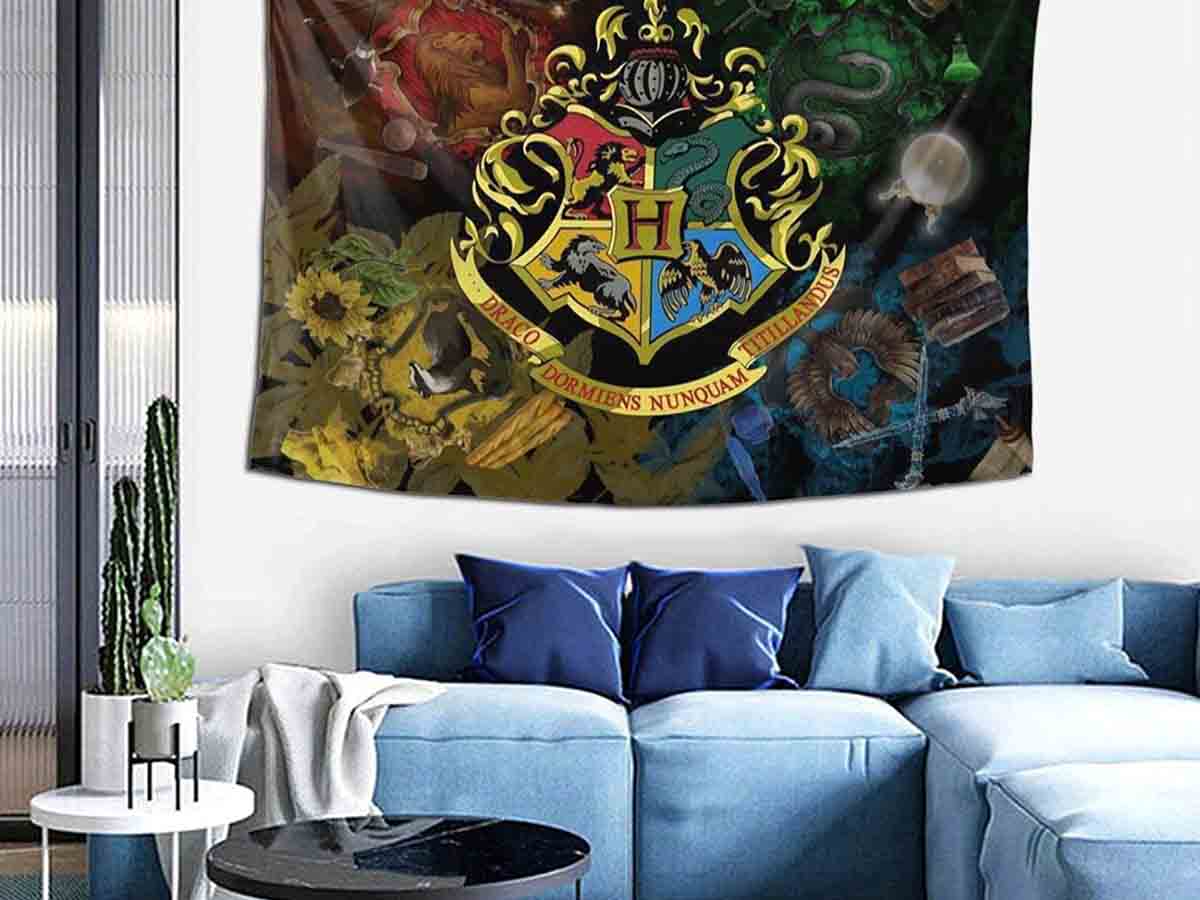
Harry Potter-themed decor? We’re looking at you millennials! Harry Potter changed our lives in the late ‘90s. Anyone with a little imagination was waiting for their owl-carried letter from Hogwarts, and we don’t blame them. Since the first book came out in 1997 and the subsequent movie series in 2001, the world has been garbage.
However, we hate to break it to you, but that letter will never come. As much as you try, bringing the magic to your home decor isn’t going to work either. The closest thing you can get to Hogwarts in real life is The Wizarding World at Universal Studios. So, if you’re looking for escapism, buy a couple tickets.
Paris Theme

People love to fantasize about living in the city of romance. They go so far as to try to replicate Paris in their own homes! The Eiffel Tower is a gorgeous feat of architecture and culture, and it should be celebrated. However, having an Eiffel Tower decal on your wall, Eiffel Tower shower curtain, and a couple of standard poodles does not a Parisian make!
This strange decor trend is straight out of a 16-year-old girl’s bedroom in 2001. Loving Paris was their entire personality. They dreamed about riding their bikes to the market, stopping for coffee at a cafe, and living the sweet life. If you were one of those girls too, you know exactly what we’re talking about.
British Colonial Decor
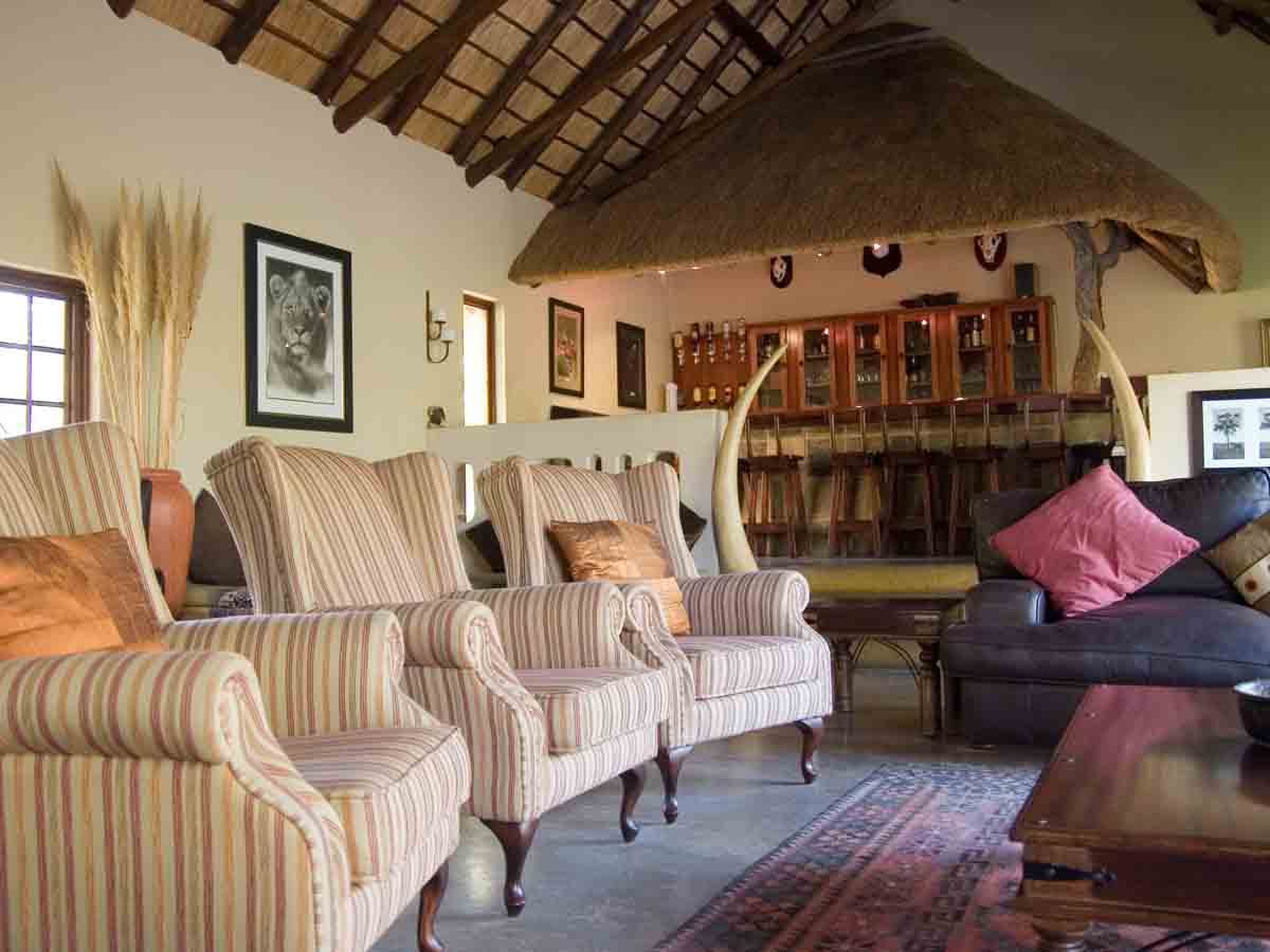
If you’re not sure what British Colonial decor is, let us explain. British Colonial is a style of decor that comes from the point in time in which the British Empire was conquering the entire world. They were exploring exotic lands and bringing home the bounty. Think of the set of Jurassic Park without the dinosaurs.
During the era, people were obsessed with the natural materials other cultures (especially African) were using in their homes. It was a time of exploration and exploitation. Today, this era is remembered by natural wood tones, light colored walls, animal print and tropical florals. Pair that with exotic decor accents and you’ve got British Colonial.
Granny Chic
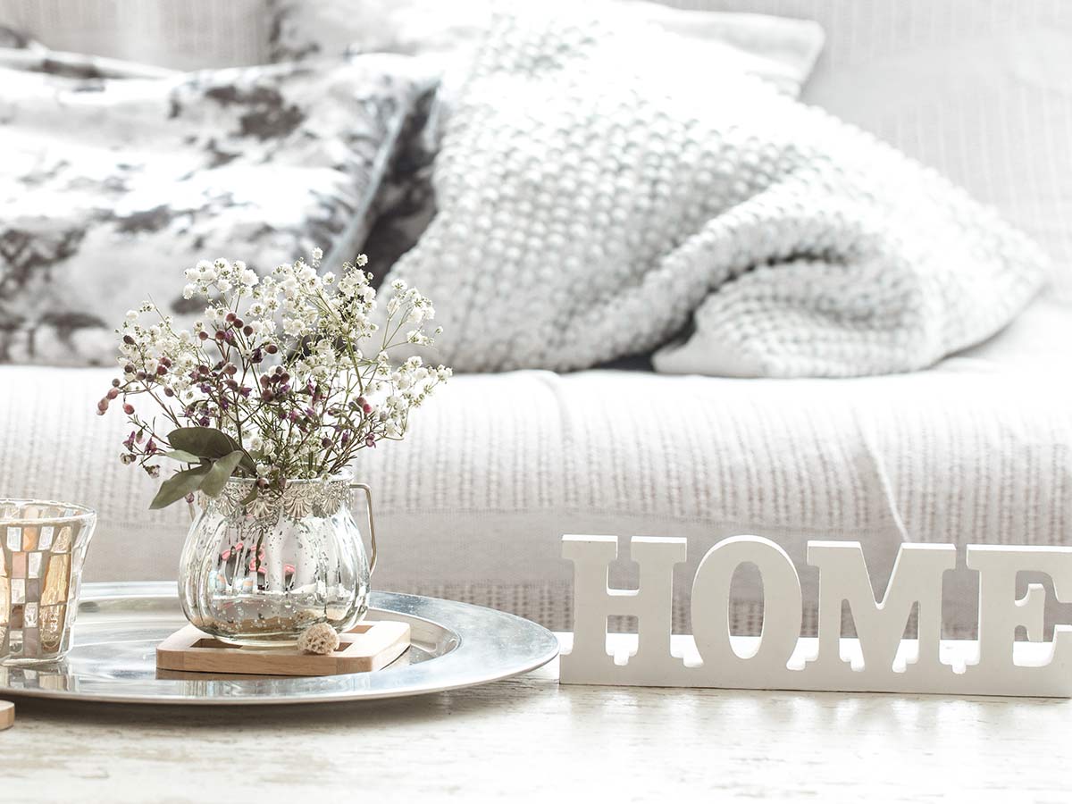
Ahh, granny chic decor. Think about what your grandma’s house looked like in the ‘90s, and that’s granny chic. We’re talking about Precious Moments figurines, ceramic cats, silk arrangements, and brass…tons of brass. Granny chic is all about “keeping it classic,” which sounds a lot like "old and dated".
For whatever reason, the ‘90s were the height of granny decor. It was the golden age of decor for those in their golden years. They still can’t let it go! We’ve all been told not to touch that curio cabinet chocked full of trinkets that could snap in half at a glance. What’s surprising is that young people are now embracing granny chic, and that’s just odd.
1980s Tropical Theme
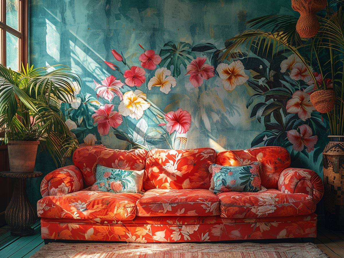
Have you ever seen Golden Girls? That’s what we mean by 1980s tropical theme. Rattan, soft floral prints, terracotta, and sun porches as far as the eye can see! While this decor theme is iconic to the time, it doesn’t mean it isn’t strange. Maybe this theme became such a hit because of the rise of mainstream TV dramas.
Everyone wanted what they saw on TV, and who doesn’t like living in a home with natural accents? However, people back them needed a reminder that beach home decor needs to stay near the coast. It just doesn’t work anywhere else! But for those old ladies who live in Florida, you can keep your ‘80s tropical decor.
Retro Miami

For those mimicking the decor you saw on Miami Vice, we hate to break it to you but you’ll never be as cool as Sonny and Rico. If you own a home that is true to the era, definitely don’t change it because it’s iconic. However, this decor theme earns its place on our list because it was so specific to Miami.
The only style that’s even gotten close to this is maybe Los Vegas, but everyone can recognize the Miami neon and architecture that features clean lines with stark, contrasting colors. It was truly like no other, and it’s so Miami. It was so strange that an entire area created its own decor and did it so well.
Terrazzo Surfaces
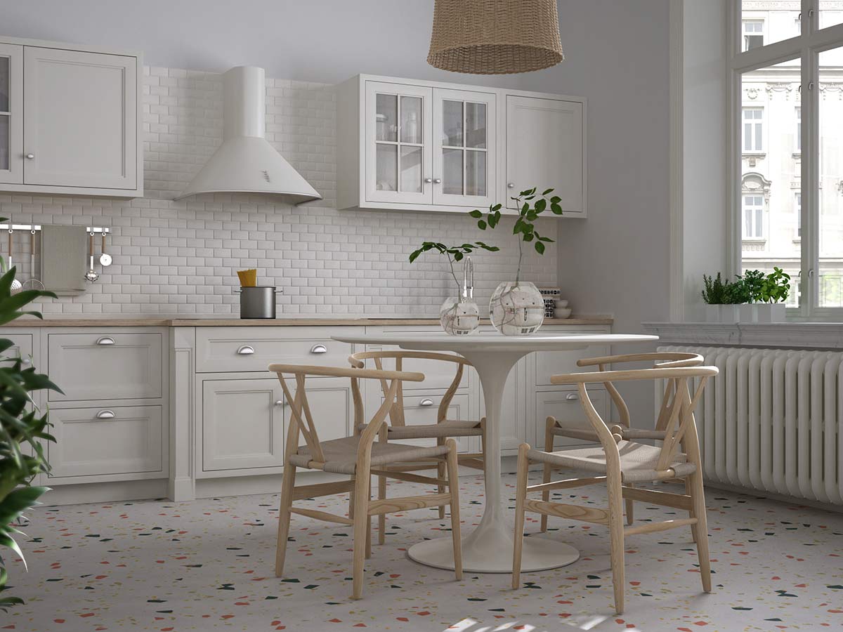
Terrazzo is a method of using chips of stone in a mosaic style, bonded together with a binding agent, and smoothed out to a uniform finish. Terrazzo found its stride in the U.S. during the 1920s art deco era; however, its roots go all the way back to the Egyptians! The popularized look we see now, however, comes from the Italians.
Terrazzo is a unique and iconic look that you don’t see just anywhere. It was used on a small scale due to its likelihood to deteriorate over time. However, the process to make Terrazzo became more sturdy through the years, letting it be used on much larger surfaces. People went all out with Terrazzo. Knowing the history behind it makes it all the more cool.
Tapestry Extravaganza
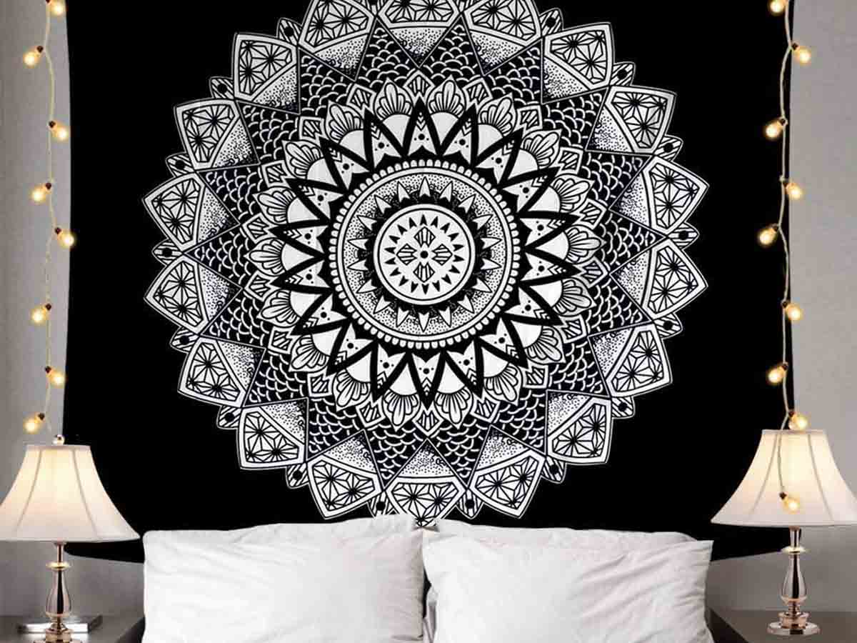
In the 2010s, Americans discovered this lovely thing called a tapestry. All of a sudden, college kids everywhere were buying them by the dozen and covering their walls with mandala prints and fringe. This look was in every dorm room and apartment, and it was the calling card for bohemians everywhere.
Along with this trend came several lifestyle changes in young people. The hippy spirit became popular again, and younger folks became interested in several '70s decor trends again. Macrame, fringe, and mid-century modern all followed this trend. Maybe it was all the thrifting we were doing back then. Either way, it was kind of strange.
Monochrome Beige
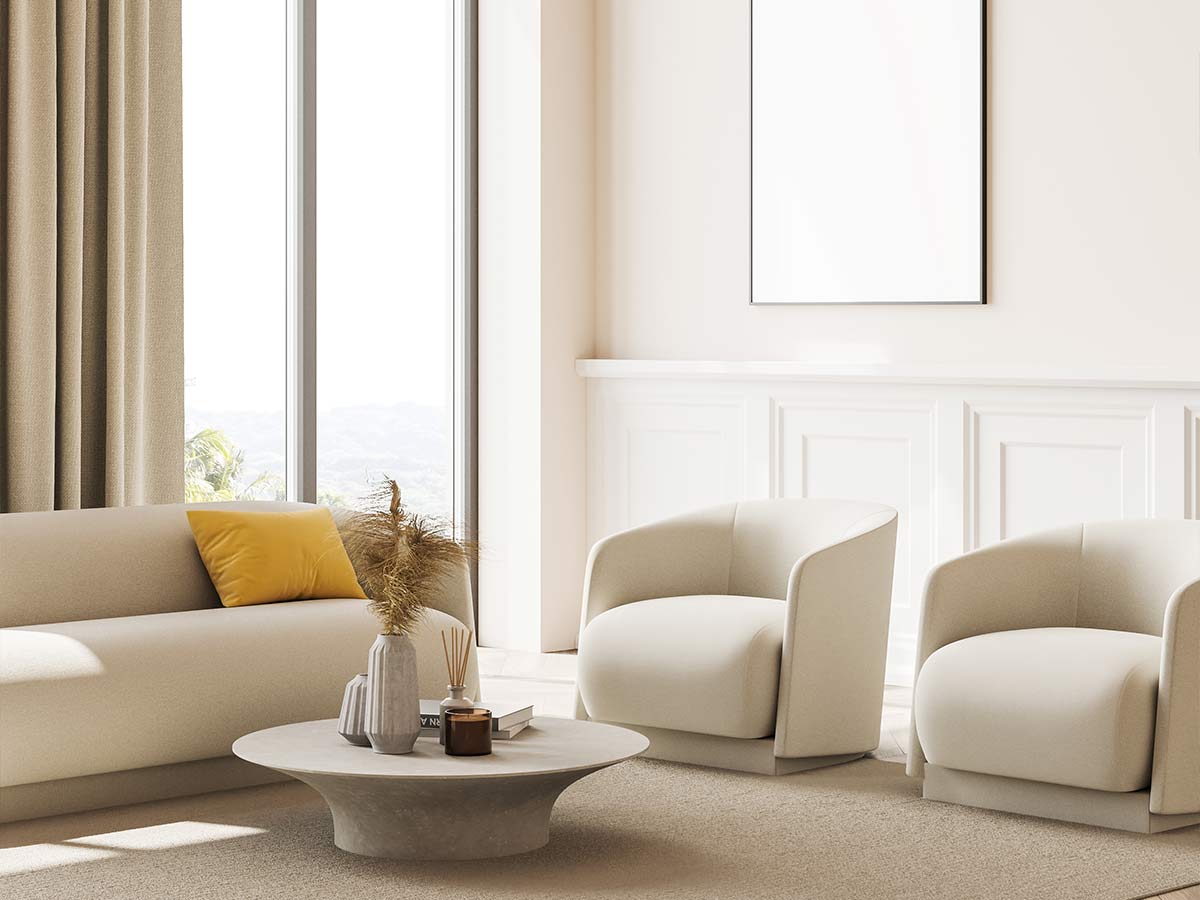
Ok, the weirdest trends we’ve been seeing lately looks like the darker side of the 1984 Macintosh commercial. People are building imposing homes, using nothing but cold concrete and stone. They’re using monochromatic themes with drab neutrals like beige and greige. They say creative types like to live in homes with blank surfaces, but this is a bit too far.
The best example of this trend may be Kim and Kanye’s Los Angeles mansion. Under Kanye’s eye, the home transformed into what Architectural Digest calls a “futuristic Belgian monastery.” The home is wall to wall off white. While it looks compelling in pictures, living in this home would be quite bleak, in our opinion.
 Author
Jennifer Freehill
Last Updated: August 16, 2024