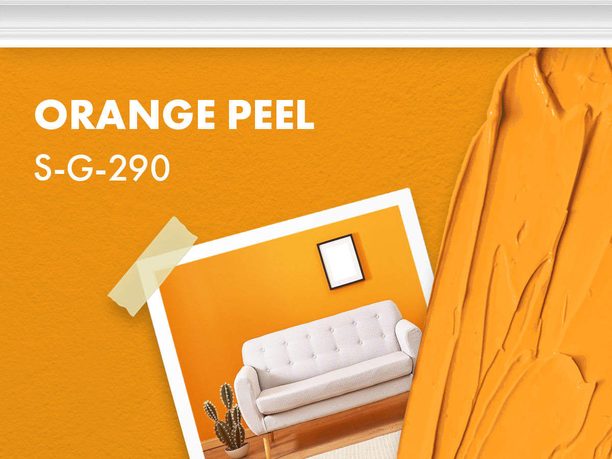
If you’re thinking about going orange…especially this color of orange...just don’t. Orange is great, just not in your house!
Why would you want a color screaming on your walls while you’re trying to relax in your living room? This color will change drastically during the day and night, making it impossible to match to.

Next is orange’s next-door neighbor, yellow! Not just any yellow, it’s 1970’s gold velour couch yellow, yay!
Just kidding, no one finds this color pleasing to the eye. So, for the love of everything interior design, do NOT paint your walls this color.
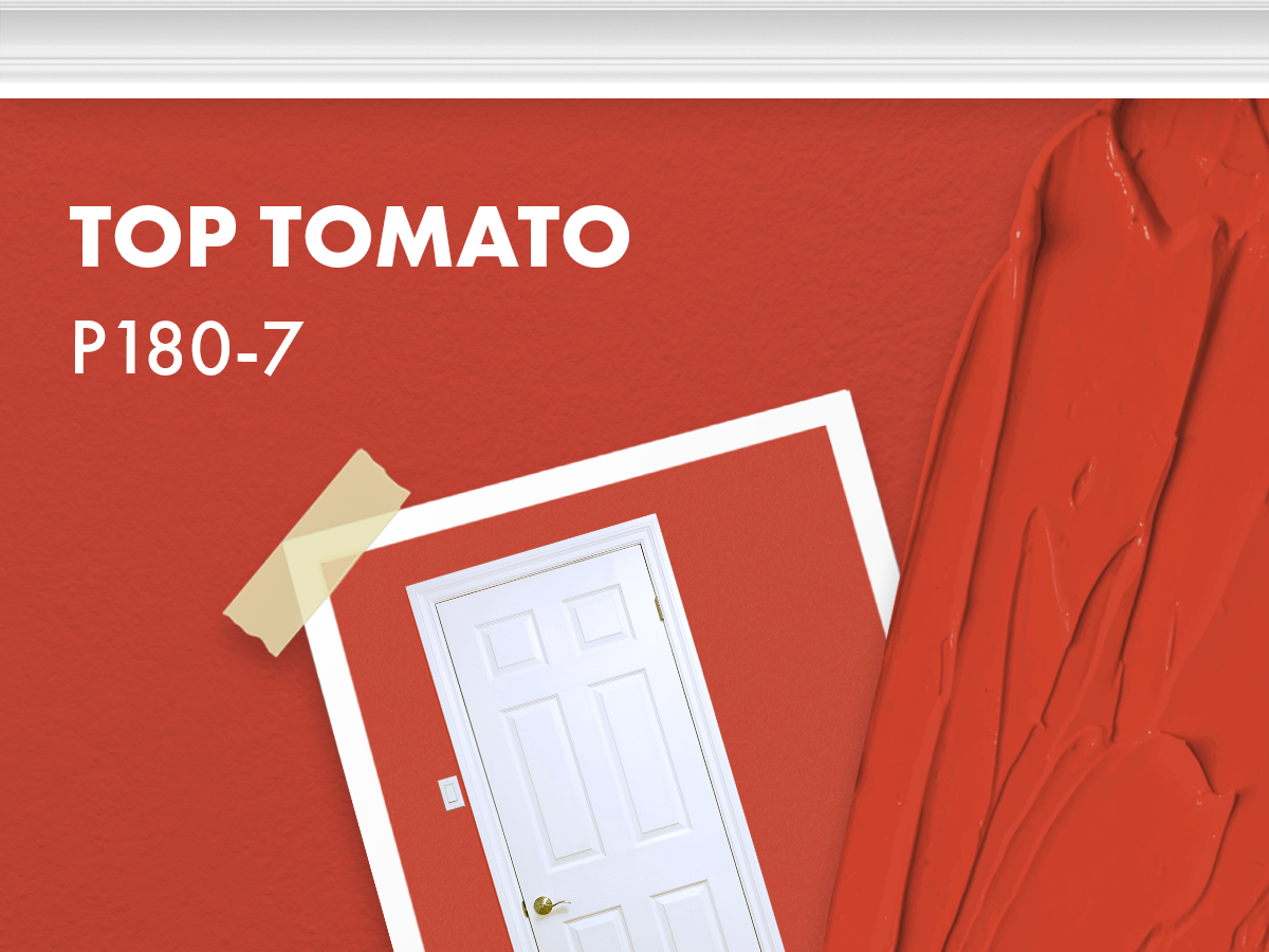
Red is a difficult color to pull off in all forms. Red lipstick, red nails, red bottom shoes…it’s just not for everyone.
Painting the walls of your home this aggressive shade of red will just make you angry! Also, when your friends ask you what color you painted your living room, do you really want to say tomato red?
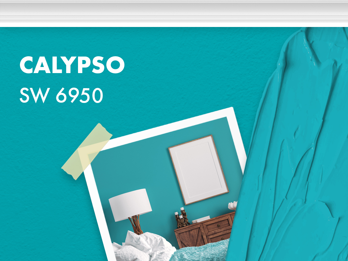
Ahhh, relaxing blue is the way to go! Unfortunately, this is just not the one. This blue is too saturated for an interior living space.
It will seriously overpower your space, and leave you feeling like there’s an imposter in your house.
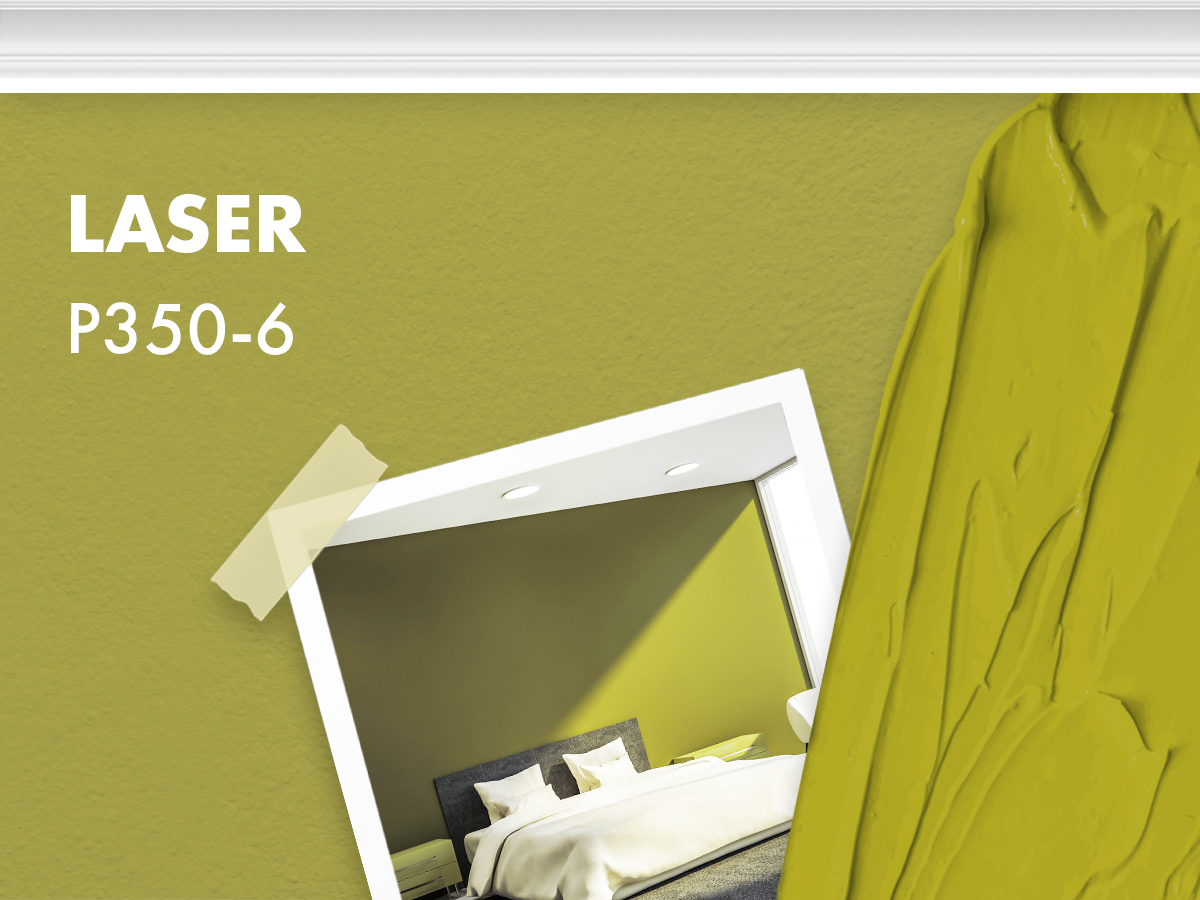
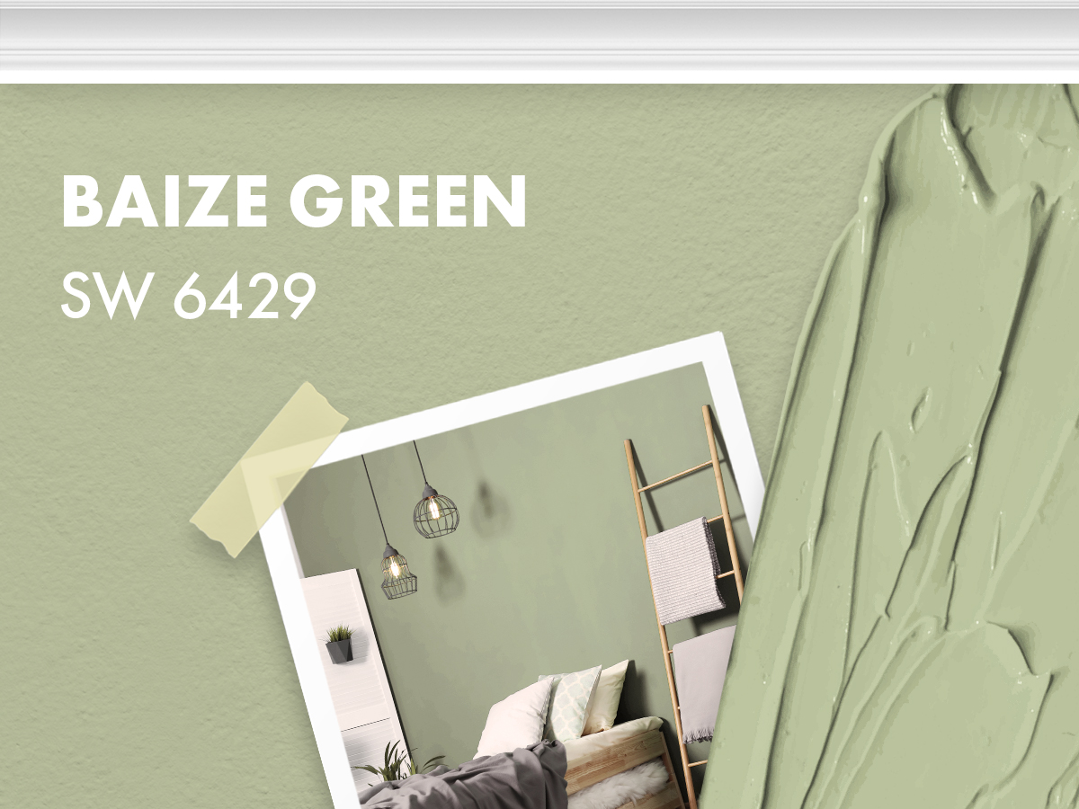
This shade of yellow-green is a total throwback color. However, if you ask someone who lived in the ‘60s and ‘70s they’ll tell you this color wasn’t good then, and definitely isn’t now.
You heard it here first folks, baby poop green is an awful color for your home.

What’s that color that’s kind of red, kind of brown, a little pink and looks like your grandma’s house? We have no idea what color this actually is, and that’s why you don’t need to invite it into your home.
Chivalry Copper is a stranger, and it’s off putting!

Here’s another retirement home color for you! Tribal Pottery by Behr lacks anything tribal and anything to do with pottery.
It’s a terrible brown-purple and we’re not quite sure why anyone, under any circumstances, would take this color home.
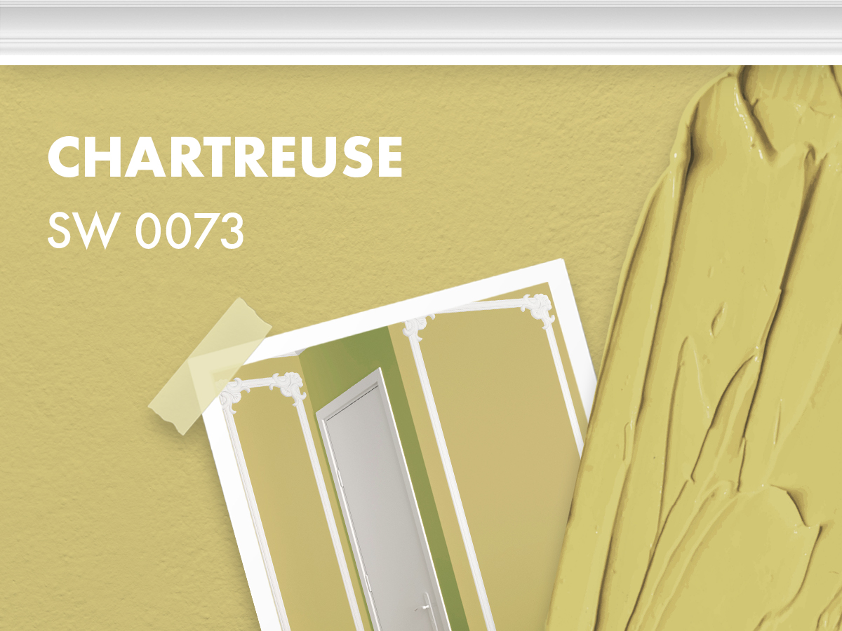
Do you know that feeling when you’re on a roller coaster and that foot-long hot dog you just ate is trying to make a second coming?
That’s what Chartreuse by Sherwin Williams will make your guests feel while staying in your home.

Boysenberry? What even is a boysenberry? We have no clue, but what we do know is this color looks like a hotel room from 2008, and that’s just not the look these days.
This color is somewhere between grey, purple, and brown making it another disturbing non-color that makes our eyes confused.
Is it grey? Is it mint? Is it yellow? It is none of those things, and all of those things at once.
This color will change colors all day long and leave you green at the gills when the sun sets. Once the sun goes down, this will be the most unsettling sickly hue.
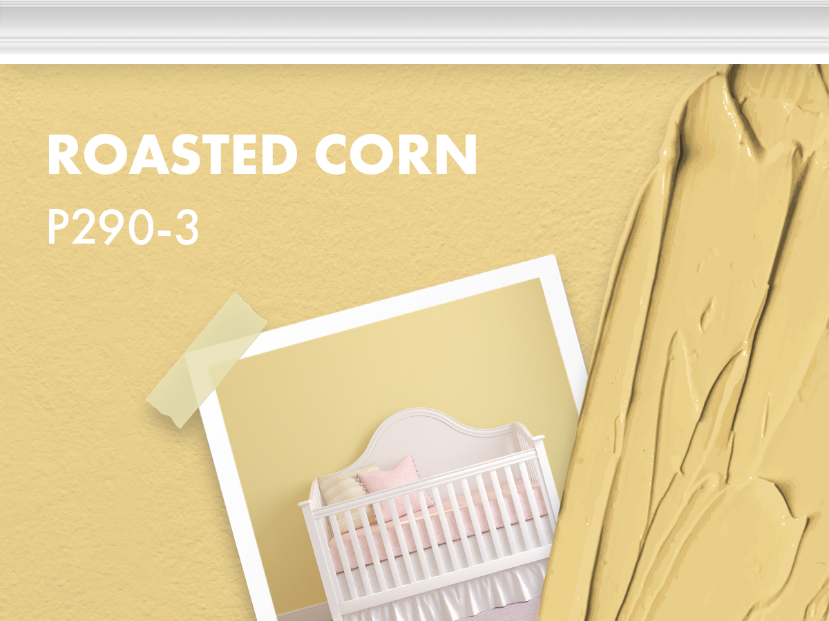
A few years ago, soft beiges were everywhere, and people wanted them in their homes ASAP. However, many colors missed the mark, and this is one of them.
It’s way too pink, and way to yellow making it look more like queso than paint. Also, it’s named after corn and nobody wants that!
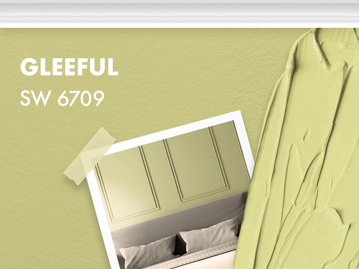
Green really is just hard to pull off, and this one is one of the worst shades on the market. Gleeful by Sherwin Williams looks like a sad avocado, and that’s not cute.
Steer clear of this color, we promise you’ll thank us later.
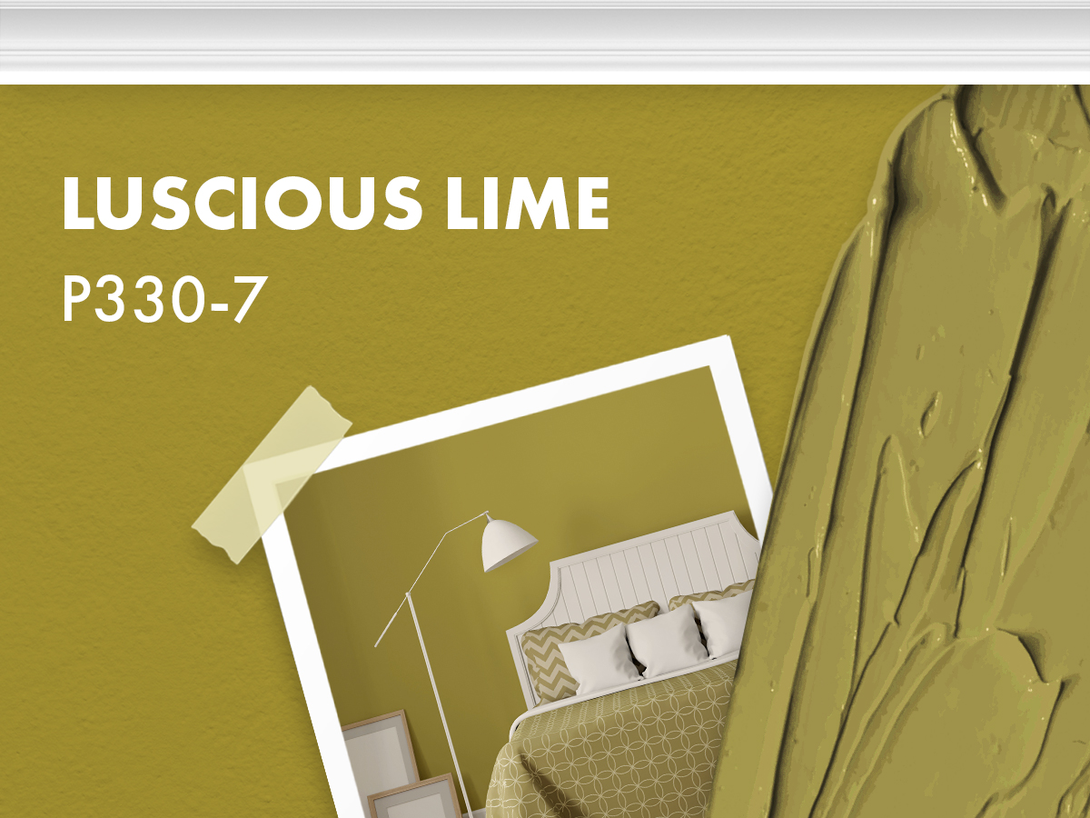
Luscious Lime by Behr is just about one of the worst colors imaginable! It looks more like a rotting lime than a luscious lime any day.
Under no circumstances should you ever invite this putrid color into your home.
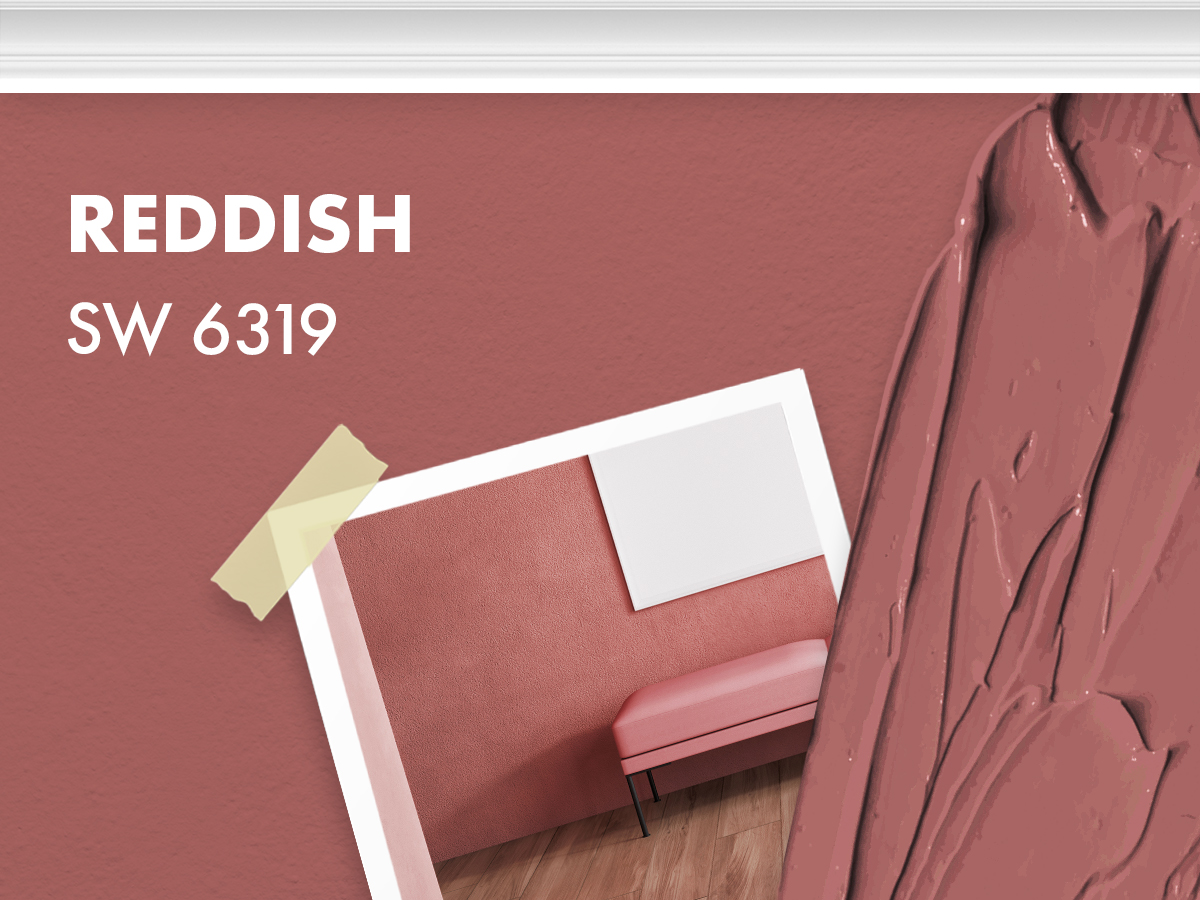
Sherwin Williams got one thing right, this color is only reddish and not red at all. In fact, this color is between pink, brown, and purple and there’s nothing appealing about that color combo.
This dusty mauve will close in your space and leave you feeling claustrophobic and uncomfortable.
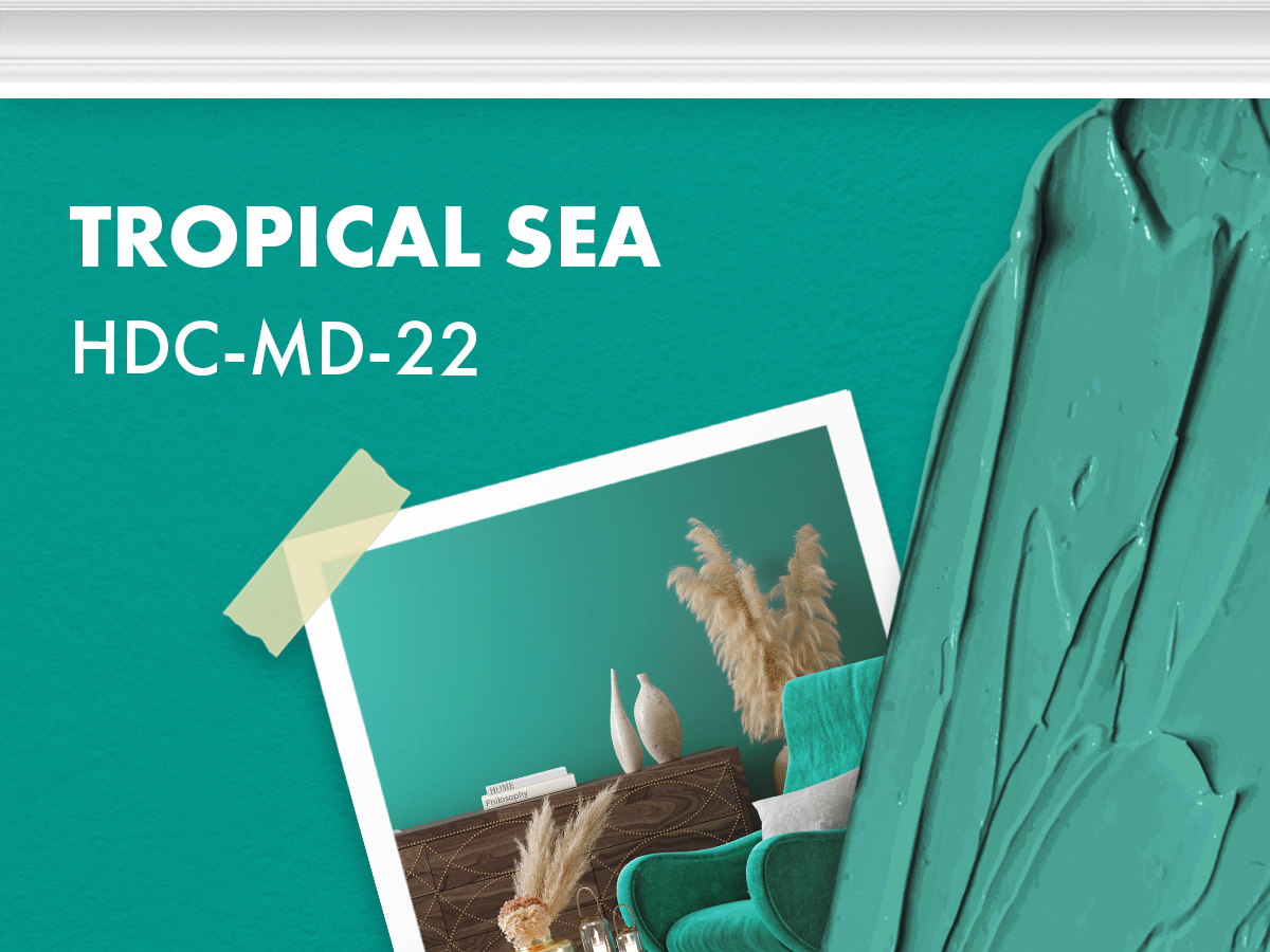
Tropical Sea by Behr is another blue that just isn’t fit for your home. It’s entirely too saturated and has a yellow tinge to it.
This will make all your soft whites look sickly green. It’s a beautiful color for accent furniture, but it just isn’t fit for your walls.
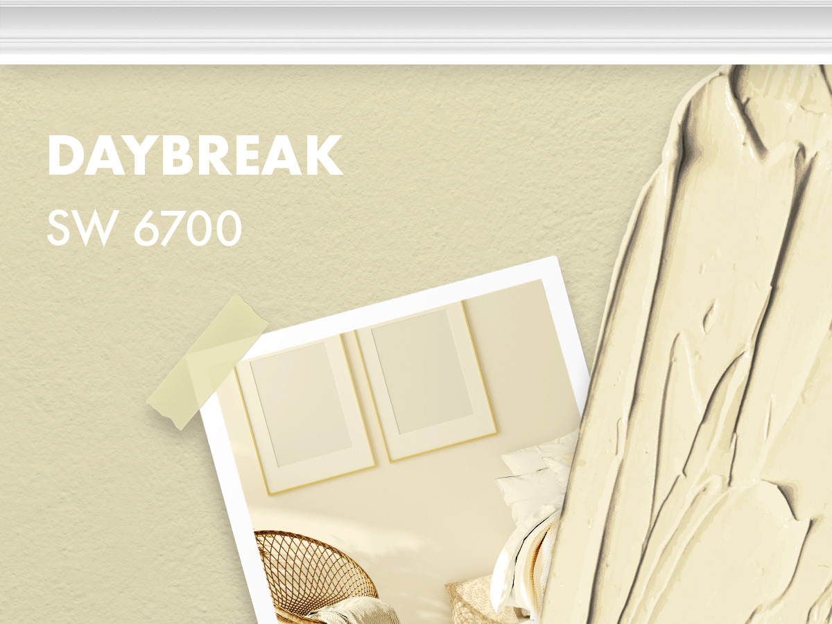
Daybreak by Sherwin Williams is part of a long list of off-whites that just feel…off. It has too much yellow in the mix, making it a terrible color at specific points of the day.
If you’re going for a warm white, this is not the one.
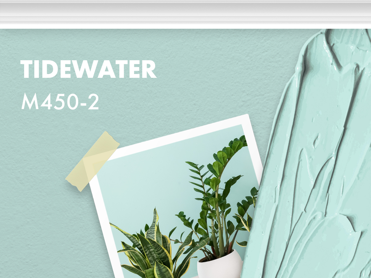
Tidewater looks like a soft blue on paper, but on a wall it’s actually way too bold. If it was less saturated it would be a perfect blue because it doesn’t have too much yellow in the mix.
As much as we want this blue to work, it just doesn’t.
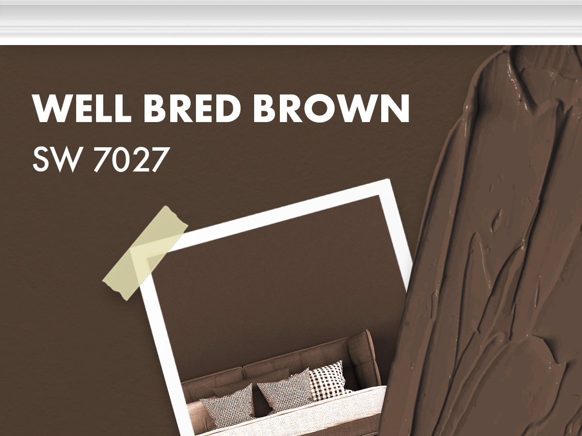
Well Bred Brown is a perfect color for your house exterior but bringing it inside is like giving a water buffalo free reign to stomp around your house!
It’s way too dark and will swallow up your wall space.
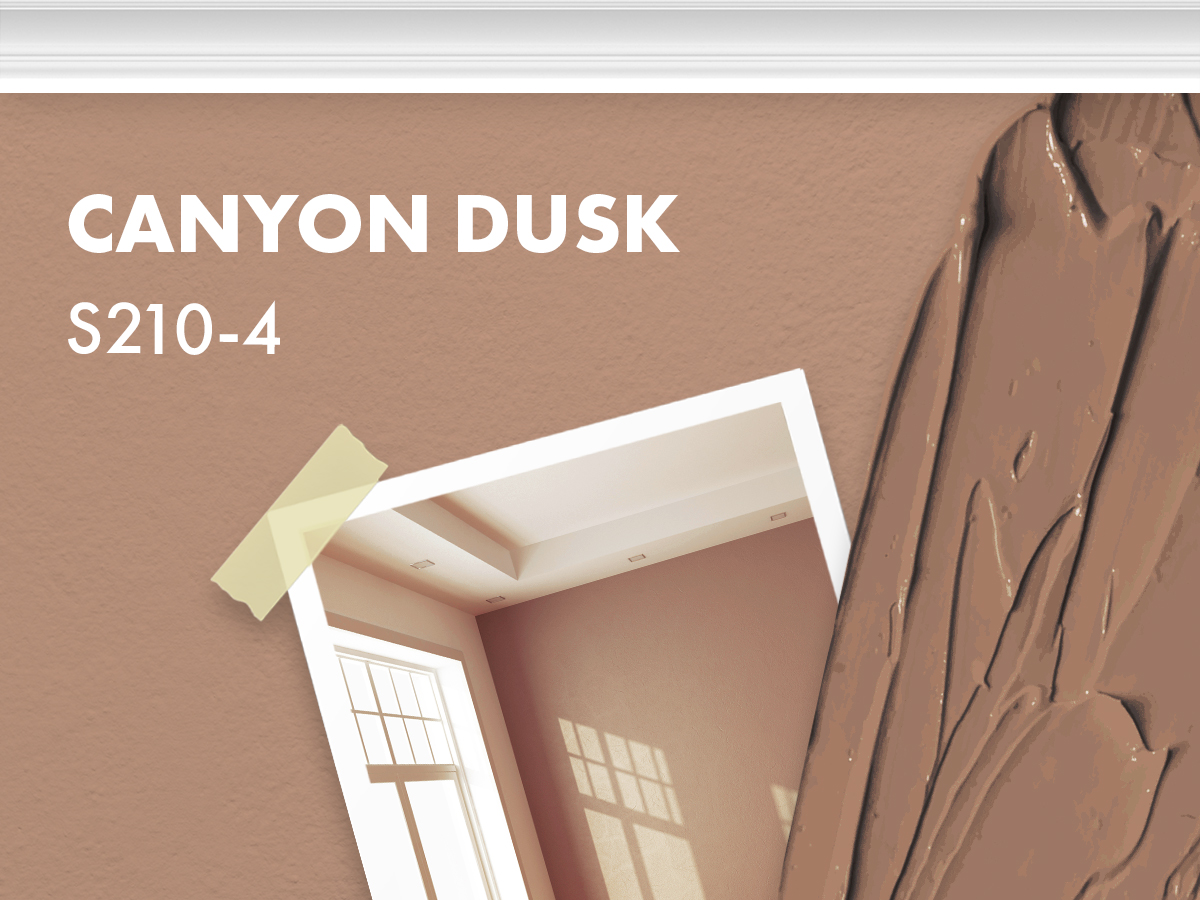
Canyon dusk is another one of those “what is it anyways?” colors that can’t seem to pick a lane.
Somewhere between brown, pink and purple is this terribly un-neutral neutral that really doesn’t bring anything nice to the party.
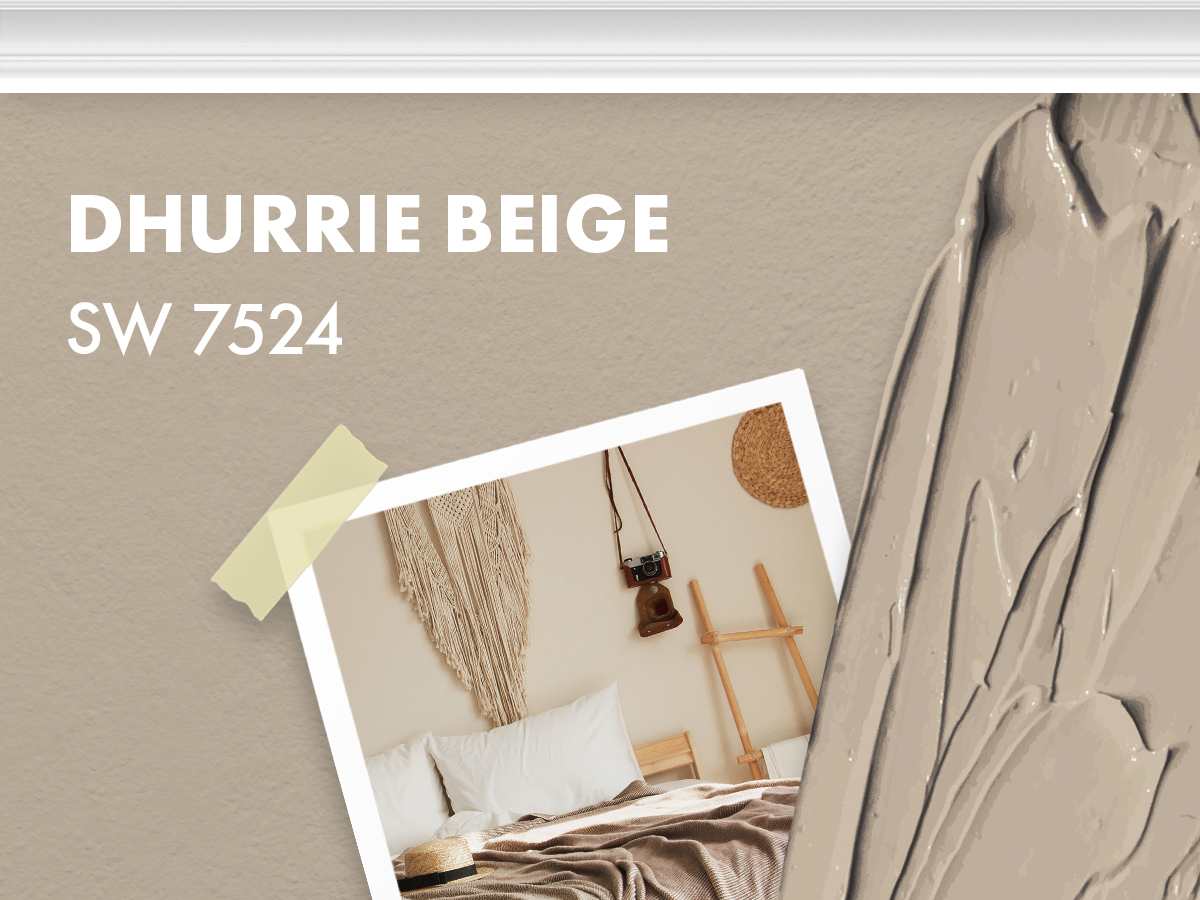
Purple, grey and beige just don’t mix well. Dhurrie Beige is at least more on the neutral side, but in darker lighting this wonderful greige will turn promptly purple!
If you like purple, no biggie. However, you might just be in for a surprise if you’re expecting a nice neutral.
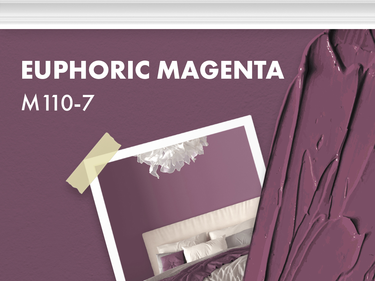
Let’s take a poll! Does anyone like prunes? Does anyone think prunes are fun to look at? No? Didn’t think so.
Euphoric Magenta doesn’t provoke euphoria, it just reminds you of that feeling you get after you drink a glass of prune juice. You know the one!

Another off putting off- white is Malted Milk by Sherwin Williams. Mixing the perfect off white is incredibly difficult. Under different lights, you can see the undertones used to make the color.
However, since the saturation is so low these colors shift almost constantly throughout the day. This soft gossamer white will quickly become lavender as the sun sets.
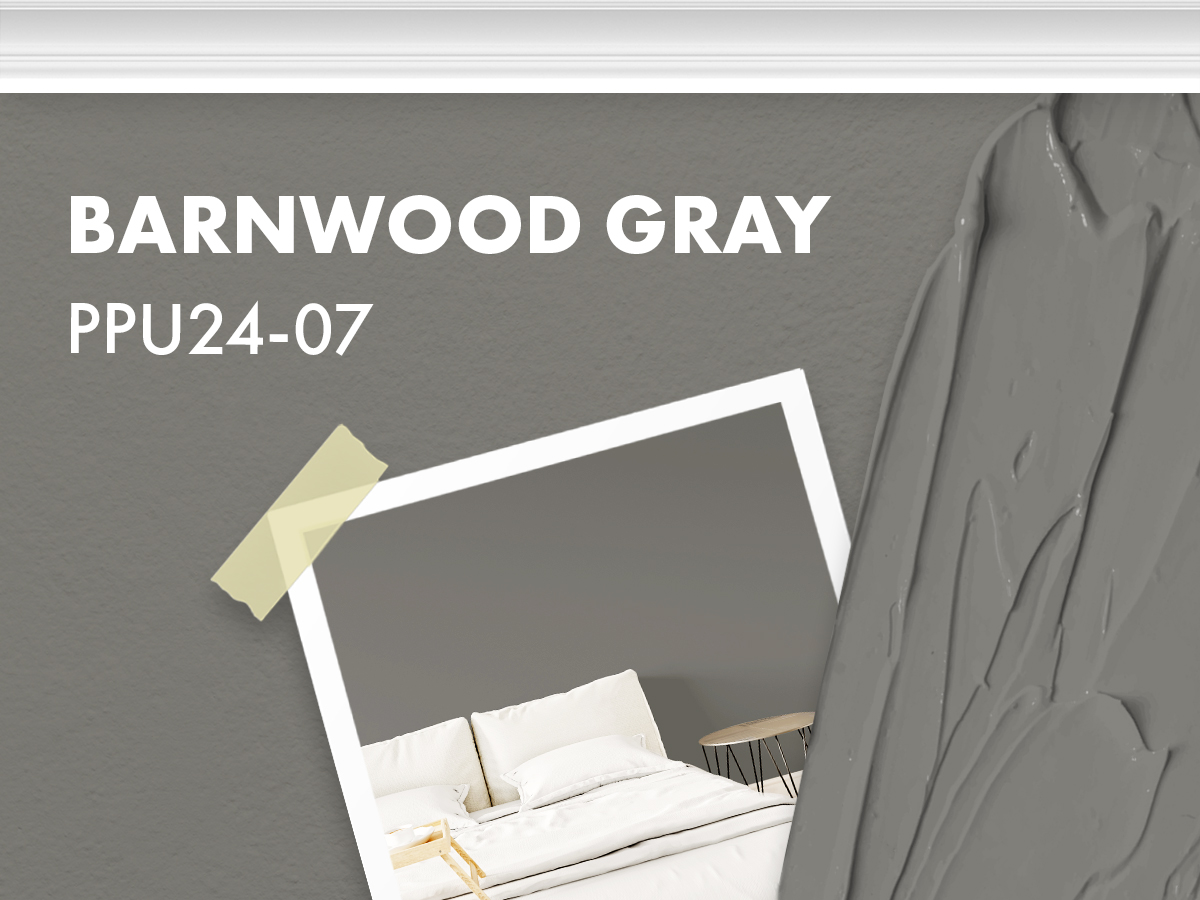
It’s all about the gray! However, barnwood gray is a little too dark and has blue undertones.
So, if you plan on mixing any warm tones into your space, you’re going to end up with a sickly green scheme. Try going with something that’s a little more greige instead.

To pull off this apricot brown, you will need a very particular space and chances are yours just won’t fit the bill.
This color teeters on the edge of overbearing and unless you’re planning on only using this as an accent color, it will swallow up your walls and overwhelm your room.
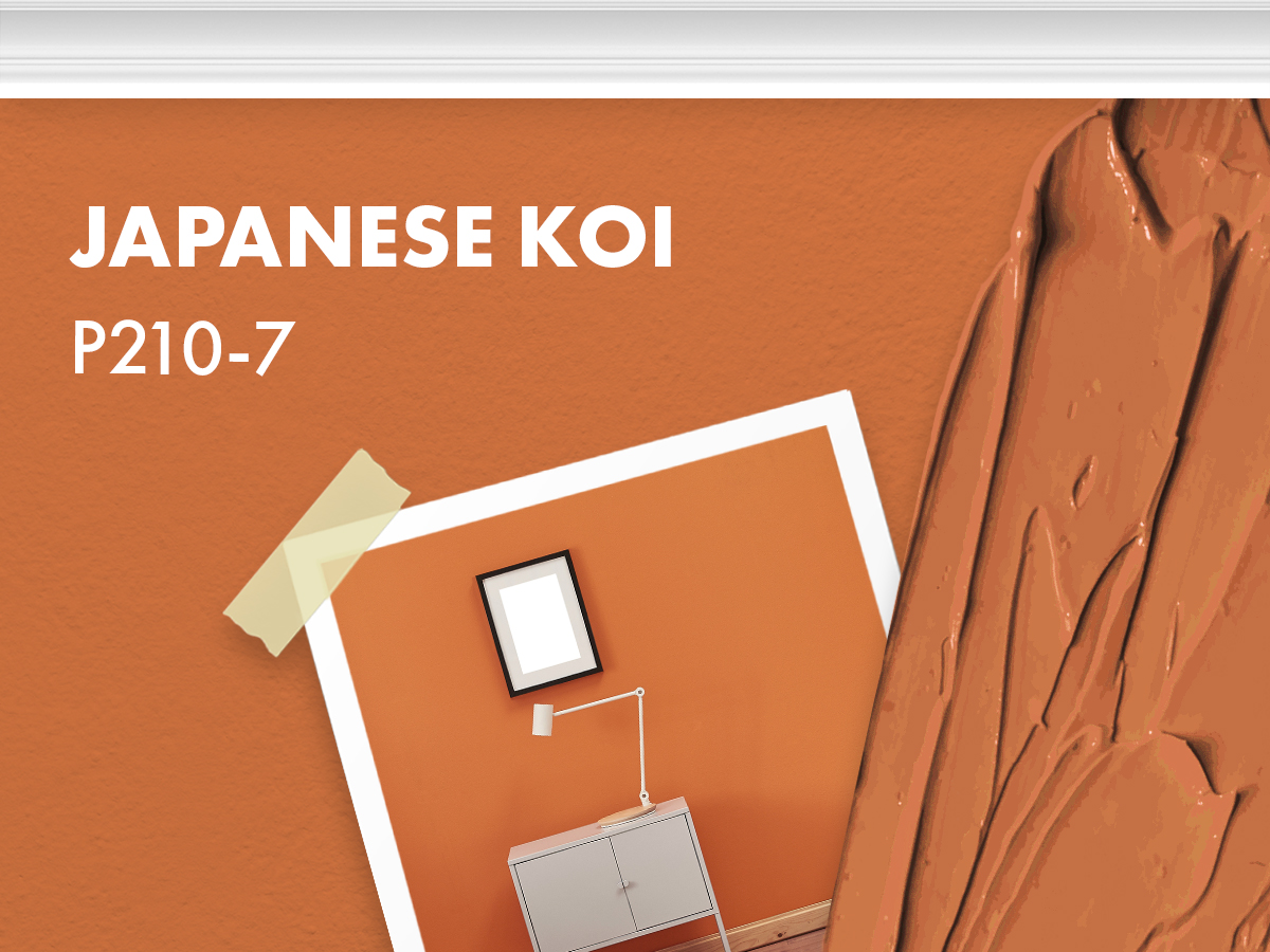
This peachy orange is probably the most un-relaxing color you could possibly paint your walls. It’s super saturated and will totally turn to a yellow orange in bright light.
This color also has peachy tones that will be too pink in darker light.
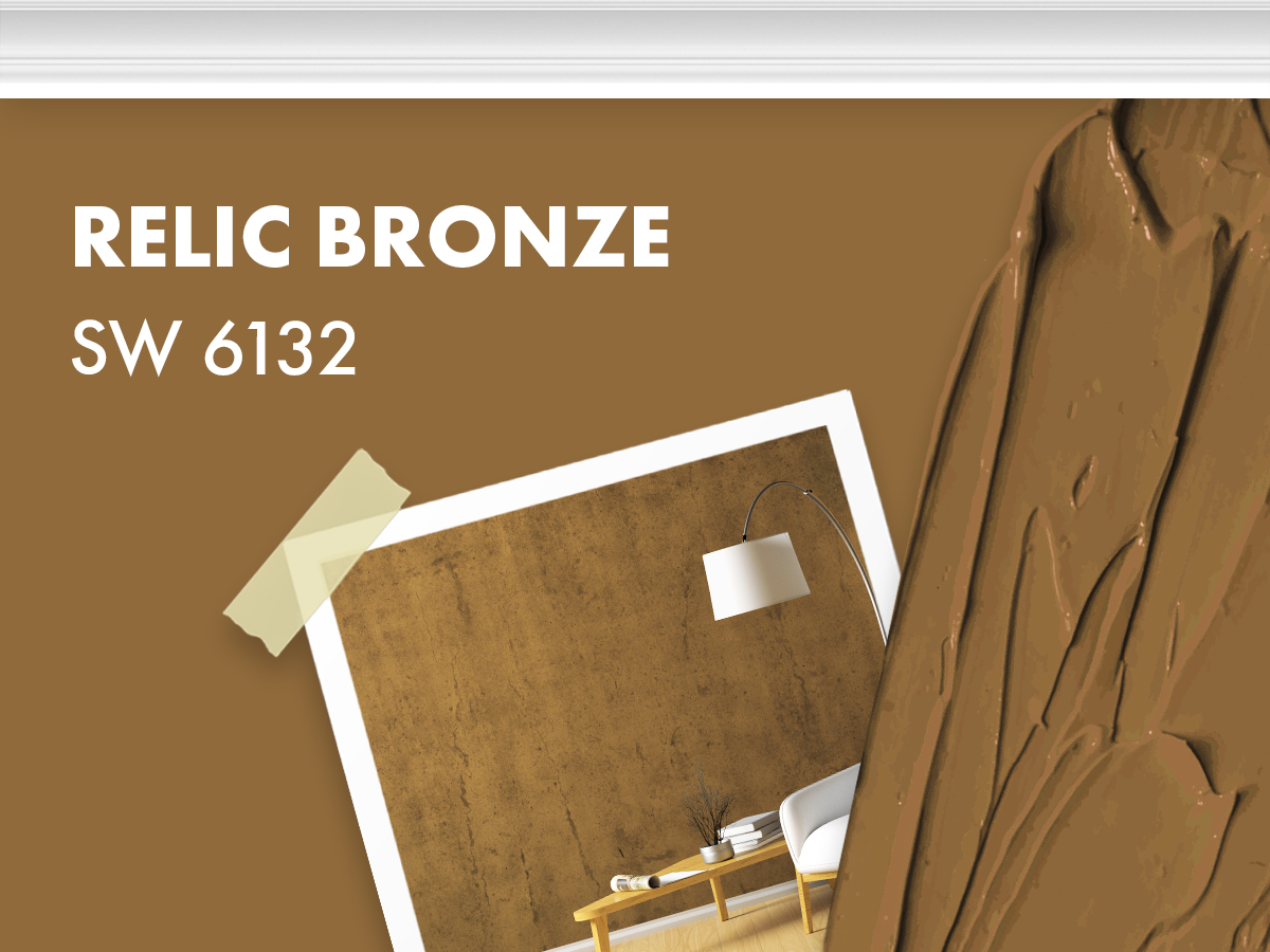
Relic Bronze by Sherwin Williams is another color that would be perfectly suited for your home’s exterior, but it would never be a good idea to introduce it to your interior.
It’s another in between colors that just leave you feeling unsettled.
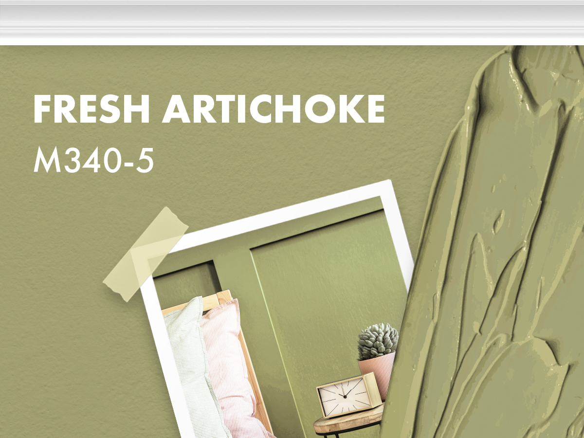
This color is called fresh artichoke, but it doesn’t give you any fresh feelings. In fact, this brownish green will make your home look dingy and sickly.
It will make whites look yellow and will have a hard time not pulling blues from greys.
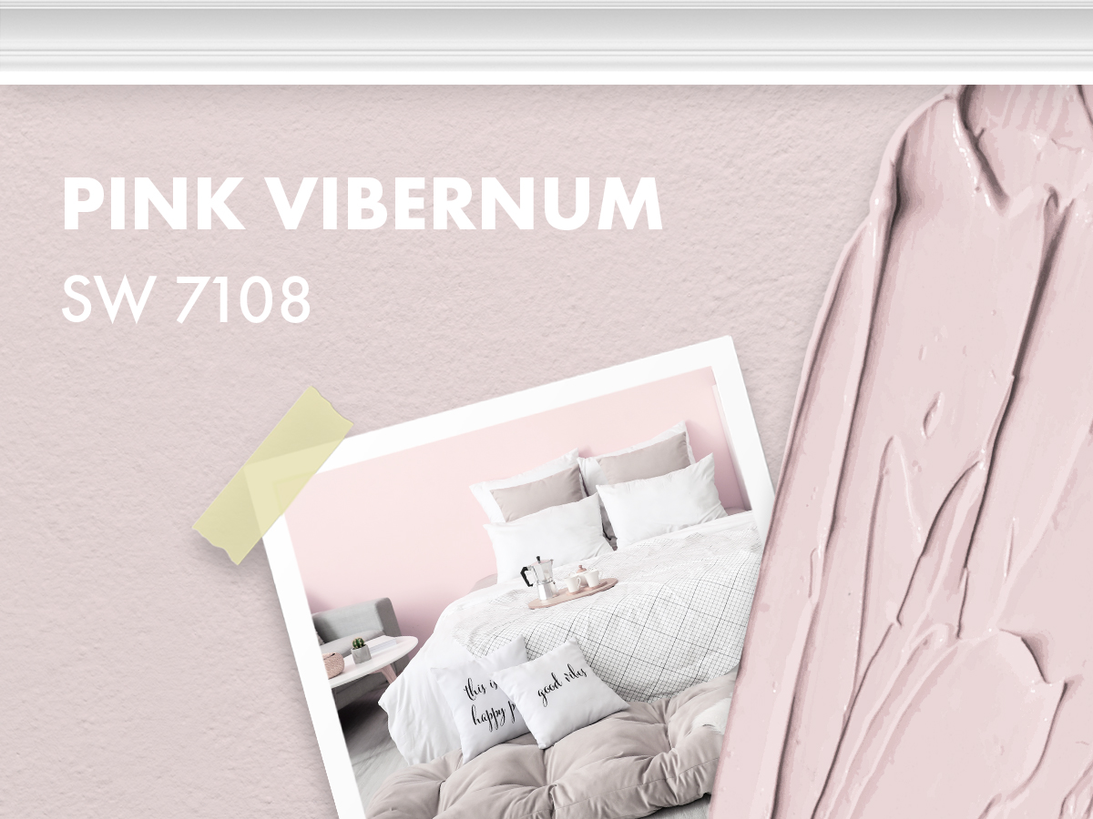
If you’re going for pink, you’re going to want to skip this color all together. Honestly, there’ s nothing pink about Pink Viburnum, it’s absolutely lavender!
In different lighting, this color will shift from pink, to yellow, to purple making it impossible to nail down an overall scheme. Cut

Glazed pears are delicious! However, this color is atrocious. Sorry Behr, but apricot brown doesn’t look good in anyone's home.
This color is too dominating and not to mention a totally weird shade.
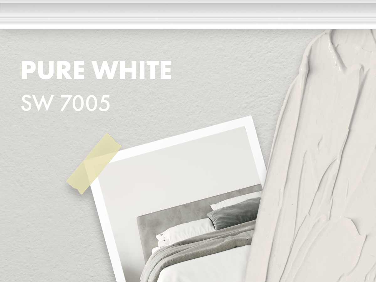
Pure white sounds amazing in theory, but in practice it’s unattainable. Every paint color will have a tinge towards some color weather it’s a warm tone or a cool tone.
Pure White leans more on the cool side making it a completely useless and boring non-colored paint.