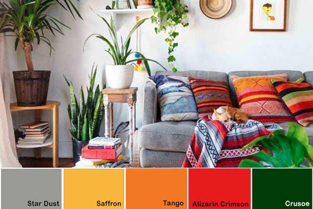
The thing about Boho is that you often use several primary colors and then pair it with a neutral to bring it all together. For this look, there are yellows, oranges, reds, and darker greens. You can also use a little blue if you want! All of these shades work together when matched with grey.
(Image via Pinterest)
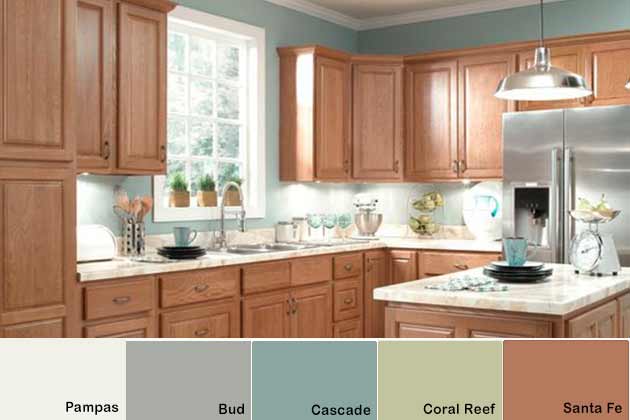
Love wood? Don’t worry; we have something for you. Oak colors can look beautiful when backed with muted colors like cascade and coral reef. You could also add white, but we suggest an off-white to keep it from stealing the attention from the natural wood.
(Image via Pinterest)
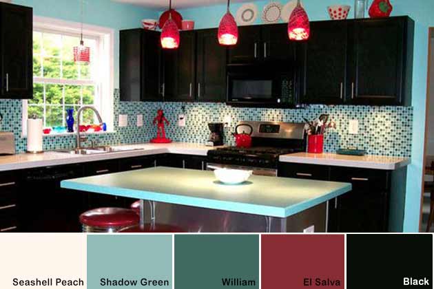
The ‘50s was a remarkable time, especially in fashion and design. This retro kitchen used reds and blue-greens that are allowed to pop with Seashell Peach, an off-white. Finally, a little bit of black brought a unique flair that makes you want to cook every single day.
(Image via Pinterest)
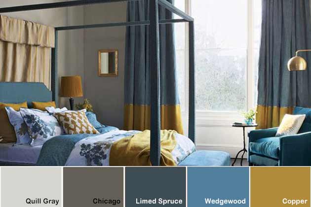
Your bedroom should be something soothing that will encourage you to fall asleep. Bright colors can sometimes hinder that, especially if you have trouble sleeping. This color palette helps you fall asleep in a beautiful environment.
(Image via Pinterest)
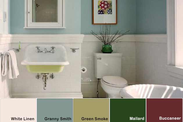
Whether it’s a bathroom, bedroom, or kitchen, blues and greens go well together. If you want a little pop in the space, you can add a maroon shade in artwork or other items. You can even add natural plant life that use this color!
(Image via Pinterest)
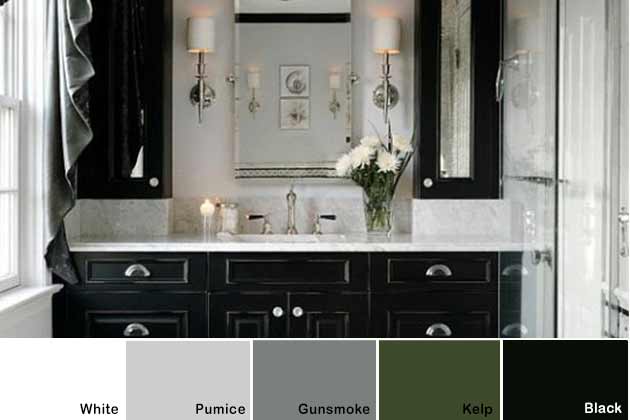
What’s better than black and white? These two shades have gone together since the beginning of time. Instead of going full black and white, adding a few greys can give you a little more freedom. Finally, we suggest that you add plant life or something natural to this palette.
(Image via Pinterest)
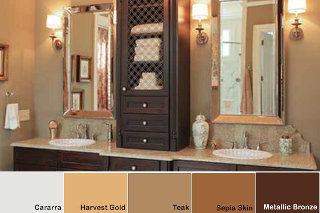
Who said that brown can’t be beautiful? Someone that didn’t know the color well enough! Browns encompass metallics and natural shades, and you have the full spectrum to play with. Off-whites like eggshell, cararra, and cream will also work well with browns as a secondary color.
(Image via Pinterest)
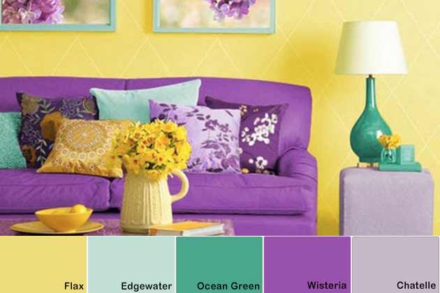
If you’re the adventurous type, this is the palette for you. This uses purples, blues, blue-greens, and yellow to make a room you won’t soon forget. If you love the palette, you can add some off-whites and greys to break up the vibrancy.
(Image via Pinterest)
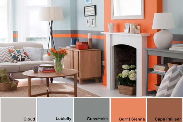
Orange is an under-utilized color. True, it can often be striking, but that’s because you can’t use safety cone orange! Instead, you should use a slightly muted option like Burnt Sienna. Then, use light blues, blue-greys, and browns to complement the primary color choice.
(Image via Pinterest)

Do you want fall all year around? Who doesn’t? It reminds you of pumpkin spice, cool weather, and comfy-cozy clothing. This palette will make it seem like it’s November as long as you’re there! We also suggest adding a bit of nature (like fresh flowers) to this type of look.
(Image via Pinterest)
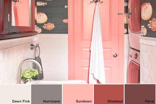
This kind of palette isn’t for the faint of heart. It’s bright, it’s bold, but above all, it’s beautiful. Pinks and darker red work so well together that it should be criminal. If you love these shades, you can break it up with more creams and greys with a few accents of pink and darker reds here and there.
(Image via Pinterest)

This color palette was designed for a boy’s bedroom, but you know what? You can literally use it anywhere. Navy blues and darker reds were meant to go together. Whether you use it for a bedroom or the living room, you’ll love this color palette.
(Image via Pinterest)
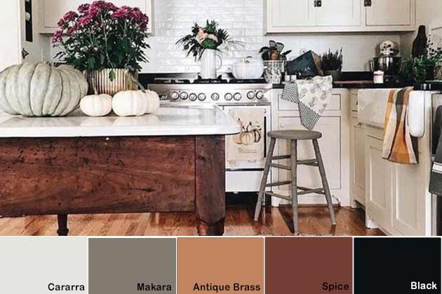
The classics never go out of style, and that is why traditional is often called “classic.” This palette looks best in the kitchen, but it can pretty much go anywhere. Natural woods are brought out by Makara, but it wouldn’t work as well if it weren’t for the black and white shades.
(Image via Pinterest)
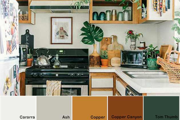
Yellow doesn’t have to be overwhelming. Copper works exceptionally well with oak or maple. Instead of flowers, this works best when you use deep green leaves. Wicker baskets and furniture can also work well with this palette.
(Image via Pinterest)
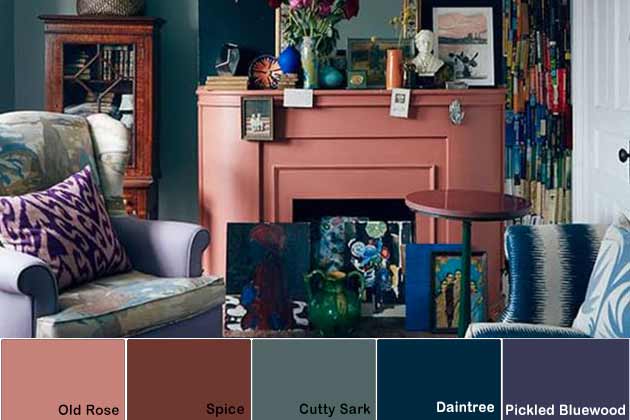
Darker colors can be beautiful in a room, but they may feel tough to work with. For this look, we’ve gone with darker blues, purples, and rose shades. Then, to tie it together, a darker turquoise can really make the other two shades pop.
(Image via Pinterest)
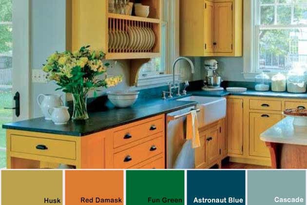
We love yellow, but sometimes it can be a bit much. That’s why darker yellows are ideal for those that find the primary color a little brash on its own. Using Husk backed with Red Damask complements both shades and brings out the other blue and green shades without allowing them to overpower each other.
(Image via Pinterest)
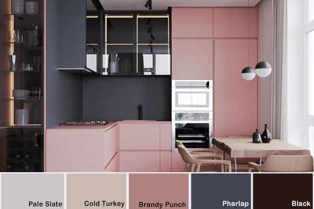
You don’t need to have a big space to make it look modern and chic. Dark, slate gray (Pharlap) looks fantastic if you pair it with a pale, muted pink. We suggest lighter woods with this color palette to allow the shades to pop. Darker woods would work, but it would make your place look smaller.
(Image via Pinterest)
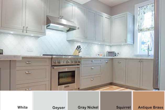
You can have a colorful kitchen with grey! There’s nothing to stop you from going neutral because this kind of kitchen works well for every season. You can add little splashes of color each season – green for spring, yellow and blue for summer, orange and red for fall, and light, icy blues for winter. This kind of color palette works beautifully with dark or light natural wood.
(Image via Pinterest)
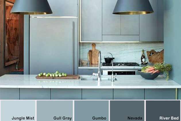
We’re using a kitchen here, but this would also look great in a bathroom or bedroom. Here, we see a monochromatic blue palette. It’s one of the most beautiful out there. Merely pick a dark blue and decrease the shade until you get to a pale, icy blue.
(Image via Pinterest)
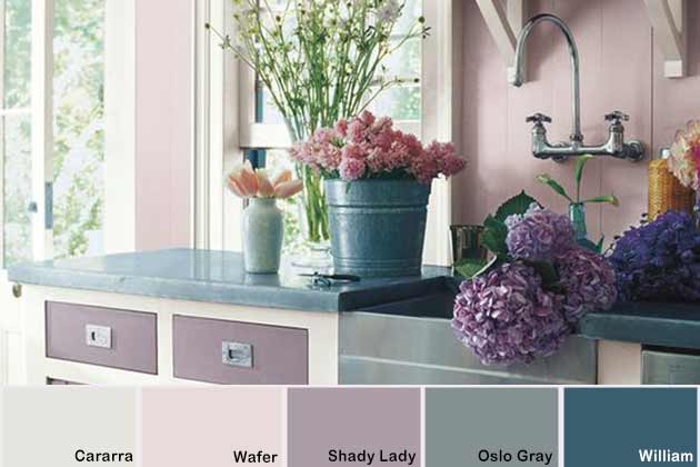
Few colors are as beautiful as lavender. It particularly works well with “rustic” themes. Take this kitchen for example – it uses buckets and silvers without detracting from the overall beauty of the palette. Best of all, pink and lavender flowers look stunning with these shades.
(Image via Pinterest)
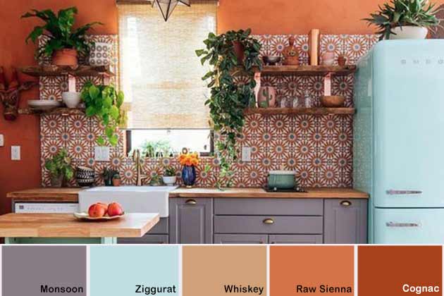
If you love color, this is the ideal palette. It’s tough adding a ton of colors into one place without making it look too busy. This kitchen focused on orange while using pastel color accents like blue, purple, and even natural, plant greens.
(Image via Pinterest)
Natural woods can be some of the most beautiful ways to decorate your home. While many colors go with natural wood, navy and yellows are easily two of the best. This kitchen uses both – navy cabinets and yellow walls. Driftwood is undoubtedly one of those colors that looks a little off-putting at first but can be amazing when used right.
(Image via Pinterest)
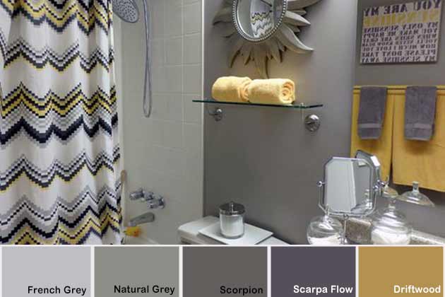
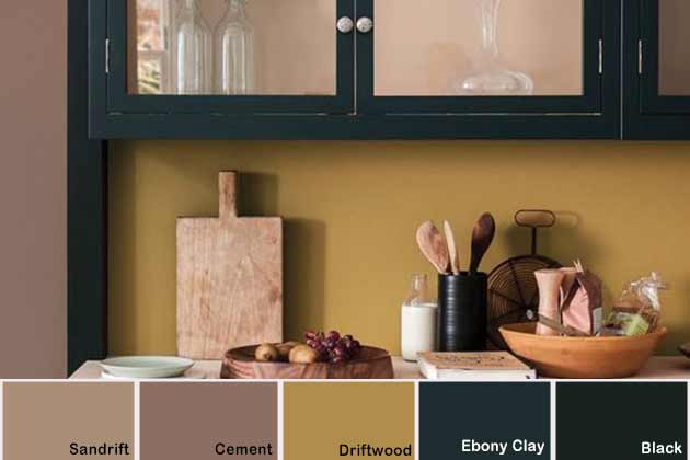
Driftwood is certainly one of the most dynamic colors out there – something someone may not expect from a mustard yellow. Here, it’s paired with greys and blue-greys. The two shades create this push and pull that work well for a modernized space. It looks especially amazing in minimalistic environments.
(Image via Pinterest)
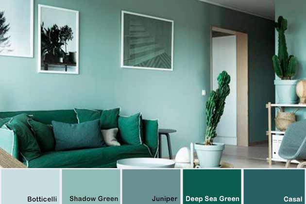
There’s something about green. It’s a natural color that is soothing while also brightening at the same time. This living room was decked out with green and blue-greens. This type of palette also works excellent with lighter woods and white. Don’t forget to add some natural plants in there to boost the appearance of the area!
(Image via Pinterest)
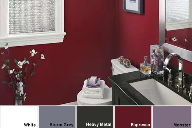
What goes great with red? Light purple! Lilac shades like Mobster. With a vibrant shade like espresso, you need to be careful when adding color, particularly if you use the tone on a wall. Splashes of Mobster make all the difference and create a cohesive design.
(Image via Pinterest)
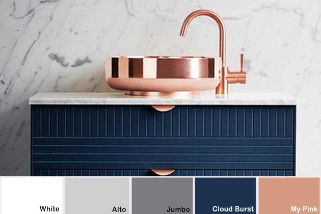
Rose gold is the best gold shade out there. Few people use this shade for fixtures, and we’re left wondering why. It looks great with pretty much anything, but navy makes it pop. This sleek bathroom will feel like a spa when you step out of the shower.
(Image via Pinterest)
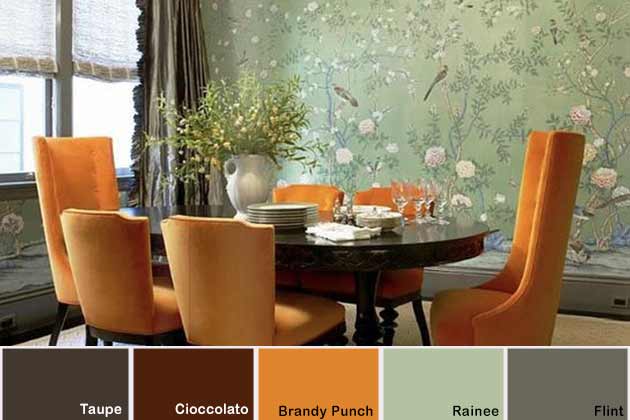
Sage is one of the top colors of the year. You could go sage and lavender for a Spring-y look, or you could go with something a little more unusual. Orange and sage look fantastic together, for example. The orange gives the pop of color that the palette needs while the browns and sage make it feel homey.
(Image via Pinterest)
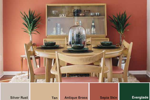
Coral is the perfect color for any home. It goes great with plenty of colors, including a deep green. Evergreen provides a little extra pop of color, and we suggest getting it by using natural plant life. If the coral color is a bit much, you can break it up with whites and natural wood.
(Image via Pinterest)
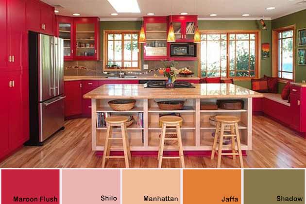
This palette isn’t for the faint of heart. Maroon Flush is a seriously vibrant color that can become overwhelming pretty fast. This kitchen uses Manhattan and Shadow to break up the color a little while also adding Jaffa to complement the lighting. It gives the whole room a warm feeling – ideal for anyone that has guests on a regular basis.
(Image via Pinterest)
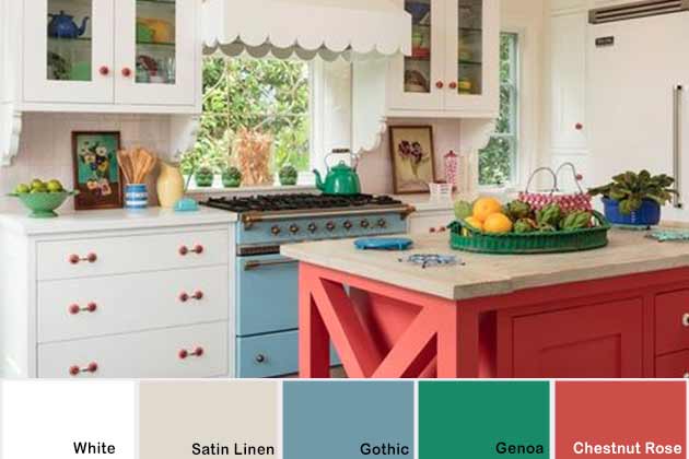
Retro kitchens are amazing. This 50s kitchen uses muted primary colors for a stunning design. Looking at the shades separately, it’s hard to imagine them working so well together, but here we are. Best of all, you don’t need to paint an entire wall. A few splashes here and there, and you’re made in the shade.
(Image via Pinterest)
